
Tailwind CSS has revolutionized how we write styles and you know how powerful utility-first styling can be. But beyond the basics, Tailwind offers a lot of hidden gems that can make your workflow faster, your code cleaner, and your UI more impressive.
If you're already using Tailwind CSS, here are 10 tricks and tips that will instantly level up your frontend game.
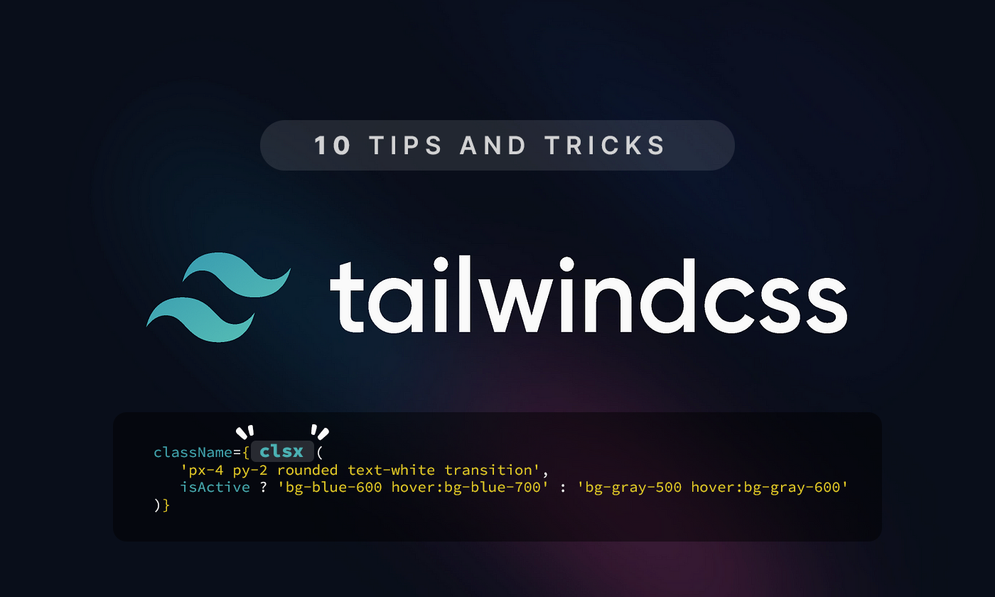
1. 💡 Use clsx for Clean Conditional Styling
Instead of manually concatenating class strings, use clsx to handle conditional Tailwind classes in a clean and readable way.
npm install clsx// components/Button.tsx
import clsx from 'clsx'
export default function Button({ isActive }: { isActive: boolean }) {
return (
<button
className={clsx(
'px-4 py-2 rounded text-white transition',
isActive ? 'bg-blue-600 hover:bg-blue-700' : 'bg-gray-500 hover:bg-gray-600'
)}
>
Click me
button>
)
}Using
clsxavoids bloatedclassNamelogic. It improves readability and reduces the risk of accidentally applying conflicting classes making your components easier to maintain and scale.
2. 🧼 Create Reusable UI Tokens with @apply
Use Tailwind’s @apply to create reusable class patterns like .btn or .card in your global CSS.
/* styles/globals.css */
.btn {
  @apply px-4 py-2 rounded bg-blue-600 text-white hover:bg-blue-700 transition;
}

.card {
  @apply p-6 bg-white rounded shadow-md;
}<button className="btn">Clickbutton>
<div className="card">Reusable UI blockdiv>
@applylets you bundle frequently used utility classes into semantic CSS rules like.btnor.card. This reduces repetition and enforces design consistency.
3. 🌙 Dark Mode Toggling with Tailwind
Enable dark mode in your Tailwind config:
// tailwind.config.js
module.exports = {
  darkMode: 'class',
}
Then toggle it in your app using document.documentElement.classList:
// pages/_app.tsx
import { useEffect, useState } from 'react'

function MyApp({ Component, pageProps }) {
  const [dark, setDark] = useState(false)

  useEffect(() => {
    document.documentElement.classList.toggle('dark', dark)
  }, [dark])

  return (
    <>
      <button onClick={() => setDark(!dark)} className="btn">
        Toggle Dark
      button>
      <Component {...pageProps} />
    >
  )
}

export default MyApp
Use dark: utilities in your components:
<div className="bg-white text-black dark:bg-black dark:text-white p-4 rounded">
  This adapts to dark mode
div>
Tailwind's dark mode support allows you to style elements based on theme. It’s ideal for building apps with light/dark theme toggles using
dark:variants.
4. 🧠 Smart Interactions with group and peer
Tailwind's group and peer utilities allow complex interactions between elements.
// Hover effect on child via parent
<div className="group p-4 border rounded hover:bg-gray-100">
  <h3 className="text-lg font-semibold group-hover:text-blue-600">
    Hovered Title
  h3>
div>// Input toggles label style
<label className="flex items-center space-x-2">
<input type="checkbox" className="peer hidden" />
<span className="px-2 py-1 bg-gray-300 peer-checked:bg-green-500 rounded">
Toggle Me
span>
label>Use
groupandpeerto trigger styles on related elements. This is great for hover, focus, or checked states without writing extra JavaScript.
5. ✨ Powerful State Styling with Variants
Tailwind supports state-based variants out of the box.
<button
  disabled
  className="bg-blue-500 text-white px-4 py-2 rounded disabled:opacity-50 disabled:cursor-not-allowed"
>
  Submit
button>
You can also use:
-
hover:,focus:,active:,disabled: -
first:,last:,even:,odd: -
aria-checked:,data-[state=open], etc.
Tailwind’s built-in variants like
hover:,focus:,disabled:,first:, andaria-*allow responsive, state-based styling using only utility classes.
6. 📏 Maintain Aspect Ratios Easily
Tailwind provides utilities for common aspect ratios:
<div className="aspect-w-16 aspect-h-9">
  <iframe
    src="https://www.youtube.com/embed/dQw4w9WgXcQ"
    className="w-full h-full"
    allowFullScreen
  >iframe>
div>
Or use the plugin for modern syntax:
npm install @tailwindcss/aspect-ratio// tailwind.config.js
plugins: [require('@tailwindcss/aspect-ratio')],<div className="aspect-video">
<img src="/banner.jpg" className="w-full h-full object-cover" />
div>Keep images and embeds responsive with
aspect-w-*andaspect-h-*, or use the official plugin. This avoids the need for custom CSS for media ratios.
7. 🔁 Use @layer components for Semantic Styles
Tailwind lets you define reusable class utilities using @layer components:
@layer components {
  .input {
    @apply border border-gray-300 px-3 py-2 rounded-md focus:outline-none focus:ring-2 focus:ring-blue-500;
  }

  .alert {
    @apply p-4 rounded bg-red-100 text-red-800;
  }
}<input className="input" placeholder="Email address" />
<div className="alert">This is an alertdiv>With
@layer components, you can define custom utility-based components inside your CSS, making your UI more scalable and semantically meaningful.
8. 🧩 Tailwind + Headless UI = Fast & Accessible
Combine Tailwind with @headlessui/react for accessible, unstyled components.
npm install @headlessui/reactimport { Dialog } from '@headlessui/react'
function Modal({ isOpen }: { isOpen: boolean }) {
return (
<Dialog open={isOpen} onClose={() => {}} className="relative z-50">
<div className="fixed inset-0 bg-black/50" />
<div className="fixed inset-0 flex items-center justify-center">
<Dialog.Panel className="bg-white p-6 rounded shadow-md">
<Dialog.Title className="text-lg font-semibold">My ModalDialog.Title>
<Dialog.Description>This is an accessible modal.Dialog.Description>
Dialog.Panel>
div>
Dialog>
)
}Headless UI provides unstyled, accessible components like modals or dropdowns. Combined with Tailwind, you get complete control over appearance and accessibility.
9. 📦 Tailwind Plugins You Should Be Using
Enhance Tailwind with official plugins:
npm install @tailwindcss/forms @tailwindcss/typography @tailwindcss/aspect-ratio// tailwind.config.js
plugins: [
require('@tailwindcss/forms'),
require('@tailwindcss/typography'),
require('@tailwindcss/aspect-ratio'),
]-
forms– better default input styles -
typography– beautiful prose -
aspect-ratio– intuitive media layouts
Plugins like
@tailwindcss/forms,typography, andaspect-ratioadd useful utilities and improve defaults, saving time and avoiding boilerplate CSS.
10. 🧠 Combine container and Custom Breakpoints
Configure the container and breakpoints to match your design system:
// tailwind.config.js
theme: {
  container: {
    center: true,
    padding: '1rem',
  },
  screens: {
    sm: '480px',
    md: '768px',
    lg: '1024px',
    xl: '1280px',
    '2xl': '1536px',
  },
}<div className="container">
<p className="text-base md:text-lg lg:text-xl">
Responsive typography in action.
p>
div>Customizing the
containerand breakpoints aligns your layout system with your design specs, helping you build responsive UIs that scale smoothly across devices.
Tailwind CSS is more than just utility classes, it's a complete UI workflow. When combined with React and Next.js, it gives you control, speed, and scalability.
Which tip was your favorite? Got one that I missed? Let me know in the comments below.
Follow me for more practical articles on React, Tailwind CSS, and Next.js!
