HTML is the backbone of web development, and it's not changing anytime soon. Even though HTML is a simple markup language, and you can easily get a reasonable grasp of it within a few hours, knowing the nitty-gritty details of HTML is what separates an average developer from a great one!
Here are 7 HTML skills you should know to become an exceptional developer in 2025.
1. Semantic HTML
As Google spits out
Semantic HTML refers to using HTML elements that clearly define the purpose and meaning of the content they contain, making your website code more understandable for both humans and machines. This is important because it enhances readability, accessibility, and search engine optimization (SEO).
Though picking up Semantic HTML is a tad difficult for beginners, once you get the hang of things, using Semantic HTML becomes almost unconscious.
Common Semantic HTML Tags are:
-
section: Thesectiontag groups the content into different sections. -
header: Theheadertag is used to define the header for a document -
nav: Thenavelement defines a set of navigation links. -
footer: Just like theheader, thefootertag is used to define the footer for a document -
aside: Theasideelement defines some content aside from the main content (eg: placed in a sidebar). -
main: Themainelement specifies the main content of the document
Here's an example of how to use Semantic HTML:
src="brand-logo.png" />


     href="#sec-1">Section 1
     href="#sec-2">Section 2


   id="sec-1">
    Section 1

      Lorem ipsum dolor sit amet, consectetur adipiscing elit. Sed do eiusmod
      tempor incididunt ut labore et dolore magna aliqua.


   id="sec-2">
    Section 2
    Lorem ipsum dolor sit amet, consectetur adipiscing elit.


     href="http://ext-1.com">External Link 1
     href="http://ext-2.com">External Link 2
2. Lazy loading assets
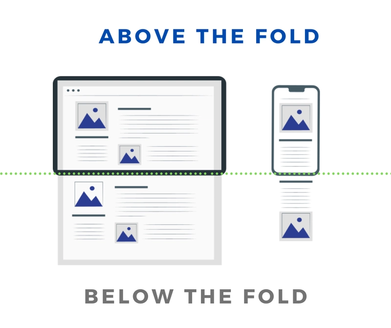
Lazy loading is a technique that defers the loading of non-essential resources at the point the page is initially loaded. Deferring the loading of images and videos can significantly improve the initial load speed of your website.
One important note - you should only lazy load images and videos that are below the fold (fancy term for elements that are not visible in the viewport when the page is loaded, you have to manually scroll down to view the elements that are below the fold). Lazy loading of images and videos that are above the fold (ie: visible on visiting the website) can lead to a poor user experience as the user will have to wait for the images and videos to load after the page is loaded.

Here's an example of how to lazy load images and videos:
src="image.png" loading="lazy" />


 preload="none">
   src="video.mp4" type="video/mp4" />
3. Preloading assets
This is the opposite of lazy loading. Preloading is a technique that allows you to load essential resources before the page is fully loaded. This can significantly improve the performance of your website, especially for resources that are critical for rendering the page.
The most common use case for preloading is to load up content that is above the fold (ie: visible on visiting the website).
Here's an example of how to preload images - the tag should be placed in the section of your HTML document:
rel="preload" href="https://example.com/asset.png" as="image" />For videos, you can reuse the preload attribute in the tag:
preload="auto">
   src="video.mp4" type="video/mp4" />
4. Custom link previews
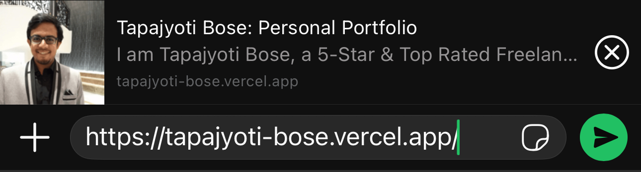
Ever wondered how WhatsApp shows a preview of the link you are sharing? It's as simple as slapping in a few tags in the section of your HTML document.
WhatsApp (& other platforms from Meta) uses the Open Graph protocol (og) to generate link previews, whereas Twitter uses the Twitter Card protocol. You can (& should) use both protocols to generate link previews for your website.
This is what I use for my portfolio:
name="description"
  content="I am Tapajyoti Bose, a 5-Star & Top Rated Freelance Frontend Web Developer specializing in React. This is my portfolio."
/>
 name="image" content="/card-image.png" />
 name="thumbnail" content="/card-image.png" />
 name="title" content="Tapajyoti Bose: Personal Portfolio" />


 name="twitter:card" content="summary" />

  name="twitter:description"
  content="I am Tapajyoti Bose, a 5-Star & Top Rated Freelance Frontend Web Developer specializing in React. This is my personal portfolio."
/>
 name="twitter:image" content="/card-image.png" />
 name="twitter:title" content="Tapajyoti Bose: Personal Portfolio" />


  property="og:description"
  content="I am Tapajyoti Bose, a 5-Star & Top Rated Freelance Frontend Web Developer specializing in React. This is my personal portfolio."
/>
 property="og:image" content="/card-image.png" />
 property="og:site_name" content="Tapajyoti Bose" />
 property="og:title" content="Tapajyoti Bose: Personal Portfolio" />
 property="og:type" content="website" />
 property="og:url" content="https://tapajyoti-bose.vercel.app/" />
There are hundreds of meta tag generators available online, but I found Meta Tags to be the best one so far.
5. Make a call or send an email
These days, most devices (including laptops & desktops) allow you to place calls. You can use the tel: links to make a call from your device simply using HTML.
If you want to send an email, mailto: links got your back! It will open the default email client on the user's device and pre-fill the recipient's email address.
Here's an example of how to use tel: and mailto: links:
href="tel:+919876543210">Call someone
 href="mailto:[email protected]">Send an email
6. Responsive images
Ever run into a slow website that takes ages to fully load due to humongous images? Well, you can avoid that in your next awesome website by using responsive images.
Art Direction is an incredible optimization technique that saves a huge amount of bandwidth by loading the optimally sized images based on some media queries.
media="(max-width: 1200px)" srcset="link-to-img" />
   media="(max-width: 2560px)" srcset="link-to-img@2x" />
   media="(min-width: 2560px)" srcset="link-to-imgl@3x" />
   src="link-to-img@3x" />
In the example above, the browser will load the required image based on the media query that matches the user's device. This is a great way to optimize the load time of your website for different devices and screen sizes.
7. Preformatted text
Are you building an app where the text formatting a user enters needs to be preserved, but HTML keeps reverting to the default formatting?

Fret not my friend, all you need to do is wrap the content with a tag to preserve the formatting of the text. Text in a pre element is displayed in a fixed-width font by default (does allow manual styling), and the text preserves both spaces and line breaks.
Lorem

 Ipsum   dolor sit             amet.
That's all folks! 🎉
Thanks for reading
Need a Top Rated Software Development Freelancer to chop away your development woes? Contact me on Upwork
Want to see what I am working on? Check out my Personal Website and GitHub
Want to connect? Reach out to me on LinkedIn
Follow my blogs for bi-weekly new Tidbits on Medium
FAQ
These are a few commonly asked questions I receive. So, I hope this FAQ section solves your issues.
-
I am a beginner, how should I learn Front-End Web Dev?
Look into the following articles: Would you mentor me?
Sorry, I am already under a heavy workload and do not have the time to mentor anyone.
