
You’re a newbie? Good.
That means you have nowhere to go BUT UP.
it can feel overwhelming. That’s natural.

Frontend development is all about [how well] you understand.
Not how [fast] you learn.
🪜 You either step up and do it right, or you watch your code breaks.
👉 Let me walk you through the biggest mistakes beginner frontend devs ever make, and how to avoid them.
1. 🤧 NOT Optimizing Images
Some of you test locally on a blazing-fast machine.
You forget real users have slower networks.
Some devs are too lazy to think about their users.
Let me get it straight: A 6MB image shrunk to 200px is a SIN.
Optimize your images. Every. Single. Time.
Some criminal devs try to reduce image file size by using CSS like this:
img {
  width: 200px;
  height: auto; /* keeps the aspect ratio */
}
👉 However, this does not reduce the ACTUAL file size.
If your image is still 6MB, it will still take a LONG TIME to download CSS just displays it smaller.
What a [BIG WASTE] of bandwidth. 🚮
🪧 So, CSS resizing is mostly for layout, not real optimization.
So what is the solution?
Well, the first solution I would suggest is to use online image compressor tools.
I found tinypng is a great tool for optimizing website images without reducing their quality.
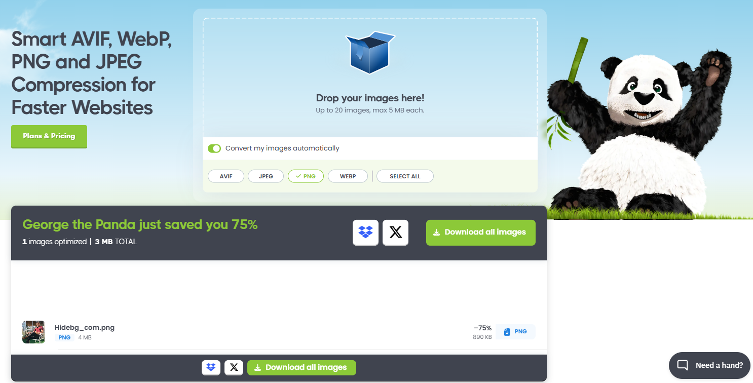
You can see my photo file size reduced to -75% (4mb to 890kb); that's crazy.
⚡ Compressed images = faster load times = happy users.
⚠️ Warning: DO NOT compress images for [larger screens]. Use HTML srcset attribute instead:
</span>

  Responsive Images Example


    src="images/large.jpg"
    alt="A beautiful scenic view"
    srcset="
      images/small.jpg   400w,
      images/medium.jpg  800w,
      images/large.jpg   1200w
    "
    sizes="
      (max-width: 400px)  400px,
      (max-width: 800px)  800px,
      1200px
    "
  />
🪨🔨 How to Optimize Images Using Node.js?
My second solution would be... use a trustworthy JavaScript library.
If you have some experience with Node.js, then here is a popular Node.js library to optimize image without reducing quality: Sharp
👇 Here’s how to use it:
const sharp = require("sharp");

sharp("large-image.jpg")  // The original, large file
  .resize(200, 150)       // Shrink dimensions
  .toFormat("jpeg", { quality: 80 }) // Convert to JPEG with 80% quality
  .toFile("optimized-image.jpg")
  .then(() => {
    console.log("Image optimized successfully!");
  })
  .catch((err) => {
    console.error("Error optimizing image:", err);
  });
2. 🥸 Using Inline Styles
Let's say you're working on a website that has [10 job offers] listed. You want them to be red to catch the user’s eye.

👇 You took the easy path:
href="/job-offer/123" style="color: red;">Junior Developer
 href="/job-offer/456" style="color: red;">Frontend Engineer
 href="/job-offer/789" style="color: red;">Backend Specialist
Sure, it works. But the moment your boss says:
“Hey dude, make all those links blue instead. My wife hates red.🥱”
You’re in TROUBLE.
You’d have to edit [each] inline style to color: blue;.
If you have 100 links scattered across multiple pages,
that’s a MASSIVE chore.
That's one of the [quick-fix traps] most devs fall into.
✅ The CSS-Only Approach
Now, let’s do it the right way. You define a simple class in your CSS:
.link-job-offer {
  color: red;
  text-decoration: none;
  /* maybe other styles, too */
}
.link-job-offer:hover {
  color: darkred;
}
👇 Then, in your HTML:
href="/job-offer/123" class="link-job-offer">Junior Developer
 href="/job-offer/456" class="link-job-offer">Frontend Engineer
 href="/job-offer/789" class="link-job-offer">Backend Specialist
👉 Change one line in .link-job-offer for a global update. That’s power.
3. 🎭 Using Inadequate Heading Tags
Don’t use just because it’s [big and bold]. That’s an SEO sin.
Headings must reflect hierarchy. If it’s purely decorative, use a Then style it in your CSS with 🔥🧯 Don’t sabotage your SEO for a cheap hack. You tested on desktop? Great. But [half] your users are on mobile. If you skip media queries, you CHEAT half your audience. It doesn't take much time; you just need to add the following CSS codes: Resist the lazy mindset. Always check your phone or dev tools. Because if it breaks on mobile, you lose. Your users matter most. It’s 2025. Floats are archaic. Resist your old habits. Use flex or grid. It’s faster, cleaner, simpler. Flexbox Example: 🙅♂️ No more float nightmares. If you find yourself reusing Some of you love to add That’s dead code. Clean it up. Wrong: Right: 🤏 Less is more. Typing But that’s a sin against separation of concerns. Use CSS: Done. Now, your text is uppercase only in presentation. Speed is tempting. “Let me build this in one night!” Then you brag about it. But your code is a mess. Most often, the entire project collapses. That’s the sin of short-term glory. Real devs write maintainable code. They think about the future. That's why writing clean code matters most in the tech industry. Grab my book Clean Code Zero to One to master this skill and join a few who truly understand everything about clean code. The reason most software companies fire these types of devs is clear: Poor code 🆚 Clean Code Frontend dev is a journey, not a sprint. Mistakes happen. That doesn't mean you SHOULD NOT look into them and struggle later. 🥊 Fight through the struggle NOW before it puts you in a painful punishment. Happy coding and share your thoughts in the comment section. I would love to hear that. 🌱🗃️ More Learning Resources:
style="font-size: 50px;">Promoted
class="promo-text">Promoted.promo-text.
4. ❌📲 Ignoring Mobile Media Queries
.container {
width: 60%;
margin: auto;
}
/* Mobile first approach */
@media (max-width: 600px) {
.container {
width: 95%;
}
}
5. 🪟 Not Benefitting from Flexbox or CSS Grid
.navbar {
display: flex;
justify-content: space-between;
align-items: center;
}
6. 🗂️ Not Abstracting Elements
.newsletter__title all over, that’s a sign of mistakes. Abstract it. Make a .section-title that you can use anywhere. That’s maintainable.
class="newsletter">
class="newsletter__title">Subscribe to Our Newsletter
class="blog">
class="newsletter__title">Latest Blog Posts
class="events">
class="newsletter__title">Upcoming Events
class="newsletter">
class="section-title">Subscribe to Our Newsletter
7. 🧹 NOT Removing Redundant Styles
display: block and float: right in the same rule. Or width: 100% on a block element.
.foo {
display: block;
float: right;
}
.foo {
float: right; /* automatically block */
}
8. 🏯 Uppercasing Things in HTML
JOB OFFERS
class="section-title">Job Offers.section-title {
text-transform: uppercase;
}
9. 💎 NOT Focusing on QUALITY
// Poor code: Hard-coded, zero flexibility
function calcPrice() {
let price = 100;
let tax = price * 0.15;
console.log(price + tax);
}// Clean code: Configurable, easy to adapt
function calcPrice(basePrice, taxRate = 0.15) {
const total = basePrice + basePrice * taxRate;
console.log(total);
}
🏁. Conclusion
