Modern CSS has rapidly evolved, integrating many features that were once exclusive to Sass/SCSS. Features like CSS variables, native nesting, color functions, and cascade layers are now built into the language — eliminating the need for a preprocessor in most cases.
This article provides a practical guide for developers looking to migrate their codebases from SCSS/Sass to modern native CSS. We’ll walk through the essential steps, offer side-by-side comparisons, and suggest strategies to take full advantage of today’s CSS capabilities.
Migration checklist
-
Audit Sass usage: Identify all Sass-specific features used (variables, nesting, mixins, functions,
@extend, loops). - Check browser support: Most modern CSS features have >90% support (Nesting, Custom Properties, Container Queries, etc.).
-
Start with variables: Replace
$variablewith--custom-propertyand usevar(--name). -
Convert mixins/functions: Use utility classes, CSS functions (
calc,clamp, etc.), or restructure. -
Eliminate
@extend/loops: Refactor where needed — custom properties and utility patterns help. - Reorganize imports: Use native CSS imports or combine with build tools.
- Test thoroughly: Ensure styles render correctly post-migration.
1. Variables
// Sass Variables
$primary-color: #3498db;
$secondary-color: #2ecc71;
$border-radius: 4px;

.button {
  background-color: $primary-color;
  border-radius: $border-radius;

  &:hover {
    background-color: darken($primary-color, 10%);
  }
}/* CSS Custom Properties */
:root {
--primary-color: #3498db;
--secondary-color: #2ecc71;
--border-radius: 4px;
}
.button {
background-color: var(--primary-color);
border-radius: var(--border-radius);
}
.button:hover {
background-color: hsl(from var(--primary-color) h s calc(l - 10%));
}2. Nesting
// Sass Nesting
.card {
  padding: 1rem;

  .card-header {
    font-weight: bold;

    h2 {
      margin: 0;
    }
  }

  .card-body {
    margin-top: 1rem;
  }
}/* CSS Nesting */
.card {
padding: 1rem;
& .card-header {
font-weight: bold;
& h2 {
margin: 0;
}
}
& .card-body {
margin-top: 1rem;
}
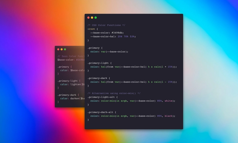
}3. Color functions
// Sass Color Functions
$base-color: #3498db;

.primary {
  color: $base-color;
}

.primary-light {
  color: lighten($base-color, 15%);
}

.primary-dark {
  color: darken($base-color, 15%);
}/* CSS Color Functions */
:root {
--base-color: #3498db;
--base-color-hsl: 204 70% 53%;
}
.primary {
color: var(--base-color);
}
.primary-light {
color: hsl(from var(--base-color-hsl) h s calc(l + 15%));
}
.primary-dark {
color: hsl(from var(--base-color-hsl) h s calc(l - 15%));
}
/* Alternative using color-mix() */
.primary-light-alt {
color: color-mix(in srgb, var(--base-color) 85%, white);
}
.primary-dark-alt {
color: color-mix(in srgb, var(--base-color) 85%, black);
}4. Functions
// Sass Functions
@function calculate-width($columns, $total: 12) {
  @return percentage($columns / $total);
}

.column-4 {
  width: calculate-width(4); // 33.33333%
}

.column-6 {
  width: calculate-width(6); // 50%
}/* CSS Calc + Custom Properties */
:root {
--grid-columns: 12;
}
.column-4 {
width: calc(4 / var(--grid-columns) * 100%); /* 33.33333% */
}
.column-6 {
width: calc(6 / var(--grid-columns) * 100%); /* 50% */
}5. Mixins
// Sass Mixin
@mixin button-style($color) {
  background-color: $color;
  color: white;
  padding: 0.5em 1em;
  border-radius: 4px;

  &:hover {
    background-color: darken($color, 10%);
  }
}

.primary-button {
  @include button-style(blue);
}

.secondary-button {
  @include button-style(green);
}/* CSS Custom Properties + Classes */
.button {
color: white;
padding: 0.5em 1em;
border-radius: 4px;
background-color: var(--button-color);
}
.button:hover {
background-color: var(--button-hover-color);
}
.primary-button {
--button-color: blue;
--button-hover-color: darkblue;
}
.secondary-button {
--button-color: green;
--button-hover-color: darkgreen;
}6. Media queries
// Sass Nested Media Queries
.sidebar {
  width: 300px;

  @media (max-width: 768px) {
    width: 100%;
  }

  .sidebar-item {
    padding: 1rem;

    @media (max-width: 768px) {
      padding: 0.5rem;
    }
  }
}/* CSS Container Queries */
.sidebar {
width: 300px;
container-type: inline-size;
@media (max-width: 768px) {
width: 100%;
}
}
.sidebar .sidebar-item {
padding: 1rem;
}
@container (max-width: 768px) {
.sidebar-item {
padding: 0.5rem;
}
}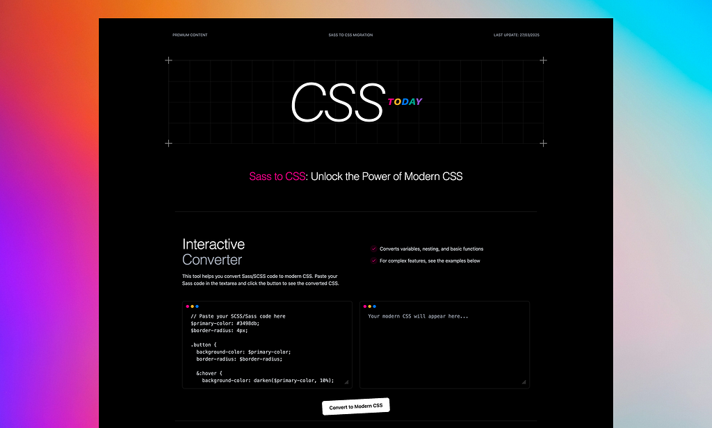
If you’re looking for practical tools to support your migration journey, check out csstoday.dev/ — it features an interactive SCSS-to-CSS converter (including color functions), deeper insights into native CSS features, and a small course with hands-on challenges.
Sass was a game-changer — but CSS has caught up. With the power of native features like variables, nesting, color manipulation, and responsive logic, there’s never been a better time to migrate. This guide helps you modernize your codebase and simplify your tooling. Happy migrating!
Ready to go all-in on modern CSS? Start with one component and build momentum. You’ll be surprised how much Sass you don’t actually need anymore.
Do you want more? Let’s check out my project, CSSToday: csstoday.dev/