This article is the third in the visual drag-and-drop series. The previous two articles analyzed the technical principles of 17 features:
- Editor
- Custom components
- Drag and drop
- Delete components, adjust layer hierarchy
- Zoom in and out
- Undo, redo
- Component property settings
- Snap
- Preview, save code
- Bind events
- Bind animations
- Import PSD
- Mobile mode
- Drag rotation
- Copy, paste, and cut
- Data interaction
- Publish
Building on this foundation, this article will analyze the technical principles of the following features:
- Combining and splitting multiple components
- Text component
- Rectangle component
- Lock component
- Shortcuts
- Grid lines
- Another implementation method for editor snapshots
If you're not familiar with my previous two articles, I recommend reading them first before continuing with this one:
- Technical Analysis of Key Points for Visual Drag-and-Drop Component Library
- Technical Analysis of Key Points for Visual Drag-and-Drop Component Library (Part 2)
Although my visual drag-and-drop component library is just a DEMO, compared to some existing products on the market (such as processon, Modao), it implements most of the basic functions.
If you're interested in low-code platforms but aren't familiar with them, I strongly recommend reading my three articles along with the project source code. I'm sure you'll gain a lot. Here are the project and online DEMO links:
18. Combining and splitting multiple components
There are relatively more technical points for combining and splitting, with the following 4 aspects:
- Selection area
- Movement and rotation after combination
- Scaling after combination
- Restoring child component styles after splitting
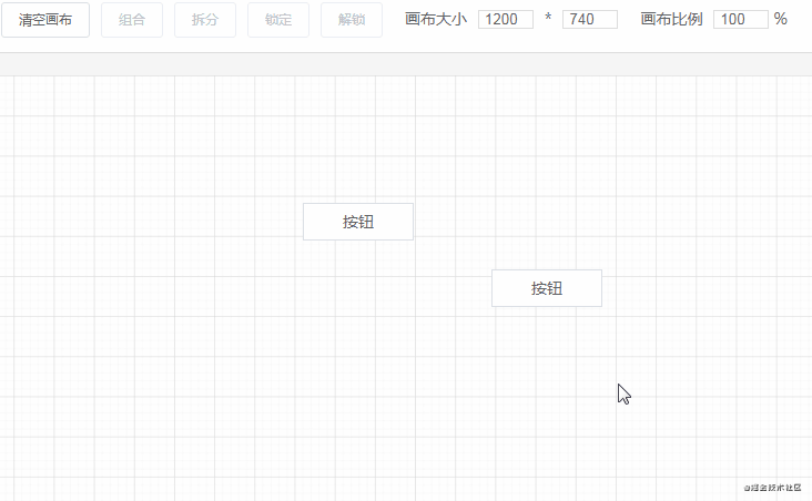
Selection area
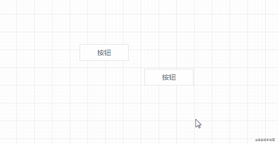
Before combining multiple components, we need to select them first. Using mouse events, we can easily display the selection area:

-
mousedownrecords the starting coordinates -
mousemovecalculates the movement area using the current coordinates and starting coordinates - If the mouse is pressed and moved toward the upper left, we need to set the current coordinates as the starting coordinates and then calculate the movement area
// Get the editor's displacement information
const rectInfo = this.editor.getBoundingClientRect()
this.editorX = rectInfo.x
this.editorY = rectInfo.y
const startX = e.clientX
const startY = e.clientY
this.start.x = startX - this.editorX
this.start.y = startY - this.editorY
// Show selection area
this.isShowArea = true
const move = (moveEvent) => {
this.width = Math.abs(moveEvent.clientX - startX)
this.height = Math.abs(moveEvent.clientY - startY)
if (moveEvent.clientX < startX) {
this.start.x = moveEvent.clientX - this.editorX
}
if (moveEvent.clientY < startY) {
this.start.y = moveEvent.clientY - this.editorY
}
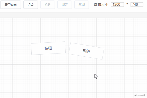
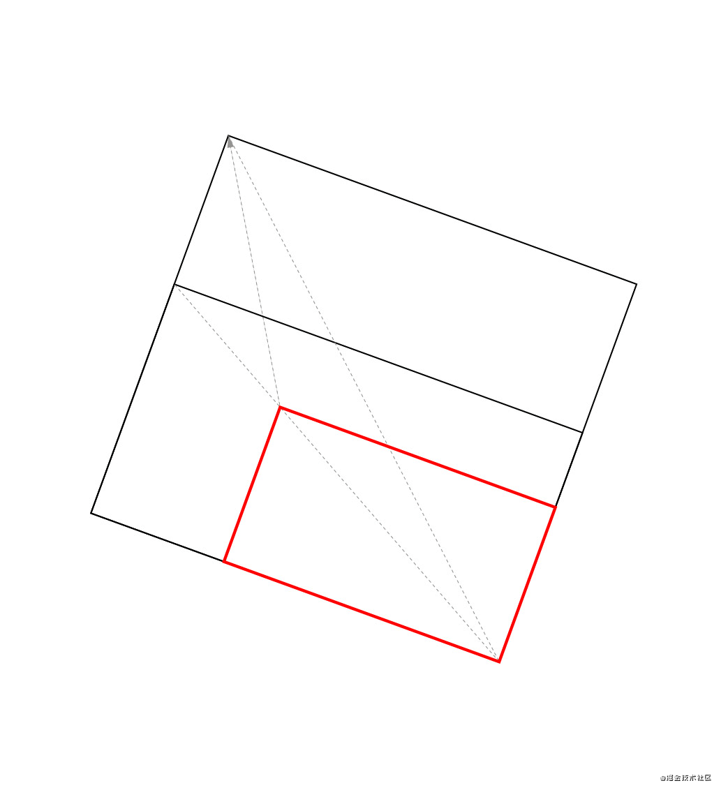
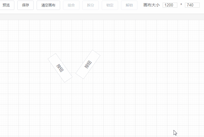
}When the mouseup event is triggered, we need to calculate the displacement and size information of all components in the selected area to obtain a minimum area that can contain all components in the region. The effect is shown in the following figure:
The code for this calculation process:
createGroup() {
  // Get component data in the selected area
  const areaData = this.getSelectArea()
  if (areaData.length <= 1) {
      this.hideArea()
      return
  }

  // Create a Group component based on the selected area and the displacement information of each component in the area
  // Need to traverse each component in the selected area, get their left top right bottom information for comparison
  let top = Infinity, left = Infinity
  let right = -Infinity, bottom = -Infinity
  areaData.forEach(component => {
      let style = {}
      if (component.component == 'Group') {
          component.propValue.forEach(item => {
              const rectInfo = $(`#component${item.id}`).getBoundingClientRect()
              style.left = rectInfo.left - this.editorX
              style.top = rectInfo.top - this.editorY
              style.right = rectInfo.right - this.editorX
              style.bottom = rectInfo.bottom - this.editorY

              if (style.left < left) left = style.left
              if (style.top < top) top = style.top
              if (style.right > right) right = style.right
              if (style.bottom > bottom) bottom = style.bottom
          })
      } else {
          style = getComponentRotatedStyle(component.style)
      }

      if (style.left < left) left = style.left
      if (style.top < top) top = style.top
      if (style.right > right) right = style.right
      if (style.bottom > bottom) bottom = style.bottom
  })

  this.start.x = left
  this.start.y = top
  this.width = right - left
  this.height = bottom - top

  // Set displacement and size information for the selected area and the component data within the area
  this.$store.commit('setAreaData', {
      style: {
          left,
          top,
          width: this.width,
          height: this.height,
      },
      components: areaData,
  })
},

getSelectArea() {
    const result = []
    // Area starting coordinates
    const { x, y } = this.start
    // Calculate all component data, determine if they are in the selected area
    this.componentData.forEach(component => {
        if (component.isLock) return
        const { left, top, width, height } = component.style
        if (x <= left && y <= top && (left + width <= x + this.width) && (top + height <= y + this.height)) {
            result.push(component)
        }
    })

    // Return all components in the selected area
    return result
}
Let me briefly describe the processing logic of this code:
- Use the getBoundingClientRect() browser API to get information about each component in four directions relative to the browser viewport, which are
lefttoprightbottom. - Compare these four pieces of information for each component to obtain the leftmost, topmost, rightmost, and bottommost values, thereby deriving a minimum area that can contain all components in the region.
- If there is already a
Groupcomponent in the selected area, we need to calculate its child components rather than calculating the combined component.
Movement and rotation after combination
To facilitate moving, rotating, scaling, and other operations on multiple components together, I created a new Group combined component:
class="group">

              v-for="item in propValue">

                    class="component"
                    :is="item.component"
                    :style="item.groupStyle"
                    :propValue="item.propValue"
                    :key="item.id"
                    :id="'component' + item.id"
                    :element="item"
                />


import { getStyle } from '@/utils/style'

export default {
    props: {
        propValue: {
            type: Array,
            default: () => [],
        },
        element: {
            type: Object,
        },
    },
    created() {
        const parentStyle = this.element.style
        this.propValue.forEach(component => {
            // component.groupStyle's top left are positions relative to the group component
            // If component.groupStyle already exists, it means it has been calculated once. No need to calculate again
            if (!Object.keys(component.groupStyle).length) {
                const style = { ...component.style }
                component.groupStyle = getStyle(style)
                component.groupStyle.left = this.toPercent((style.left - parentStyle.left) / parentStyle.width)
                component.groupStyle.top = this.toPercent((style.top - parentStyle.top) / parentStyle.height)
                component.groupStyle.width = this.toPercent(style.width / parentStyle.width)
                component.groupStyle.height = this.toPercent(style.height / parentStyle.height)
            }
        })
    },
    methods: {
        toPercent(val) {
            return val * 100 + '%'
        },
    },
}


<span class="na">lang="scss" scoped>
.group {
    & > div {
        position: relative;
        width: 100%;
        height: 100%;

        .component {
            position: absolute;
        }
    }
}
The purpose of the Group component is to put the components in the area under it, making them child components. And when creating a Group component, get the relative displacement and relative size of each child component within the Group component:
created() {
    const parentStyle = this.element.style
    this.propValue.forEach(component => {
        // component.groupStyle's top left are positions relative to the group component
        // If component.groupStyle already exists, it means it has been calculated once. No need to calculate again
        if (!Object.keys(component.groupStyle).length) {
            const style = { ...component.style }
            component.groupStyle = getStyle(style)
            component.groupStyle.left = this.toPercent((style.left - parentStyle.left) / parentStyle.width)
            component.groupStyle.top = this.toPercent((style.top - parentStyle.top) / parentStyle.height)
            component.groupStyle.width = this.toPercent(style.width / parentStyle.width)
            component.groupStyle.height = this.toPercent(style.height / parentStyle.height)
        }
    })
},
methods: {
    toPercent(val) {
        return val * 100 + '%'
    },
},
This is converting the child component's left top width height properties into relative values ending with %.
Why not use absolute values?
If we use absolute values, then when moving the Group component, in addition to calculating the properties of the Group component, we would also need to calculate each of its child components. And if the Group contains too many child components, the calculation load would be very large when moving or scaling, possibly causing page lag. If we change to relative values, we only need to calculate once when the Group is created. Then when the Group component is moved or rotated, we don't need to worry about the child components of the Group, we just calculate it itself.
Scaling after combination
Scaling after combination is a big problem, mainly due to the presence of rotation angles. First, let's look at scaling when the child components are not rotated:
From the animation, we can see that the effect is perfect. The size of each child component changes with the size of the Group component.
Now let's try adding rotation angles to the child components and see the effect:
Why does this problem occur?
The main reason is that regardless of whether a component is rotated or not, its top left properties remain unchanged. This creates a problem: although the component's top left width height properties haven't changed, they appear to have changed in appearance. Below are two identical components: one is not rotated, and the other is rotated 45 degrees.
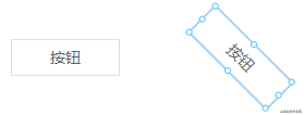
As you can see, the top left width height properties of the rotated button are different from what we see in appearance.
Let's look at a specific example:
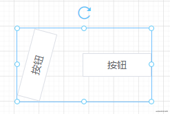
Above is a Group component, and the properties of its child component on the left are:
transform: rotate(-75.1967deg);
width: 51.2267%;
height: 32.2679%;
top: 33.8661%;
left: -10.6496%;
We can see that the value of width is 51.2267%, but from appearance, this child component takes up at most one-third of the width of the Group component. So this is the problem with abnormal scaling.
An unworkable solution (feel free to skip)
Initially, I thought of first calculating its top left width height properties relative to the browser viewport, then calculating the relative values of these properties on the Group component. This can be done using the getBoundingClientRect() API. As long as the proportion of each property in appearance remains unchanged, when the Group component is scaled, the rotation angle can be used, along with knowledge of rotation matrices (this is described in detail in the second article), to obtain its top left width height properties before rotation. This way, dynamic adjustment of child components can be achieved.
But there's a problem: the getBoundingClientRect() API can only get the appearance-based top left right bottom width height properties of a component. Adding an angle still leaves us with insufficient parameters, so we can't calculate the actual top left width height properties of a component.
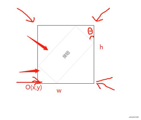
As shown in the image above, knowing only the origin O(x,y), w, h, and the rotation angle, we cannot calculate the width and height of the button.
A workable solution
I discovered this by chance. When scaling the Group component, I found that as long as the width-to-height ratio of the Group component is maintained, the child components can be scaled proportionally. So now the problem becomes how to maintain the width-to-height ratio when scaling the Group component. I found this article online, which describes in detail how to maintain the width-to-height ratio when scaling a rotated component, complete with source code examples.
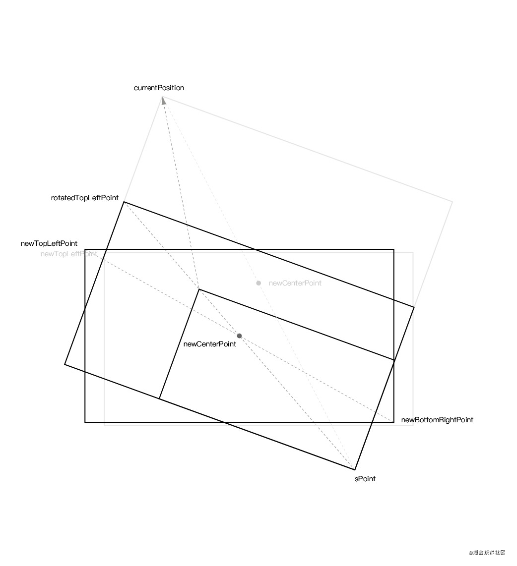
Now I'll try to briefly describe how to maintain the width-to-height ratio when scaling a rotated component (I recommend reading the original article). Below is a rectangle that has been rotated by a certain angle. Suppose we are now dragging its top-left point to stretch it.
First step, calculate the component's width-to-height ratio, and calculate the component's center point when the mouse is pressed based on the component's coordinates (regardless of how many degrees it rotates, the component's top left properties remain unchanged) and size:
// Component width-to-height ratio
const proportion = style.width / style.height
const center = {
x: style.left + style.width / 2,
y: style.top + style.height / 2,
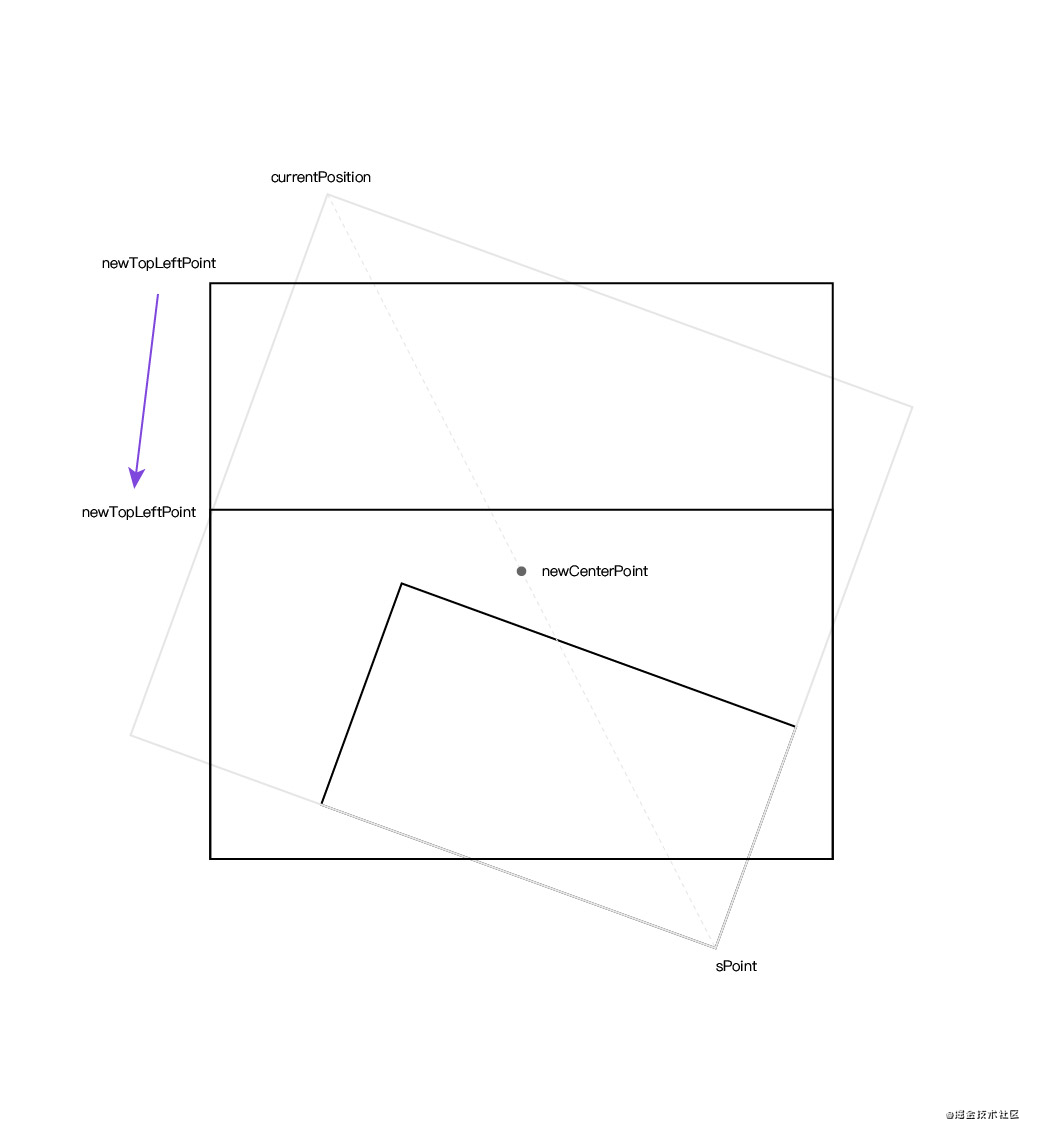
}Second step, use the current click coordinates and the component's center point to calculate the symmetric point coordinates of the current click coordinates:
// Get canvas displacement information
const editorRectInfo = document.querySelector('#editor').getBoundingClientRect()

// Current click coordinates
const curPoint = {
    x: e.clientX - editorRectInfo.left,
    y: e.clientY - editorRectInfo.top,
}

// Get coordinates of the symmetric point
const symmetricPoint = {
    x: center.x - (curPoint.x - center.x),
    y: center.y - (curPoint.y - center.y),
}
Third step, when holding the top-left corner of the component to stretch it, calculate the new component center point using the current mouse real-time coordinates and symmetric point:
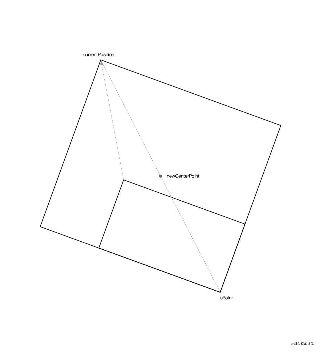
const curPositon = {
    x: moveEvent.clientX - editorRectInfo.left,
    y: moveEvent.clientY - editorRectInfo.top,
}

const newCenterPoint = getCenterPoint(curPositon, symmetricPoint)

// Calculate the midpoint coordinates between two points
function getCenterPoint(p1, p2) {
    return {
        x: p1.x + ((p2.x - p1.x) / 2),
        y: p1.y + ((p2.y - p1.y) / 2),
    }
}
Since the component is in a rotated state, even if you know the xy distance moved during stretching, you cannot directly calculate the component. Otherwise, bugs will occur, such as misalignment or incorrect scaling direction. Therefore, we need to calculate it in the case where the component is not rotated.
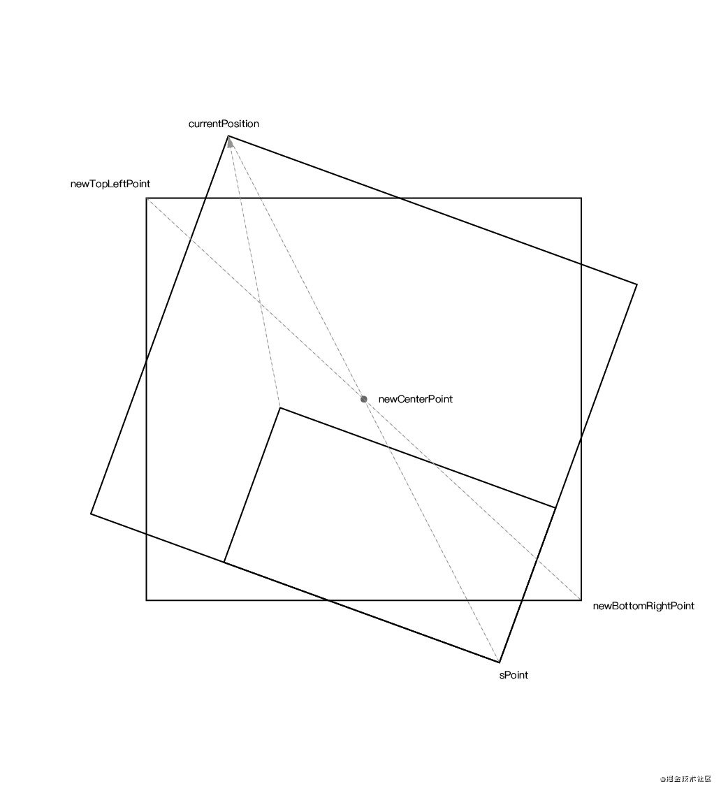
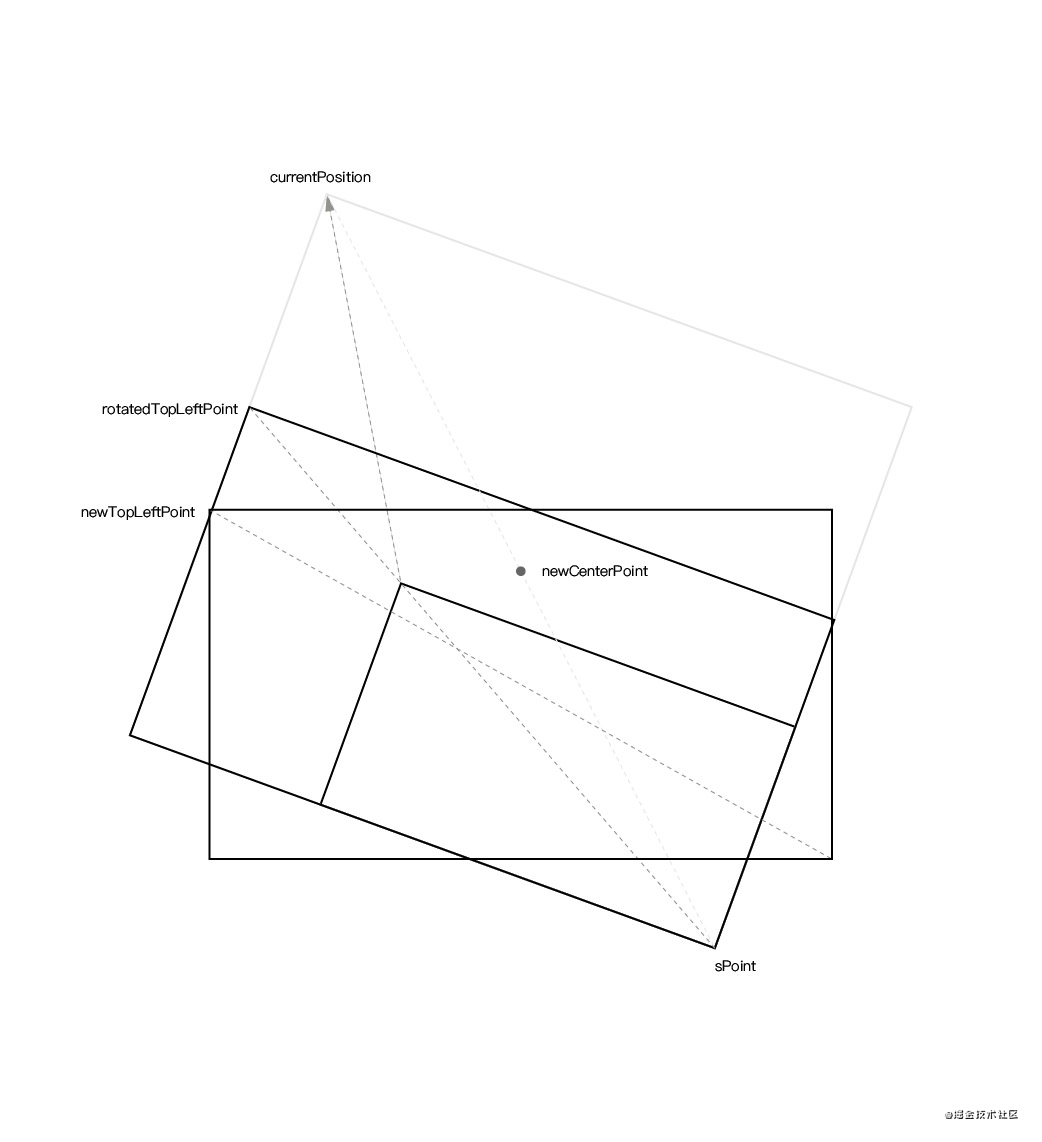
Fourth step, based on the known rotation angle, new component center point, and current mouse real-time coordinates, we can calculate the coordinates newTopLeftPoint of the current mouse real-time coordinates currentPosition when not rotated. At the same time, we can also calculate the coordinates newBottomRightPoint of the component symmetric point sPoint when not rotated based on the known rotation angle, new component center point, and symmetric point.
The corresponding calculation formula is as follows:
/**
* Calculate the coordinates of a point after rotation around a center
* @param {Object} point Point coordinates before rotation
* @param {Object} center Rotation center
* @param {Number} rotate Rotation angle
* @return {Object} Coordinates after rotation
* https://www.zhihu.com/question/67425734/answer/252724399 Rotation matrix formula
*/
export function calculateRotatedPointCoordinate(point, center, rotate) {
/**
* Rotation formula:
* Point a(x, y)
* Rotation center c(x, y)
* Rotated point n(x, y)
* Rotation angle θ
* nx = cosθ * (ax - cx) - sinθ * (ay - cy) + cx
* ny = sinθ * (ax - cx) + cosθ * (ay - cy) + cy
*/
return {
x: (point.x - center.x) * Math.cos(angleToRadian(rotate)) - (point.y - center.y) * Math.sin(angleToRadian(rotate)) + center.x,
y: (point.x - center.x) * Math.sin(angleToRadian(rotate)) + (point.y - center.y) * Math.cos(angleToRadian(rotate)) + center.y,
}
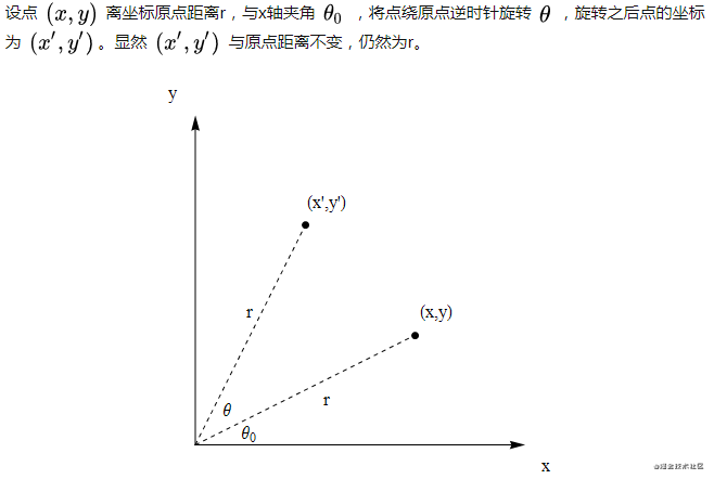
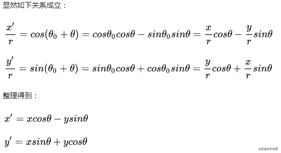
}The above formula involves knowledge of rotation matrices in linear algebra, which is really difficult for someone who hasn't gone to university. Fortunately, I found the reasoning process for this formula from an answer on Zhihu. Here is the original text of the answer:
Through the above calculated values, we can get the component's new displacement values top left and new component size. The corresponding complete code is as follows:
function calculateLeftTop(style, curPositon, pointInfo) {
    const { symmetricPoint } = pointInfo
    const newCenterPoint = getCenterPoint(curPositon, symmetricPoint)
    const newTopLeftPoint = calculateRotatedPointCoordinate(curPositon, newCenterPoint, -style.rotate)
    const newBottomRightPoint = calculateRotatedPointCoordinate(symmetricPoint, newCenterPoint, -style.rotate)

    const newWidth = newBottomRightPoint.x - newTopLeftPoint.x
    const newHeight = newBottomRightPoint.y - newTopLeftPoint.y
    if (newWidth > 0 && newHeight > 0) {
        style.width = Math.round(newWidth)
        style.height = Math.round(newHeight)
        style.left = Math.round(newTopLeftPoint.x)
        style.top = Math.round(newTopLeftPoint.y)
    }
}
Now let's look at scaling after rotation:
Fifth step, since we now need to scale with a locked width-to-height ratio, we need to recalculate the coordinates of the top-left corner of the stretched figure.
Let's define the naming of several shapes:
- Original shape: red part
- New shape: blue part
- Corrected shape: green part, that is, the shape corrected with the width-to-height ratio lock rule
After calculating the component's newTopLeftPoint newBottomRightPoint newWidth newHeight before rotation in the fourth step, we need to calculate the new width or height based on the width-to-height ratio proportion.
The above image is an example of needing to change the height, with the calculation process as follows:
if (newWidth / newHeight > proportion) {
    newTopLeftPoint.x += Math.abs(newWidth - newHeight * proportion)
    newWidth = newHeight * proportion
} else {
    newTopLeftPoint.y += Math.abs(newHeight - newWidth / proportion)
    newHeight = newWidth / proportion
}
Since we are now calculating the coordinates before rotation based on the coordinates before reducing width and height according to proportion, after reducing width and height, we need to rotate back according to the original center point to get the coordinates corresponding to reducing width and height and rotating back. Then use this coordinate and the symmetric point to get a new center point, and recalculate the coordinates before rotation.
The complete code after modification is as follows:
function calculateLeftTop(style, curPositon, proportion, needLockProportion, pointInfo) {
    const { symmetricPoint } = pointInfo
    let newCenterPoint = getCenterPoint(curPositon, symmetricPoint)
    let newTopLeftPoint = calculateRotatedPointCoordinate(curPositon, newCenterPoint, -style.rotate)
    let newBottomRightPoint = calculateRotatedPointCoordinate(symmetricPoint, newCenterPoint, -style.rotate)

    let newWidth = newBottomRightPoint.x - newTopLeftPoint.x
    let newHeight = newBottomRightPoint.y - newTopLeftPoint.y

    if (needLockProportion) {
        if (newWidth / newHeight > proportion) {
            newTopLeftPoint.x += Math.abs(newWidth - newHeight * proportion)
            newWidth = newHeight * proportion
        } else {
            newTopLeftPoint.y += Math.abs(newHeight - newWidth / proportion)
            newHeight = newWidth / proportion
        }

        // Since we are now calculating the coordinates before rotation based on the coordinates before reducing width and height according to proportion
        // After reducing width and height, we need to rotate back according to the original center point to get the coordinates corresponding to reducing width and height and rotating back
        // Then use this coordinate and the symmetric point to get a new center point, and recalculate the coordinates before rotation
        const rotatedTopLeftPoint = calculateRotatedPointCoordinate(newTopLeftPoint, newCenterPoint, style.rotate)
        newCenterPoint = getCenterPoint(rotatedTopLeftPoint, symmetricPoint)
        newTopLeftPoint = calculateRotatedPointCoordinate(rotatedTopLeftPoint, newCenterPoint, -style.rotate)
        newBottomRightPoint = calculateRotatedPointCoordinate(symmetricPoint, newCenterPoint, -style.rotate)

        newWidth = newBottomRightPoint.x - newTopLeftPoint.x
        newHeight = newBottomRightPoint.y - newTopLeftPoint.y
    }

    if (newWidth > 0 && newHeight > 0) {
        style.width = Math.round(newWidth)
        style.height = Math.round(newHeight)
        style.left = Math.round(newTopLeftPoint.x)
        style.top = Math.round(newTopLeftPoint.y)
    }
}
The effect of scaling while maintaining the width-to-height ratio is as follows:
When the Group component has rotated child components, it needs to maintain the width-to-height ratio when scaling. So when creating a Group component, you can check if the child components have rotation angles. If not, you don't need to maintain the width-to-height ratio when scaling.
isNeedLockProportion() {
    if (this.element.component != 'Group') return false
    const ratates = [0, 90, 180, 360]
    for (const component of this.element.propValue) {
        if (!ratates.includes(mod360(parseInt(component.style.rotate)))) {
            return true
        }
    }

    return false
}
Restoring child component styles after splitting
Combining multiple components together is just the first step. The second step is to split the Group component and restore the styles of each child component. This ensures that the child components' appearance attributes remain unchanged after splitting.
The calculation code is as follows:
// store
decompose({ curComponent, editor }) {
    const parentStyle = { ...curComponent.style }
    const components = curComponent.propValue
    const editorRect = editor.getBoundingClientRect()

    store.commit('deleteComponent')
    components.forEach(component => {
        decomposeComponent(component, editorRect, parentStyle)
        store.commit('addComponent', { component })
    })
}

// Split each child component in the combination, and calculate their new style
export default function decomposeComponent(component, editorRect, parentStyle) {
    // Child component style relative to browser viewport
    const componentRect = $(`#component${component.id}`).getBoundingClientRect()
    // Get the center point coordinates of the element
    const center = {
        x: componentRect.left - editorRect.left + componentRect.width / 2,
        y: componentRect.top - editorRect.top + componentRect.height / 2,
    }

    component.style.rotate = mod360(component.style.rotate + parentStyle.rotate)
    component.style.width = parseFloat(component.groupStyle.width) / 100 * parentStyle.width
    component.style.height = parseFloat(component.groupStyle.height) / 100 * parentStyle.height
    // Calculate the new top left coordinates of the element
    component.style.left = center.x - component.style.width / 2
    component.style.top = center.y - component.style.height / 2
    component.groupStyle = {}
}
The processing logic of this code is:
- Traverse the child components of
Groupand restore their styles - Use the
getBoundingClientRect()API to get thelefttopwidthheightproperties of the child component relative to the browser viewport. - Use these four properties to calculate the center point coordinates of the child component.
- Since the
widthheightproperties of the child component are relative to theGroupcomponent, multiply their percentage values byGroupto get specific values. - Then use the center point
center(x, y)minus half the width and height of the child component to get itslefttopproperties.
With this, the combination and splitting explanation is complete.
19. Text component
The VText text component was implemented before, but it wasn't perfect. For example, it couldn't select text. Now I've rewritten it to support the selection function.
v-if="editMode == 'edit'" class="v-text" @keydown="handleKeydown" @keyup="handleKeyup">

         :contenteditable="canEdit" :class="{ canEdit }" @dblclick="setEdit" :tabindex="element.id" @paste="clearStyle"
            @mousedown="handleMousedown" @blur="handleBlur" ref="text" v-html="element.propValue" @input="handleInput"
            :style="{ verticalAlign: element.style.verticalAlign }"
        >

     v-else class="v-text">
         v-html="element.propValue" :style="{ verticalAlign: element.style.verticalAlign }">


import { mapState } from 'vuex'
import { keycodes } from '@/utils/shortcutKey.js'

export default {
    props: {
        propValue: {
            type: String,
            require: true,
        },
        element: {
            type: Object,
        },
    },
    data() {
        return {
            canEdit: false,
            ctrlKey: 17,
            isCtrlDown: false,
        }
    },
    computed: {
        ...mapState([
            'editMode',
        ]),
    },
    methods: {
        handleInput(e) {
            this.$emit('input', this.element, e.target.innerHTML)
        },

        handleKeydown(e) {
            if (e.keyCode == this.ctrlKey) {
                this.isCtrlDown = true
            } else if (this.isCtrlDown && this.canEdit && keycodes.includes(e.keyCode)) {
                e.stopPropagation()
            } else if (e.keyCode == 46) { // deleteKey
                e.stopPropagation()
            }
        },

        handleKeyup(e) {
            if (e.keyCode == this.ctrlKey) {
                this.isCtrlDown = false
            }
        },

        handleMousedown(e) {
            if (this.canEdit) {
                e.stopPropagation()
            }
        },

        clearStyle(e) {
            e.preventDefault()
            const clp = e.clipboardData
            const text = clp.getData('text/plain') || ''
            if (text !== '') {
                document.execCommand('insertText', false, text)
            }

            this.$emit('input', this.element, e.target.innerHTML)
        },

        handleBlur(e) {
            this.element.propValue = e.target.innerHTML || ' '
            this.canEdit = false
        },

        setEdit() {
            this.canEdit = true
            // Select all
            this.selectText(this.$refs.text)
        },

        selectText(element) {
            const selection = window.getSelection()
            const range = document.createRange()
            range.selectNodeContents(element)
            selection.removeAllRanges()
            selection.addRange(range)
        },
    },
}


<span class="na">lang="scss" scoped>
.v-text {
    width: 100%;
    height: 100%;
    display: table;

    div {
        display: table-cell;
        width: 100%;
        height: 100%;
        outline: none;
    }

    .canEdit {
        cursor: text;
        height: 100%;
    }
}
The redesigned VText component has the following functions:
- Double-click to start editing.
- Support for selecting text.
- Filter out text styles when pasting.
- Automatically expand the text box height when line breaking.
20. Rectangle component
The rectangle component is actually a DIV with an embedded VText text component.
class="rect-shape">
         :propValue="element.propValue" :element="element" />


export default {
    props: {
        element: {
            type: Object,
        },
    },
}


<span class="na">lang="scss" scoped>
.rect-shape {
    width: 100%;
    height: 100%;
    overflow: auto;
}
It has all the functionality of the VText text component and can be resized arbitrarily.
21. Lock component
I implemented the lock component feature mainly because I saw that processon and Modao have this feature. The specific requirements for locking a component are: it cannot be moved, scaled, rotated, copied, pasted, etc., only unlocking operations can be performed.
Its implementation principle is not difficult:
- Add an
isLockproperty to the custom component to indicate whether the component is locked. - When clicking on a component, hide the eight points and rotation icon on the component based on whether
isLockistrue. - To highlight that a component is locked, add an opacity property and a lock icon to it.
- If a component is locked, gray out the buttons corresponding to the requirements mentioned above, making them unclickable.
Related code is as follows:
export const commonAttr = {
    animations: [],
    events: {},
    groupStyle: {}, // Used when a component becomes a child component of a Group
    isLock: false, // Whether to lock the component
}@click="decompose"
:disabled="!curComponent || curComponent.isLock || curComponent.component != 'Group'">Split
@click="lock" :disabled="!curComponent || curComponent.isLock">Lock
@click="unlock" :disabled="!curComponent || !curComponent.isLock">Unlockclass="contextmenu" v-show="menuShow" :style="{ top: menuTop + 'px', left: menuLeft + 'px' }">
@mouseup="handleMouseUp">
v-if="curComponent">
v-if="!curComponent.isLock">
@click="copy">Copy
@click="paste">Paste
@click="cut">Cut
@click="deleteComponent">Delete
@click="lock">Lock
@click="topComponent">Bring to front
@click="bottomComponent">Send to back
@click="upComponent">Bring forward
@click="downComponent">Send backward
v-else @click="unlock">Unlock
v-else @click="paste">Paste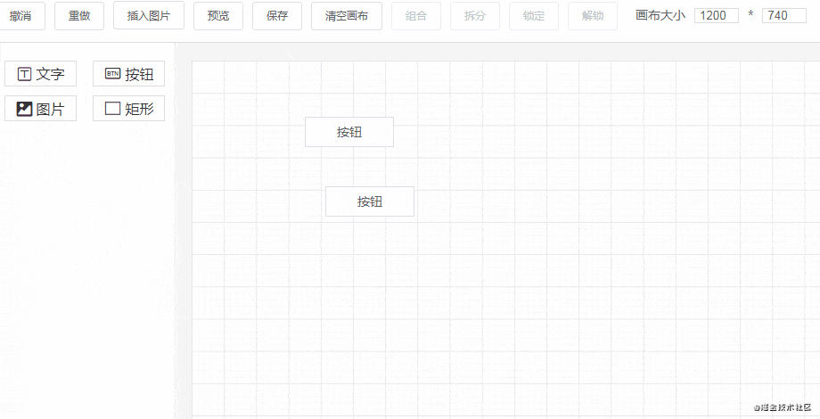
22. Shortcuts
Supporting shortcuts is mainly to improve development efficiency, as clicking with the mouse is not as fast as pressing keyboard keys. Currently, the shortcuts support the following functions:
const ctrlKey = 17,
    vKey = 86, // Paste
    cKey = 67, // Copy
    xKey = 88, // Cut

    yKey = 89, // Redo
    zKey = 90, // Undo

    gKey = 71, // Group
    bKey = 66, // Split

    lKey = 76, // Lock
    uKey = 85, // Unlock

    sKey = 83, // Save
    pKey = 80, // Preview
    dKey = 68, // Delete
    deleteKey = 46, // Delete
    eKey = 69 // Clear canvas
The implementation principle mainly uses window global monitoring of key events, and executes corresponding operations when keys that meet the conditions are triggered:
// Operations that are independent of component state
const basemap = {
    [vKey]: paste,
    [yKey]: redo,
    [zKey]: undo,
    [sKey]: save,
    [pKey]: preview,
    [eKey]: clearCanvas,
}

// Operations that can be performed when a component is locked
const lockMap = {
    ...basemap,
    [uKey]: unlock,
}

// Operations that can be performed when a component is not locked
const unlockMap = {
    ...basemap,
    [cKey]: copy,
    [xKey]: cut,
    [gKey]: compose,
    [bKey]: decompose,
    [dKey]: deleteComponent,
    [deleteKey]: deleteComponent,
    [lKey]: lock,
}

let isCtrlDown = false
// Global key event monitoring to execute corresponding commands
export function listenGlobalKeyDown() {
    window.onkeydown = (e) => {
        const { curComponent } = store.state
        if (e.keyCode == ctrlKey) {
            isCtrlDown = true
        } else if (e.keyCode == deleteKey && curComponent) {
            store.commit('deleteComponent')
            store.commit('recordSnapshot')
        } else if (isCtrlDown) {
            if (!curComponent || !curComponent.isLock) {
                e.preventDefault()
                unlockMap[e.keyCode] && unlockMap[e.keyCode]()
            } else if (curComponent && curComponent.isLock) {
                e.preventDefault()
                lockMap[e.keyCode] && lockMap[e.keyCode]()
            }
        }
    }

    window.onkeyup = (e) => {
        if (e.keyCode == ctrlKey) {
            isCtrlDown = false
        }
    }
}
To prevent conflicts with browser default shortcuts, we need to add e.preventDefault().
23. Grid lines
The grid lines feature is implemented using SVG:
class="grid" width="100%" height="100%" xmlns="http://www.w3.org/2000/svg">

             id="smallGrid" width="7.236328125" height="7.236328125" patternUnits="userSpaceOnUse">

                    d="M 7.236328125 0 L 0 0 0 7.236328125"
                    fill="none"
                    stroke="rgba(207, 207, 207, 0.3)"
                    stroke-width="1">


             id="grid" width="36.181640625" height="36.181640625" patternUnits="userSpaceOnUse">
                 width="36.181640625" height="36.181640625" fill="url(#smallGrid)">

                    d="M 36.181640625 0 L 0 0 0 36.181640625"
                    fill="none"
                    stroke="rgba(186, 186, 186, 0.5)"
                    stroke-width="1">


         width="100%" height="100%" fill="url(#grid)">


<span class="na">lang="scss" scoped>
.grid {
    position: absolute;
    top: 0;
    left: 0;
}
For those who aren't familiar with SVG, I recommend checking out the MDN tutorial.
24. Another implementation method for editor snapshots
In the first article of this series, I already analyzed the implementation principle of snapshots.
snapshotData: [], // Editor snapshot data
snapshotIndex: -1, // Snapshot index

undo(state) {
    if (state.snapshotIndex >= 0) {
        state.snapshotIndex--
        store.commit('setComponentData', deepCopy(state.snapshotData[state.snapshotIndex]))
    }
},

redo(state) {
    if (state.snapshotIndex < state.snapshotData.length - 1) {
        state.snapshotIndex++
        store.commit('setComponentData', deepCopy(state.snapshotData[state.snapshotIndex]))
    }
},

setComponentData(state, componentData = []) {
    Vue.set(state, 'componentData', componentData)
},

recordSnapshot(state) {
    // Add a new snapshot
    state.snapshotData[++state.snapshotIndex] = deepCopy(state.componentData)
    // When adding a new snapshot during the undo process, clear the snapshots after it
    if (state.snapshotIndex < state.snapshotData.length - 1) {
        state.snapshotData = state.snapshotData.slice(0, state.snapshotIndex + 1)
    }
},
An array is used to save the editor's snapshot data. Saving a snapshot is continuously executing the push() operation, pushing the current editor data into the snapshotData array, and increasing the snapshot index snapshotIndex.
Since each time a snapshot is added, all the current editor's component data is pushed into snapshotData, the more snapshots saved, the more memory is used. There are two solutions to this:
- Limit the number of snapshot steps, for example, only saving data for 50 steps.
- Only save the differences when saving snapshots.
Now let me describe the second solution in detail.
Suppose we add components a, b, c, and d to the canvas in sequence. In the original implementation, the corresponding snapshotData would be:
// snapshotData
[
  [a],
  [a, b],
  [a, b, c],
  [a, b, c, d],
]
From the code above, we can see that between each adjacent snapshot, only one piece of data is different. So we can add a type field for each snapshot step to indicate whether this operation is an addition or a deletion.
Then for the above operation of adding four components, the corresponding snapshotData would be:
// snapshotData
[
  [{ type: 'add', value: a }],
  [{ type: 'add', value: b }],
  [{ type: 'add', value: c }],
  [{ type: 'add', value: d }],
]
If we want to delete component c, then the snapshotData would become:
// snapshotData
[
  [{ type: 'add', value: a }],
  [{ type: 'add', value: b }],
  [{ type: 'add', value: c }],
  [{ type: 'add', value: d }],
  [{ type: 'remove', value: c }],
]
So how do we use this snapshot data now?
We need to iterate through the snapshot data to generate the editor's component data componentData. Suppose we perform an undo operation on the above data:
// snapshotData
// Snapshot index snapshotIndex is now 3
[
  [{ type: 'add', value: a }],
  [{ type: 'add', value: b }],
  [{ type: 'add', value: c }],
  [{ type: 'add', value: d }],
  [{ type: 'remove', value: c }],
]-
snapshotData[0]type isadd, add component a tocomponentData, nowcomponentDatais[a] - Similarly, progress to
[a, b] [a, b, c][a, b, c, d]
If we now execute a redo operation, the snapshot index snapshotIndex becomes 4. The corresponding snapshot data type is type: 'remove', removing component c. The array data becomes [a, b, d].
This method is actually trading time for space. Although each saved snapshot only has one item, we need to iterate through all the snapshot data each time. Neither method is perfect, and which one to use depends on you. Currently, I'm still using the first method.
Summary
From the perspective of creating tools, this is my fourth relatively satisfying project, the other three being:
Creating projects is a great way to improve your technical skills, but you should create meaningful and challenging projects, and only create one of each type. After completing a project, you should also write a summary, ideally sharing it as an article.
