
This article is the fourth in the visual drag-and-drop series. Compared to the previous three articles, this one has slightly fewer features, totaling five points:
- SVG components
- Dynamic attribute panel
- Data sources (API requests)
- Component linkage
- Component loading on demand
If you're not familiar with my previous articles in this series, I recommend reading these three articles first, then reading this one (otherwise, without context, it may be difficult to understand):
- Analysis of Key Technical Principles for a Visual Drag-and-Drop Component Library
- Analysis of Key Technical Principles for a Visual Drag-and-Drop Component Library (2)
- Analysis of Key Technical Principles for a Visual Drag-and-Drop Component Library (3)
Here are the project and online DEMO links:
SVG Components
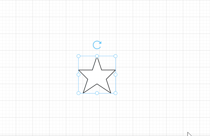
Currently, the custom components provided in the project all support free resizing, but they have one thing in common - they are all regular shapes. This means that to resize them, you can directly change the width and height without any other processing. But irregular shapes are different. For example, for a five-pointed star, you need to consider how to proportionally change the size when scaling. Eventually, I adopted the SVG solution to implement this (I also considered using iconfont, but it had flaws, so I abandoned it). Let's take a look at the specific implementation details.
Drawing a Five-Pointed Star with SVG
Suppose we need to draw a 100 * 100 five-pointed star, the code would be like this:
version="1.1"
    baseProfile="full"
    xmlns="http://www.w3.org/2000/svg"
>

        points="50 0,62.5 37.5,100 37.5,75 62.5,87.5 100,50 75,12.5 100,25 62.5,0 37.5,37.5 37.5"
        stroke="#000"
        fill="rgba(255, 255, 255, 1)"
        stroke-width="1"
    >
The version and namespace attributes on svg are not very important and can be ignored for now. The focus is on the polygon element, which in SVG defines "a closed shape consisting of a set of connected straight line segments." The last point connects to the first point. In other words, this polygon consists of a series of coordinate points, and points that are connected to each other are automatically connected. The points attribute of the polygon is used to represent a series of coordinate points of the polygon, with each coordinate point consisting of x and y coordinates, and each coordinate point separated by commas ,.
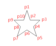
The image above is a five-pointed star drawn with SVG, consisting of ten coordinate points: 50 0,62.5 37.5,100 37.5,75 62.5,87.5 100,50 75,12.5 100,25 62.5,0 37.5,37.5 37.5. Since this is a 100*100 five-pointed star, we can easily calculate the proportion of each coordinate point in the star (coordinate system) based on their values. For example, the first point is p1(50,0), so its x and y coordinate ratios are 50%, 0; the second point p2(62.5,37.5), with corresponding ratios of 62.5%, 37.5%...
// Proportion collection of ten coordinate points of the five-pointed star
const points = [
    [0.5, 0],
    [0.625, 0.375],
    [1, 0.375],
    [0.75, 0.625],
    [0.875, 1],
    [0.5, 0.75],
    [0.125, 1],
    [0.25, 0.625],
    [0, 0.375],
    [0.375, 0.375],
]
Now that we know the proportions of the five-pointed star, it's easy to draw a five-pointed star of any size. We just need to proportionally provide the specific value for each coordinate point each time we resize the five-pointed star and change its dimensions.
class="svg-star-container">

        version="1.1"
        baseProfile="full"
        xmlns="http://www.w3.org/2000/svg"
    >

            ref="star"
            :points="points"
            :stroke="element.style.borderColor"
            :fill="element.style.backgroundColor"
            stroke-width="1"
        />

     :prop-value="element.propValue" :element="element" />


function drawPolygon(width, height) {
    // Proportion collection of ten coordinate points of the five-pointed star
    const points = [
        [0.5, 0],
        [0.625, 0.375],
        [1, 0.375],
        [0.75, 0.625],
        [0.875, 1],
        [0.5, 0.75],
        [0.125, 1],
        [0.25, 0.625],
        [0, 0.375],
        [0.375, 0.375],
    ]

    const coordinatePoints = points.map(point => width * point[0] + ' ' + height * point[1])
    this.points = coordinatePoints.toString() // Get the points attribute data for the five-pointed star
}
Other SVG Components
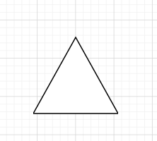
Similarly, to draw other types of SVG components, we just need to know the proportions of their coordinate points. If you don't know how to draw an SVG, you can search online and first find a usable SVG code (the SVG code for this five-pointed star was found online). Then calculate the proportions of each coordinate point, convert them to decimal form, and finally input this data into the drawPolygon() function provided above. For example, the code to draw a triangle looks like this:
function drawTriangle(width, height) {
    const points = [
        [0.5, 0.05],
        [1, 0.95],
        [0, 0.95],
    ]

    const coordinatePoints = points.map(point => width * point[0] + ' ' + height * point[1])
    this.points = coordinatePoints.toString() // Get the points attribute data for the triangle
}
Dynamic Attribute Panel
Currently, all custom components share the same AttrList component for their attribute panels. The disadvantage is obvious: we need to write many if statements, because different components have different attributes. For example, the rectangle component has a content attribute, but the image does not, so one different attribute requires one if statement.
v-if="name === 'rectShape'" label="Content">
    />
Fortunately, the solution to this problem is not difficult. In the first article of this series, we discussed how to dynamically render custom components:
:is="item.component">Each custom component's data structure has a component attribute, which is the name registered in Vue. Therefore, the attribute panel for each custom component can be made dynamic, just like the component itself (using the component attribute):
class="right">
     v-if="curComponent" v-model="activeName">
         label="Attributes" name="attr">
             :is="curComponent.component + 'Attr'" />

         label="Animation" name="animation" style="padding-top: 20px;">
             />

         label="Events" name="events" style="padding-top: 20px;">
             />


     v-else>
At the same time, the directory structure of custom components also needs to be adjusted. The original directory structure was:
- VText.vue
- Picture.vue
...
After adjustment, it becomes:
- VText
    - Attr.vue
    - Component.vue
- Picture
    - Attr.vue
    - Component.vue
Now each component includes both the component itself and its attribute panel. After the transformation, the image attribute panel code is also more concise:
class="attr-list">


             label="Mirror flip">
                 style="clear: both;">
                     v-model="curComponent.propValue.flip.horizontal" label="horizontal">Horizontal flip
                     v-model="curComponent.propValue.flip.vertical" label="vertical">Vertical flip
In this way, both components and their corresponding attribute panels become dynamic. It will be very convenient to add attributes to a specific custom component in the future.
Data Sources (API Requests)
Some components need to load data dynamically, so I specifically added a Request common attribute component for requesting data. When a custom component has a request attribute, the API request related content will be rendered on the attribute panel. So far, there are two common components for the attribute panel:
-common
    - Request.vue
- CommonAttr.vue// VText custom component data structure
{
component: 'VText',
label: 'Text',
propValue: 'Double-click to edit text',
icon: 'wenben',
request: { // API request
method: 'GET',
data: [],
url: '',
series: false, // Whether to send requests periodically
time: 1000, // Timed update interval
paramType: '', // string object array
requestCount: 0, // Request count limit, 0 for unlimited
},
style: { // Common styles
width: 200,
height: 28,
fontSize: '',
fontWeight: 400,
lineHeight: '',
letterSpacing: 0,
textAlign: '',
color: '',
},
}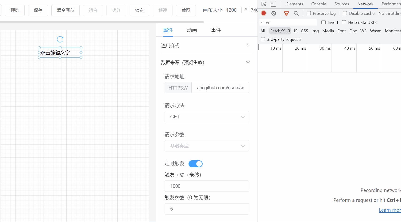
From the GIF above, you can see that the API request method parameters can be manually modified. But how do we control assigning the returned data to a certain property of the component? This can be done by passing the entire data object obj of the component and the key of the property to be modified as parameters when making the request, and when the data returns, we can directly use obj[key] = data to modify the data.
// The second parameter is the parent object of the data to be modified, the third parameter is the key of the data to be modified, the fourth parameter is the type of data to be modified
this.cancelRequest = request(this.request, this.element, 'propValue', 'string')
Component Linkage
Component linkage: When one component triggers an event, another component receives a notification and performs a corresponding operation.
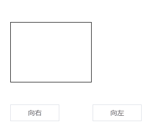
The rectangle in the GIF above monitors the hover events of the two buttons below. When the first button triggers a hover and broadcasts the event, the rectangle executes a callback to rotate and move to the right; the second button does the opposite, rotating and moving to the left.
To implement this feature, first add a new property linkage to the custom component to record all components to be linked:
{
    // Other component properties...
    linkage: {
         duration: 0, // Transition duration
         data: [ // Component linkage
             {
                 id: '', // Linked component id
                 label: '', // Linked component name
                 event: '', // Monitored event
                 style: [{ key: '', value: '' }], // Properties that need to be changed when the monitored event is triggered
             },
         ],
     }
}
The corresponding attribute panel is:
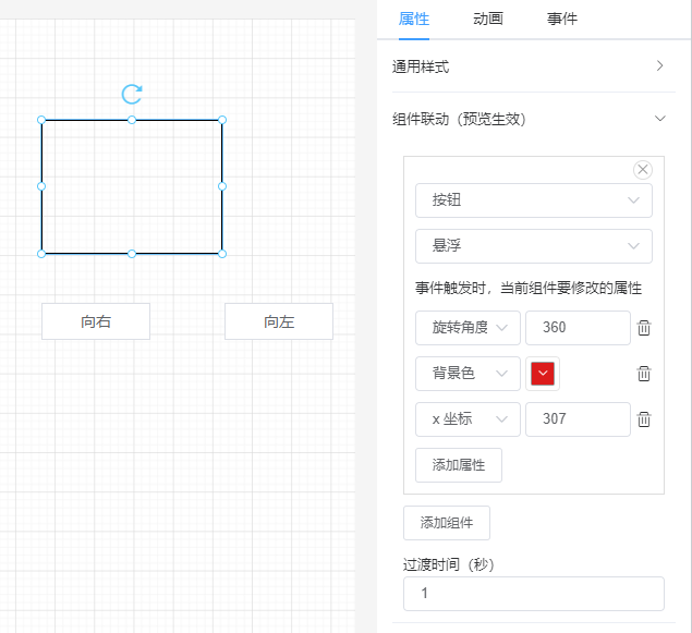
Component linkage is essentially the application of the publish/subscribe pattern. Each component iterates through all the components it monitors when rendering.
Event Monitoring
import eventBus from '@/utils/eventBus'

export default {
    props: {
        linkage: {
            type: Object,
            default: () => {},
        },
        element: {
            type: Object,
            default: () => {},
        },
    },
    created() {
        if (this.linkage?.data?.length) {
            eventBus.$on('v-click', this.onClick)
            eventBus.$on('v-hover', this.onHover)
        }
    },
    mounted() {
        const { data, duration } = this.linkage || {}
        if (data?.length) {
            this.$el.style.transition = `all ${duration}s`
        }
    },
    beforeDestroy() {
        if (this.linkage?.data?.length) {
            eventBus.$off('v-click', this.onClick)
            eventBus.$off('v-hover', this.onHover)
        }
    },
    methods: {
        changeStyle(data = []) {
            data.forEach(item => {
                item.style.forEach(e => {
                    if (e.key) {
                        this.element.style[e.key] = e.value
                    }
                })
            })
        },

        onClick(componentId) {
            const data = this.linkage.data.filter(item => item.id === componentId && item.event === 'v-click')
            this.changeStyle(data)
        },

        onHover(componentId) {
            const data = this.linkage.data.filter(item => item.id === componentId && item.event === 'v-hover')
            this.changeStyle(data)
        },
    },
}
From the code above, we can see that:
- Each custom component initializes by monitoring two events:
v-clickandv-hover(currently there are only click and hover events) - When event callback functions are triggered, they receive a parameter - the component id that emitted the event (e.g., if multiple components triggered click events, we need to determine if it's the component we're monitoring based on the id)
- Finally, modify the corresponding properties
Event Triggering
@click="onClick" @mouseenter="onMouseEnter">

            :is="config.component"
            ref="component"
            class="component"
            :style="getStyle(config.style)"
            :prop-value="config.propValue"
            :element="config"
            :request="config.request"
            :linkage="config.linkage"
        />


import eventBus from '@/utils/eventBus'

export default {
    methods: {
        onClick() {
            const events = this.config.events
            Object.keys(events).forEach(event => {
                this[event](events[event])
            })

            eventBus.$emit('v-click', this.config.id)
        },

        onMouseEnter() {
            eventBus.$emit('v-hover', this.config.id)
        },
    },
}
From the code above, we can see that when rendering components, each component's outermost layer monitors the click and mouseenter events. When these events are triggered, eventBus triggers the corresponding event (v-click or v-hover) and passes the current component id as a parameter.
Let's review the overall logic once more:
- Component a monitors native events click and mouseenter
- Users click or move the mouse to the component, triggering native events click or mouseenter
- Event callback functions then use eventBus to trigger v-click or v-hover events
- Component b, which is monitoring these two events, receives the notification and modifies the relevant properties of component b (such as the x coordinate and rotation angle of the rectangle above)
Component Loading on Demand
Currently, this project itself has not implemented on-demand loading, but I'll describe the implementation approach in text form, which should be sufficient.
Step 1: Extraction
First, we need to extract all custom components and store them separately. It's recommended to use a monorepo approach, with all components stored in one repository. Each package is a component that can be packaged separately.
- node_modules
- packages
    - v-text # One component is one package
    - v-button
    - v-table
- package.json
- lerna.json
Step 2: Packaging
It's recommended to package each component as a single js file, such as bundle.js. After packaging, directly call the upload API to store it on the server (publishing to npm is also an option), and each component has a unique id. Each time the frontend renders a component, it requests the component resource URL from the server using this component id.
Step 3: Dynamic Loading of Components
There are two ways to dynamically load components:
import()-
tag
The first method is more convenient to implement:
const name = 'v-text' // Component name
const component = await import('https://xxx.xxx/bundile.js')
Vue.component(name, component)
But there are some compatibility issues. If you need to support some older browsers (like IE), you can use the tag to load:
function loadjs(url) {
    return new Promise((resolve, reject) => {
        const script = document.createElement('script')
        script.src = url
        script.onload = resolve
        script.onerror = reject
    })
}

const name = 'v-text' // Component name
await loadjs('https://xxx.xxx/bundile.js')
// This way of loading components will directly mount the component to the global variable window, so window[name] gives the component
Vue.component(name, window[name])
To support both loading methods, you need to determine whether the browser supports ES6 when loading components. If it does, use the first method; if not, use the second method:
function isSupportES6() {
    try {
        new Function('const fn = () => {};')
    } catch (error) {
        return false
    }

    return true
}
Finally, the packaging also needs to be compatible with both loading methods:
import VText from './VText.vue'

if (typeof window !== 'undefined') {
    window['VText'] = VText
}

export default VText
Export the component and mount it under window at the same time.
Other Small Optimizations
Image Mirroring
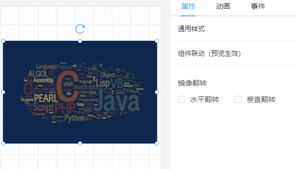
Image mirroring needs to be implemented using canvas, mainly using canvas's translate() and scale() methods. Suppose we want to horizontally mirror a 100*100 image, the code would be like this:
width="100" height="100">


    const canvas = document.querySelector('canvas')
    const ctx = canvas.getContext('2d')
    const img = document.createElement('img')
    const width = 100
    const height = 100
    img.src = 'https://avatars.githubusercontent.com/u/22117876?v=4'
    img.onload = () => ctx.drawImage(img, 0, 0, width, height)

    // Horizontal flip
    setTimeout(() => {
        // Clear image
        ctx.clearRect(0, 0, width, height)
        // Translate image
        ctx.translate(width, 0)
        // Symmetric mirroring
        ctx.scale(-1, 1)
        ctx.drawImage(img, 0, 0, width, height)
        // Restore coordinate point
        ctx.setTransform(1, 0, 0, 1, 0, 0)
    }, 2000)
The ctx.translate(width, 0) line means moving the image's x-coordinate forward by width pixels, so after translation, the image is just outside the canvas. Then using ctx.scale(-1, 1) to horizontally flip the image, you get a horizontally flipped image.

Vertical flipping follows the same principle, but with different parameters:
// Originally horizontal flip was ctx.translate(width, 0)
ctx.translate(0, height)
// Originally horizontal flip was ctx.scale(-1, 1)
ctx.scale(1, -1)
Real-Time Component List
Each component in the canvas has a hierarchy, but the specific hierarchy of each component is not displayed in real-time. Therefore, this real-time component list feature was created.
This feature is not difficult to implement; its principle is the same as canvas rendering components, but this list only needs to render icons and names.
class="real-time-component-list">

        v-for="(item, index) in componentData"
        :key="index"
        class="list"
        :class="{ actived: index === curComponentIndex }"
        @click="onClick(index)"
    >
         class="iconfont" :class="'icon-' + getComponent(index).icon">
        {{ getComponent(index).label }}
But one thing to note is that in the component data array, the components at the end have higher hierarchy. So without processing the array data index, what users see is like this (assuming the order of adding components is text, button, image):
From the user's perspective, the image with the highest hierarchy is at the end of the real-time list. This doesn't match our usual understanding. So, we need to reverse() the component data. For example, the text component with index 0 has the lowest hierarchy and should be displayed at the bottom. Each time we display the real-time list, we can convert using the code below to get the reversed index, then render, making the order more comfortable:
class="real-time-component-list">

        v-for="(item, index) in componentData"
        :key="index"
        class="list"
        :class="{ actived: transformIndex(index) === curComponentIndex }"
        @click="onClick(transformIndex(index))"
    >
         class="iconfont" :class="'icon-' + getComponent(index).icon">
        {{ getComponent(index).label }}


function getComponent(index) {
    return componentData[componentData.length - 1 - index]
}

function transformIndex(index) {
    return componentData.length - 1 - index
}
After conversion, the image with the highest hierarchy is at the top of the real-time list. Perfect!
Conclusion
With this, the fourth article in the visual drag-and-drop series comes to an end. I didn't expect this project to be so popular, gaining recognition from many netizens in just one year. So I hope this fourth article in the series will be as helpful to everyone as before. Thank you again!
