Taming Hierarchy in the UI Jungle
Tree views are everywhere—navigation menus, page builders, file explorers, site maps.
But if you’ve ever tried building one from scratch, you know it’s deceptively complex:
Drag-and-drop without breaking structure
Lazy loading nested nodes
Keyboard accessibility
Visual customization
State management
Most solutions are tightly bound to a framework (React or Vue), often fragile under large datasets, or simply not extensible.
I wanted something different.
So I built Node Explorer—a web component that solves all of this while staying framework-agnostic and fully customizable.
Introducing: Node Explorer
Node Explorer is a standalone, modern web component that offers:
- Infinite nesting of tree nodes
- Native drag-and-drop support
- API event system for control (select, expand, drop, etc.)
- Material Design icon support
- Accessible by keyboard
- Fully themeable (dark, light, minimal, high contrast)
- Works with React, Vue, Angular, or plain JavaScript
And it’s open source.
Let me show you how to use it in a real Vue 3 + TypeScript project.
Installation
npm install @jmkcoder/componentsVue 3 + TypeScript Integration
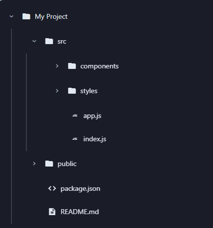
Take your content tree or CMS editor to the next level with a native-feeling file explorer in just a few lines of code.
Here's what the result looks like when embedded in your app

Click the image to try the live, interactive component in Storybook!
Lets break it down
📦 Step 1: Import the Component
Lets import the styles and component bundle in your App.vue file
import '@jmkcoder/components/dist/components.bundle.css'
import '@jmkcoder/components/dist/index.js'
🧩 Step 2: Wrap in a Local Component
Use the odyssey-node-explorer as a native Web Component inside a Vue wrapper
<template>

    ref="explorer"
    :allow-drag-drop="allowDragDrop"
    :allow-multi-select="allowMultiSelect"
    :theme="theme"
    :compact="compact"
  />
template>

<script lang="ts">
import { defineComponent, ref, watch, onMounted, onBeforeUnmount } from 'vue'

export default defineComponent({
  name: 'NodeExplorer',
  props: {
    nodes: Array,
    allowDragDrop: { type: Boolean, default: true },
    allowMultiSelect: { type: Boolean, default: false },
    theme: { type: String, default: 'light' },
    compact: { type: Boolean, default: false },
  },
  emits: ['node-selected'],
  setup(props, { emit }) {
    const explorer = ref<HTMLElement | null>(null)

    const updateNodes = () => {
      if (explorer.value) {
        explorer.value.setAttribute('nodes', JSON.stringify(props.nodes))
      }
    }

    const handleNodeSelected = (event: CustomEvent) => {
      emit('node-selected', event)
    }

    watch(() => props.nodes, updateNodes)
    watch(() => props.compact, (newVal) => {
      explorer.value?.setAttribute('compact', newVal ? 'true' : 'false')
    })

    onMounted(() => {
      updateNodes()
      explorer.value?.addEventListener('node-selected', handleNodeSelected)
    })

    onBeforeUnmount(() => {
      explorer.value?.removeEventListener('node-selected', handleNodeSelected)
    })

    return { explorer }
  },
})
script>
🏡 Step 3: Use It in a View
Pass your dynamic data into the explorer with simple bindings.
<template>

    :nodes="treeData"
    theme="dark"
    @node-selected="onNodeSelected"
  />
template>

<script setup lang="ts">
import NodeExplorer from '../components/NodeExplorer.vue'
import type { ExplorerNode } from '@jmkcoder/components/dist/components/node-explorer/node-explorer.type'

const treeData: ExplorerNode[] = [
  {
    id: 'root',
    label: 'My Project',
    icon: 'folder',
    expanded: true,
    children: [
      {
        id: 'src',
        label: 'src',
        icon: 'folder',
        children: [
          {
            id: 'components',
            label: 'components',
            icon: 'folder',
            children: [
              { id: 'button.js', label: 'button.js', icon: 'javascript' },
              { id: 'input.js', label: 'input.js', icon: 'javascript' },
            ],
          },
          { id: 'app.js', label: 'app.js', icon: 'javascript' },
        ],
      },
    ],
  },
]

const onNodeSelected = (event: CustomEvent) => {
  const selectedNode = event.detail.node as ExplorerNode
  console.log('Selected:', selectedNode.label)
}
script>
🎨 Customizing the Look
Switch between light/dark themes instantly:
theme="dark" />Or go fully custom using CSS variables:
odyssey-node-explorer {
  --primary-color: #635BFF;      /* Accent color */
  --primary-light: rgba(99, 91, 255, 0.08); /* Lighter accent */
  --gray-light: #F7FAFC;         /* Background for headers */
  --gray-border: #E8E8E8;        /* Border colors */
  --hover-bg: #F5F7FA;           /* Hover background */
  --text-secondary: #697386;     /* Secondary text color */
  --text-primary: #1A1F36;       /* Primary text color */
  --transition-duration: 200ms;  /* Animation speed */
  --connector-width: 2px;        /* Width of the connector lines */
  --connector-color: #E8E8E8;    /* Color of connector lines */
}
API Events You Can Hook Into
| Event Name | Description |
|---|---|
load-children |
Fired when a lazy-loaded node is expanded and needs its children |
node-selected |
Fired when a node is selected |
nodes-selected |
Fired when multiple nodes are selected (when multi-select is enabled) |
nodes-changed |
Fired when nodes structure changes (drag-drop, expand/collapse) |
node-expanded |
Fired when a node is expanded |
node-collapsed |
Fired when a node is collapsed |
drag-start |
Fired when a drag operation starts |
drag-over |
Fired during a drag operation |
drag-leave |
Fired when a drag operation leaves a target |
drop |
Fired when a node is dropped |
These events give you fine-grained control over how you react to user actions, whether you're syncing state to Vuex, calling an API, or just updating UI.
Why Node Explorer is Different
There are many libraries and plugins that try to solve this.
Node Explorer does it while being:
- Framework-agnostic: works with anything
- Composable: expose only what you need via API
- Extensible: add custom data, event handlers, even logic layers
- Production-ready: optimized rendering and accessibility
Getting Started
Docs: Node Explorer Storybook
npm: @jmkcoder/components
GitHub: Odyssey Components
Let’s Build Together
This is just the beginning.
Node Explorer will be powering more plugins, editors, and UIs as I work on a project I call Odyssey.
If you’re building something that requires dynamic hierarchy—give this component a try.
If it sparks ideas or could use improvements, I’d love your feedback.
→ Star it. Fork it. Use it.
Let’s explore what’s possible, together.