A year ago, I faced a work challenge that led to the creation of React-Hinter. We needed interactive hints for our application, similar to what Reactour offers. However, our client strictly prohibited using most third-party UI libraries, so I had to build a solution from scratch. A year later, I revisited the project, fixed a few bugs, and decided to share my experience with the community. In this article, I’ll dive into how React-Hinter was created, the problems it solved, and why it might be useful for other developers.
The Backstory: Why I Built My Own Library
On one of our projects, the team needed to implement an interactive onboarding experience for users. Think of a typical scenario: guiding users through the interface by highlighting elements and showing pop-up hints with explanations. Reactour is perfect for this, but our client’s restrictions on third-party libraries meant we couldn’t use it. So, I had to create something custom—lightweight, functional, and free of external dependencies.
I started by outlining the requirements:
- Hints should be tied to DOM elements.
- Support for sequential navigation between steps (forward/backward/finish).
- Customizable appearance and behavior.
- Must be independent of UI frameworks.
- TypeScript support for a better developer experience.
This led to the creation of React-Hinter - a library that meets all these needs while remaining simple to use.
What is React-Hinter?
React-Hinter is a React component for displaying interactive hints that is:
- Dependency-free (no external dependencies).
- Lightweight—minimal bundle size.
- Highly customizable—allows replacing content and styles.
- Written in TypeScript for excellent typing and autocompletion.
- Works with any HTML elements via data attributes.
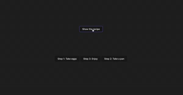
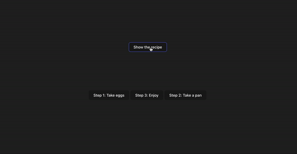
The library lets you attach hints to interface elements, define their display order, and configure behavior. Here’s a basic usage example:
import { ReactHinter } from "react-hinter";
import "react-hinter/dist/css/style.css";
import { useState } from "react";

function App() {
  const [active, setActive] = useState(false);

  return (
    <>
      <button
        data-rh-namespace="tutorial"
        data-rh-step={1}
        data-rh-text="This is the first hint"
      >
        Step 1
      </button>
      <button
        data-rh-namespace="tutorial"
        data-rh-step={2}
        data-rh-text="This is the second hint"
      >
        Step 2
      </button>
      <ReactHinter
        namespace="tutorial"
        active={active}
        onEnd={() => setActive(false)}
      />
    </>
  );
}
This code sets up two elements with hints that appear sequentially when the ReactHinter component is activated.
Revisiting a Year Later: Fixing Bugs
A year after creating the library, I decided to polish it. I noticed a couple of bugs that surfaced in rare cases:
I fixed the positioning bugs by implementing dynamic coordinate calculations and handling resize events. I also added a scrollToActiveElement option that automatically scrolls the page to the active element. Now, the library works reliably even in complex interfaces with dynamic content.
Key Features of React-Hinter
React-Hinter offers a range of features that make it developer-friendly:
- Content Customization You can fully replace the hint content by passing a custom component via the content prop. For example:
import { ReactHinter, ReactHinterContentProps } from "react-hinter";

const CustomContent: React.FC<ReactHinterContentProps> = ({
  prevStep,
  nextStep,
  finish,
  text,
}) => (
  <div className="custom-hint">
    <p>{text}</p>
    <button onClick={nextStep}>Next</button>
    <button onClick={prevStep}>Previous</button>
    <button onClick={finish}>Finish</button>
  </div>
);

<ReactHinter
  namespace="tutorial"
  active={true}
  content={CustomContent}
  onEnd={() => setActive(false)}
/>;
Style Customization
The library comes with minimal default styles that are easy to override. You can add your own classes via the className prop or include custom CSS.Portals
Hints are rendered in a portal to avoid z-index issues with other elements. You can customize the portal’s class via the portal prop or remove the portal.TypeScript Support
Full TypeScript support ensures a smooth development experience with autocompletion and type checking.Flexibility
Use data attributes (data-rh-namespace, data-rh-step, data-rh-text, data-rh-preferred-position) to control hint behavior and appearance directly in your markup.
Future Plans
React-Hinter already meets its original goals, but I plan to keep improving it. My roadmap includes:
Adding animations for smoother transitions between steps.
Supporting localization for hint text.
Enhancing testing with Jest and Testing Library.
Optimizing performance for large apps with hundreds of elements.
Full documentation is available in the README on GitHub https://github.com/straystreyk/react-hinter.
Conclusion
Building React-Hinter was a rewarding experience that showed how complex problems can be solved with minimal resources. What started as an internal tool for one project is now available to everyone. I hope React-Hinter will be useful for developers who need a lightweight, flexible solution for onboarding or hints in their apps.