This post was originally published at thedevspace.io. Everything you need to master web development, all in one place.
The flexbox is another layout model in CSS that provides an efficient way to design and structure complex layouts, but with a more flexible approach. It is particularly suited for creating one-dimensional layouts, either in a row or a column, as we will see later.
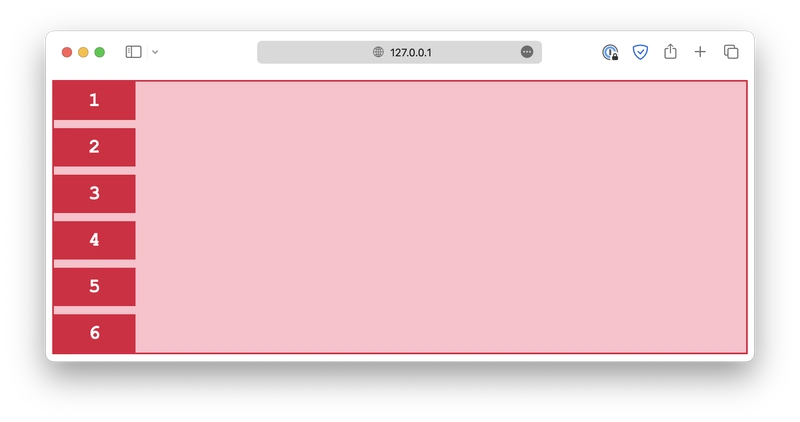
Just like a grid layout, a flexbox layout also consists of a flex container and several flex items. The container should have its display property set to flex, and all of its direct children automatically become flex items.
class="container">
   class="item">1
   class="item">2
   class="item">3
   class="item">4
   class="item">5
class="item">6.container {
display: flex;
gap: 10px;
}Flex direction
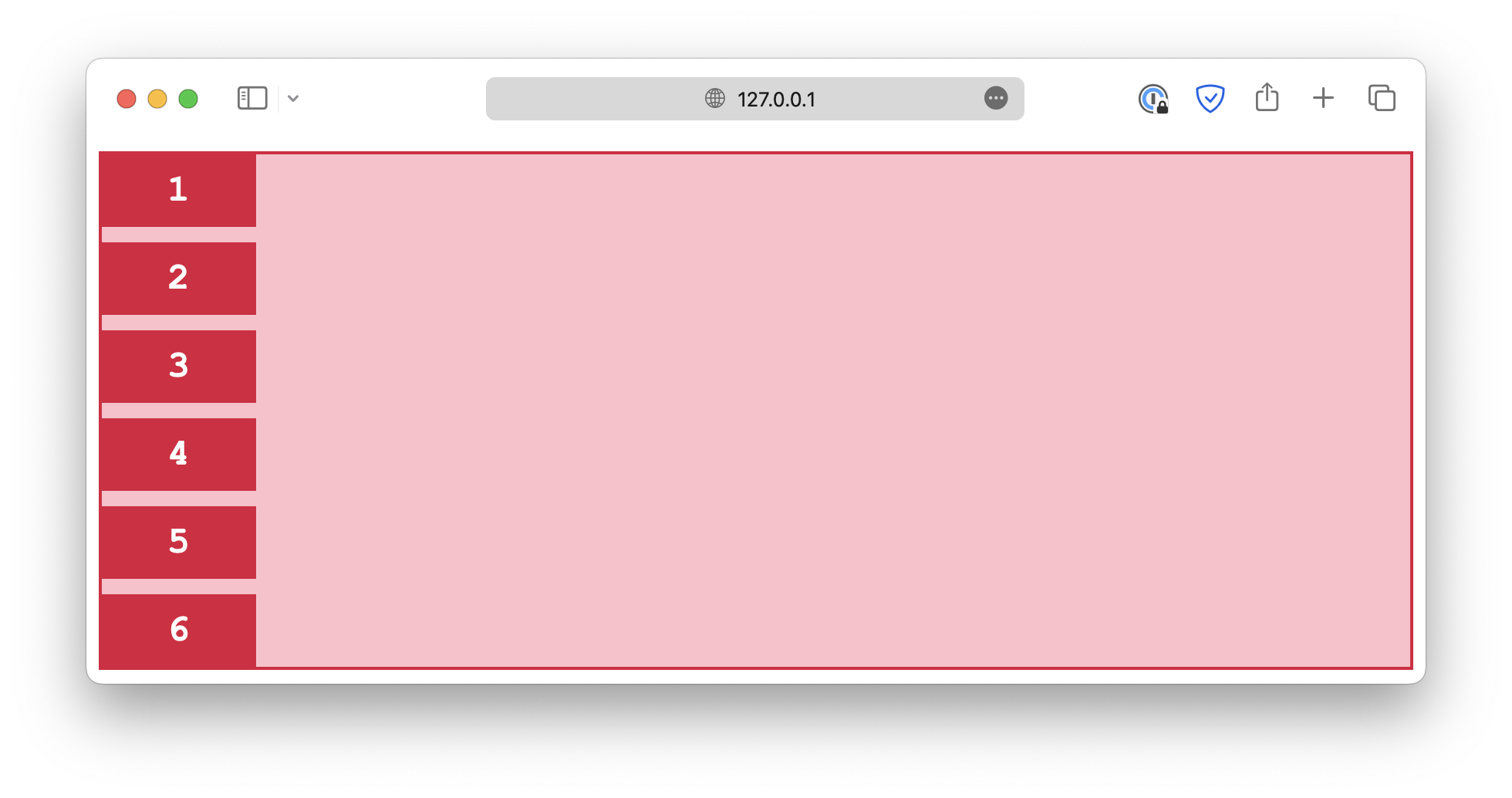
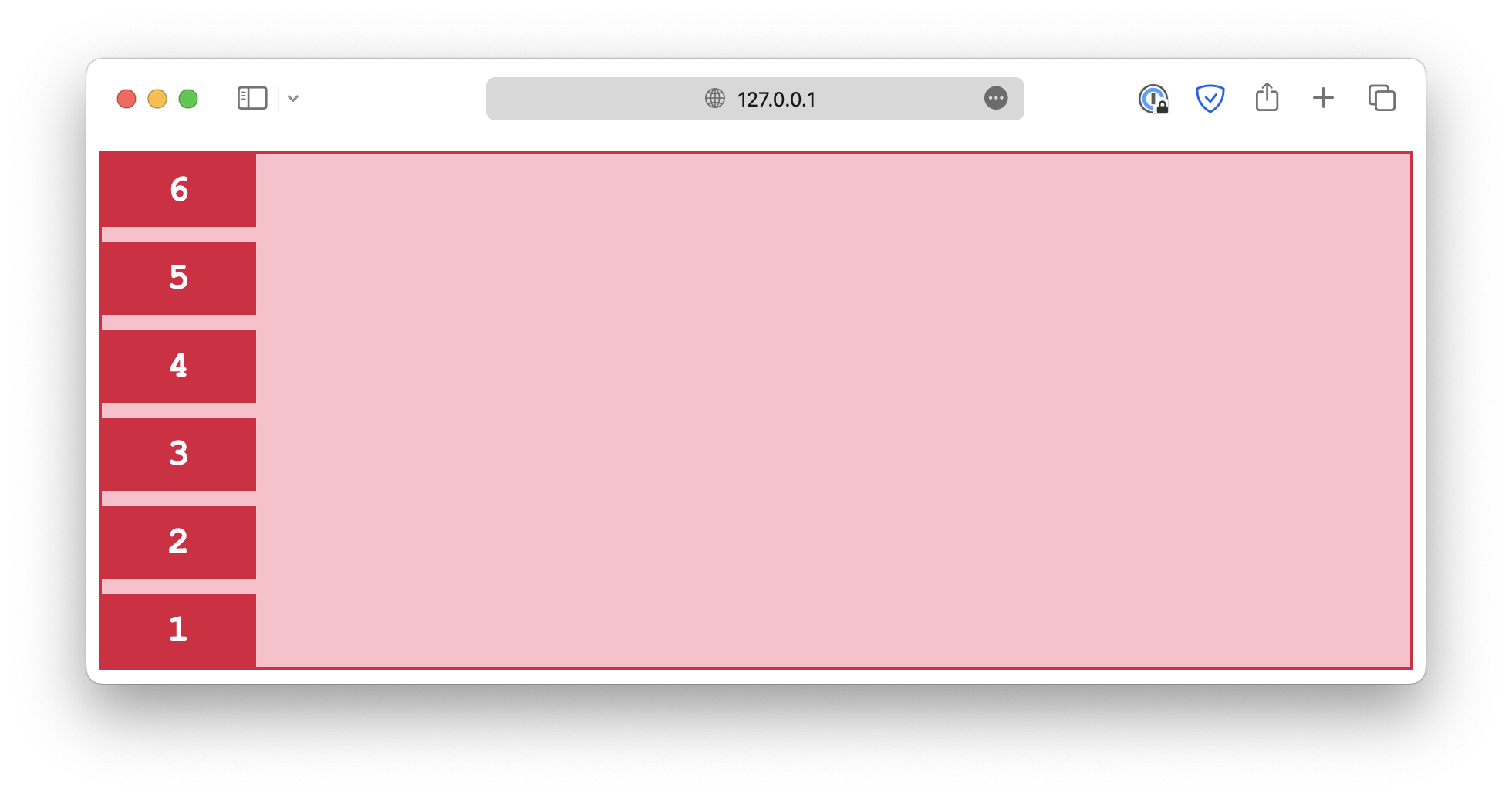
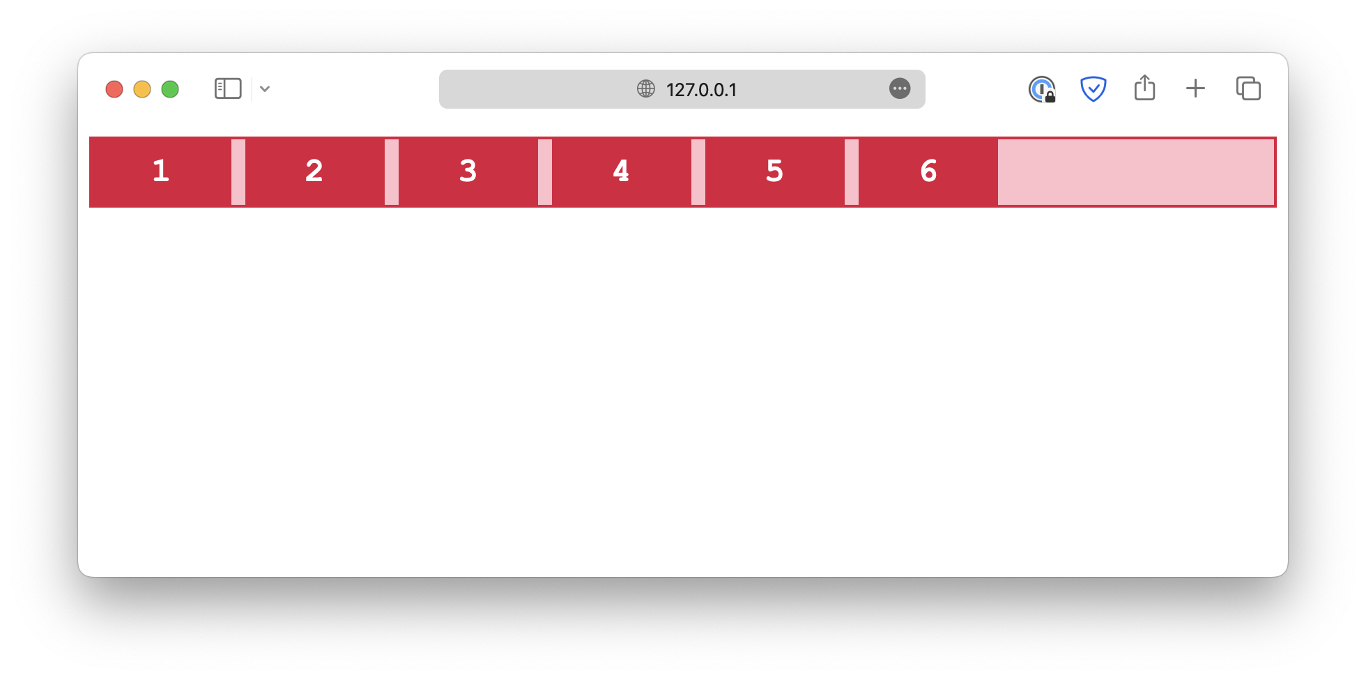
With a flex layout, instead of rows and columns, you must define a flex-direction and a flex-wrap. The flex-direction specifies in which direction the container should stack its flex items. The accepted values are:
-
column
.container {
  flex-direction: column;
}
-
column-reverse
.container {
  flex-direction: column-reverse;
}
-
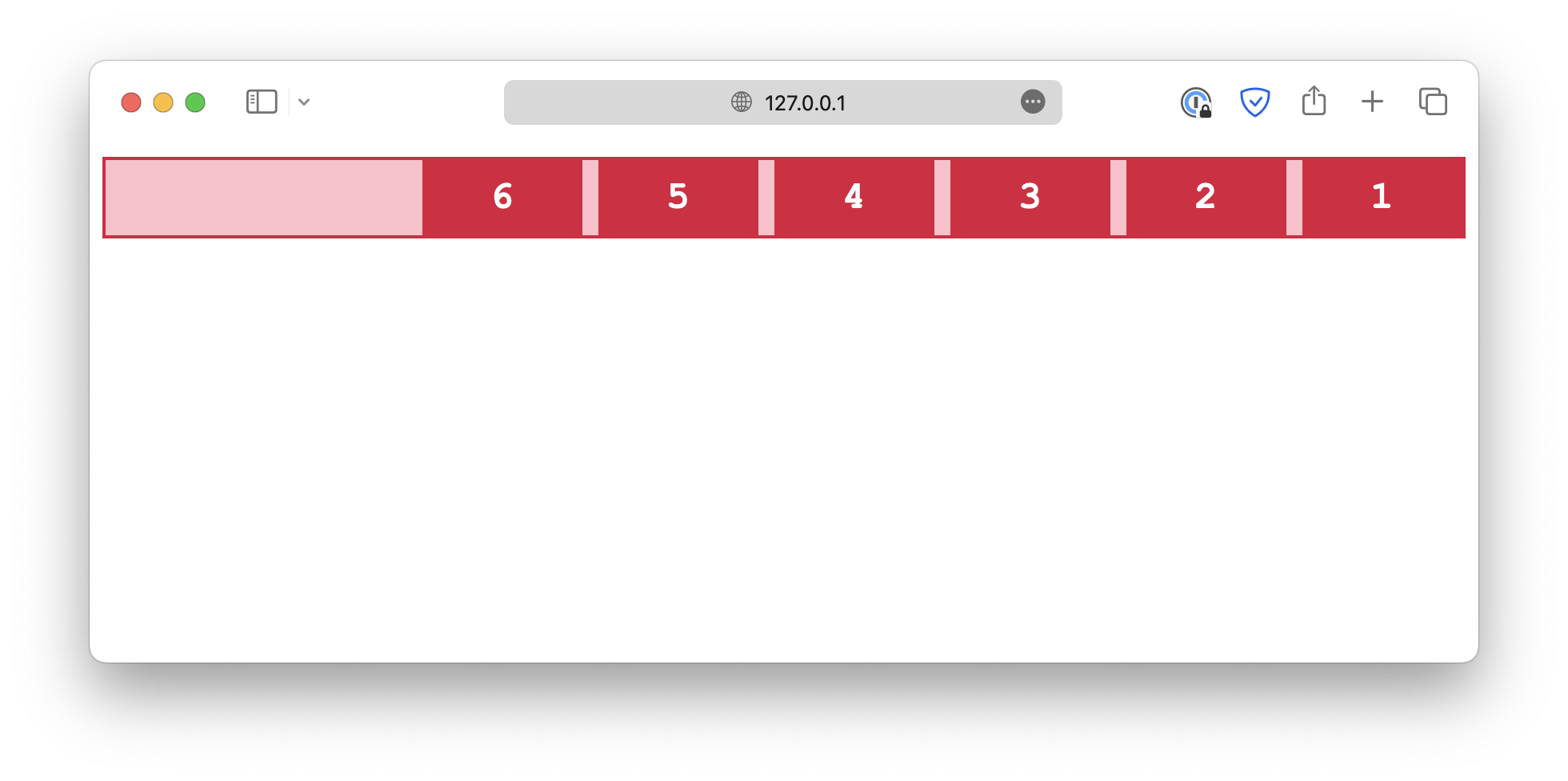
row
.container {
  flex-direction: row;
}
-
row-reverse
.container {
  flex-direction: row-reverse;
}
Flex wrap
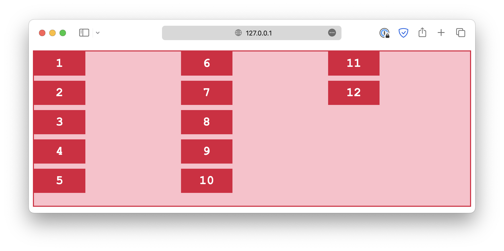
The flex-wrap property determines whether the flex items should wrap, which means automatically change to the following line when there is insufficient space.
-
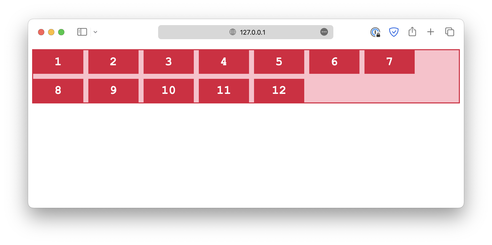
wrap
.container {
  flex-wrap: wrap;
}
-
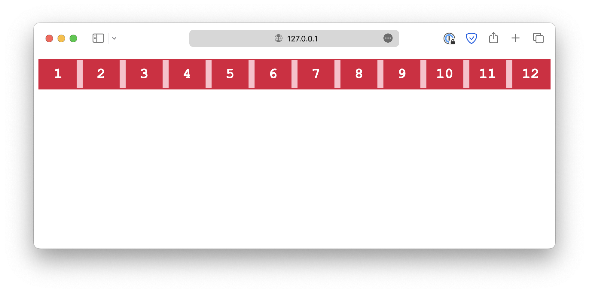
nowrap
.container {
  flex-wrap: nowrap;
}
-
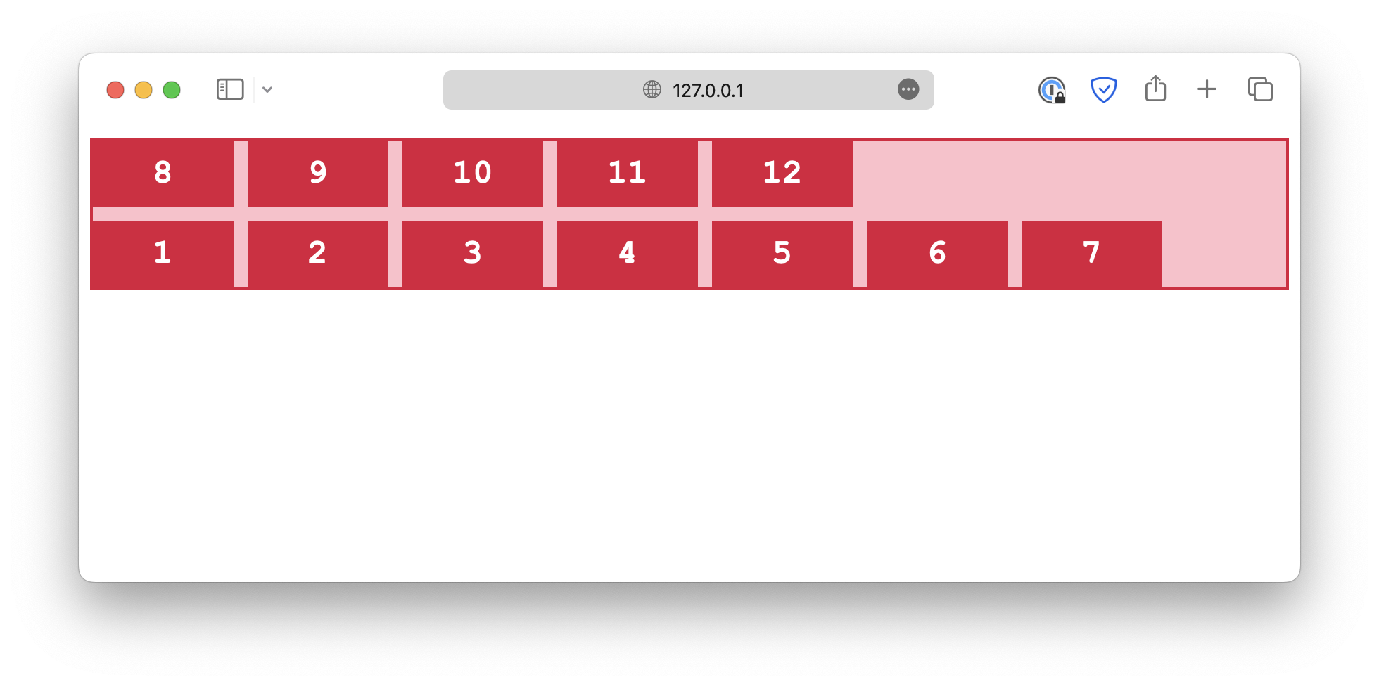
wrap-reverse
.container {
  flex-wrap: wrap-reverse;
}
The flex-flow is a shorthand for both flex-direction and flex-wrap properties.
.container {
  flex-flow: column wrap;
}
Read More
- What is a CSS Selector
- Rest Parameter and Spread Syntax in JavaScript
- A Beginner's Guide to Express.js
Follow us for daily coding tips:
🔹 TheDevSpace | LinkedIn
🔹 TheDevSpace | X
🔹 TheDevSpace | Threads