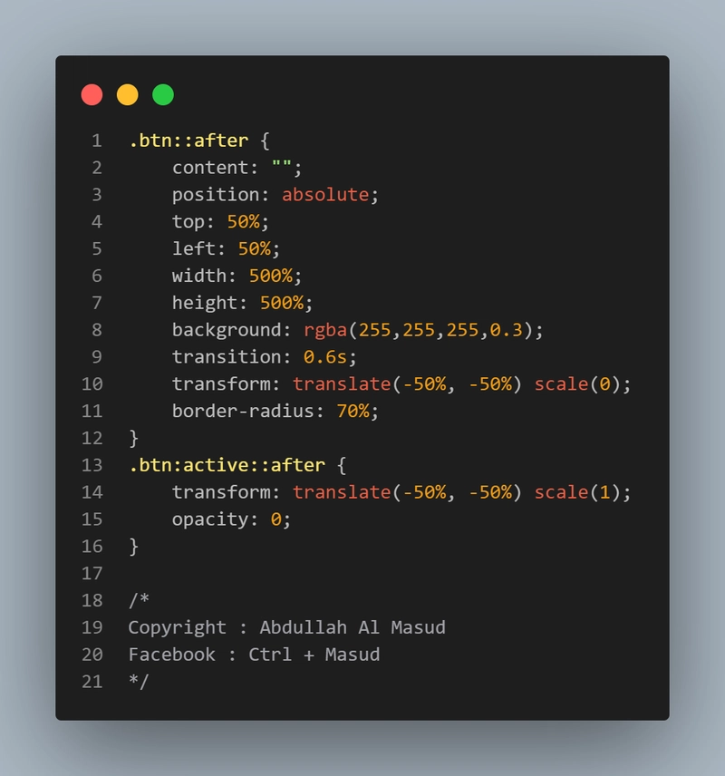
 → Uses ::after pseudo-element ✅
→ Smooth transition ✅
→ Scales from center outward ✅
.btn {
            position: relative;
            padding: 10px 20px;
            font-size: 1.2rem;
            color: white;
            background: #ff5733;
            border: none;
            overflow: hidden;
        }
        .btn::after {
            content: "";
            position: absolute;
            top: 50%;
            left: 50%;
            width: 500%;
            height: 500%;
            background: rgba(255,255,255,0.3);
            transition: 0.6s;
            transform: translate(-50%, -50%) scale(0);
            border-radius: 70%;
        }
        .btn:active::after {
            transform: translate(-50%, -50%) scale(1);
            opacity: 0;
        }

        /*
        Copyright : Abdullah Al Masud
        Facebook : Ctrl + Masud
        */
Pro tip: Adjust width/height and transition-duration for different effects.
Try it in your project!
