CSS just keeps getting better.
Last year, I shared some techniques that helped clean up messy stylesheets and selectors that make our life easier. In 2025, the evolution continues, with new CSS features that give us more control and more flexibility.
Whether we're building a design system or just trying to stop fighting with specificity, these updates are worth learning and can change the way we write and organize our styles.
Container Queries
Make components responsive to their surroundings, not just the screen.
What we used to do:
Use global media queries like @media (min-width: 768px) to adapt component layouts. But this tightly couples components to the viewport and often breaks when you reuse them elsewhere (e.g. imagine card used in a side menu, the viewport query wouldn't be really helpful in this case).
What we can do now:
Use container queries to style components based on the size of their parent container, not the viewport.
.card {
  container-type: inline-size;
}

@container (min-width: 500px) {
  .card-content {
    display: flex;
    gap: 1rem;
  }

  .card-content img {
    width: 150px;
  }
}
Why this matters:
- We can build reusable components that adapt wherever they’re placed
- No need for global overrides or layout assumptions anymore
- Perfect for responsive cards, search bars, sidebars, etc.
See related codepen, showing container queries in action, with cards that adapt layout based on their container, not the screen.
Cascade Layers
Organize CSS into predictable zones and stop fighting specificity.
What we used to do:
Rely on naming conventions (like BEM), import order, or even CSS-in-JS to prevent style collisions and unexpected overrides.
What we can do now:
Use @layer to group styles into base, components, and utilities, and control how they override each other.
@layer base {
  body {
    font-family: system-ui, sans-serif;
  }
}

@layer components {
  .button {
    padding: 1rem 2rem;
    color: white;
    background: black;
  }
}

@layer utilities {
  .text-red {
    color: red;
  }
}

/** in this case the utilities layer will have the highest specificity and the base layer the lowest **/
@layer base, components, utilities;
Why this matters:
- No more “why is this class overriding my component?”
- Layers give us full control over the cascade, even if multiple classes have the same specificity
- Works great with design systems or utility-first frameworks like Tailwind
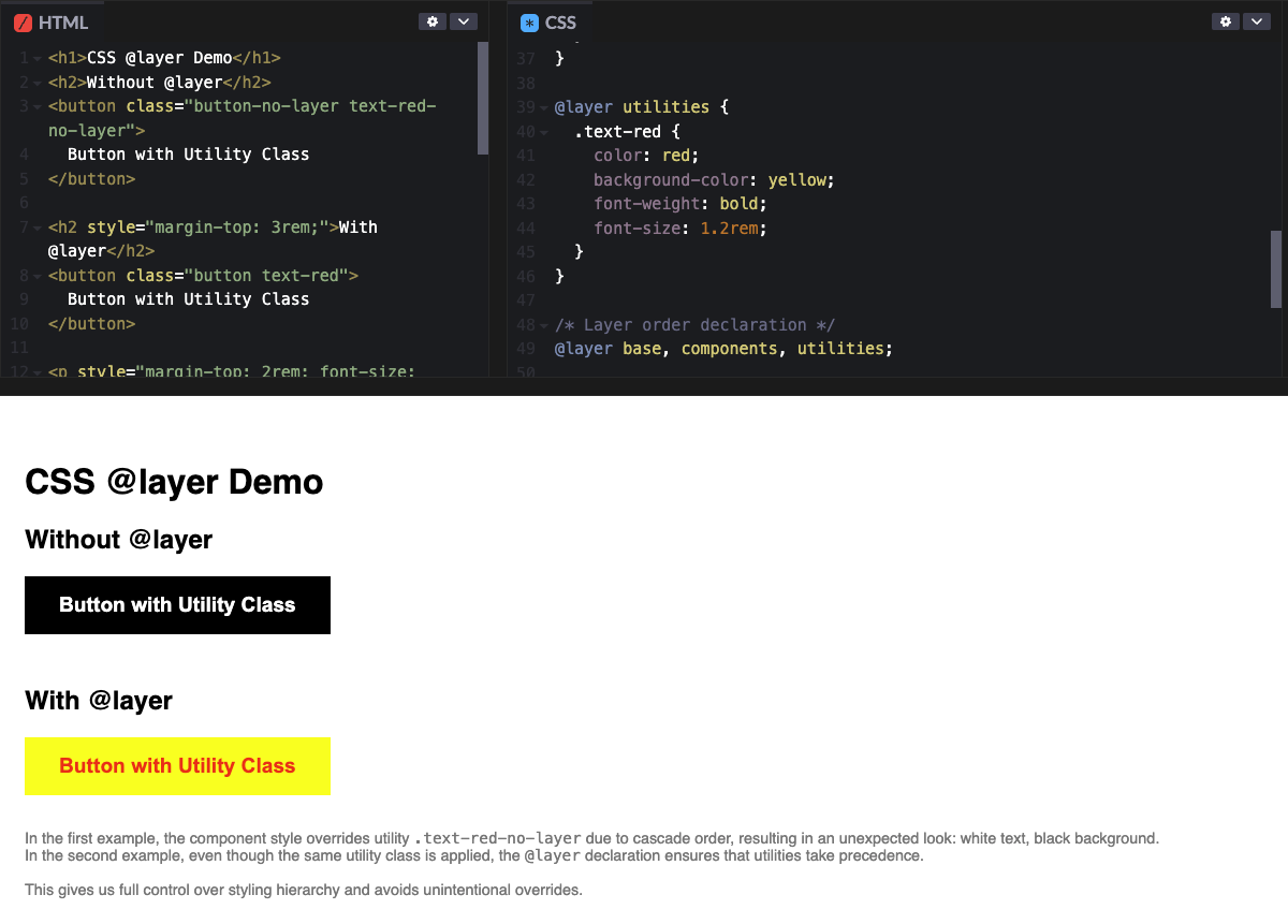
See related codepen, showing cascade layers in action, where utility and component classes clash and @layer makes it crystal clear who wins and why.
The @property Rule
Typed custom properties with better browser support.
What we used to do:
Use --variables, but without type safety, defaults, or animation support.
What we can do now:
Use @property to define typed, animatable custom properties:
@property --angle {
  syntax: '';
  initial-value: 0deg;
  inherits: false;
}

.loader {
  transform: rotate(var(--angle));
}
This is especially useful for CSS-driven animations and custom design tokens that need to interpolate smoothly (e.g., colors, angles, numbers).
Animation Composition
Combine multiple animations with smooth custom control.
What we used to do:
Avoid animating transform in multiple keyframes, since one would override the other. And animate custom props only in JS or preprocessors.
What we can do now:
Use @property to define a CSS variable, and animation-composition to additively apply multiple transform effects at once:
@property --rotation {
  syntax: "";
  initial-value: 0deg;
  inherits: false;
}

.spinner {
  --rotation: 0deg;
  width: 100px;
  height: 100px;
  margin: 2rem auto;
  background: hotpink;
  border-radius: 50%;
  display: flex;
  align-items: center;
  justify-content: center;
  color: white;
  font-weight: bold;
  animation: spin 2s linear infinite, pulse 2s ease-in-out infinite;
  animation-composition: add;
}

@keyframes spin {
  to {
    transform: rotate(360deg);
  }
}

@keyframes pulse {
  0%,
  100% {
    transform: scale(1);
  }
  50% {
    transform: scale(1.2);
  }
}
See it in action. This setup allows:
-
spinto animate a custom angle via--rotation -
pulseto scale the element independently - Both animations to be layered together without interfering
It’s clean, performant, and unlocks more expressive animations, without needing any JS to glue it together.
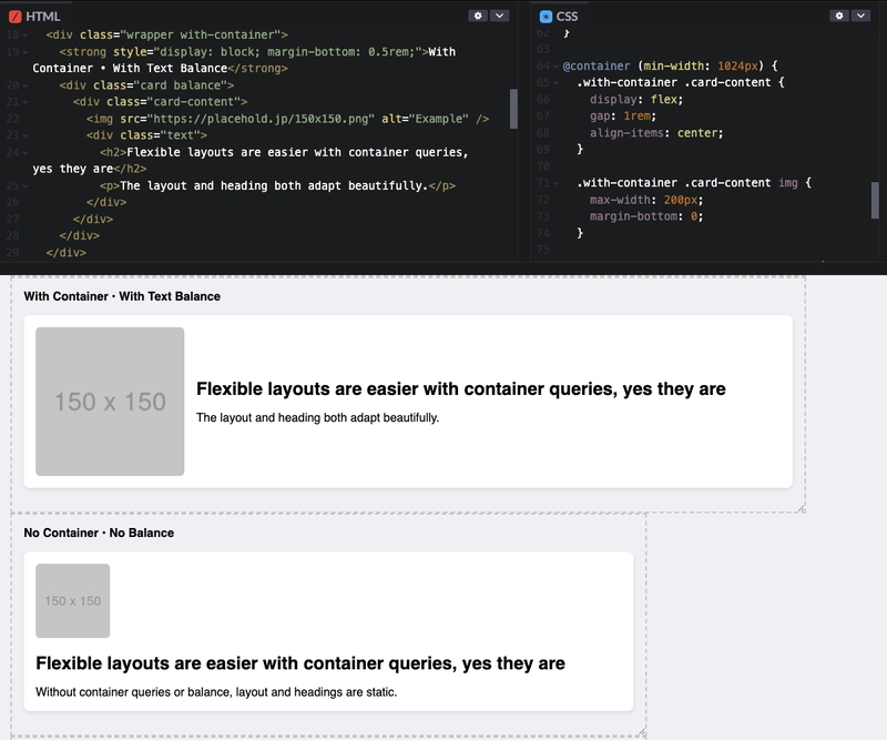
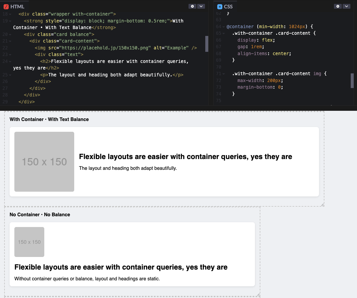
Text-wrap: balance
Smarter, cleaner line breaks for headings.
What we used to do:
Manually adjust line breaks or max-width to prevent awkward wrapping in headings.
What we can do now:
Let the browser do it for us with one line of CSS:
h2 {
  text-wrap: balance;
}
It balances multi-line headings automatically, making them more readable across devices. This is especially useful for hero sections, card titles, and headlines.
Fully supported in all major browsers since 2024.
See related codepen, within the cards there are balanced and unbalanced headings, so you can notice the difference.
Final thoughts
In 2025, CSS is moving from workarounds to purpose-built solutions:
- Container queries unlock true layout flexibility.
- Cascade layers allow us to define a clear specificity order.
- Animation composition, and typed properties are making styles more expressive and reusable.
- Text balancing improves our UX with zero effort.
These aren't just nice-to-haves, they're tools you should start using today in your CSS.
Which feature are you most excited to try out?
