This week we're continuing our series on how nonprofits can leverage AWS analytics tools to drive more community value from their data. This post will tackle the common data problem of analyzing survey data and generating deep insights and effective data visualizations at a fraction of the cost of other leading analytics platforms. You will learn how to use AWS tools like QuickSight, S3, Athena, and Glue to build out your organization's data stack and quickly start driving value with your data.
Nonprofits and Survey Data
Nonprofit organizations frequently rely on surveys to gather crucial information and feedback from their target populations. These surveys help them understand community needs, measure program effectiveness, evaluate satisfaction with services, and inform strategic decision-making. Whether it's assessing the impact of a community workshop, gauging opinions on a new initiative, or collecting demographic data, surveys are a cornerstone of nonprofit operations.
However, as nonprofits grow, managing the increasing volume of survey data in spreadsheets becomes challenging. Spreadsheets can be difficult to scale, analyze, and collaborate on, and they often lack adequate security, posing risks of data loss or unauthorized access. AWS addresses these issues with a suite of services for scalable, secure, and cost-effective data storage and analysis, enabling nonprofits to maximize the value of their survey data.
Amazon QuickSight: Powerful Dashboards and Reporting at Any Size
Amazon QuickSight is a powerful, cloud-based business intelligence (BI) service that enables organizations of all sizes to easily create and share interactive dashboards and reports. It provides a user-friendly interface for visualizing data, performing ad-hoc analysis, and gaining actionable insights.
For nonprofits, QuickSight offers a compelling alternative to traditional BI tools like Tableau and Power BI. While these tools are feature-rich, their pricing can be prohibitive for small to medium-sized nonprofits with limited budgets. QuickSight's pricing model is designed to be more cost-effective, with a pay-per-session structure that aligns well with the often fluctuating data analysis needs of nonprofits. This makes it an attractive option for organizations looking to maximize their resources and minimize overhead costs.
QuickSight integrates seamlessly with other AWS services, allowing nonprofits to securely store their data in services like Amazon S3 and analyze it directly within QuickSight. This eliminates the need to transfer data between different platforms, reducing the risk of data breaches and ensuring data integrity. In contrast, the free tiers of Tableau and Power BI often require users to publish their dashboards publicly, which may not be suitable for nonprofits handling sensitive community data. By leveraging AWS, nonprofits can maintain greater control over their data and ensure that it is protected by robust security measures.
Creating a Dashboard in QuickSight
In the following example, our nonprofit just delivered a series of workshops for local community leaders, and after each session, a post-workshop survey was sent out to participants. The survey platform that they used didn't offer the types of visualizations they wanted to analyze the survey responses, so the decide to create a custom dashboard in Quicksight for their reporting.
Uploading survey data directly to Quicksight
To start prototyping our dashboard, we will begin by uploading our data directly to Quicksight as a dataset. Our dataset contains a list of responses from the post-workshop survey that contains basic information, ratings, and feedback from the participants. You can follow along with this post by accessing the data here.
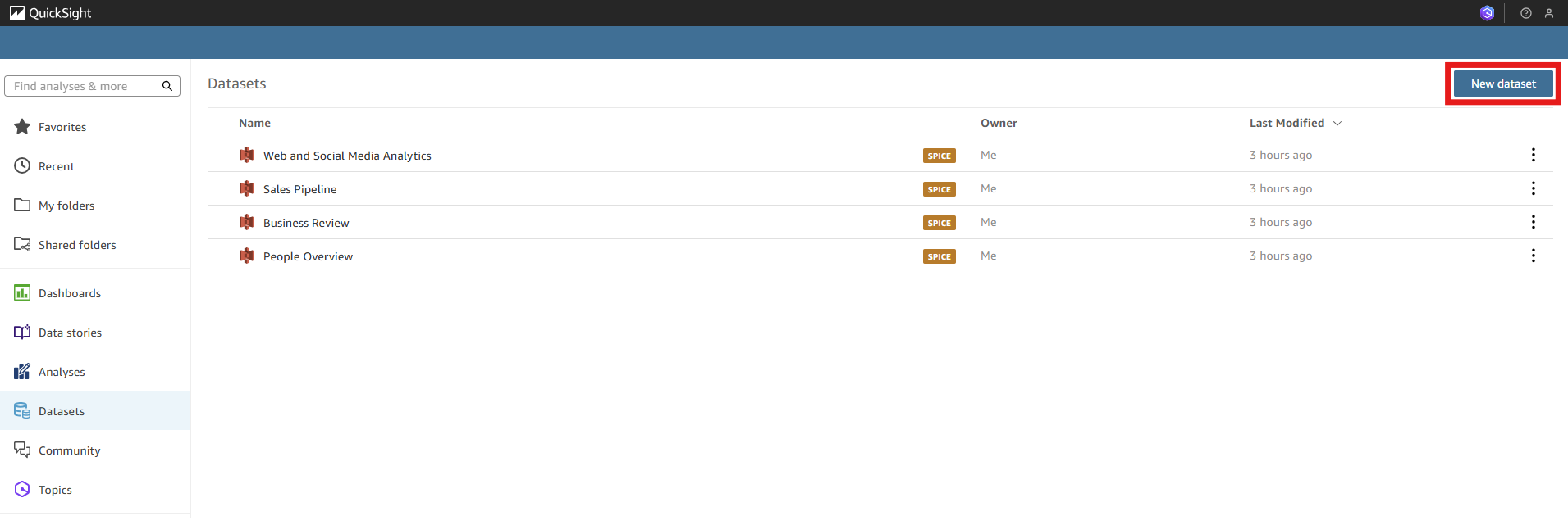
From the "Datasets" tab on the QuickSight homepage, select the "New dataset" button.
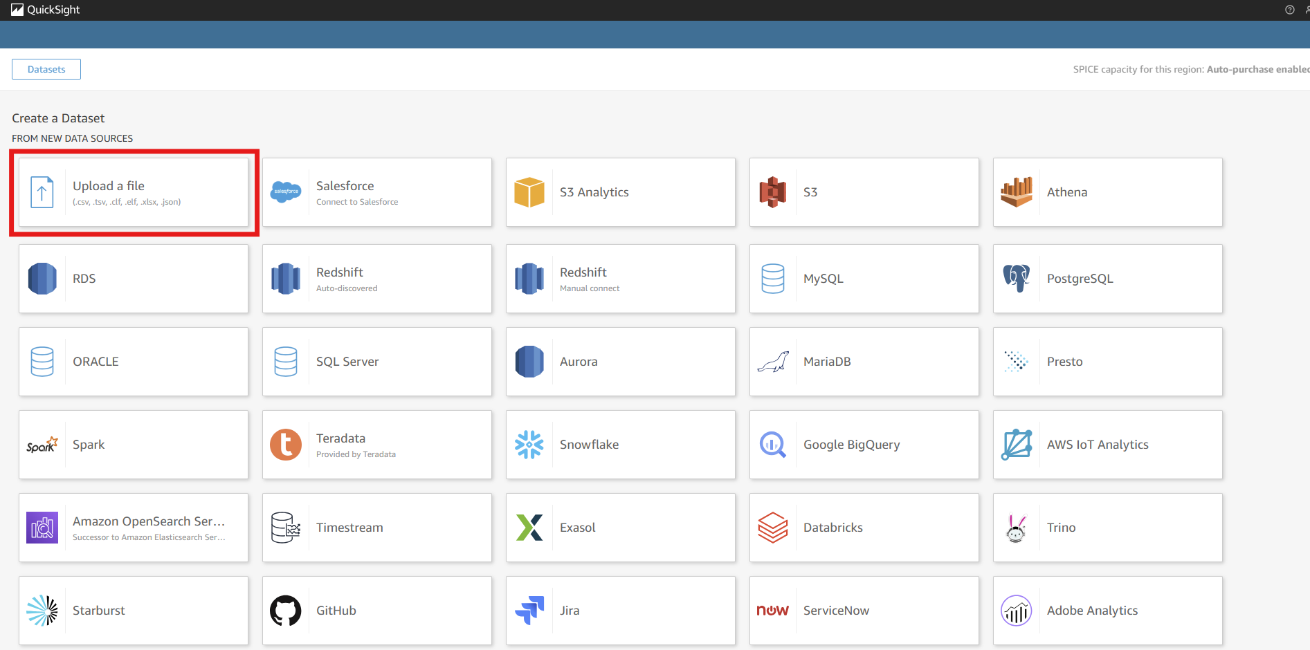
There are a number of connectors and services offered to make data available for use in Quicksight, which we will explore later on in this post. For now, select the "Upload a file" tile and select the survey data file
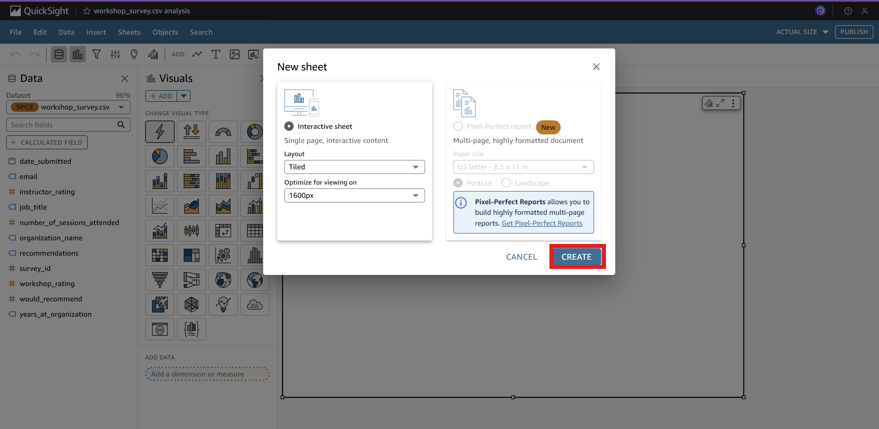
After clicking through to the next screen, select the "Visualize" button to open the visualization editor. Keep the standard settings and select
"Create" on the new sheet page:
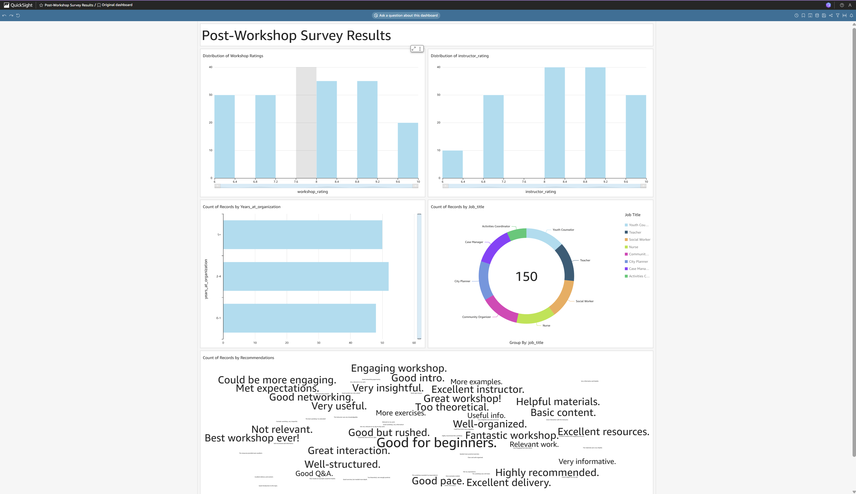
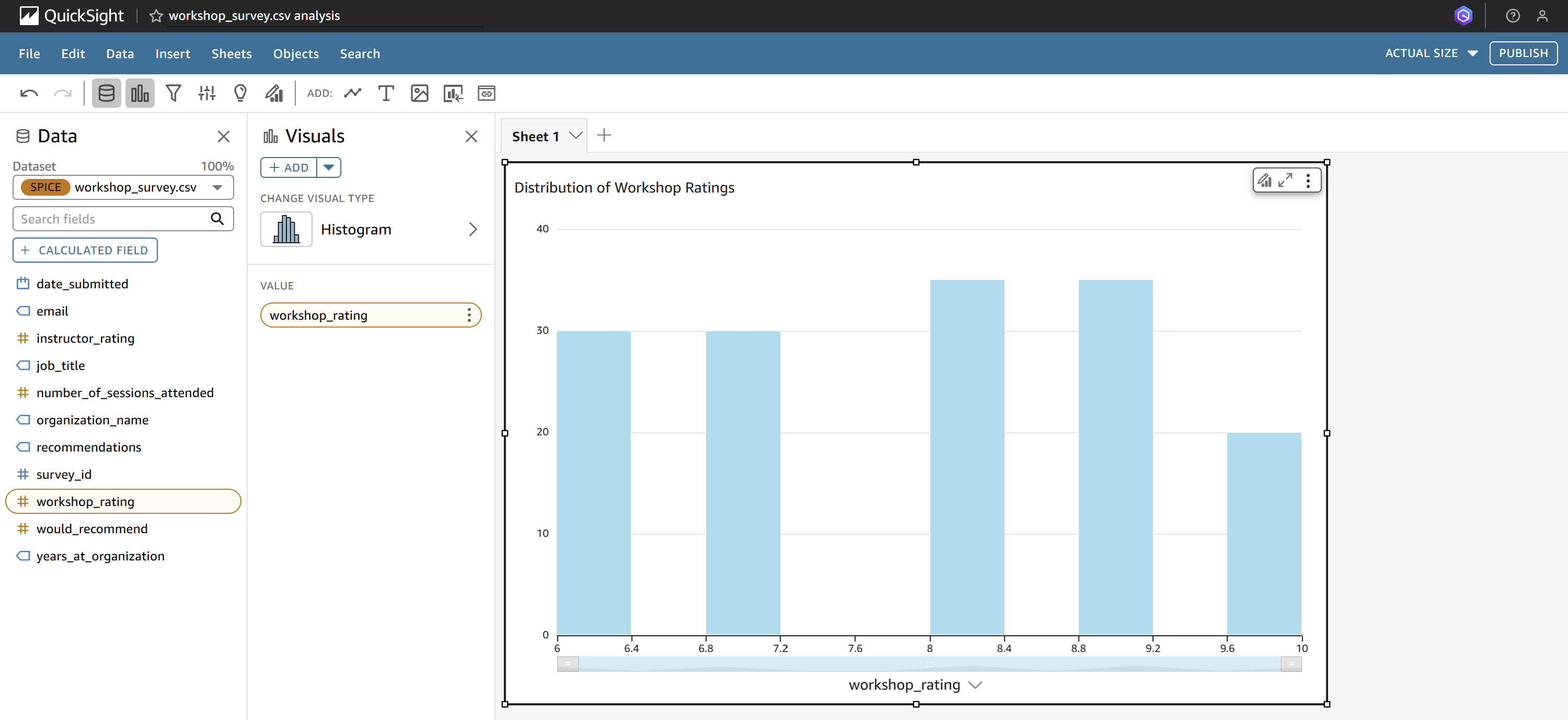
For our first chart, we're going to create a histogram that generates the distribution of the workshop ratings. Similar to other BI platforms like Tableau, you can create the histogram by selecting it from the chart types and dragging the workshop_rating column onto the parameters pane. After giving our chart a title, we've create the first component for our final dashboard:
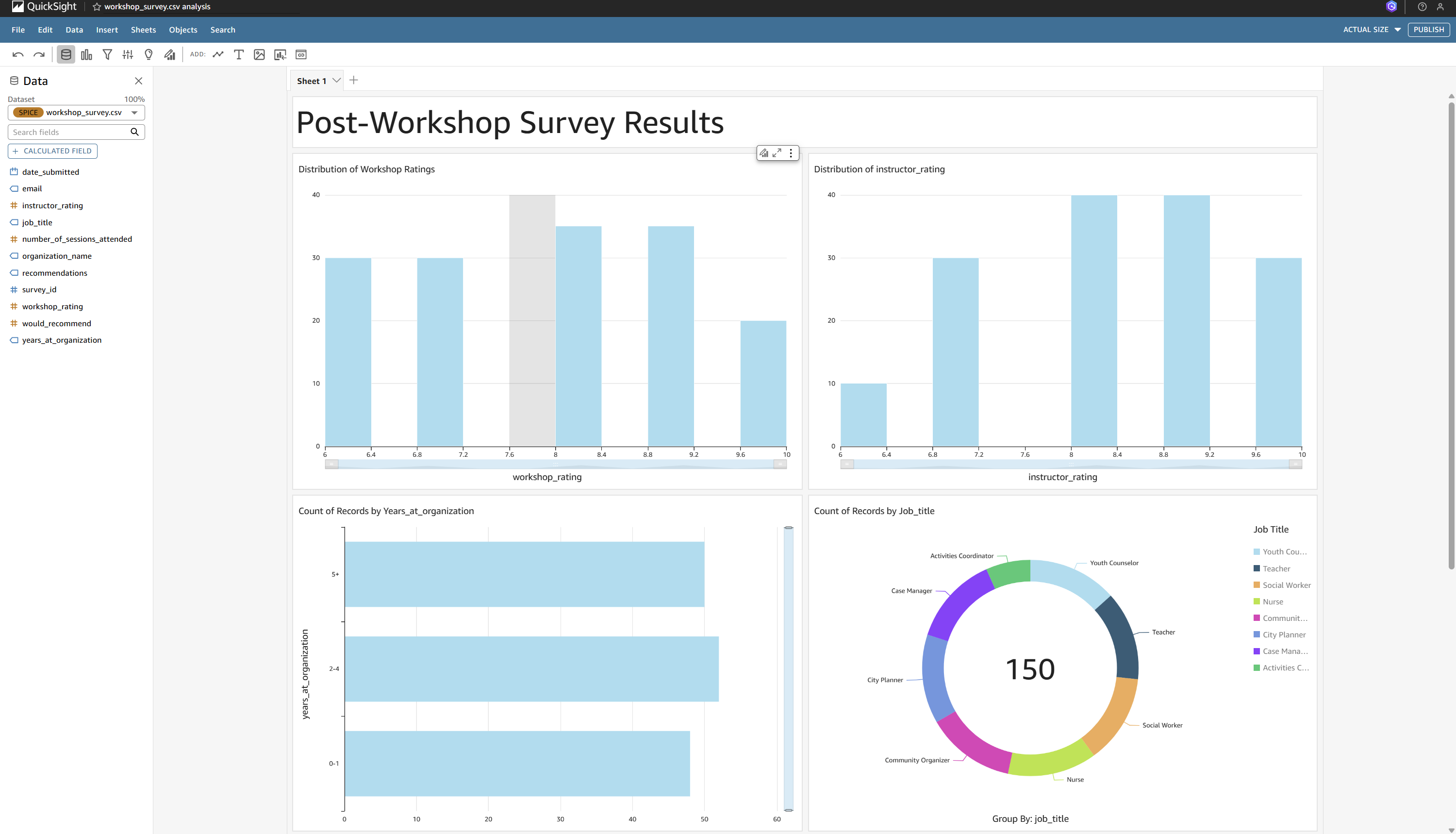
After adding a few more visuals, including a distribution of the instructor rating, distribution of settings attended, and the breakdown of participant job titles, we now have a basic report of our survey data:
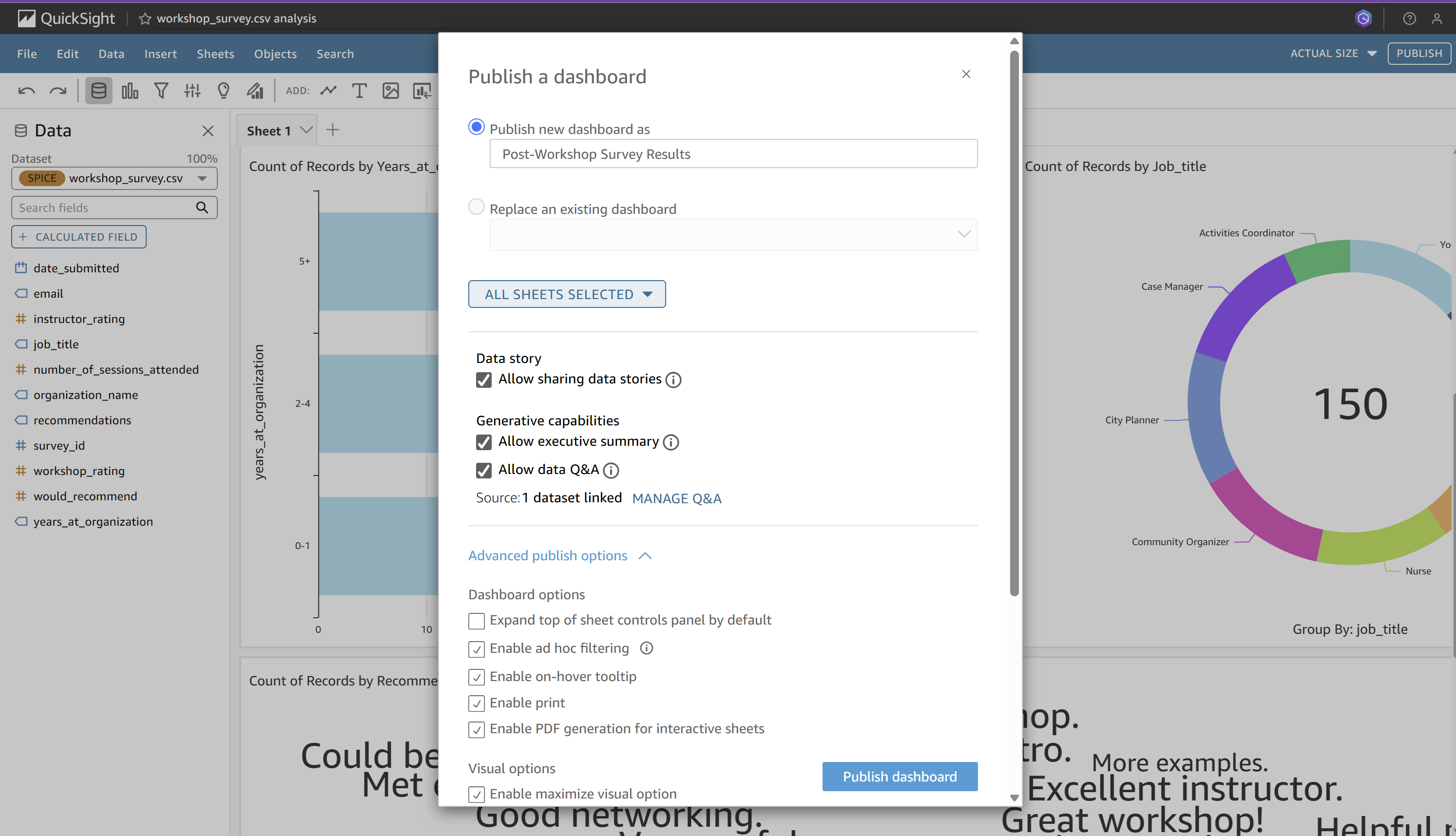
Now that we've explored our survey data and selected the final visuals we want to display, we can publish our analysis to make it a QuickSight Dashboard (select all of the default options):
Final Dashboard: