

Introduction | Features | Installation | Enum Initialization | API | Usage | Localization | Global Extension
Introduction
enum-plus is an enhanced enum library that is fully compatible with the native enum and extends it with powerful features such as display text, localization, UI control binding, enum items traversal, and more useful extension methods. This lightweight, zero-dependency, TypeScript library works with any front-end framework.
With the extended display text capability, enum items can be used to generate dropdowns, checkboxes, and other UI controls with a single line of code. By using the extension methods of the enum, you can easily traverse the array of enum items, get the display text of a certain enum value, determine whether a value exists, etc. The display text of the enum item supports localization, which can return the corresponding text according to the current language environment, making the display text of the enum item more flexible and more in line with user needs.
What other exciting features are there? Please continue to explore! Or you can check out this usage video first.
Features
- Full compatibility with native
enumbehavior - Support for multiple data types including
numberandstring - Enhanced enum items with customizable display text
- Built-in localization capabilities that integrate with any i18n library
- Streamlined conversion from enum values to human-readable display text
- Extensible design allowing unlimited custom fields on enum items
- Seamless integration with any UI libraries like Ant Design, ElementPlus, Material-UI, in a single line of code
- Complete Node.js compatibility with SSR support
- Zero dependencies - pure JavaScript implementation usable in any front-end framework
- First-class TypeScript support with comprehensive type inference
- Lightweight (only 2KB+ gzipped)
Installation
npm install enum-plusEnum Initialization
This section shows the various ways to initialize enums using the Enum function. Understanding these different initialization formats allows you to choose the most convenient approach for your specific use case.
1. Simple key-value Format
The simplest format is a direct mapping of keys to values. This is similar to the native enum format.
import { Enum } from 'enum-plus';

const Week = Enum({
  Sunday: 0,
  Monday: 1,
} as const);

Week.Monday; // 1
The
as consttype assertion is used to ensure that the enum values are treated asliteraltypes, otherwise they will be treated asnumbertypes. If you are using JavaScript, please remove theas const.
2. Standard Format (Recommended)
The standard format includes both a value and a label for each enum item. This is the most commonly used format and is recommended for most cases. This format allows you to specify a display text for each enum item, which can be used in UI components.
import { Enum } from 'enum-plus';

const Week = Enum({
  Sunday: { value: 0, label: 'I love Sunday' },
  Monday: { value: 1, label: 'I hate Monday' },
} as const);

Week.Sunday; // 0
Week.label(0); // I love Sunday
3. Array Format
The array format is useful when you need to create enums dynamically, such as from API data. This allows for flexibility in custom field mapping to adapt to different data structures.
import { Enum } from 'enum-plus';

const petTypes = await getPetsData();
// [   { value: 1, key: 'dog', label: 'Dog' },
//     { value: 2, key: 'cat', label: 'Cat' },
//     { value: 3, key: 'rabbit', label: 'Rabbit' }   ];
const PetTypes = Enum(petTypes);
4. Native Enum Format
You can also create from native enums. It benefits from the native enum's auto-incrementing behavior.
import { Enum } from 'enum-plus';

enum init {
  Sunday = 0,
  Monday,
  Tuesday,
  Wednesday,
  Thursday,
  Friday,
  Saturday,
}
const Week = Enum(init);

Week.Sunday; // 0
Week.Monday; // 1
Week.Saturday; // 6
Week.label('Sunday'); // Sunday
API
💎 Picks an enum value
Enum.XXX
Works like native enum, allowing you to access enum values directly.
Week.Sunday; // 0
Week.Monday; // 1
💎 items
{ value, label, key, raw }[]
Returns a read-only array of all enum items. The array structure conforms to Ant Design component specifications, which makes it possible to generate dropdown menus, checkboxes, and other UI conrols with just one line of code. For more details, please refer to the usage examples below.
💎 keys
string[]
Returns a read-only array of all enum item key(s)
💎 label
[Function] label(keyOrValue?: string | number): string | undefined
Gets the display text of an enum item based on a certain value or key. If localization has been set up, the localized text will be returned.
Week.label(1); // Monday
Week.label('Monday'); // Monday (here is label, not key)
Week.label('Monday'); // 星期日, or show localized text if localization is set up
💎 key
[Function] key(value?: string | number): string | undefined
Get the key of an enum item based on the enum value, if the key is not found, return undefined.
Week.key(1); // Monday (here is key, not label)💎 has
[Function] has(keyOrValue?: string | number): boolean
Determine whether a certain enum item (value or key) exists.
Week.has(1); // true
Week.has('Sunday'); // true
Week.has(9); // false
Week.has('Birthday'); // false
💎 toSelect
[Function] toSelect(config?: OptionsConfig): {value, label}[]
toSelect is similar to items, both return an array of all enum items. The difference is that the elements returned by toSelect only contain the label and value fields, no other extra fields. At the same time, the toSelect method allows inserting a default element at the beginning of the array, which is generally used for the default option (which means all, none, or unlimited, etc) of select control. Of course, you can customize this default option.
💎 toMenu
[Function] toMenu(): { key, label }[]
Returns an array of all enum items that conforms to Ant Design specifications. It's used to generate the Menu, Dropdown controls, in a single line of code.
import { Menu } from 'antd';

<Menu items={Week.toMenu()} />;
The data format is:
[
  { key: 0, label: 'Sunday' },
  { key: 1, label: 'Monday' },
];
💎 toFilter
[Function] toFilter(): { text, value }[]
Returns an array of enum items that can pass directly to the Ant Design Table component as filters property of a column. This is used to add a dropdown filter box in the table header to filter table data.
The data format is:
[
  { text: 'Sunday', value: 0 },
  { text: 'Monday', value: 1 },
];
💎 toValueMap
[Function] toValueMap(): Record
Returns a value-to-text mapping object, which maps enum values to their display text, conforming to the Ant Design Pro specification. This is used to generate data sources for ProFormField series controls, and ProTable.
The data format is:
{
  0: { text: 'Sunday' },
  1: { text: 'Monday' },
}
💎 raw
[Override^1] raw(): Record
[Override^2] raw(keyOrValue: V | K): T[K]
The raw method is used to return the original initialization object of the enum collection, which is the object used to create the enum.
The second overload method is used to return the original initialization object of a single enum item.
The main purpose of the raw method is to get the extended custom fields of the enum items. Unlimited number of custom fields are allowed.
const Week = Enum({
  Sunday: { value: 0, label: 'Sunday', happy: true },
  Monday: { value: 1, label: 'Monday', happy: false },
} as const);

Week.raw(0).happy; // true
Week.raw(0); // { value: 0, label: 'Sunday', happy: true }
Week.raw('Monday'); // { value: 1, label: 'Monday', happy: false }
Week.raw(); // { Sunday: { value: 0, label: 'Sunday', happy: true }, Monday: { value: 1, label: 'Monday', happy: false } }
⚡️ valueType [TypeScript ONLY]
value1 | value2 | ...
In TypeScript, provides a union type containing all enum values, enabling precise type constraints for variables and component properties. This replaces broad primitive types like number or string with exact value sets, preventing invalid assignments while enhancing both code readability and compile-time type safety.
type WeekValues = typeof Week.valueType; // 0 | 1

const weekValue: typeof Week.valueType = 1; // ✅ Type correct, 1 is a valid week enum value
const weeks: (typeof Week.valueType)[] = [0, 1]; // ✅ Type correct, 0 and 1 are valid week enum values
Note: This is a TypeScript type only and cannot be called at runtime. Calling it at runtime will throw an exception.
⚡️ keyType [TypeScript ONLY]
key1 | key2 | ...
Similar to valueType, provides an union type of all enum key(s)
type WeekKeys = typeof Week.keyType; // 'Sunday' | 'Monday'

const weekKey: typeof Week.keyType = 'Monday';
const weekKeys: (typeof Week.keyType)[] = ['Sunday', 'Monday']
Note: This is a TypeScript type only and cannot be called at runtime. Calling it at runtime will throw an exception.
⚡️ rawType [TypeScript ONLY]
{ value: V, label: string, [...] }
Provides a type of the original initialization object of the Enum collection.
Note: This is a TypeScript type only and cannot be called at runtime. Calling it at runtime will throw an exception.
Usage
• Picks enum values, consistent with native enums
const Week = Enum({
  Sunday: { value: 0, label: 'Sunday' },
  Monday: { value: 1, label: 'Monday' },
} as const);

Week.Sunday; // 0
Week.Monday; // 1
• Supports JSDoc comments on enum items
In the code editor, hover the cursor over the enum item to display detailed Jsdoc comments about that enum item, without having to go to the enum definition to view it.
const Week = Enum({
  /** Represents Sunday */
  Sunday: { value: 0, label: 'Sunday' },
  /** Represents Monday */
  Monday: { value: 1, label: 'Monday' },
} as const);

Week.Monday; // Hover over Monday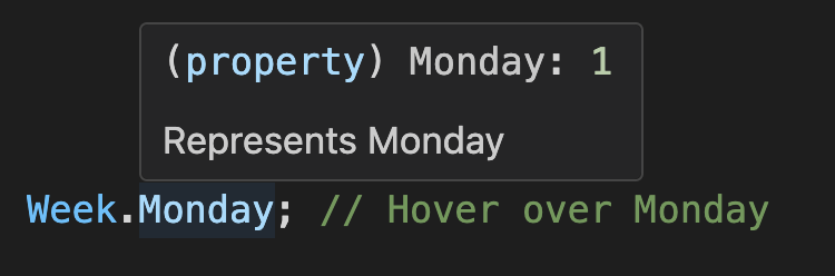
You can see that this hover functionality reveals both documentation and enum values simultaneously, without leaving your current position in the code.
• Gets a read-only enum items array
Week.items; // The output is:
// [
//  { value: 0, label: 'Sunday', key: 'Sunday', raw: { value: 0, label: 'Sunday' } },
//  { value: 1, label: 'Monday', key: 'Monday', raw: { value: 1, label: 'Monday' } },
// ]
• Gets the first enum value
Week.items[0].value; // 0• Checks if a value is a valid enum value
Week.has(1); // true
Week.items.some((item) => item.value === 1); // true
1 instanceof Week; // true
• instanceof operator
1 instanceof Week; // true
'1' instanceof Week; // true
'Monday' instanceof Week; // true
• Supports traversing enum items array
Week.items.length; // 2
Week.items.map((item) => item.value); // [0, 1], ✅ Traversable
Week.items.forEach((item) => {}); // ✅ Traversable
for (let item of Week.items) {
  // ✅ Traversable
}
Week.items.push({ value: 2, label: 'Tuesday' }); // ❌ Not allowed, read-only
Week.items.splice(0, 1); // ❌ Not allowed, read-only
Week.items[0].label = 'foo'; // ❌ Not allowed, read-only
• Gets enum display text by value (or key)
Week.label(1); // Monday, here is label, not key
Week.label(Week.Monday); // Monday, here is label, not key
Week.label('Monday'); // Monday, get label by key
• Gets enum key by value
Week.key(1); // 'Monday'
Week.key(Week.Monday); // 'Monday'
Week.key(9); // undefined, because it does not exist
• Extends an unlimited number of custom fields
const Week = Enum({
  Sunday: { value: 0, label: 'Sunday', active: true, disabled: false },
  Monday: { value: 1, label: 'Monday', active: false, disabled: true },
} as const);

Week.raw(0).active; // true
Week.raw(Week.Sunday).active; // true
Week.raw('Sunday').active; // true
• Converts to UI controls
⊹ Enum.items can be consumed as control data sources (using Select as an example)
React-based UI libraries
Ant Design | Arco Design Select
import { Select } from 'antd';

  <Select options={Week.items} />;
Material-UI Select
import { MenuItem, Select } from '@mui/material';

  <Select>
    {Week.items.map((item) => (
      <MenuItem key={item.value} value={item.value}>
        {item.label}
      MenuItem>
    ))}
  Select>;
Kendo UI Select
import { DropDownList } from '@progress/kendo-react-dropdowns';

  <DropDownList data={Week.items} textField="label" dataItemKey="value" />;
Vue-based UI libraries
ElementPlus Select
<el-select>
    <el-option v-for="item in Week.items" v-bind="item" />
  el-select>
Ant Design Vue | Arc Design Select
<a-select :options="Week.items" />Vuetify Select
<v-select :items="Week.items" item-title="label" />Angular-based UI libraries
Angular Material Select
*ngFor="let item of Week.items" [value]="item.value">{{ item.label }}NG-ZORRO Select
*ngFor="let item of Week.items" [nzValue]="item.value">{{ item.label }}⊹ toMenu method is used to generate data sources for Ant Design Menu, Dropdown components.
import { Menu } from 'antd';

<Menu items={Week.toMenu()} />;
⊹ toFilter method is used to add a dropdown filter box in the Ant Design Table header to filter table data.
import { Table } from 'antd';

const columns = [
  {
    title: 'week',
    dataIndex: 'week',
    filters: Week.toFilter(),
  },
];
// Add column filter at table header
<Table columns={columns} />;
⊹ toValueMap method is used to generate data sources for binding the Ant Design Pro ProFormField series controls, and ProTable.
import { ProFormCheckbox, ProFormRadio, ProFormSelect, ProFormTreeSelect, ProTable } from '@ant-design/pro-components';

<ProFormSelect valueEnum={Week.toValueMap()} />; // Select
<ProFormCheckbox valueEnum={Week.toValueMap()} />; // Checkbox
<ProFormRadio.Group valueEnum={Week.toValueMap()} />; // Radio
<ProFormTreeSelect valueEnum={Week.toValueMap()} />; // TreeSelect
<ProTable columns={[{ dataIndex: 'week', valueEnum: Week.toValueMap() }]} />; // ProTable
• Merge two enums (or extend an enum)
const myWeek = Enum({
  ...Week.raw(),
  Friday: { value: 5, label: 'Friday' },
  Saturday: { value: 6, label: 'Saturday' },
});
• Narrowing number to enum value sequences [TypeScript ONLY]
By leveraging the valueType type constraint, you can narrow variable types from broad primitives like number or string to precise enum value unions. This type narrowing not only prevents invalid assignments at compile time, but also enhances code readability and self-documentation while providing stronger type safety guarantees.
const weekValue: number = 8; // 👎 Any number can be assigned to the week enum, even if it is wrong
const weekName: string = 'Birthday'; // 👎 Any string can be assigned to the week enum, even if it is wrong

const goodWeekValue: typeof Week.valueType = 1; // ✅ Type correct, 1 is a valid week enum value
const goodWeekName: typeof Week.keyType = 'Monday'; // ✅ Type correct, 'Monday' is a valid week enum name

const badWeekValue: typeof Week.valueType = 8; // ❌ Type error, 8 is not a valid week enum value
const badWeekName: typeof Week.keyType = 'Birthday'; // ❌ Type error, 'Birthday' is not a valid week enum name

type FooProps = {
  value?: typeof Week.valueType; // 👍 Component property type constraint, prevent erroneous assignment, and also prompts which values are valid
  names?: (typeof Week.keyType)[]; // 👍 Component property type constraint, prevent erroneous assignment, and also prompts which values are valid
};
Localization
While enum-plus doesn't include built-in internationalization capabilities, it offers flexible localization through the optional localize parameter. This allows you to implement a custom localization function that transforms enum label values into appropriate translated text based on the current language context. The language state management remains your responsibility, with your localize method determining which localized text to return. For production applications, we strongly recommend leveraging established internationalization libraries such as i18next rather than creating custom solutions.
Below is a simple example for illustration purposes. Note that the first approach is not recommended for production use due to its limited flexibility - it serves only to demonstrate the basic concept.
import { Enum } from 'enum-plus';
import i18next from 'i18next';
import Localize from './Localize';

let lang = 'zh-CN';
const setLang = (l: string) => {
  lang = l;
};

// 👎 Not a good example, just for demonstration - not recommended for production
const sillyLocalize = (content: string) => {
  if (lang === 'zh-CN') {
    switch (content) {
      case 'enum-plus.options.all':
        return '全部';
      case 'week.sunday':
        return '星期日';
      case 'week.monday':
        return '星期一';
      default:
        return content;
    }
  } else {
    switch (content) {
      case 'enum-plus.options.all':
        return 'All';
      case 'week.sunday':
        return 'Sunday';
      case 'week.monday':
        return 'Monday';
      default:
        return content;
    }
  }
};
// 👍 Recommended to use i18next or other internationalization libraries
const i18nLocalize = (content: string | undefined) => i18next.t(content);
// 👍 Or encapsulate it into a basic component
const componentLocalize = (content: string | undefined) => <Localize value={content} />;

const Week = Enum(
  {
    Sunday: { value: 0, label: 'week.sunday' },
    Monday: { value: 1, label: 'week.monday' },
  } as const,
  {
    localize: sillyLocalize,
    // localize: i18nLocalize, // 👍  Recommended to use i18n
    // localize: componentLocalize, // 👍  Recommended to use component
  }
);
setLang('zh-CN');
Week.label(1); // 星期一
setLang('en-US');
Week.label(1); // Monday
For applications with consistent localization needs, the Enum.localize method offers a convenient way to set localization globally rather than configuring each enum individually. When enum-specific localization options are provided during initialization, these will override the global settings.
Enum.localize = i18nLocalize;Global Extension
While Enum provides a comprehensive set of built-in methods, you can extend its functionality with custom methods using the Enum.extends API. These extensions are globally applied to all enum instances, including those created before the extension was applied, and take effect immediately without requiring any manual setup.
Enum.extends({
  toMySelect(this: ReturnType<typeof Enum>) {
    return this.items.map((item) => ({ value: item.value, title: item.label }));
  },
  reversedItems(this: ReturnType<typeof Enum>) {
    return this.items.reverse();
  },
});

Week.toMySelect(); // [{ value: 0, title: 'Sunday' }, { value: 1, title: 'Monday' }]
Compatibility
-
Browser Environments:
-
Modern Bundlers: With bundlers supporting the exports field (Webpack 5+, Vite, Rollup), enum-plus targets
ES2020. For broader browser support, transpile to earlier syntax using@babel/preset-envduring your build process. -
Legacy Bundlers: For tools without
exportsfield support (like Webpack 4), enum-plus automatically falls back to themainfield entry point, which targetsES2016. - Polyfill Strategy: enum-plus ships without polyfills to minimize bundle size. For legacy browser support, incorporate:
-
core-js -
@babel/preset-envwith appropriateuseBuiltInssettings - Alternative polyfill implementations
-
Modern Bundlers: With bundlers supporting the exports field (Webpack 5+, Vite, Rollup), enum-plus targets
Node.js Compatibility: enum-plus requires a minimum of
ES2016features, compatible with Node.jsv7.xand above.
Still want more? Visit enum-plus to discover even more advanced tips and techniques. If you like this project, please star it on GitHub. Help more developers discover it.
Trust me, you'll wish you had discovered it sooner!
