Introduction
Data exploration is one of the first and most critical steps in any data analysis process. But doing this through code or spreadsheets can be repetitive, slow, or hard to share with non-technical users. This is where Streamlit comes in.
In this article, I’ll walk you through how to build and deploy a simple, interactive CSV Data Explorer using Streamlit. With this dashboard, you can upload a .csv file, preview its contents, explore statistics, and generate dynamic visualizations — all from a clean and fast web interface.
What is Streamlit?
Streamlit is an open-source Python library that turns data scripts into shareable web apps with minimal effort. It’s ideal for dashboards, quick data tools, and prototyping.
Other great tools for data visualization include:
- Dash (by Plotly) – flexible, ideal for production dashboards.
- Bokeh – powerful for interactive plotting.
- Gradio – often used in machine learning demos.
But Streamlit stands out for its simplicity and speed of development.
Features of Our App
Our CSV Data Explorer app includes the following:
- 📂 Upload any .csv file from your computer
- 👀 Preview the data in a table
- 📊 View descriptive statistics (mean, std, min, max…)
- 📈 Generate histograms and scatter plots
- 💾 Export a copy of the data (optional)
- 🖥️ Hosted live via Streamlit Cloud
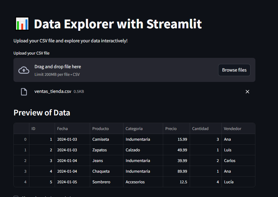
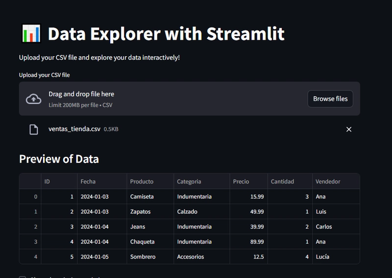
Demo: Using the App
Once deployed, the app allows the user to:
- Upload a CSV file (e.g. ventas_tienda.csv)
- View the first few rows and basic statistics
- Choose numeric columns to visualize:
- Histogram (distribution + KDE curve)
- Scatter plot between two variables
Download the same file or modified data (optional feature)
Here’s an example dataset:
Fecha,Producto,Categoria,Precio,Cantidad,Vendedor
2024-01-03,Camiseta,Indumentaria,15.99,3,Ana
2024-01-04,Jeans,Indumentaria,39.99,2,Carlos
2024-01-05,Sombrero,Accesorios,12.50,4,Lucía
Code (Core Logic)
Here’s a simplified version of the app (see full code in GitHub):
import streamlit as st
import pandas as pd
import seaborn as sns
import matplotlib.pyplot as plt

st.title("📊 CSV Data Explorer")

uploaded_file = st.file_uploader("Upload a CSV file", type="csv")

if uploaded_file:
    df = pd.read_csv(uploaded_file)
    st.write("### Preview", df.head())
    st.write("### Descriptive Statistics", df.describe())

    st.write("## 📈 Histogram")
    column = st.selectbox("Choose a column", df.select_dtypes(include='number').columns)
    fig, ax = plt.subplots()
    sns.histplot(df[column], kde=True, ax=ax)
    st.pyplot(fig)

    st.write("## 📉 Scatter Plot")
    cols = df.select_dtypes(include='number').columns
    col1 = st.selectbox("X-axis", cols, index=0)
    col2 = st.selectbox("Y-axis", cols, index=1)
    fig2, ax2 = plt.subplots()
    sns.scatterplot(data=df, x=col1, y=col2, ax=ax2)
    st.pyplot(fig2)
Conclusion
This Streamlit app shows how easy it is to transform a simple Python script into an interactive web tool for data exploration. With just a few lines of code, users can upload CSV files, visualize their data, and extract insights—all without needing advanced technical knowledge.
Streamlit makes data applications accessible, fast to build, and even easier to share. Whether you're a student, analyst, or developer, tools like this help bring data to life for everyone.
GitHub Repository
https://github.com/DylanTapiaVargas999/Streamlit-
Live Demo
You can see the full project in action here:
https://hghguua5xkuqc7ypasslea.streamlit.app/
This live version allows you to upload your own CSV file, explore it interactively, and generate visualizations