The Struggle:
At first, I threw all my content together into a card layout with no structure, using just plain text and images. It looked cluttered and unappealing. 😣 My initial design felt more like a rough draft than something polished.
Debugging:
1️⃣ Initial Insight:
I recognized that my card design lacked visual hierarchy and an appealing background. The layout needed a revamp to engage users truly.
2️⃣ Exploring Resources:
After watching a detailed video tutorial, I discovered the value of layering design elements. I learned that starting with a strong background and well-defined outer layers could transform the overall look of the card.
3️⃣ Breakthrough Moment:
I began by setting a contrasting body background color to highlight the card. Next, I defined the card’s outer layer to create a distinct container. Then, I added all the essential components and refined each element’s style. BOOM! The evolution from a messy draft to a sleek, professional card was complete!
Lesson Learned:
Moral of the story: A step-by-step approach to layering design elements can dramatically enhance your layout. Don't be afraid to start over and learn from tutorials—it's all part of the creative process.
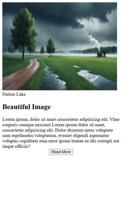
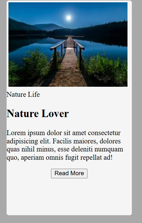
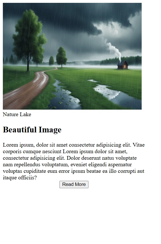
📸 Attached:
I have attached the screenshots of both the initial and final card designs.
🤔 To my network:
Who else has transformed their design by revisiting the fundamentals? What strategies did you use to upgrade your layouts?