I just learned Tailwind CSS v4, and I wanted to explore its new features through a hands-on project. I decided to redesign a familiar interface – the Google homepage — but with a strong, experimental twist: the Neobrutalism design style.
This project allowed me to experiment with Tailwind's expanded functionality, create a fully responsive layout, and implement both light and dark mode themes, all while having fun with a unique UI approach.
🧱 About the Project
The goal was to replicate Google's homepage and combine it with Neobrutalist themes.
✨ Key Features
✅ Neobrutalist Theme: Strong borders, vibrant accents, flat backgrounds
✅ Dark and Light Mode Support: Toggle between modes using simple utility classes
✅ Fully Responsive: Optimized for all device sizes — from mobile to desktop
🎦 Preview of Project
👉 Live Demo
👉 GitHub Repository
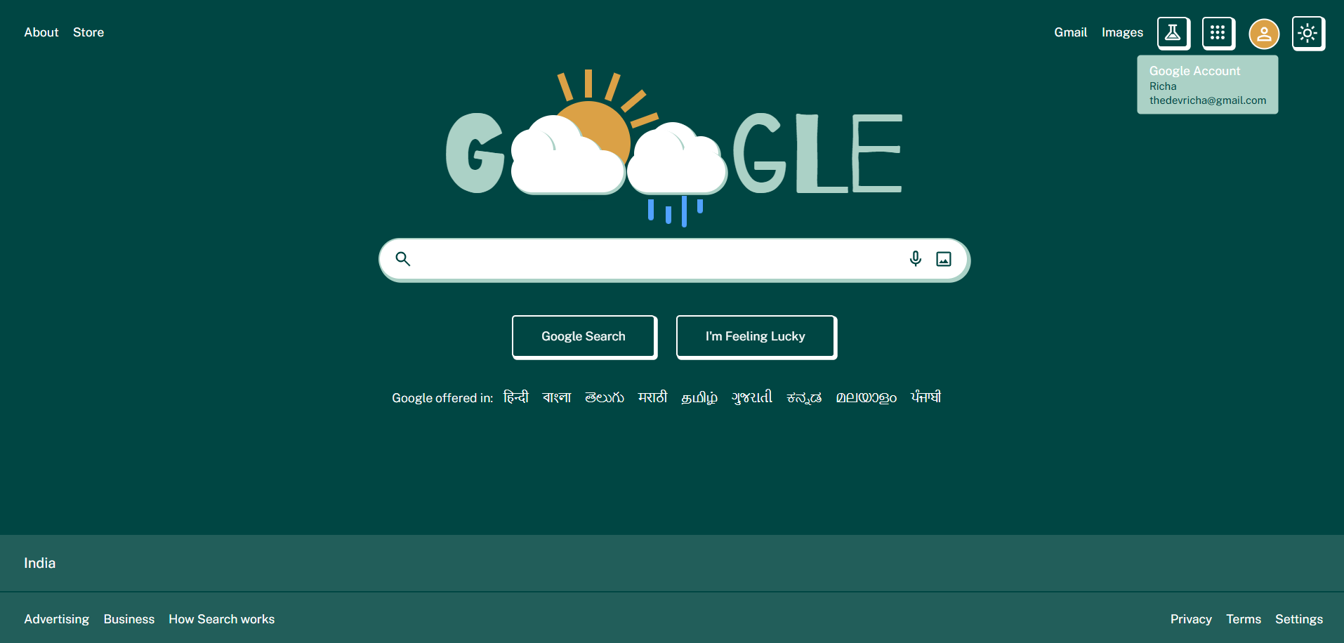
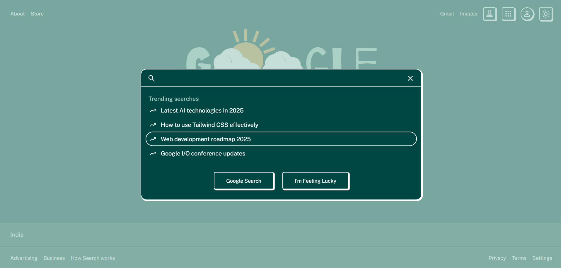
👀 Sneak Peek
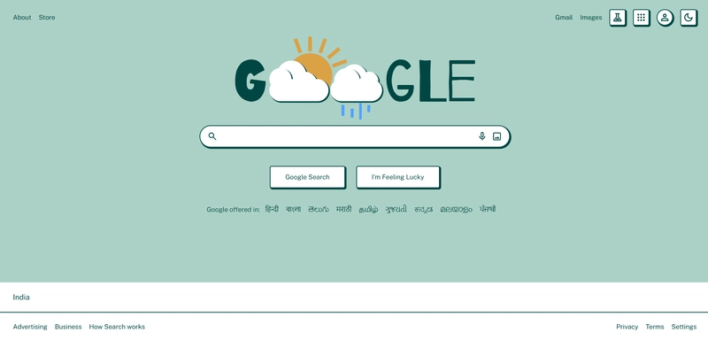
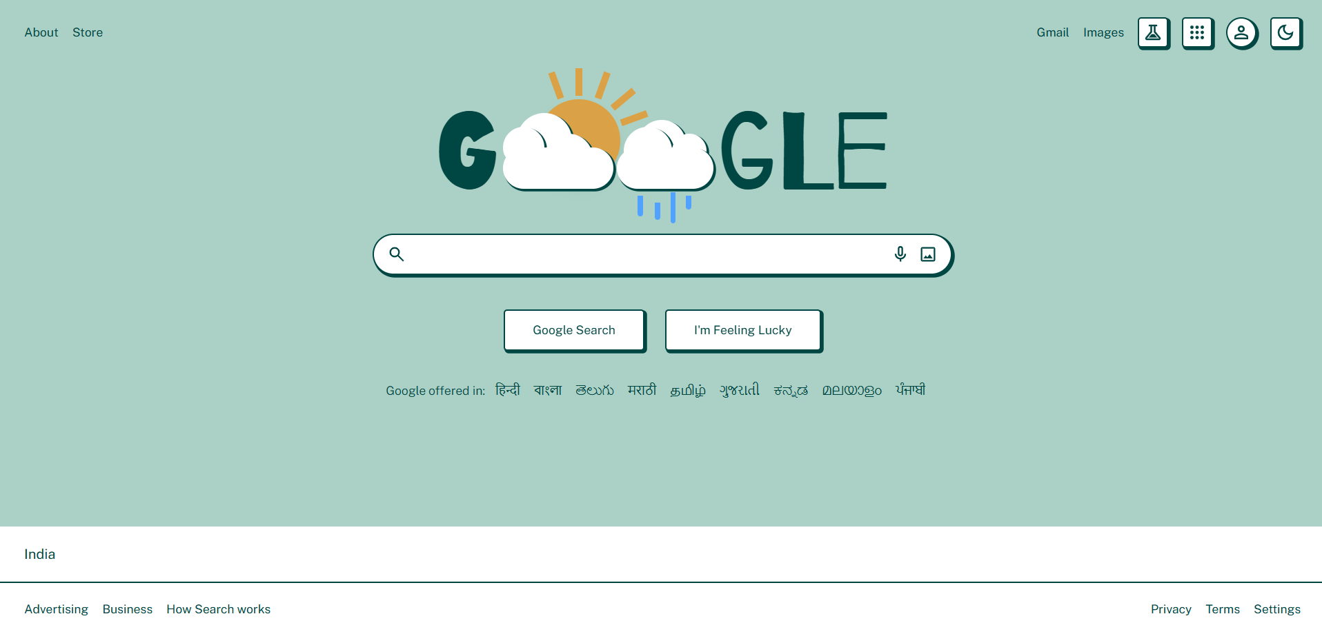
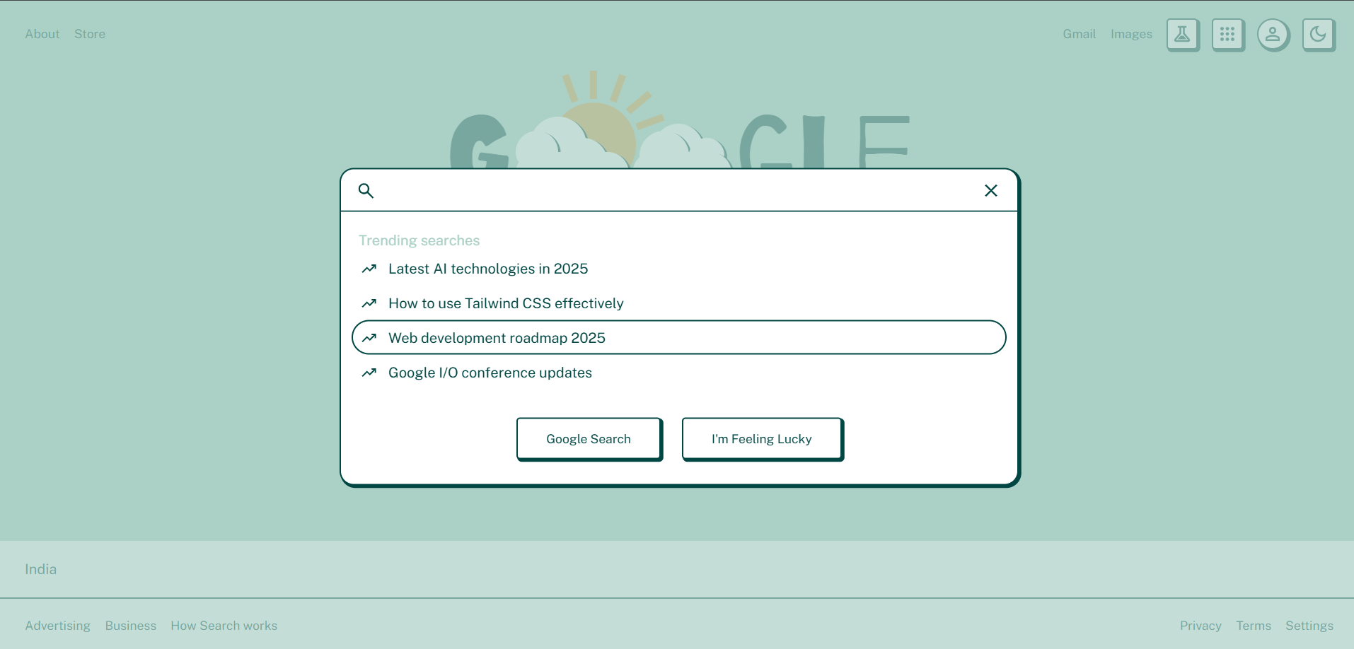
☀️ Light Mode
🌑 Dark Mode
🔍 What I Learned
Working on this project taught me:
- How Tailwind CSS v4 works, with its simpler setup and build steps
- That bold styles like Neobrutalism are tricky but fun to use
- Why it’s key to mix creative ideas with easy-to-use designs
- How to add dark and light modes without making things heavy
Conclusion
This was a cool little test where I mixed a well-known interface with a bold design style. It got me rethinking how layouts, colors, and accessibility can work together. If you’re messing around with Tailwind CSS or digging into wild UI ideas like Neobrutalism, give this a shot—I think you’ll like it!
If you liked this or have any ideas, let me know! I’d love to hear your thoughts or tips.
Happy Coding!✨