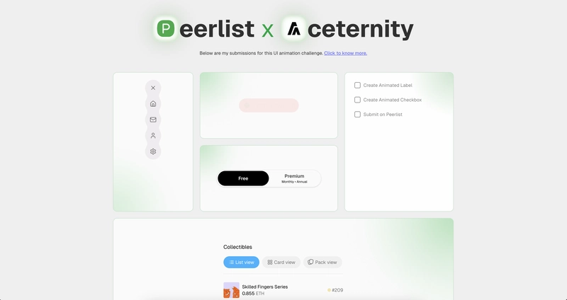
Click here to see my submissions
Click here for the repository
🎯 What is the UI Animation Challenge?
The UI Animation Challenge was a 5-day design-to-code event hosted by Peerlist in collaboration with Aceternity UI. Each day, participants were given an animated UI component and were challenged to bring it to life.
There were six winners in total:
- One prize winner received access to the highly acclaimed UI Animation course by Emil Kowalski.
- Five additional winners received a lifetime subscription to Aceternity UI Pro
I participated in the challenge and won a lifetime subscription to Aceternity UI Pro. In this article, I’ll walk you through my problem solving approach for each of the five daily challenges, how I interpreted the prompts, made design decisions, and tackled technical hurdles along the way.
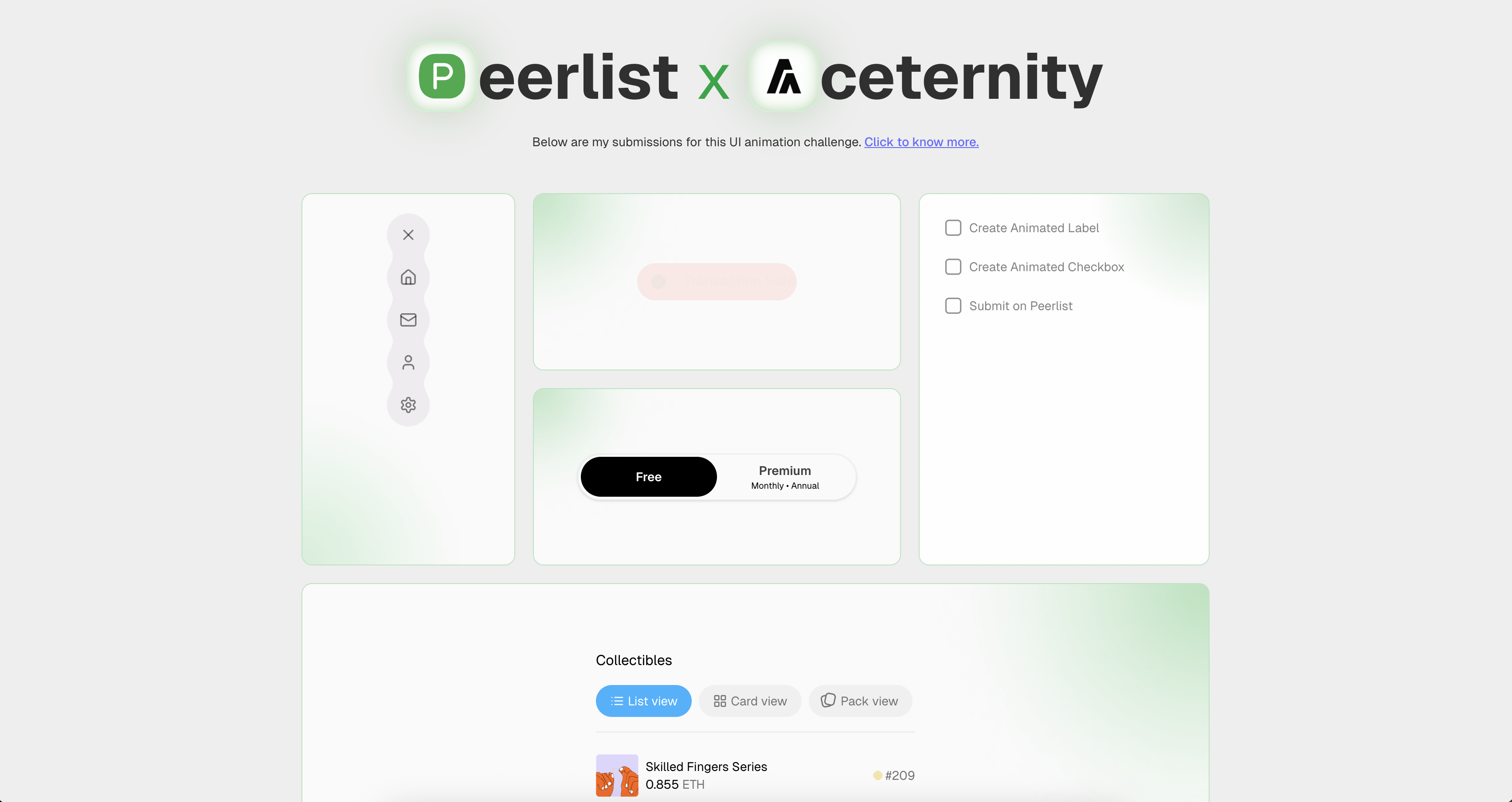
Day 1 – Fluid Menu Animation
🔗 View the challenge
🎯 View my submission
💭 Initial Thoughts
The moment I saw the reference video, it was clear that it was gooey animation. I'd heard of them before, but never actually tried building one myself. Honestly, I had no idea how it worked under the hood or how the icons were blending into each other like that.
Still, it felt doable if broken down into smaller steps. The animation made sense to me, all the icons seemed to be hidden behind the main menu button and then popped out vertically when the menu was opened. So the plan was to stack them all in the same spot using absolute positioning, and then animate them along the Y axis when triggered.
🛠️ Building It
I started off by designing each icon button, just simple circles with a background color and full border radius. A toggle state was added to track whether the menu was open or closed, and from there, the layout for the open state was built. I used motion and AnimatePresence from framer-motion to animate the transition between state
That part was pretty straightforward and felt familiar.
The tricky bit was the actual gooey effect. Since I hadn’t done it before, I went straight to the internet to get an idea of how it works. Turned out, it could be done using SVG filters like feGaussianBlur and feColorMatrix, which let elements blend and stretch into each other.
After applying the filter and messing around with the values a bit, the gooey look started to come together. It was super satisfying to see it work, especially considering I started off not knowing how to even approach it.
Day 2 – Dynamic Status Indicator
🔗 View the challenge
🎯 View my submission
💭 Initial Thoughts
Out of all the challenges, this one felt like the easiest. It was pretty straightforward, and I’d already worked on similar entry and exit animations using framer-motion in the past. I could tell what was happening behind the scenes just by watching the reference video a couple of times.
🛠️ Building It
The component had three states: loading, success, and error. I started by building the UI for each state separately. Then, I set up a setInterval to automatically switch between the status.
To animate the transitions between the different states, I used AnimatePresence from framer-motion. But early on, I ran into a weird issue the component would slightly distort during transitions. That’s when I discovered that AnimatePresence supports different modes, and switching to wait mode fixed the glitch. In this mode, the next element waits for the current one to fully exit before entering, which ended up making the transition much smoother.
Once everything was working, I was pretty happy with the result and submitted it.
I looked at it again later and realized I had missed two important details:
- The direction of the text animation is actually different depending on the state.
- “Analyzing Transaction” (loading) enters from the left, suggesting progress or motion.
- “Transaction Safe” (success) comes in from the right, giving it a sense of completion or arrival.
- The width of the container animated during state changes, which I completely overlooked.
Looking back, I think I was a bit too confident while building this one. Since I already felt comfortable with the concept, I might’ve rushed through it and didn’t pay close enough attention to the finer details. It’s wild how much nuance there can be in animations that seem super simple at first glance.
Day 3 – Animated Checkbox
🔗 View the challenge
🎯 View my submission
💭 Initial Thoughts
This one was a bit tricky. I could tell right away that the checkbox border animation was some sort of path animation, most likely done using SVG, but I had no real experience implementing one before. I did understand how to handle the text animation when an item is marked complete, so I figured I’d start there and build things up gradually - same mindset as Day 1. Just take it step by step, learn what’s needed along the way, and eventually the full component would come together.
🛠️ Building It
I kicked things off by setting up a basic todo list UI, similar to the prompt. Got a list of checkboxes, and added a simple animated strikethrough for the text when a task was marked as done.
Then came the tricky part: the border animation on the checkbox itself. I headed on to the internet and came across this article by Cassie Evans, which explained how stroke-dasharray and stroke-dashoffset work together to create path animations.
Using that, I created an SVG rect and animated its stroke to draw around the checkbox using framer-motion. Once I figured out how the stroke lengths corresponded to the path, it all clicked into place.
But looking back, I missed 1 detail here too:
- The checkbox text actually shakes horizontally when clicked. I completely missed it in the excitement of figuring out path animations.
By this point, I knew I had to step up for the last two challenges. I had already missed three small details across the first three days. If I wanted to stand out and win something, I needed to slow down a bit and focus harder going forward.
Day 4 – Animated Toggles
🔗 View the challenge
🎯 View my submission
💭 Initial Thoughts
This one needed the most focus so far. I really had to study the animation closely to figure out what was going on. Also, great timing , I happened to be on a road trip with my family that day, building this from the back seat of a moving car.
After watching the reference video a few times, I realized there was a background div behind the toggles that slides depending on which button is clicked. What made it tricky was how smooth the whole transition felt. When you click “Premium,” the heading seems to slide down while the “Monthly · Annual” options come up, it gives the illusion of the whole component zooming in. I also noticed there was likely a fade involved to help sell the motion.
🛠️ Building It
I started small again, just built a basic toggle UI with no animations or active states. Then I added the sliding background div to indicate the selected option. Once that was working, I created a separate component for the active “Premium” state and wired it up with AnimatePresence to handle entry and exit transitions.
I spent quite a bit of time here tweaking values to make sure the motion felt seamless and unified, like it was all part of one animation instead of separate moving parts. I also made a conscious effort not to rush this one, especially after missing some details in the earlier challenges.
I ended up submitting it later in the day after getting home from the trip and giving it a proper final review. Personally, I think this was my strongest submission of the week.
Day 5 – Shared Layout Tabs
🔗 View the challenge
🎯 View my submission
💭 Initial Thoughts
This was hands down the toughest challenge of the week. I had done something a bit similar before using Hero animations in Flutter, so I had a rough idea of what was going on, but I didn’t really know how to approach it in the React + Framer Motion.
The individual views were simple to build. It was the smooth transition between them that had me scratching my head. Once again, I was back in familiar territory: unsure how to do it, but confident I could figure it out step by step.
🛠️ Building It
I started by laying out the basic structure, added the heading, animated tab bar, and built out each view without worrying about transitions at first. I wanted to make sure everything looked good statically before diving into animations.
Once I was happy with the layout, I went down learning how to animate between views. That’s when I discovered framer-motion’s layout animations, and I found this article which explained the concept really well.
After reading through it and experimenting a bit, things started to click. I took my time with this one, no rushing, and paid extra attention to the little details I had missed earlier in the week. Finally, I submitted the component and wrapped up the challenge.
Felt like the perfect way to end the week, learning something completely new and actually getting it to work!
Looking Back
This challenge was honestly one of the most fun and rewarding things I’ve done in a while. I had an absolute blast learning new concepts, pushing myself out of my comfort zone, and figuring things out as I went. I don’t think I’ve ever felt this challenged creatively and technically and that’s exactly what made it so exciting.
It’s a solid reminder that consistent challenges like this are a great way to level up. I’m definitely going to make it a habit to take on more of these, just to keep learning, building, and improving as a developer.
Can’t wait to participate in more challenges like this in the future!
