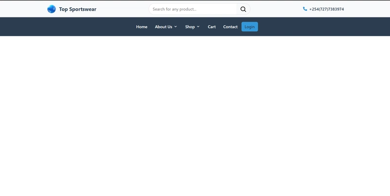
Here, I build a responsive navigation bar for a e-commerce company with a dropdown menu using HTML, CSS and Javascript. The nav bar should have a top nav bar containing a favicon, company name, search bar and phone number. The bottom bar contains Home, About, Shop, Cart, contact and a login button. Shop is a dropdown item with a menu and a sub-menu. The dropdown list should be visible when a user hovers above the dropdown item. The dropdown list items should then close when the pointer moves away from the dropdown item or when the user clicks on the body of the page. The navigation bar should finally look this way:

You can find the full code at:https://github.com/BryanArapKoech/navbar-doublebar.
We start by first adding the fontawesome and remixicons links to the section as below.
Top Sportswear - Quality, affordable sportswear and equipmentThe basic structure of our body section is below. In the body section, we are building our navbar inside the tag. The next step is building code for the top-navbar and then we can go to the building the bottom-navbar.
Add code here
Add code here
Enter fullscreen mode
Exit fullscreen mode
Building the top navbar
The Top navbar will have the components: the favicon with logo text, a search bar and phone. We now add the code to the top-navbar with the final code as:
Top Sportswear
+254(727)7383974
Enter fullscreen mode
Exit fullscreen mode
We give the contents of the top-navbar a class "top-navbar_content." For good code organization, we add inside the class a section of each of the components we want to add. We use an svg image for cleaner implementation and put the text next to in a with a class “logo_text" so that we can easily change its properties.
For the form section, we have used a dummy link https://www.google.com/search with the method “get” and class “search_bar.”
This is the code for the hamburger:
+254(721)370738
Enter fullscreen mode
Exit fullscreen mode
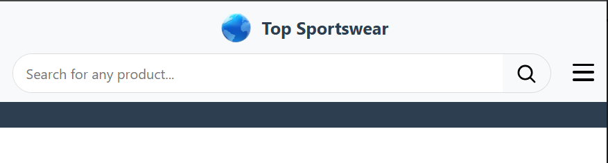
We want the hamburger for screens of size <768pixels to be at the same level as the search bar, so we place it just above the phone section as:
+254(727)7383974
Enter fullscreen mode
Exit fullscreen mode
Building the bottom navbar
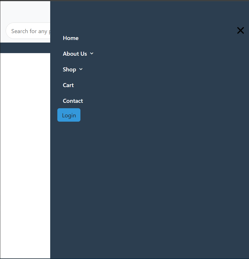
The bottom bar has home, About Us (has a dropdown), shop (has a dropdown and dropdown sub-menu), cart, contact and login.
Add code here
Enter fullscreen mode
Exit fullscreen mode
Inside the nav-container we add the code for the bottom-bar items. But first, we define a general structure. Here we use lists. For the The About us and Shop, there's more coding work to be done!! But the general of the bottom-navbar code structure is as below.
Home
About Us
Add code here
Shop
Add code here
Cart
Contact
Login
Enter fullscreen mode
Exit fullscreen mode
For the bottom navbar items with dropdowns, we give them a list class "dropdown__item" and then give the item text (i.e About us and Shop) a class name "nav__link".
Lets write code for the About Us section. For this, we create an unordered list (ul) inside the list (li) with the class "dropdown__menu".
Home
About Us
Our Mission
Our Vision
Shop
Add code here
Cart
Contact
Login
Enter fullscreen mode
Exit fullscreen mode
Next, lets write code for the Shop section. For this, we create an unordered list (ul) inside the list (li) with the class "dropdown__menu". this is the code in the context of the general structure:
About Us
Our Mission
Our Vision
Enter fullscreen mode
Exit fullscreen mode
Now,
About Us
Our Mission
Our Vision
Shop
Shoes
Fullsuit
Equipment
Balls
Nets
Bags
Cones
Ankle support
Leg sleeve
Vests
Gloves
Jackets
Caps
Shorts
T-shirts
Socks
Enter fullscreen mode
Exit fullscreen mode
The overall code is for the navbar now is:
Top Sportswear - Quality, affordable sportswear and equipment
Top Sportswear
+254(727)7383974
Home
About Us
Our Mission
Our Vision
Shop
Shoes
Fullsuit
Equipment
Balls
Nets
Bags
Cones
Ankle support
Leg sleeve
Vests
Gloves
Jackets
Caps
Shorts
T-shirts
Socks
Cart
Contact
Login
Enter fullscreen mode
Exit fullscreen mode
Javascript code:
// Mobile Menu Toggle
const hamburger = document.getElementById('hamburger-menu');
const navMenu = document.getElementById('nav-menu');
hamburger.addEventListener('click', () => {
navMenu.classList.toggle('show-menu');
hamburger.classList.toggle('active'); // Add/remove active class for X shape
});
// Close menu when clicking outside
document.addEventListener('click', (e) => {
if (!hamburger.contains(e.target) && !navMenu.contains(e.target)) {
navMenu.classList.remove('show-menu');
hamburger.classList.remove('active'); // Remove active class when closing menu
}
});
Enter fullscreen mode
Exit fullscreen mode
The css code:
/* Global Styles */
* {
margin: 0;
padding: 0;
box-sizing: border-box;
}
body {
font-family: 'Segoe UI', Tahoma, Geneva, Verdana, sans-serif;
}
/* Top Navbar */
.top-navbar {
background-color: #f8f9fa;
padding: 10px 0;
box-shadow: 0 1px 3px rgba(0,0,0,0.1);
}
.top-navbar__content {
display: flex;
justify-content: space-between;
align-items: center;
max-width: 1200px;
margin: 0 auto;
padding: 0 15px;
}
.logo {
display: flex;
align-items: center;
}
.logo__img {
height: 40px;
margin-right: 10px;
}
.logo__text {
font-weight: 700;
font-size: 1.25rem;
color: #2c3e50;
text-decoration: none; /* Remove underline */
}
.nav__logo {
text-decoration: none; /* Remove underline from the link */
display: flex;
align-items: center;
}
.search_bar {
display: flex;
align-items: center;
width: 400px;
max-width: 100%;
border: 1px solid #ddd;
border-radius: 50px;
overflow: hidden;
}
.search_bar input {
flex: 1;
padding: 10px 15px;
border: none;
outline: none;
}
.search_bar button {
background: transparent;
border: none;
padding: 8px 15px;
cursor: pointer;
}
.phone {
display: flex;
align-items: center;
font-weight: 600;
color: #2c3e50;
}
.phone .icon {
margin-right: 8px;
color: #3498db;
}
/* Bottom Navbar */
.bottom-navbar {
background-color: #2c3e50;
padding: 15px 0;
}
.bottom-navbar__content {
display: flex;
justify-content: center; /* Center the navigation */
align-items: center;
max-width: 1200px;
margin: 0 auto;
padding: 0 15px;
}
.nav-container {
width: 100%;
}
.nav__menu {
display: flex;
justify-content: center; /* Center the menu */
width: 100%;
}
.nav__list {
display: flex;
justify-content: center; /* Center the list items */
align-items: center;
list-style: none;
margin: 0;
padding: 0;
width: 100%;
max-width: 800px; /* Limit the width for better centering */
}
.nav__link {
color: #fff;
text-decoration: none;
padding: 10px 15px;
display: flex;
align-items: center;
font-weight: 500;
transition: color 0.3s;
}
.nav__link:hover {
color: #3498db;
}
.dropdown__arrow {
margin-left: 5px;
}
.dropdown__item {
position: relative;
}
.dropdown__menu {
position: absolute;
top: 100%;
left: 0;
min-width: 200px;
background-color: #fff;
box-shadow: 0 5px 15px rgba(0,0,0,0.1);
border-radius: 5px;
padding: 10px 0;
list-style: none;
z-index: 100;
display: none;
}
.dropdown__item:hover .dropdown__menu {
display: block;
}
.dropdown__link {
display: flex;
align-items: center;
padding: 10px 20px;
color: #212121;
text-decoration: none;
transition: background-color 0.3s;
}
.dropdown__link:hover {
background-color: #f1f1f1;
color: #3498db;
}
.dropdown__subitem {
position: relative;
}
.dropdown__submenu {
position: absolute;
top: 0;
left: 100%;
min-width: 200px;
background-color:#fbf6f6;
box-shadow: 0 5px 15px rgba(0,0,0,0.1);
border-radius: 5px;
padding: 10px 0;
list-style: none;
display: none;
}
.dropdown__subitem:hover .dropdown__submenu {
display: block;
}
.dropdown__add {
margin-left: auto;
}
.dropdown__sublink {
display: block;
padding: 10px 20px;
color: #212121;
text-decoration: none;
transition: background-color 0.3s;
}
.dropdown__sublink:hover {
background-color: #f1f1f1;
color: #3498db;
}
.btn {
background-color: #3498db !important;
color: #fff;
padding: 10px 20px;
border-radius: 50px;
font-weight: 600;
text-decoration: none;
transition: background-color 0.3s;
}
.btn:hover {
background-color: #5a7c93;
}
.hamburger {
display: none;
flex-direction: column;
justify-content: space-between;
height: 20px;
width: 25px;
cursor: pointer;
position: relative;
}
/* Hamburger to X transformation */
.hamburger.active .bar:nth-child(1) {
transform: translateY(8.5px) rotate(45deg);
}
.hamburger.active .bar:nth-child(2) {
opacity: 0;
}
.hamburger.active .bar:nth-child(3) {
transform: translateY(-8.5px) rotate(-45deg);
}
.bar {
width: 25px;
height: 3px;
background-color: #201414;
border-radius: 3px;
transition: transform 0.3s ease, opacity 0.2s ease;
}
/* Responsive */
@media (max-width: 995px) {
.nav__menu {
position: fixed;
top: 0;
right: -100%;
width: 80%;
height: 100%;
background-color: #2c3e50;
transition: right 0.3s;
padding: 80px 20px 20px;
z-index: 90;
justify-content: flex-start;
}
.nav__menu.show-menu {
right: 0;
}
.bottom-navbar__content {
justify-content: space-between;
}
.nav__list {
flex-direction: column;
align-items: flex-start;
justify-content: flex-start;
}
.dropdown__menu, .dropdown__submenu {
position: static;
width: 100%;
box-shadow: none;
padding-left: 20px;
}
.hamburger {
display: flex;
z-index: 100;
}
.search_bar {
width: 250px;
}
.phone {
display: none;
}
.dropdown__link, .dropdown__sublink {
color: #fff;
}
.dropdown__link:hover, .dropdown__sublink:hover {
background-color: #34495e;
}
}
@media (max-width: 768px) {
.top-navbar__content {
flex-wrap: wrap;
position: relative;
}
.logo {
order: 1;
width: 100%;
margin-bottom: 10px;
justify-content: center; /* Center the logo */
}
/* phone below logo */
.phone{
order: 2;
width: 100%;
justify-content: center;
margin-bottom: 10px;
display: flex;
}
.search {
order: 3;
width: calc(100% - 50px); /* Make room for hamburger */
}
.search_bar {
width: 100%;
}
/* hamburger next to search bar */
.hamburger {
position: absolute;
bottom: 14px; /* Align with search bar */
right: 15px;
display: flex;
z-index: 100;
}
/* Change hamburger color to match theme */
.bar {
background-color: black;
}
/* Hide bottom navbar hamburger */
.bottom-navbar .hamburger {
display: none;
}
/* Hide phone number completely on small screens */
.phone {
display: none;
}
}
Enter fullscreen mode
Exit fullscreen mode
That is how to build a responsive double bar navigation bar!!
Full code at: You can find the full code at:https://github.com/BryanArapKoech/navbar-doublebar.