Written by Idorenyin Obong✏️
Editor's note: This article was updated by Emmanuel John in March 2025 to include instructions on setting CSS variables dynamically with JavaScript, differentiate between CSS and SASS variables, and troubleshoot common developer issues with CSS variables.
CSS offers many predefined standard key-value-based properties for styling semantic HTML elements. However, while designing webpages, developers often need to repetitively use the same values for properties in several segments of stylesheets — for example, while using a primary accent color for various webpage elements.
CSS now supports using custom properties, also known as CSS variables, to avoid repetitive CSS property values. Like any popular programming language, CSS also implements variables for writing clean code with a productive assignment and retrieval syntax, scoping support, and fallback values.
In this tutorial, we’ll first demystify CSS variables and then build four simple projects that utilize them. Some basic CSS knowledge is required to follow along with this tutorial. Let’s dive in!
What are CSS variables?
CSS variables are user-defined values that can be reused throughout a stylesheet. They are also known as custom properties*.* The -- prefix and var() function is used to define and access CSS variables respectively:
:root {
  --primary-color: #3498db;
}

button {
  background-color: var(--primary-color);
}
Unlike traditional CSS properties, CSS variables can be modified dynamically with JavaScript using (element.style.setProperty). CSS variables can be changed in one place and all elements using it update automatically. They can be defined within selectors or globally using (:root ).
One of the most common use cases for CSS variables is managing websites in which numerous values are similar to those in the document. This helps to reduce the friction associated with refactoring or updating your code.
What we’ll build in this tutorial
To solidify our knowledge about CSS variables, we’ll build four very simple projects:
- Button variations — This concept is popular in Bootstrap, where certain elements share CSS rules that give them a default design but are differentiated by colors or other properties
- Theme-based design — Specifically, a light-and-dark theme manipulated by JavaScript
- A responsive login form — We’ll display different layouts on desktop, tablet, and mobile screens
- JavaScript-free dynamic elements — This project generates a colorful native checkbox list
Each project should provide insights into how we can use CSS variables to take care of a wide variety of use cases.
Also referred to as custom properties or cascading variables, CSS variables have myriad use cases.
How to declare and use CSS variables
CSS variables can be declared in two ways (-- prefix and @property at-rule).
-- prefix
The -- prefix declares variables in two ways (globally and locally). The former uses the :root selector to define global variables:
:root {
  --primary-color: blue;
  --font-size: 16px;
}
While the latter defines a variable inside specific elements:
.card {
  --card-bg: lightgray;
  background-color: var(--card-bg);
}
Here, --card-bg is only accessible inside .card. Global variables are accessible everywhere in the stylesheet.
@property at-rule
The @property at-rule allows you to be more expressive with the definition of CSS variables by allowing you to define their type, control inheritance, and set default values which act as fallback. Using the @property at-rule ensures more predictable behavior.
@property --card-color {
  syntax: "";
  inherits: false;
  initial-value: #FFFFFF;
}
Here, --card-color is declared as a CSS variable that expects inherits:false; property prevents it from being inherited by child elements, and initial-value:#FFFFFF; sets a default color when no
How to use variables in CSS**
CSS variables can be applied to elements using the var() function:
button {
  background-color: var(--primary-color);
  font-size: var(--font-size);
}
If the value of --primary-color is updated, all the elements using it will automatically change.
CSS variables inheritance**
Like traditional CSS properties, CSS variables follow standard property rules — i.e., they inherit, can be overridden, and adhere to the CSS specificity algorithm. The value of an element is inherited from its parent elements if no custom property is defined in a specific child element, as shown in the following example.
The HTML:
class="container">
   class="post">
     class="post-title">Heading text
     class="post-content">Paragraph text
The CSS:
.container {
--padding: 1rem;
}
.post {
--padding: 1.5rem;
}
.post-content {
padding: var(--padding);
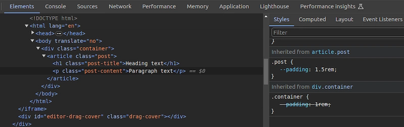
}In this case, the .post-content selector inherits padding value from its direct parent, .post, with the value of 1.5rem rather than 1rem. You can use Chrome DevTools to see from where the specific CSS variable value gets inherited, as shown in the following preview:  You can use CSS variable inheritance to pass variable values from parent elements to child elements without re-declaring them in selectors. Also, overriding variable values is possible as traditional CSS properties.
CSS variables cascading
CSS cascade rules handle the precedence of CSS definitions that come from various sources. CSS variables also follow the standard cascade rules as any other standard properties. For example, if you use two selectors with the same specificity score, the variable assignment order will decide the value of a specific CSS variable.
A variable assignment in a new CSS block typically overrides the existing precedence and re-assigns values to variables. Let’s understand variable cascading rules with a simple example.
The HTML:
class="lbl lbl-ok">OKThe CSS:
.lbl {
  --lbl-color: #ddd;
  background-color: var(--lbl-color);
  padding: 6px;
}

.lbl-ok { --lbl-color: green }

/* --- more CSS code ---- */
/* ---- */

.lbl-ok { --lbl-color: lightgreen }
The above CSS selectors have the same specificity, so CSS uses cascading precedence to select the right lbl-color value for elements. Here, we’ll get the lightgreen color for the span element since lightgreen is in the last variable assignment. The color of the label may change based on the order of the above selectors.
CSS variables also work with developer-defined cascade layers that use the @layer at-rule. To demonstrate this, we can add some cascade layers to the above CSS snippet:
@layer base, mods;

@layer base {
  .lbl {
    --lbl-color: #ddd;
    background-color: var(--lbl-color);
    padding: 6px;
  }
}

@layer mods {
  .lbl-ok { --lbl-color: lightgreen }
}
You can check how cascading rules overwrite variable values with Chrome DevTools: 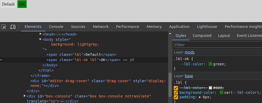
Fallback and invalid values**
When using custom properties, you might reference a custom property that isn’t defined in the document. You can specify a fallback value to be used in place of that value.
The syntax for providing a fallback value is still the var() function. Send the fallback value as the second parameter of the var() function:
:root {
  --light-gray: #ccc;
}

p {
  color: var(--light-grey, #f0f0f0); /* No --light-grey, so #f0f0f0 is
  used as a fallback value */
}
Did you notice that I misspelled the value --light-gray? This should cause the value to be undefined, so the browser loads the fallback value, #f0f0f0 for the color property.
A comma-separated list is also accepted as a valid fallback value. For example, the following CSS definition loads red, blue as the fallback value for the gradient function:
background-image: linear-gradient(90deg, var(--colors, red, blue));You can also use variables as fallback values with nested var() functions. For example, the following definition loads #ccc from --light-gray if it’s defined:
color: var(--light-grey, var(--light-gray, #f0f0f0));Note that it’s generally not recommended to nest so many CSS functions due to performance issues caused by nested function parsing. Instead, try to use one fallback value with a readable variable name. If your web app should work on older web browsers that don’t support custom properties, you can define fallback values outside of the var() function as follows:
p {
  color: #f0f0f0; /* fallback value for older browsers */
  color: var(--light-grey);
}
If the browser doesn’t support CSS variables, the first color property sets a fallback value. We’ll discuss browser compatibility in the upcoming section about browser support for the CSS variables feature.
Meanwhile, custom properties can get invalid values due to developer mistakes. Let’s learn how the browser handles invalid variable assignments and how to override the default invalid assignment handling behavior:
:root {
  --text-danger: #ff9500;
}

body {
  --text-danger: 16px;
  color: var(--text-danger);
}
In this snippet, the --text-danger custom property was defined with a value of #ff9500. Later, it was overridden with 16px, which isn’t technically wrong. But when the browser substitutes the value of --text-danger in place of var(--text-danger), it tries to use a value of 16px, which is not a valid property value for color in CSS.
The browser treats it as an invalid value and checks whether the color property is inheritable by a parent element. If it is, it uses it. Otherwise, it falls back to a default color (black in most browsers).
This process doesn’t bring the correct initial value defined in the :root selector block, so we have to define custom properties with the accepted type and initial value using the @property at-rule, as shown in the following code snippet:
@property --text-danger {
  syntax: "";
  inherits: true;
  initial-value: #ff9500;
}

body {
  --text-danger: 16px;
  color: var(--text-danger);
}
Now, the browser renders the expected text color even if we assign an invalid value within the body selector.
Creating scoped CSS variables
As discussed in previous examples, it’s possible to create global CSS variables using either :root or @property at-rule. Also, creating local variables is possible by defining variables inside child element selectors. For example, a variable defined inside header won’t be exposed to body.
However, if you define a variable inside a specific tag, it gets exposed to all elements that match the particular selector. What if you need to create a scoped variable that is only available for a targeted HTML segment?
By default, browsers won’t scope style tags even if we wrap them with elements like Here, the second style tag becomes scoped for the wrapped The first button gets the Variables should be grouped logically as follows: Fallback values should be used to ensure compatibility:@scope at-rule helps us implement scoped CSS variables with scoped style tags, as shown in the following HTML snippet:
<style>
button {
padding: 6px 18px;
border: none;
border-radius: 4px;
margin: 12px;
background-color: var(--accent-color, #4cc2e6);
}
style>
<div>
<style>
@scope {
button {
--accent-color: #f2ba2c;
}
}
style>
<button>Sample button #1button>
div>
<button>Sample button #2button>@scope at-rule. So, the button selector in the second style tag selects only buttons inside the parent --accent-color is only available for the first button. #f2ba2c color for the background since the scoped style tag’s button selector sets the --accent-color variable. The second button gets the #4cc2e6 fallback background color since the --accent-color scoped variable is not available in the global scope: 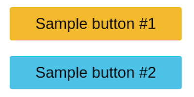 Learn more about the
 @scope at rule from the official MDN documentation. @scope is still an experimental feature, so you can use the minimal css-scope-inline library to create scoped CSS variables in production.
Best practices for structuring CSS variables in projects
:root {
/* Colors */
--primary-color: #3498db;
--secondary-color: #2ecc71;
/* Typography */
--font-size-base: 16px;
--font-weight-bold: 700;
}color: var(--text-color, black);```
<p>If <code>--text-colorcode> is not defined, <code>blackcode> will be used as a default. <strong>Use meaningful names (avoid <code>--color1code>, <code>--sizeAcode>)strong>p>
<h2>
<a name="project-1-building-button-variations" href="#project-1-building-button-variations">
a>
Project 1: Building button variations
h2>
<p>In CSS frameworks such as <a href="https://blog.logrocket.com/bootstrap-adoption-guide/">Bootstrapa>, variables make sharing a base design across elements much easier. Take the <code>.bg-dangercode> class, which turns an element’s background color to red and its own color to white. In this first project, you’ll build something similar. p>
<p>Get started with the first project by adding the following HTML document to a new <code>.htmlcode> file:<br>
p>
<pre class="highlight html"><code><span class="cp"><!DOCTYPE html>span>
<span class="nt"><htmlspan> <span class="na">lang=span><span class="s">"en"span><span class="nt">>span>
<span class="nt"><head>span>
<span class="nt"><metaspan> <span class="na">charset=span><span class="s">"UTF-8"span> <span class="nt">/>span>
<span class="nt"><metaspan> <span class="na">name=span><span class="s">"viewport"span> <span class="na">content=span><span class="s">"width=device-width, initial-scale=1.0"span> <span class="nt">/>span>
<span class="nt"><metaspan> <span class="na">http-equiv=span><span class="s">"X-UA-Compatible"span> <span class="na">content=span><span class="s">"ie=edge"span> <span class="nt">/>span>
<span class="nt"><title>span>CSS Variables - Button Variations<span class="nt"></title>span>
<span class="nt"></head>span>
<span class="nt"><body>span>
<span class="nt"><section>span>
<span class="nt"><divspan> <span class="na">class=span><span class="s">"container"span><span class="nt">>span>
<span class="nt"><h1span> <span class="na">class=span><span class="s">"title"span><span class="nt">>span>CSS Color Variations<span class="nt"></h1>span>
<span class="nt"><divspan> <span class="na">class=span><span class="s">"btn-group"span><span class="nt">>span>
<span class="nt"><buttonspan> <span class="na">class=span><span class="s">"btn btn-primary"span><span class="nt">>span>Primary<span class="nt"></button>span>
<span class="nt"><buttonspan> <span class="na">class=span><span class="s">"btn btn-secondary"span><span class="nt">>span>Secondary<span class="nt"></button>span>
<span class="nt"><buttonspan> <span class="na">class=span><span class="s">"btn btn-link"span><span class="nt">>span>Link<span class="nt"></button>span>
<span class="nt"><buttonspan> <span class="na">class=span><span class="s">"btn btn-success"span><span class="nt">>span>Success<span class="nt"></button>span>
<span class="nt"><buttonspan> <span class="na">class=span><span class="s">"btn btn-error"span><span class="nt">>span>Error<span class="nt"></button>span>
<span class="nt"></div>span>
<span class="nt"></div>span>
<span class="nt"></section>span>
<span class="nt"></body>span>
<span class="nt"></html>span>
code>pre>
<p>p>
<p>The structure of this markup is pretty standard. Notice how each button element has two classes: the <code>btncode> class and a second class. We’ll refer to the <code>btncode> class, in this case, as the base class and the second class as the modifier class that consists of the <code>btn-code> prefix. p>
<p>Next, add the following style tag content to the above:<br>
p>
<pre class="highlight css"><code><span class="o"><span><span class="nt">stylespan><span class="o">>span>
<span class="o">*span> <span class="p">{
class="nl">border class="p">: class="m">0 class="p">;
class="p">}span>
<span class="nd">:rootspan> <span class="p">{
class="py">--primary class="p">: class="m">#0076c6 class="p">;
class="py">--secondary class="p">: class="m">#333333 class="p">;
class="py">--error class="p">: class="m">#ce0606 class="p">;
class="py">--success class="p">: class="m">#009070 class="p">;
class="py">--white class="p">: class="m">#ffffff class="p">;
class="p">}span>
<span class="c">/* base style for all buttons */span>
<span class="nc">.btnspan> <span class="p">{
class="nl">padding class="p">: class="m">1rem class="m">1.5rem class="p">;
class="nl">background class="p">: class="nb">transparent class="p">;
class="nl">font-weight class="p">: class="m">700 class="p">;
class="nl">border-radius class="p">: class="m">0.5rem class="p">;
class="nl">cursor class="p">: class="nb">pointer class="p">;
class="p">}span>
<span class="c">/* variations */span>
<span class="nc">.btn-primaryspan> <span class="p">{
class="nl">background class="p">: class="n">var class="p">( class="n">--primary class="p">);
class="nl">color class="p">: class="n">var class="p">( class="n">--white class="p">);
class="p">}span>
<span class="nc">.btn-secondaryspan> <span class="p">{
class="nl">background class="p">: class="n">var class="p">( class="n">--secondary class="p">);
class="nl">color class="p">: class="n">var class="p">( class="n">--white class="p">);
class="p">}span>
<span class="nc">.btn-successspan> <span class="p">{
class="nl">background class="p">: class="n">var class="p">( class="n">--success class="p">);
class="nl">color class="p">: class="n">var class="p">( class="n">--white class="p">);
class="p">}span>
<span class="nc">.btn-errorspan> <span class="p">{
class="nl">background class="p">: class="n">var class="p">( class="n">--error class="p">);
class="nl">color class="p">: class="n">var class="p">( class="n">--white class="p">);
class="p">}span>
<span class="nc">.btn-linkspan> <span class="p">{
class="nl">color class="p">: class="n">var class="p">( class="n">--primary class="p">);
class="p">}span>
<span class="o"></span><span class="nt">stylespan><span class="o">>span>
code>pre>
<p>p>
<p>The <code>btncode> class contains the base styles for all the buttons and the variations come in where the individual modifier classes get access to their colors, which are defined at the <code>:rootcode> level of the document. This is extremely helpful not just for buttons, but for other elements in your HTML that can inherit the custom properties. p>
<p>For example, if tomorrow you decide the value for the <code>--errorcode> custom property is too dull for a red color, you can easily switch it up to <code>#f00000code>. Once you do so, voila — all elements using this custom property are updated with a single change! p>
<p>Here’s what your first project should look like: <img src="https://dev-to-uploads.s3.amazonaws.com/uploads/articles/8u2ugfq6exeln38vbedd.png" alt="Preview Of Project Using Css To Build Button Color Variations"> You can access the complete source code and see a live preview of this project from <a href="https://codepen.io/shalithasuranga/pen/dyrKEyd">this CodePena>.p>
<h2>
<a name="project-2-setting-css-variables-dynamically-with-javascript" href="#project-2-setting-css-variables-dynamically-with-javascript">
a>
Project 2: Setting CSS variables dynamically with JavaScript
h2>
<p>The <code>document.documentElement.style.setPropertycode> method is used to set CSS variables dynamically with JavaScript, updating CSS variables in real-time without modifying the style sheet:<br>
p>
<pre class="highlight css"><code><span class="nt">documentspan><span class="nc">.documentElement.style.setPropertyspan><span class="o">(span><span class="s2">'--primary-color'span><span class="o">,span> <span class="s2">'green'span><span class="o">)span>
code>pre>
<p>p>
<p>This will update the <code>--primary-colorcode> variable, affecting all the elements that use it. p>
<p>To see the practical use case for this, we’ll build the second project “a light-and-dark theme”. The light theme will take effect by default unless the user already has their system set to a dark theme. On the page, we’ll create a toggle button that allows the user to <a href="https://blog.logrocket.com/create-better-themes-with-css-variables">switch between themesa>. p>
<p>First, add the following HTML structure into a new <code>.htmlcode> file:<br>
p>
<pre class="highlight html"><code><span class="cp"><!DOCTYPE html>span>
<span class="nt"><htmlspan> <span class="na">lang=span><span class="s">"en"span><span class="nt">>span>
<span class="nt"><head>span>
<span class="nt"><metaspan> <span class="na">charset=span><span class="s">"UTF-8"span> <span class="nt">/>span>
<span class="nt"><metaspan> <span class="na">name=span><span class="s">"viewport"span> <span class="na">content=span><span class="s">"width=device-width, initial-scale=1.0"span> <span class="nt">/>span>
<span class="nt"><metaspan> <span class="na">http-equiv=span><span class="s">"X-UA-Compatible"span> <span class="na">content=span><span class="s">"ie=edge"span> <span class="nt">/>span>
<span class="nt"><title>span>CSS Variables - Theming<span class="nt"></title>span>
<span class="nt"></head>span>
<span class="nt"><body>span>
<span class="nt"><header>span>
<span class="nt"><divspan> <span class="na">class=span><span class="s">"container"span><span class="nt">>span>
<span class="nt"><divspan> <span class="na">class=span><span class="s">"container-inner"span><span class="nt">>span>
<span class="nt"><aspan> <span class="na">href=span><span class="s">"#"span> <span class="na">class=span><span class="s">"logo"span><span class="nt">>span>My Blog<span class="nt"></a>span>
<span class="nt"><divspan> <span class="na">class=span><span class="s">"toggle-button-container"span><span class="nt">>span>
<span class="nt"><labelspan> <span class="na">class=span><span class="s">"toggle-button-label"span> <span class="na">for=span><span class="s">"checkbox"span><span class="nt">>span>
<span class="nt"><inputspan> <span class="na">type=span><span class="s">"checkbox"span> <span class="na">class=span><span class="s">"toggle-button"span> <span class="na">id=span><span class="s">"checkbox"span> <span class="nt">/>span>
<span class="nt"><divspan> <span class="na">class=span><span class="s">"toggle-rounded"span><span class="nt">></div>span>
<span class="nt"></label>span>
<span class="nt"></div>span>
<span class="nt"></div>span>
<span class="nt"></div>span>
<span class="nt"></header>span>
<span class="nt"><article>span>
<span class="nt"><divspan> <span class="na">class=span><span class="s">"container"span><span class="nt">>span>
<span class="nt"><h1span> <span class="na">class=span><span class="s">"title"span><span class="nt">>span>Title of article<span class="nt"></h1>span>
<span class="nt"><divspan> <span class="na">class=span><span class="s">"info"span><span class="nt">>span>
<span class="nt"><divspan> <span class="na">class=span><span class="s">"tags"span><span class="nt">>span>
<span class="nt"><span>span>#html<span class="nt"></span>span>
<span class="nt"><span>span>#css<span class="nt"></span>span>
<span class="nt"><span>span>#js<span class="nt"></span>span>
<span class="nt"></div>span>
<span class="nt"><span>span>1st February, 2024<span class="nt"></span>span>
<span class="nt"></div>span>
<span class="nt"><divspan> <span class="na">class=span><span class="s">"content"span><span class="nt">>span>
<span class="nt"><p>span>
Lorem ipsum dolor sit amet consectetur adipisicing elit.
<span class="nt"><aspan> <span class="na">href=span><span class="s">"#"span><span class="nt">>span>Link to another url<span class="nt"></a>span> Eius, saepe optio! Quas
repellendus consequuntur fuga at. Consequatur sit deleniti, ullam
qui facere iure, earum corrupti vitae laboriosam iusto eius magni,
adipisci culpa recusandae quis tenetur accusantium eum quae harum
autem inventore architecto perspiciatis maiores? Culpa, officiis
totam! Rerum alias corporis cupiditate praesentium magni illo, optio
nobis fugit.
<span class="nt"></p>span>
<span class="nt"><p>span>
Eveniet veniam ipsa similique atque placeat dignissimos
quos reiciendis. Odit, eveniet provident fugiat voluptatibus esse
culpa ullam beatae hic maxime suscipit, eum reprehenderit ipsam.
Illo facilis doloremque ducimus reprehenderit consequuntur
cupiditate atque harum quaerat autem amet, et rerum sequi eum cumque
maiores dolores.
<span class="nt"></p>span>
<span class="nt"></div>span>
<span class="nt"></div>span>
<span class="nt"></article>span>
<span class="nt"></body>span>
<span class="nt"></html>span>
code>pre>
<p>p>
<p>This snippet represents a simple blog page with a header, a theme toggle button, and a dummy article. p>
<p>Next, add the following style tag to add CSS definitions for the above HTML structure:<br>
p>
<pre class="highlight css"><code><span class="o"><span><span class="nt">stylespan><span class="o">>span>
<span class="nd">:rootspan> <span class="p">{
class="py">--primary-color class="p">: class="m">#0d0b52 class="p">;
class="py">--secondary-color class="p">: class="m">#3458b9 class="p">;
class="py">--font-color class="p">: class="m">#424242 class="p">;
class="py">--bg-color class="p">: class="m">#ffffff class="p">;
class="py">--heading-color class="p">: class="m">#292922 class="p">;
class="py">--white-color class="p">: class="m">#ffffff class="p">;
class="p">}span>
<span class="c">/* Layout */span>
<span class="o">*span> <span class="p">{
class="nl">padding class="p">: class="m">0 class="p">;
class="nl">border class="p">: class="m">0 class="p">;
class="nl">margin class="p">: class="m">0 class="p">;
class="nl">box-sizing class="p">: class="n">border-box class="p">;
class="p">}span>
<span class="nt">htmlspan> <span class="p">{
class="nl">font-size class="p">: class="m">14px class="p">;
class="nl">font-family class="p">: class="n">-apple-system class="p">, class="n">BlinkMacSystemFont class="p">, class="s2">'Segoe UI' class="p">, class="n">Roboto class="p">, class="n">Oxygen class="p">,
class="n">Ubuntu class="p">, class="n">Cantarell class="p">, class="s2">'Open Sans' class="p">, class="s2">'Helvetica Neue' class="p">, class="nb">sans-serif class="p">;
class="p">}span>
<span class="nt">bodyspan> <span class="p">{
class="nl">background class="p">: class="n">var class="p">( class="n">--bg-color class="p">);
class="nl">color class="p">: class="n">var class="p">( class="n">--font-color class="p">);
class="p">}span>
<span class="nc">.containerspan> <span class="p">{
class="nl">width class="p">: class="m">100% class="p">;
class="nl">max-width class="p">: class="m">768px class="p">;
class="nl">margin class="p">: class="nb">auto class="p">;
class="nl">padding class="p">: class="m">0 class="m">1rem class="p">;
class="p">}span>
<span class="nc">.container-innerspan> <span class="p">{
class="nl">display class="p">: class="n">flex class="p">;
class="nl">justify-content class="p">: class="n">space-between class="p">;
class="nl">align-items class="p">: class="nb">center class="p">;
class="p">}span>
<span class="c">/* Using custom properties */span>
<span class="nt">aspan> <span class="p">{
class="nl">text-decoration class="p">: class="nb">none class="p">;
class="nl">color class="p">: class="n">var class="p">( class="n">--primary-color class="p">);
class="p">}span>
<span class="nt">pspan> <span class="p">{
class="nl">font-size class="p">: class="m">1.2rem class="p">;
class="nl">margin class="p">: class="m">1rem class="m">0 class="p">;
class="nl">line-height class="p">: class="m">1.5
