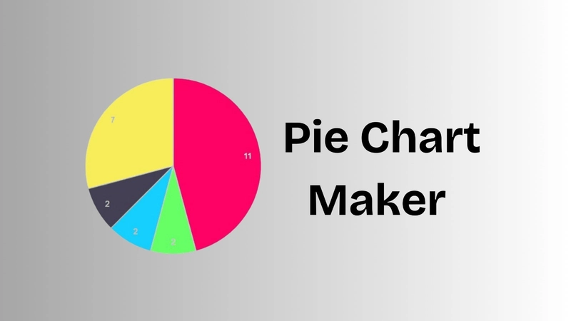

As developers, we often find ourselves building tools we personally need or wish existed in a simpler form. That’s exactly what led me to create piechartmaker.me 🥧 — a fast, free, and easy-to-use pie chart generator for everyone.
In this post, I’ll walk you through:
- Why I decided to build it
- How I built it (tech stack + challenges)
- Features and UI decisions
- Future roadmap
- Lessons learned
- Why I Built This
I was working on a small analytics report and needed to whip up a pie chart. I searched for tools online and ran into a few common problems:
Most tools asked me to sign up or create an account
Others had cluttered interfaces packed with advanced options I didn’t need
Some required me to download software or use spreadsheet tools
And a few were just straight-up ugly 🙈
All I wanted was a clean, web-based tool where I could enter some labels and values, preview the chart, and download it as an image. So I built it.
The Tech Stack
Here’s the stack I chose and why:
Frontend: React + Tailwind CSS
React made it easy to create a dynamic form and live chart preview. Tailwind gave me utility-first styling out of the box, which helped keep the codebase small and maintainable.
Charting: Google Charts
Google Charts is one of the most robust charting libraries around. It supports beautiful, interactive charts and handles resizing and responsive layouts effortlessly.
Hosting: Vercel
I deployed the site using Vercel for zero-config deployment, fast CDN, and built-in HTTPS. Vercel’s previews and Git integration made iteration quick and painless.
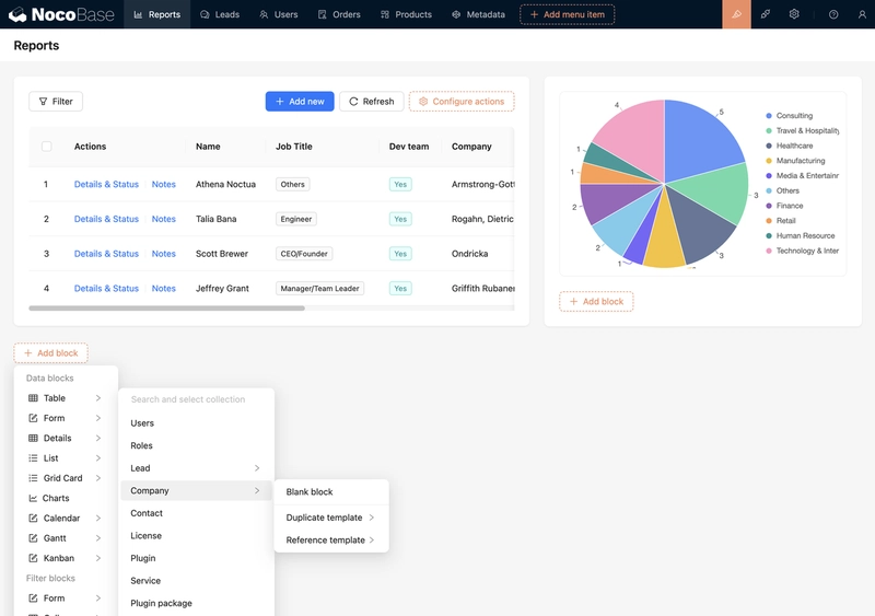
Features
Here’s what the site does (as of now):
Dynamic Data Input
You can add as many data points as you want—each with a label and value. The chart updates in real-time as you type.
📸 Export as PNG, JPG or SVG
You can download your chart as a high-resolution PNG, JPG, SVG image. Perfect for presentations, school projects, or quick reports.
💻 Fully Client-Side
No data is ever sent to a server. Everything runs in the browser. Fast and privacy-friendly.
💡 UX Decisions
I deliberately avoided advanced options like tooltips, legends, or 3D rendering in this first version. The idea was to keep it minimal and intuitive—so that even someone with zero tech background could use it.
🛤️ What’s Coming Next
The current version works great for basic use cases, but I’ve got a list of features I’d love to add:
✅ CSV upload support
✅ Dark mode
✅ Export as SVG or PDF
✅ Shareable chart links (via query params or a simple backend)
✅ Mobile layout improvements
✅ More color customization options
Have more suggestions? I’d love to hear them!
🧠 What I Learned
This project was a great reminder that:
Even simple tools are useful when well-designed
Tailwind makes styling UIs way more enjoyable
Vercel continues to be my go-to for personal projects
And most importantly—building something small but complete feels amazing.
🙌 Try It Out
If you want to generate a quick pie chart without fuss, give it a spin:
👉 https://www.piechartmaker.me/
💬 Let’s Chat
Have you built a micro-tool that solved a real problem for you? I’d love to see it! Or if you’ve got feedback for mine—hit me up in the comments.
Thanks for reading
Happy charting!