
In today's web applications, providing visual feedback to users during operations is essential for a positive user experience. Progress bars are one of the most effective UI elements for communicating the status of operations like file uploads, form submissions, or data processing. They reduce perceived wait times and keep users informed about what's happening behind the scenes.
In this article, I'll share practical implementations for both frameworks and discuss the architectural approaches that make each unique.
Understanding Progress Bar Requirements
Before diving into code, let's define what makes an effective progress bar:
- Visual representation - A clear indicator of completion percentage
- Animation - Smooth transitions between states
- Accessibility - Proper ARIA attributes for screen readers
- Configurability - Customizable appearance and behavior
- Responsiveness - Works across different screen sizes
Implementation in React
React's component-based architecture with hooks provides a clean way to implement progress bars. Here's a complete implementation:
import { useEffect, useState } from "react";

const ProgressBar = ({ progress }) => {
  const [animatedProgress, setAnimatedProgress] = useState(0);

  useEffect(() => {
    setTimeout(() => {
      setAnimatedProgress(progress);
    }, 200);
  }, [progress]);

  return (
    <div className="outer">
      <div
        className="inner"
        style={{
          transform: `translateX(${animatedProgress - 100}%)`,
          color: animatedProgress < 5 ? "black" : "white",
        }}
        role="progressbar"
        aria-valuenow={animatedProgress}
        aria-valuemax={"100"}
        aria-valuemin={"0"}
      >
        {animatedProgress}%
      div>
    div>
  );
};

export default ProgressBar;
The CSS:
.outer {
  border: 1px solid black;
  border-radius: 12px;
  overflow: hidden;
}

.inner {
  background-color: red;
  color: white;
  text-align: right;
  transition: 1s ease-in-out;
}
How the React Implementation Works
-
State Management: We use the
useStatehook to trackanimatedProgress, which controls the visual state of our progress bar -
Animation: The
useEffecthook triggers when theprogressprop changes, and we usesetTimeoutto create a small delay before updating the animated value - Styling: We use inline styles for dynamic properties like transform and color, while keeping static styles in CSS
-
Accessibility: The component includes proper ARIA attributes (
role="progressbar",aria-valuenow,aria-valuemax,aria-valuemin) -
Visual Technique: We use CSS transform with
translateX()to create the fill effect by shifting the element from right to left
To use this component:
import ProgressBar from "./component/ProgressBar";
export default function App() {
return (
<div className="App">
<h1>React Progress Bar Demoh1>
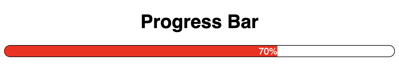
<ProgressBar progress={70} />
div>
);
}Implementation in Angular
Now, let's implement the same progress bar in Angular:
// progress-bar.component.ts
import { Component, Input, OnChanges, SimpleChanges } from '@angular/core';

@Component({
  selector: 'app-progress-bar',
  template: `


        {{animatedProgress}}%


  `,
  styleUrls: ['./progress-bar.component.css']
})
export class ProgressBarComponent implements OnChanges {
  @Input() progress: number = 0;
  animatedProgress: number = 0;

  ngOnChanges(changes: SimpleChanges): void {
    if (changes['progress']) {
      setTimeout(() => {
        this.animatedProgress = this.progress;
      }, 200);
    }
  }
}
The CSS file (progress-bar.component.css):
.outer {
  border: 1px solid black;
  border-radius: 12px;
  overflow: hidden;
}

.inner {
  background-color: red;
  color: white;
  text-align: right;
  transition: 1s ease-in-out;
}
To use this component in an Angular application:
// app.component.ts
import { Component } from '@angular/core';

@Component({
  selector: 'app-root',
  template: `

      Angular Progress Bar Demo


  `,
  styleUrls: ['./app.component.css']
})
export class AppComponent {
  // Additional functionality can be added here
}
Enhancing Your Progress Bar
Regardless of which framework you choose, here are some enhancements you might consider:
1. Add Indeterminate State
For operations where progress can't be determined, add an indeterminate state:
/* Indeterminate animation */
@keyframes indeterminate {
  0% { transform: translateX(-100%); }
  100% { transform: translateX(100%); }
}

.indeterminate {
  width: 100%;
  animation: indeterminate 1.5s infinite linear;
}
2. Add Color Variations
Different colors can convey different meanings:
// React example
const ProgressBar = ({ progress, variant = 'primary' }) => {
  // ...existing code

  return (
    <div className="outer">
      <div
        className={`inner ${variant}`}
        // ...existing attributes
      >
        {animatedProgress}%
      div>
    div>
  );
};
3. Add Buffer Indication
For uploads or streaming operations, a buffer indicator can be useful:
.buffer {
  position: absolute;
  top: 0;
  bottom: 0;
  background: repeating-linear-gradient(
    45deg,
    rgba(255,255,255,0.2),
    rgba(255,255,255,0.2) 10px,
    rgba(255,255,255,0.3) 10px,
    rgba(255,255,255,0.3) 20px
  );
  z-index: 1;
}
Performance Considerations
Both implementations use CSS transitions for animation, which is performant as it leverages the browser's compositor thread. However, be cautious of:
- Frequent Updates: Rapidly changing progress values can cause jank
- Layout Thrashing: Avoid reading layout properties in the same tick as you're writing them
- Mobile Performance: Animations might need to be simplified on lower-powered devices
Accessibility Best Practices
Our implementations already include basic ARIA attributes, but you might also want to:
- Add an accessible label:
aria-label="File upload progress" - Include status updates for screen readers using ARIA live regions
- Consider high contrast modes for users with visual impairments
Conclusion
Progress bars are a seemingly simple UI component that can significantly enhance user experience. Both React and Angular provide robust ways to implement them, with the choice between frameworks often coming down to your existing tech stack or personal preference.
Whether you're using React's hooks or Angular's component architecture, the key is to focus on creating a smooth, accessible experience that keeps your users informed and engaged throughout longer operations.
Remember, the best progress bar is one that users barely notice—it should feel like a natural part of the interface that simply does its job without drawing unnecessary attention.
Happy coding!
