This article was co-authored by: @calyx_426 Charles Nigel Espiloy
Introduction
Every front-end developer knows how dreadful it is to recreate the same UI component across different projects. It might feel great creating a design for elements like buttons, forms, or header at first but it becomes tedious when we create the exact same thing for future projects.
Practically speaking, it's time consuming to rebuild the same line of code from a previous project, consuming a lot of resources that should be dedicated for functionality.
A short building time for a project development is crucial since it saves operation costs from prototyping, revisions, and user testing. This allows us to create different variations of our interface to cater a better end-user experience.
That’s why most, if not all, front-end developers use component libraries to achieve UI needs in consistency and coherency across various projects.
What are component libraries?
Component libraries are collections of already built, UI components like buttons, cards, and forms that follow a consistent design system.
These libraries help developers speed up their front-end development process by providing ready-to-use code components that are functionally robust across various projects.
The main aim of component libraries is to reduce code redundancy, standardize project development, and enforce scalability among different projects. It improves the developer workflow experience because of the following:
- Time Saving Capability: As developers we’re faced with very tight deadlines and having tools to make our workflow efficient is vital while also not compromising the web experience of end-users.
Through component libraries we are able to cut time in component creation, giving more time to focus on the finer details of the website.
- Less Repetition, More Motivation: Repetition, the enemy of frontend developers who hate recreating the same components manually. Repetitiveness tends to make devs become easily bored and out of focus when developing projects, making errors unconsciously in some components affecting the whole project - rebuilding code and thus wasting more resources and time.
Through the use of component libraries that’s centered around the end-user experience, we are able to produce a complete website while also being able to bring more functionality and focus on the technical aspects.
- Guideline to Consistency: Component libraries act as style guides. It dictates the color palettes to use, size of text, and how UI elements behave or interact with each other. If we rewrite the components each time, we are bound to increase the likelihood of deviating from the style we want to achieve
The Problem with Traditional UI Libraries
Traditional Component libraries work by installing packages from NPMs (Node Package Managers), importing the components and using them in projects.
While it’s true that traditional UI Libraries such as Bootstrap or Material-UI provide components that are pre-built that allows users to develop their code quickly, it also has its compromises:
Performance Overhead: Unnecessary styles and scripts are often included in many traditional libraries, using more storage space and may slow down application performance.
Customization Limitation: The libraries mentioned above use a specific design system, focusing more on the ‘out-of-the-box’ components that are already consistent and have a complete feel rather than a base component that the developers can deeply modify. This often time results in developers to override styles or use workarounds to achieve a unique and specific look.
Lock-in Dependency: Completing a projecting using a traditional library enforces devs to stick with that library forever. The problem? When we try to switch to another framework that provides more functions and new features, it might be challenging to switch libraries since some components are heavily dependent on the traditional library’s framework.
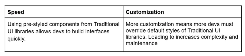
Speed vs Customization
The table down below shows the tradeoffs between speed and customization of traditional UI libraries.
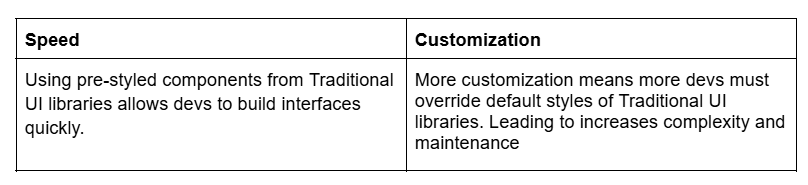
Basically, traditional libraries may speed up development of projects at first, but they become the bottleneck when scaling the projects since extensive modifications may be needed to create a complete, consistent, and coherent product.
Why Customizing NPM Packages Can Be a Hassle
Complex Web of Dependencies: Many NPM packages are built upon layers of dependencies, making it difficult for modifications without breaking functionality.
Risk of Version Clashes: Updating or modifying a package often triggers compatibility problems with other dependencies, creating unwanted complications.
Sparse Documentation: Some packages offer limited guidance for customization, leaving developers no choice but to delve into the source code to find the answers they need.
Rebuild Challenges: Customizing a package frequently requires rebuilding it, which can lead to unforeseen errors, adding more complexity to the process.
Why Shadcn/UI is a Game Changer
Components are not imported as NPM packages
Yes, you heard that right, they are not imported as NPM packages. The components are installed directly into our projects. This will provide you the source code of a component and it lives in your project, allowing you or the developer to have control over the blueprint and can tweak it in any way they want.It uses Tailwind CSS
Tailwind CSS is a utility-first CSS framework that lets us style our JSX by using reusable class names directly to your line of code. It’s fast, consistent, and implementation of Mobile-First Approach in developing a component is easy, and Shadcn uses this framework as its default styling system.
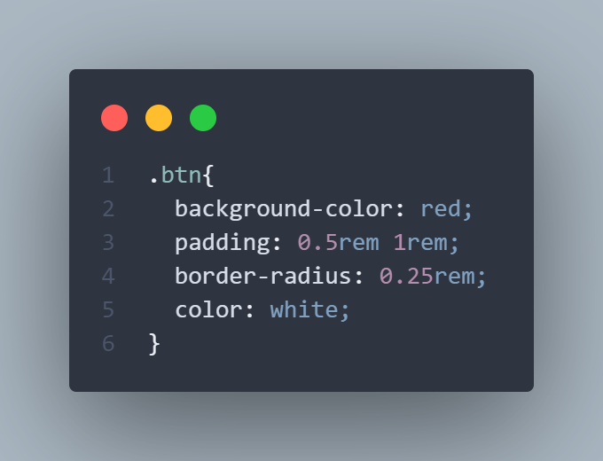
Regular CSS:
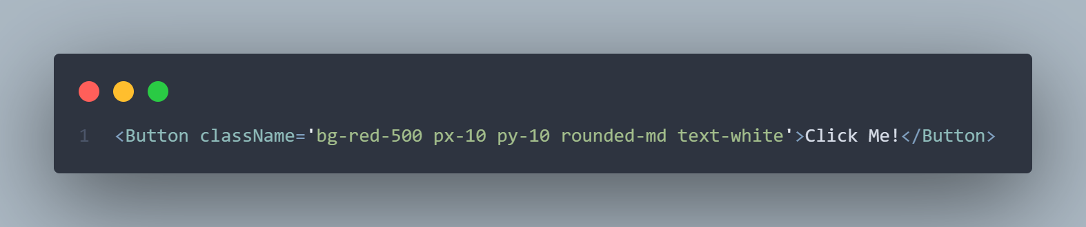
Tailwind CSS:
- Built for React/Next.js Projects Shadcn/UI is built for React and Next.js applications. Shadcn supports React Server Components which works effectively with Next.js App Router, making it a perfect addition to your modern tech stack. Shadcn’s components are written as .tsx files and come with TypeScript support making it easier to catch type errors and improves developer experience.
Benefits of Using Shadcn/UI
1.) Full Customization
- Custom Components: Shadcn/UI allows developers to customize pre-built components to match their application's design system while avoiding excessive dependency.
- Tailwind CSS Integration: With Tailwind CSS, developers can easily override default styles and create unique designs.
- Flexibility: Developers may extend and adapt components for specific design requirements, leading to flexibility and control.
- CSS Variables: Shadcn/UI provides a theming system using CSS variables to promote flexibility and allow for the easy switch between different themes.
2.) Consistent Design
Unified Design Language: By using pre-built components and styles alongside reusable components, Shadcn/UI automatically affords a consistent design language for the application.
Modular Consistency: Shadcn/UI modular design encourages consistent design, simplifying the maintenance of application-level consistency with large-scale applications.
Beautiful Defaults: Shadcn/UI provides good-looking defaults that work on their own design-wise and also form a coherent system with one another.
3.) Streamlined Workflow
Rapid Development: Shadcn/UI permits rapid development, thanks to the hundreds of prebuilt components and the utility-first nature of Tailwind CSS.
Efficient: Developers can quickly access pre-built components and styling, saving time and effort by not recreating them.
Collaborative Efficiency: Shadcn/UI supports collaboration between designers and developers in one UI kit, so everybody speaks the same language.
Streamlined Process: Shadcn/UI smoothens the design-to-code process and bridges the gap between design and development.
Built-In Accessibility: Shadcn/UI keeps accessibility in mind while providing out-of-the-box solutions to ensure that web apps are accessible to as many users as possible.
Getting Started with Shadcn/UI
To use Shadcn/UI in your React/Next.js project, we need to first run the initialize command of shadcn.
In this demonstration, we are going to use mainly Next.js examples.
- Create a Next.js Project First, create a next.js project using these command:
npx create-next-app@latest shadcn-demo
cd shadcn-demo
Note: Make sure to choose Typescript
- Initialize your Shadcn/UI Run shadcn init in your project terminal
npx shadcn@latest init- Adding Components Once the setup of your project is complete, you can start adding Shadcn/UI components by using this command:
Adding of one component:
npx shadcn@latest add buttonThis will only add the Button component and it will be placed inside the /app/components/ui directory by default.
Adding multiple components in one command:
npx shadcn@latest add button card input sheetThis one-liner command installs the Button, Card, Input, and Sheet components all at once in the same directory, then you're all set to start using Shadcn!
Building a Modal: Plain CSS vs Shadcn UI Workflow
In this comparison, we'll show the building of a simple modal dialog using these two approaches. This will help highlight their differences in development speed, and customization.
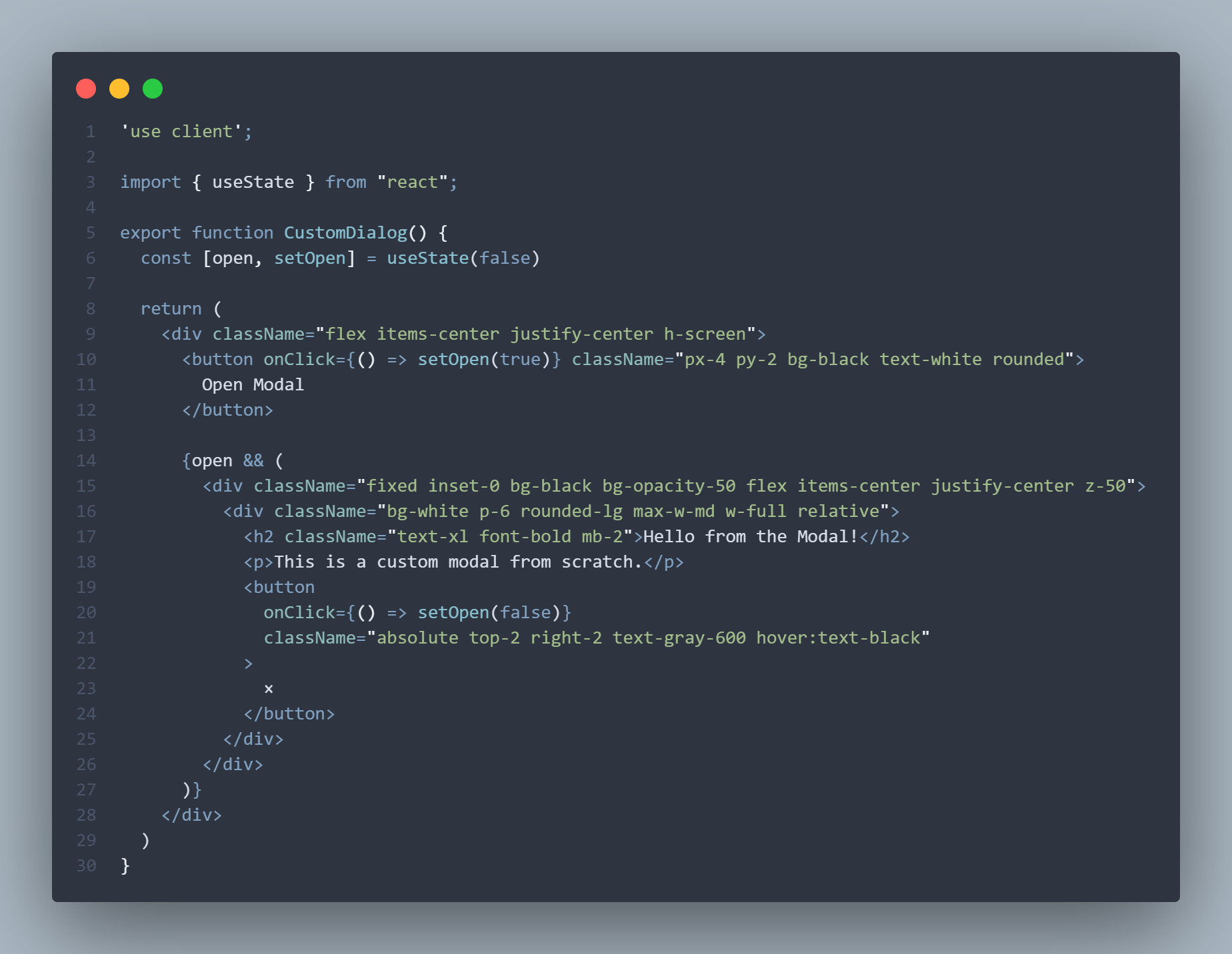
- Modal Dialog Using Plain CSS

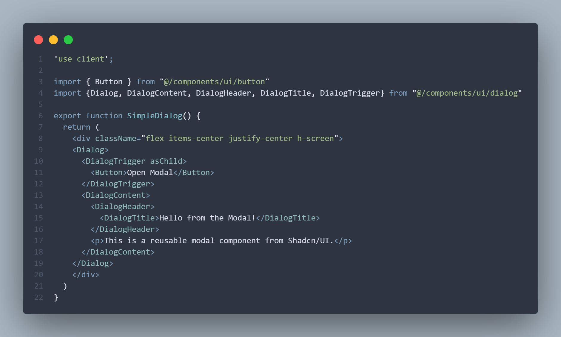
- Modal Dialog using Shadcn/UI:
- Below is a side-by-side look at their differences
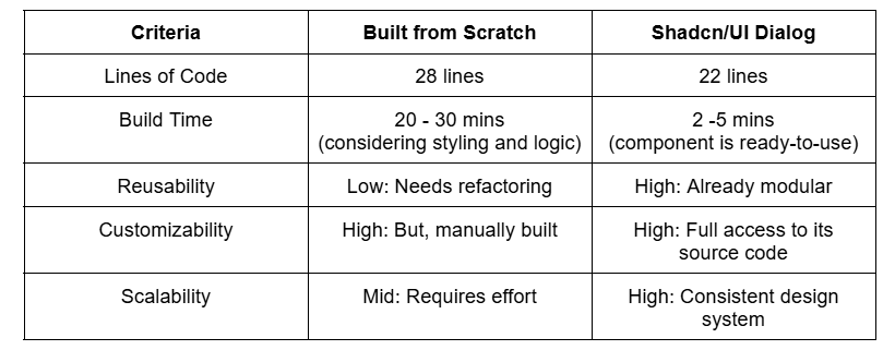
It's true that making the modal dialog from scratch gives you full control of the CSS. However, it's also clear that Shadcn/UI significantly speeds up the process by providing ready-to-use components.
How to Customize a Shadcn/UI Component?
Open the component source code in your project.
It should be inside the components folder, here's the usual path to your component file /app/components/ui/button.tsx . We are going to use the button component as an example.Customize its style
Since the code is not precompiled, you can directly modify a component's class names (tailwind css), props/variants, and even their behavior (eg. hover effects, animation).Inside the code, locate this variant of the button
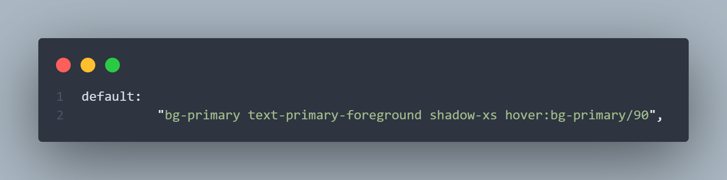
As you can see, the default style of the button has background-primary, text-primary, hover:bg-primary/50. We can style the button by modifying these tailwind styles that are already used by the button.
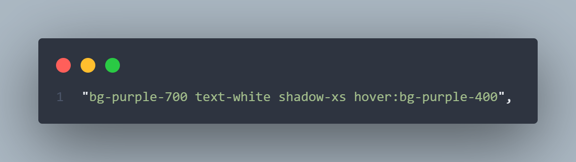
Another way to customize Shadcn components is modifying its tailwind class name when the button is already used, no need to touch the original source file. This is a great way to customize how a button looks in one place, without worrying about breaking or changing the rest of your UI.
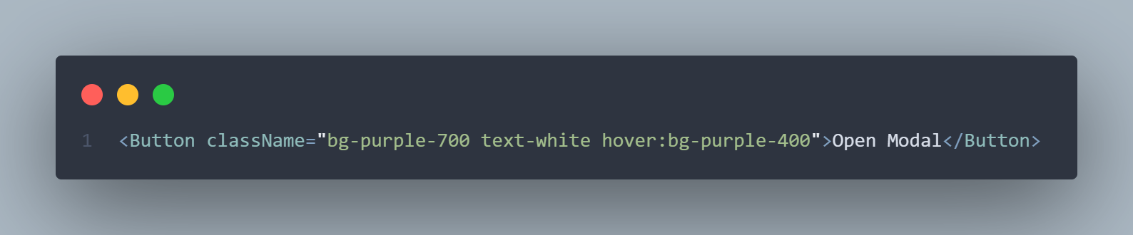
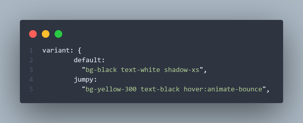
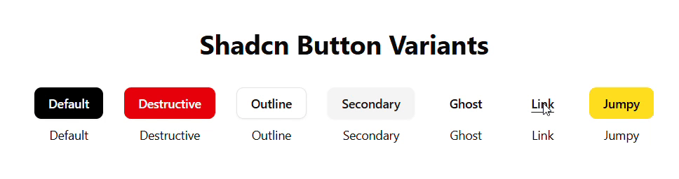
- Adding Custom Variants If you really want a new variant of a button, you can always add a new one inside the original source code. Props are a way of passing data configuration to a component. And a variant is a type of prop used to change the style of a component.
Let's start with opening the button.tsx again. Suppose you want to create a yellow button that has jumping animation on hover. Here's how you can create that variant.
The variant name is jumpy:
Conclusion
To sum up the article we can say how Shadcn/UI:
Installs directly into your project as simple, ready-to-use components-no more wrestling with external dependencies or heavy theming layers that comes with traditional libraries.
Uses Tailwind CSS by default, so you can leverage your existing utility‑first workflow and design tokens from day one.
Is built specifically for React and Next.js, offering first‑class support for TypeScript, server‑side rendering, and seamless integration with your favorite frameworks.
Shadcn/UI is an amazing tool that's more than another run of the mill UI library–it strikes a balance between flexibility and performance. By integrating headless components with stunning, customizable styles right out of the box, it allows developers to create classy interfaces without compromising control.
Whether you're rapidly prototyping or refining production-ready apps, Shadcn/UI streamlines your workflow and enables you to focus on what truly matters: building amazing end user experiences.
Thank you for reading! Happy Coding! 🚀
You can access the source codes of the examples here:

ShadCN Demo
This repository contains example code used in my article to demonstrate and compare building UI components from scratch versus using ShadCN UI.
It also shows how to customize ShadCN components and extend them with variants to fit real-world design needs.
🔍 What You'll Find Here
This repo showcases:
- A comparison between handcrafted UI components and ShadCN components
- How to customize ShadCN components with Tailwind CSS
- How to add and manage variants using ShadCN's utility-based approach
- Clean and responsive UI patterns using modern frontend tools
If you're following along with the article, this is the companion repo to reference the source code and explore how everything works under the hood.
🛠️ Tech Stack
- Framework: Next.js
- UI Components: ShadCN UI
- Styling: Tailwind CSS
- TypeScript for type safety
🚀 Getting Started
To run the examples locally:
# Clone the repo
git clone https://github.com/maksdeb-g/shadcndemo.git
# Navigate into the
…