Overview
CSS Custom Properties (also popularly called CSS Variables). Variables that can be updated and altered dynamically in the file. While we had “variables” with pre/post-processors (like Sass and PostCSS), these “variables” got compiled into CSS and didn’t have dynamic capabilities to update their content. This isn’t true with CSS variables, which truly store updateable values.
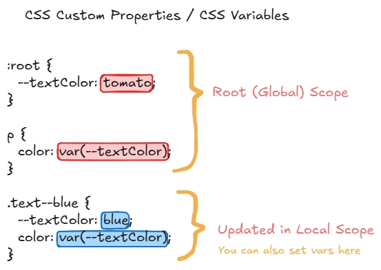
The way you set CSS variables is with a pre-pended -- and the way you access them is via var(--varName). In a very elemental way, you can write the following to use a CSS variable that declares the text colour to be yellow:
span {
  --color: yellow;
  color: var(--color);
}
CSS Variables
Let's talk about why dynamic CSS variables are much better than what we used before.
Dynamic JavaScript + CSS
With CSS variables, we can now more easily update values that we determine through JavaScript. This means we don’t have to use inline property styles or update class names. We can simply pass values into our CSS variables instead.
To pass values into the :root, one can do the following:
document.documentElement.style.setProperty('--varName', 'propValue')This writes and/or updates the value to the root of your CSS file. So, if I wanted to update the width of a loader bar to represent the percentage of load time, I could do something like this:
function calculateProgress() {
  let progress = 0;

  // Implement the update progress here.

  return progress;
}

// Set width of progress bar
document.documentElement.style.setProperty('--progressBarWidth', calculateProgress());
Dynamic Property Fragments
Another note that’s really cool about CSS variables is how specific we can get within property values. While we previously had to use separate declarations for border properties, we now can use variables to update any portion of a property, including shorthand properties like the border and properties that accept an unknown argument list like drop-shadow and gradients.
.button-gradient {
  background: linear-gradient(var(--gradientAngle), var(--gradientStart), var(--gradientStop));

  --gradientAngle: 60deg;
  --gradientStart: lightpink;
  --gradientStop: lightyellow;
}

.button-gradient:hover {
  --gradientAngle: 0deg;
}
We’re updating the --gradientAngle and not the entire background property. We can also do this with JavaScript and update these values as the user interacts with any element 😎.
Cleaner Components
CSS variables also allow us to write modular code with modifiers in a cleaner way. A typical example for components are multi-style buttons, so let’s stick with those.
Traditionally, with a naming convention like BEM, we would set classes via a pre/post processor, and then make modifier classes to override the base classes:
// Variables:
$primaryColor: lightgreen;
$buttonBgColor: $primaryColor;

// Base Class:
.button {
  background: $buttonBgColor;
  // Other properties.
}

// Modifier Class:
.button--blue {
  background: lightblue;
}
In the example above, we’re writing a property to override a previously stated property, increasing specificity, file weight, and cluttering our codebases. But with CSS Variables, we no longer need to override entire base style properties. We just update their variables.
It can look something like this:
/* Variables: */
:root {
  --primaryColor: lightgreen;
  --buttonBgColor: var(--primaryColor);
}

/* Base Class: */
.button {
  background: var(--buttonBgColor);
}

/* Modifier Class: */
.button--blue {
  --buttonBgColor: lightblue;
}
Better with Local Scope
This is a great way to set global variables, but isn’t a necessity. CSS variables don’t need to be declared only in the :root—they can be declared at any point in the CSS file, and live within the scope at which point they are specified. This is similar to JavaScript variables instantiated with the let keyword, which take the scope of their containing block ({}) (aka block scope). So we can leverage this specificity in our component styling declarations.
Leveraging CSS Variable scope improves the size, specificity, & semantics of our stylesheets. That’s a lot of alliteration!
For example, --buttonBgColor isn’t something we needed to put in :root as a global variable (in the earlier example). A cleaner approach would be to rename that variable to just --bgColor and place it within the component. This makes it more tightly coupled with its parent component, and makes more semantic sense in its ordering within the CSS file.

CSS Custom Properties are scoped to their containing blocks (
{}), just like JavaScript variables instantiated with the let keyword.
A good general rule is as follows: Use local CSS variables until you need a global variable. Then, work your way up the tree. This reduces a massive list of CSS variables from piling up in your :root and makes the code much cleaner when building design systems and custom properties.
Organization & Example
With Sass, we can extend this idea use the nested & to rewrite it a little bit cleaner and more visually object-oriented. This is where we can see a neat structure emerging, broken up by:
- Default styles (property specification)
- Default values (base variables)
- Variances (updated variables)
.button {
  // 1. Default Styles:
  background: var(--bgColor);
  padding: var(--size);
  line-height: var(--size);
  border: var(--outline);
  font-size: var(--size);

  // 2. Default Values:
  --bgColor: lightgreen;
  --outline: none;
  --size: 1rem;

  // 3. Variances:
  &--blue {
    --bgColor: lightblue;
  }

  &--pink {
    --bgColor: hotpink;
  }

  &--large {
    --size: 1.5rem;
  }

  &--outlined {
    --outline: 2px solid currentColor;
  }
}
Note: We can and should still leverage :root for global variables, like base colour styling and sizing resets, but locally scoped variables reduce specificity, thereby reducing size, and also increase semantics.
Default Values
It’s also interesting to note that you can use default values to stub variables in case they don’t exist yet. var() gives us this capability by accepting two arguments (and can be nested within itself). In the example below, if --bgColor is not defined, the card will take the primary colour (red). So we can potentially remove step 2 from the base style for .button and just update --bgColor in the modifiers (if we wanted the base button to be the primary colour).
/* 0. Set global variables here: */
:root {
  --colorPrimary: red;
}

.button {
  /* 1. Default Styles: */
  /* If --bgColor is not defined, the background will be the fallback: red. */
  background: var(--bgColor, var(--colorPrimary));

  /* 2. Default Values: */
  /* Since --bgColor is defined, the button remains lightgreen. */
  /* If the line below was missing, the button would be red. */
  --bgColor: lightgreen;

  /* ... */
}
Theming with the Trailing &
If we have more complex components, we can still use this technique, and to make it even more concise, we can combine this with a CSS preprocessor like Sass. Theming buttons inside of card components using the Sass trailing ampersand technique can work like so:
.button--large {
  .card & {
    --size: 1.7rem;
  }
}
This would make all large buttons have a slightly bigger --size within a card component than they would in any other place. The trailing ampersand allows us to style directly within the element block and outputs to:
.card .button--large {
  --size: 1.7rem;
}class="card">
class="button button--pink button--large">
Large Pink ButtonAfter applying the code above, we can see that the big pink button has become even bigger on our improvised card.
Support ❤️
It took a lot of time and effort to create this material. If you found this article useful or interesting, please support my work with a small donation. It will help me to continue sharing my knowledge and ideas.
Make a contribution or Subscription to the author's content: Buy me a Coffee, Patreon, PayPal.
