This post was originally published at thedevspace.io. Everything you need to master web development, all in one place.
For more complex layouts, you can opt to use a grid system.
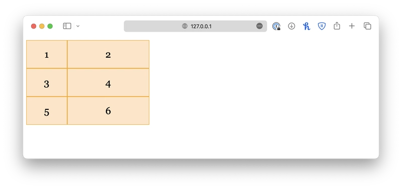
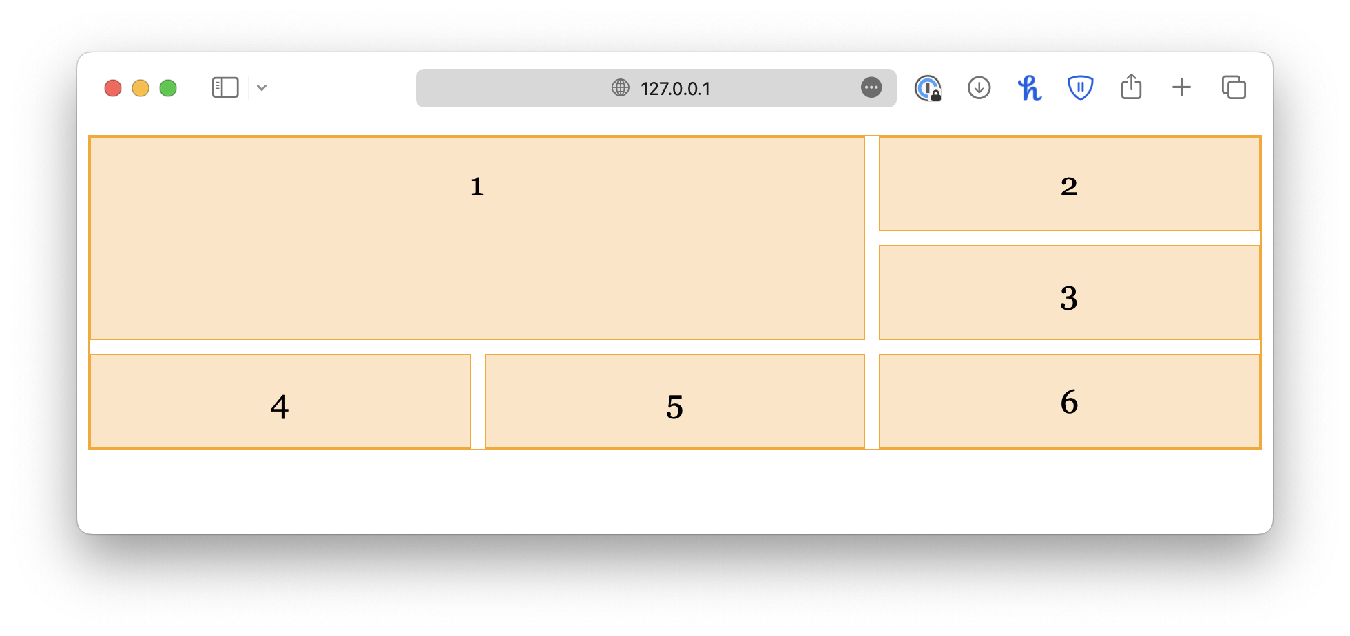
A grid layout consists of a grid container and several grid items. The grid container must have its display property set to grid or inline-grid. grid creates a block-level container, and inline-grid creates an inline-level container.
class="container">
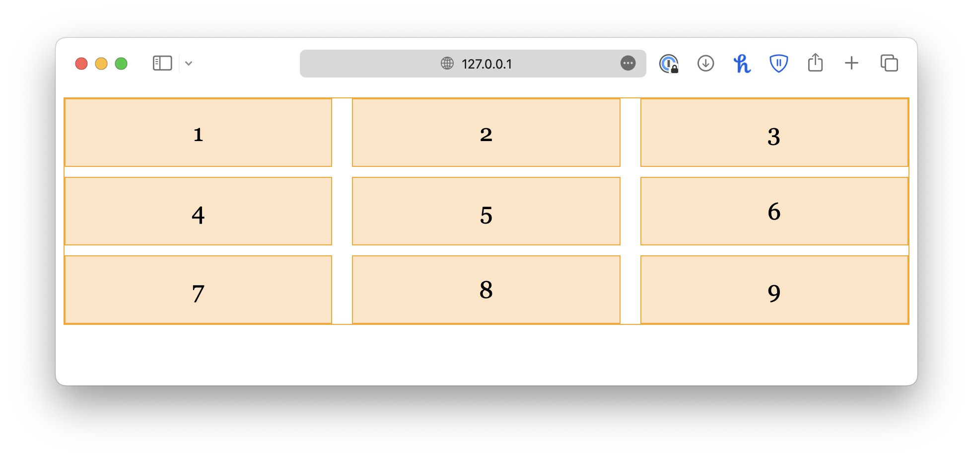
class="item">1
class="item">2
class="item">3
class="item">4
class="item">5
class="item">6.container {
display: grid;
}All direct children of this container will automatically become grid items.
Grid columns
Hint: You can edit this CodePen demo directly.
You can then specify how many columns you wish to create using the grid-template-columns property. The property accepts any number of values. The number of values determines the number of columns, and the value itself determines the size of that column. For example:
.container {
  display: grid;
  grid-template-columns: 100px 200px;
}.item {
font-family: Georgia, "Times New Roman", Times, serif;
font-size: x-large;
text-align: center;
padding: 20px;
border: 1px solid orange;
background-color: bisque;
}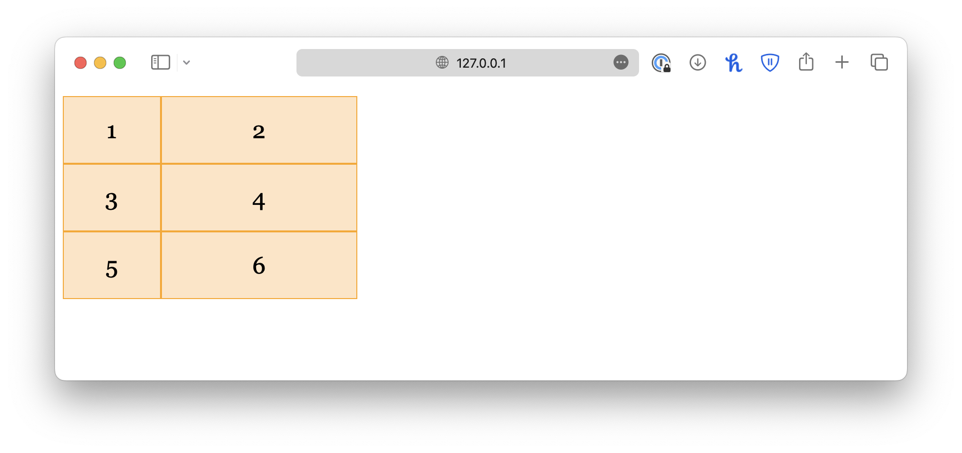
In this example, we created two columns, the first one is 100px wide, and the second one is 200px wide. If you want more columns, simply add more values.
.container {
  display: grid;
  grid-template-columns: 100px 200px 50px;
}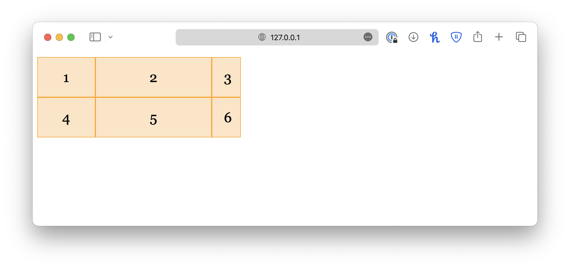
If you want all columns to be equal in size, set the value to auto.
.container {
  display: grid;
  grid-template-columns: auto auto auto;
}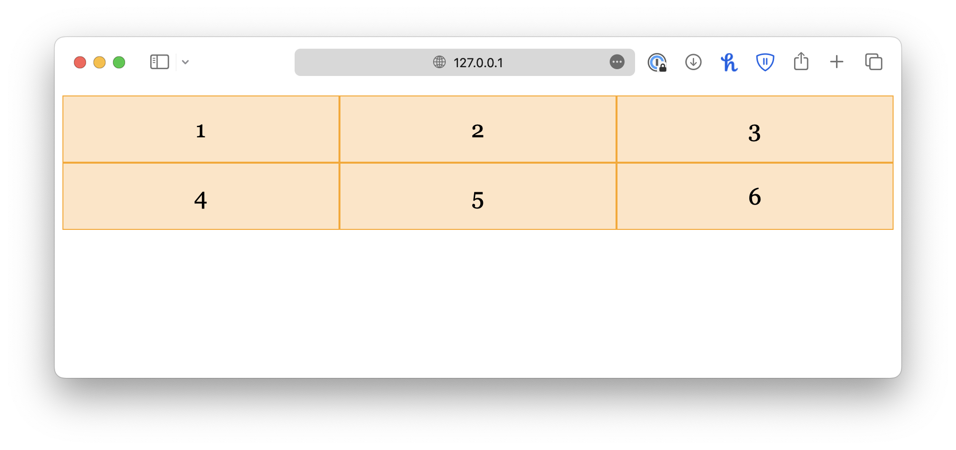
This will allow the browser to choose an appropriate column size to fill the parent container.
Grid rows
The grid rows, on the other hand, are created automatically. You can define row sizes using the grid-template-rows property.
.container {
  display: grid;
  grid-template-columns: auto auto auto;
  grid-template-rows: 100px 150px;
}
However, this property does not determine the number of rows in the grid. It only controls the row height. If you specify extra values, they will be ignored.
This is because, by default, the grid items will flow horizontally, meaning they will fill the first row, and if there is insufficient space, the remaining items will be moved to the second row, and so on.
Grid flow
This default behavior is a bit problematic because sometimes, you only know how many rows you want, and you need the browser to create the columns automatically. In this case, you can change the flow direction of the grid items by setting grid-auto-flow to column.
Next, you can configure the gird rows, and this time, you can define the number of rows, as well as their sizes. The columns, on the other hand, will be created automatically.
.container {
  display: grid;
  grid-auto-flow: column;

  grid-template-rows: 100px 100px;
  grid-template-columns: 100px 200px 300px;
}
The grid template shorthand
Lastly, grid-template is a shorthand property for grid-template-columns and grid-template-rows with the following syntax:
grid-template: ... / ...;.container {
display: grid;
grid-template: 100px 150px / auto auto auto;
}
Grid gaps
When designing a webpage, it is good to leave some space between elements so that they are not too close to each other. By using the grid layout, you can easily add equal spacing between the grid items instead of micromanaging their individual margin. For example:
.container {
  display: grid;
  grid-template-columns: auto auto auto;
  row-gap: 10px;
  column-gap: 20px;
}
Alternatively, you may use the shorthand property, gap:
.container {
  display: grid;
  grid-template-columns: auto auto auto;
  gap: 10px 20px;
}
If you want equal spacing for columns and rows, give a single value:
.container {
  display: grid;
  grid-template-columns: auto auto auto;
  gap: 10px;
}
Spanning over multiple columns
You can also customize individual grid items using CSS. In a real-life scenario, it is common for one grid item to take up multiple columns or rows. For example, you can define an item to span multiple columns by specifying a start point (grid-column-start) and an end point (grid-column-end).
class="container">
   class="item-2col">1
   class="item">2
   class="item">3
   class="item">4
   class="item">5
   class="item">6
   class="item">7
class="item">8.item-2col {
grid-column-start: 1;
grid-column-end: 3;
}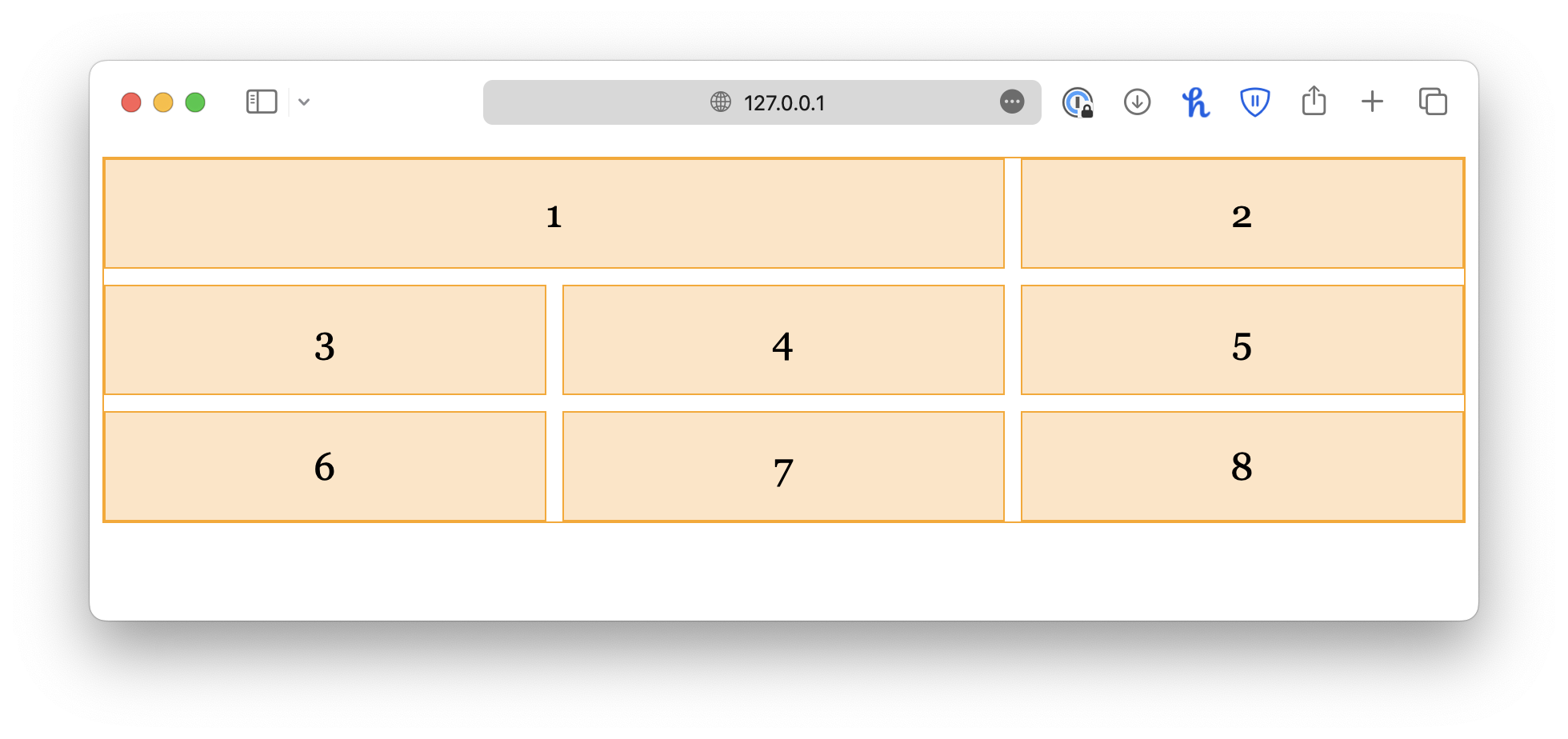
Keep in mind that the numbers refer to the column line, not the column itself, as shown in the chart below.
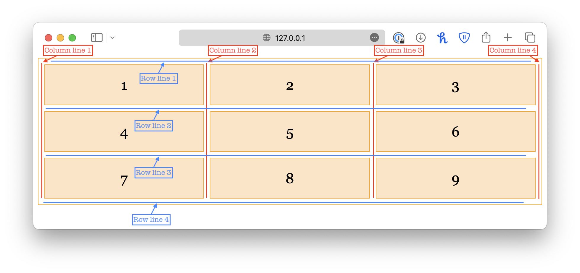
As a result, for an item to span over two columns, it should start from 1 and end with 3.
You can also use the shorthand property grid-column:
.item-2col {
  grid-column: 1 / 3;
}
Or use span:
.item-2col {
  grid-column: span 2;
}

.item-3col {
  grid-column: span 3;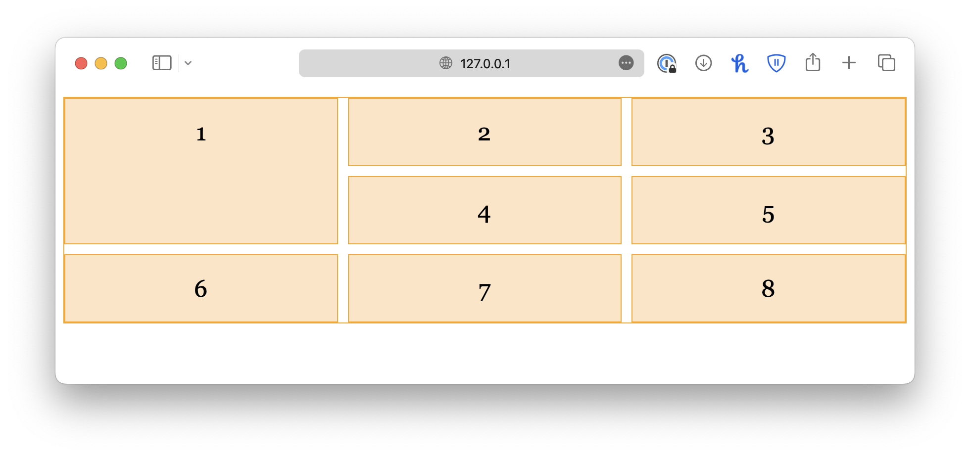
}Spanning over multiple rows
.item-2row {
  grid-row-start: 1;
  grid-row-end: 3;
}

/* or shorthand */
.item-2row {
  grid-row: 1 / 3;
}
Spanning over an area
.item-area {
  grid-area: 1 / 1 / 3 / 3;
}
Nested grid systems
You can even nest grids for complex layouts. This helps maintain structure and consistency.

Read More
- How to Build a Web App with JavaScript
- Learn about Network and HTTP in JavaScript
- How to Add Box Shadow Using CSS
Follow us for more web development tutorials:
🔹 TheDevSpace | LinkedIn
🔹 TheDevSpace | X
🔹 TheDevSpace | Threads
