Master these three React design patterns to write scalable, reusable, and maintainable code with detailed explanations and practical examples! 🌟
React’s component-based architecture is a game-changer for building dynamic user interfaces, but as applications grow, so does complexity. Design patterns offer reusable solutions to common challenges, helping you write cleaner, more maintainable code. In this post, we’ll explore three essential React design patterns: Recursive Components 🌳, Partial Components 🛠️, and Composition 🧩. We’ll dive deep into each pattern with detailed explanations, practical examples, and visual aids to ensure clarity.
1. Recursive Components: Simplifying Nested Data Structures 🌳
Recursive components are perfect for rendering hierarchical or nested data, such as JSON objects, file directories, or comment threads. By having a component call itself, you can elegantly handle complex, nested structures without repetitive code. 🔄
How It Works
A recursive component processes data by:
- Checking if the input data is a primitive (e.g., string, number) or an object.
- Rendering primitives directly as leaf nodes.
- For objects, iterating over key-value pairs and recursively rendering each value.
This approach mirrors the recursive nature of the data, making the code concise and maintainable. ✅
Example: Rendering a Nested Object 📋
Here’s a component that renders a nested JavaScript object as a nested HTML list:
const isValidObj = (data) => typeof data === "object" && data !== null;

const Recursive = ({ data }) => {
  if (!isValidObj(data)) {
    return <li>{data}li>;
  }

  const pairs = Object.entries(data);
  return (
    <>
      {pairs.map(([key, value]) => (
        <li key={key}>
          {key}:
          <ul>
            <Recursive data={value} />
          ul>
        li>
      ))}
    >
  );
};

const myNestedObject = {
  key1: "value1",
  key2: {
    innerKey1: "innerValue1",
    innerKey2: {
      innerInnerKey1: "innerInnerValue1",
      innerInnerKey2: "innerInnerValue2",
    },
  },
  key3: "value3",
};

function App() {
  return <Recursive data={myNestedObject} />;
}
Detailed Explanation 📚
-
Base Case: The
isValidObjfunction checks ifdatais an object (and not null). Ifdatais a primitive (e.g.,"value1"), it’s rendered as aelement, stopping the recursion. 🛑 -
Recursive Case: If
datais an object,Object.entriesconverts it into an array of[key, value]pairs. For each pair, the component renders the key and a nested -
Key Prop: The
keyprop ensures React efficiently updates the DOM by uniquely identifying each. 🔑 -
Output: The nested object is rendered as a nested
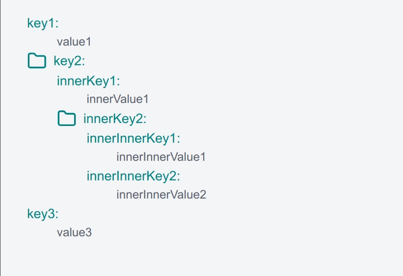
Visualizing the Recursion 📊
To better understand, here’s a diagram of how the myNestedObject is processed:
myNestedObject
├── key1: "value1" → key1: value1
├── key2: { ... } → key2:
│   ├── innerKey1: "innerValue1" → innerKey1: innerValue1
│   └── innerKey2: { ... } → innerKey2:
│       ├── innerInnerKey1: "innerInnerValue1" → innerInnerKey1: innerInnerValue1
│       └── innerInnerKey2: "innerInnerValue2" → innerInnerKey2: innerInnerValue2
└── key3: "value3" → key3: value3
This tree-like structure shows how each level of the object is recursively processed, resulting in a nested HTML list. 🌲
Use Cases 💡
- Rendering nested menus or dropdowns. 📜
- Displaying threaded comments in a discussion forum. 💬
- Visualizing JSON data for debugging or user interfaces. 🖥️
Benefits 🎉
- Simplifies code for complex, nested data.
- Eliminates the need for multiple components to handle different levels of nesting.
- Scales well with varying data depths.
2. Partial Components: Reusing Components with Predefined Props 🛠️
Partial components allow you to create specialized versions of a component by predefining some of its props. This pattern is ideal for reusing components with consistent configurations, reducing duplication and ensuring uniformity. 🔧
How It Works
A higher-order component (HOC) wraps the base component and injects predefined props. The returned component merges these predefined props with any additional props passed during usage, offering flexibility and reusability. 🔄
Example: Customizable Buttons 🎨
Let’s create a Button component and derive specialized versions using the partial pattern:
const partial = (Component, partialProps) => {
  return (props) => {
    return <Component {...partialProps} {...props} />;
  };
};

const Button = ({ size, color, text, ...props }) => {
  return (
    <button
      style={{
        fontSize: size === "large" ? "25px" : "16px",
        backgroundColor: color,
      }}
      {...props}
    >
      {text}
    button>
  );
};

const SmallButton = partial(Button, { size: "small" });
const LargeRedButton = partial(Button, { size: "large", color: "crimson" });

// Usage
function App() {
  return (
    <>
      <SmallButton text="Click Me" color="blue" />
      <LargeRedButton text="Submit" />
    >
  );
}
Detailed Explanation 📖
-
HOC Definition: The
partialfunction takes aComponentandpartialProps(the predefined props). It returns a new component that spreadspartialPropsand any additionalpropsonto the original component. 🔗 -
Prop Merging: The spread operator (
...) ensures that props passed at runtime (e.g.,color="blue") can override or supplement the predefined props. 🔄 -
Specialized Components:
SmallButtonalways hassize="small", whileLargeRedButtonhassize="large"andcolor="crimson". Both can accept additional props liketextoronClick. 🛠️ -
Output:
Why Use Partial Components? 🤔
-
Consistency: Ensures components share common configurations (e.g., all
SmallButtons have the same size). ✅ - Reusability: Reduces the need to repeatedly specify the same props. 🔄
- Flexibility: Allows customization through additional props. 🌈
Use Cases 💼
- Creating branded buttons (e.g., primary, secondary, danger). 🎨
- Standardizing form inputs with default styles or behaviors. 📝
- Reusing UI elements across different parts of an application. 🏗️
3. Composition: Building Flexible Components 🧩
Composition is a core React principle that involves combining smaller components to create more complex ones. Unlike inheritance, composition promotes flexibility by allowing components to be layered and customized through props. 🛠️
How It Works
A parent component passes props to a child component, which may itself be composed of other components. This creates a chain of components that build on each other, enabling reusable and modular UI elements. 🔗
Example: Composing Button Variants 🎨
Let’s create a Button component and compose it to create specialized variants:
const Button = ({ size, color, text, ...props }) => {
  return (
    <button
      style={{
        fontSize: size === "large" ? "25px" : "16px",
        backgroundColor: color,
      }}
      {...props}
    >
      {text}
    button>
  );
};

const SmallButton = (props) => {
  return <Button {...props} size="small" />;
};

const SmallRedButton = (props) => {
  return <SmallButton {...props} color="crimson" />;
};

// Usage
function App() {
  return (
    <>
      <SmallButton text="Cancel" color="blue" />
      <SmallRedButton text="Delete" />
    >
  );
}
Detailed Explanation 📚
-
Base Component: The
Buttoncomponent acceptssize,color, andtextprops, rendering a styled. 🖌️ -
First Layer:
SmallButtoncomposesButtonby settingsize="small". It passes through all other props using the spread operator. 🔄 -
Second Layer:
SmallRedButtoncomposesSmallButtonby addingcolor="crimson". It also passes through any additional props. 🔗 -
Prop Flow: Props passed to
SmallRedButton(e.g.,text="Delete") flow throughSmallButtontoButton, ensuring flexibility. 🌊 -
Output:
Why Use Composition? 🤔
- Modularity: Breaks down complex components into smaller, reusable pieces. 🧩
- Flexibility: Allows layering of functionality without rigid inheritance. 🌈
- Maintainability: Makes it easier to update or replace individual components. 🔧
Use Cases 💡
- Building a library of UI components with progressive customization. 📚
- Creating complex layouts with reusable header, footer, and sidebar components. 🏛️
- Structuring forms by composing inputs, labels, and buttons. 📝
Comparing the Patterns 📊
| Pattern | Best For | Key Benefit | Example Use Case |
|---|---|---|---|
| Recursive Components 🌳 | Nested or hierarchical data | Simplifies complex rendering | Rendering JSON or comment threads |
| Partial Components 🛠️ | Reusing components with defaults | Ensures consistency and reusability | Standardized buttons or inputs |
| Composition 🧩 | Building modular UIs | Promotes flexibility and modularity | Layered UI components or layouts |
Conclusion 🎉
Mastering React design patterns like Recursive Components 🌳, Partial Components 🛠️, and Composition 🧩 can transform how you build applications. Recursive components simplify nested data rendering, partial components streamline reusable configurations, and composition enables flexible, modular UIs. By incorporating these patterns, you’ll write code that’s not only cleaner but also scalable and maintainable. 🚀
Experiment with these patterns in your next React project, and see how they improve your workflow. Which pattern are you most excited to try? Share your thoughts or questions in the comments below! 💬