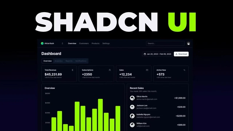
The landscape of frontend development is constantly evolving, especially when it comes to UI components. For years, we've juggled comprehensive libraries like Material UI, Ant Design, or Chakra UI. They offer a wealth of pre-built components, but often come with trade-offs: heavy bundle sizes, complex style overrides, and a feeling of being locked into their specific ecosystem and design opinions. Then came Shadcn/ui, and for many developers like myself, it fundamentally changed the game.

Shadcn/ui isn't a component library in the traditional sense. It's better described as a curated collection of beautifully designed, highly reusable UI primitives and components built using Radix UI for behaviour and accessibility, and Tailwind CSS for styling. The magic lies in its approach: you don't install it as a dependency. Instead, you use its CLI tool to copy the actual component code directly into your project. This means you own the code. You can tweak, modify, and style it exactly as you need, without fighting against library internals or complex specificity rules.
This approach offers incredible flexibility, promotes understanding of the underlying code, and keeps your application lean by only including what you actually use. It perfectly blends the power of well-architected primitives (thanks to Radix) with the utility-first styling prowess of Tailwind CSS. After integrating Shadcn/ui into several projects, a set of core components has emerged as my absolute go-to toolkit. These aren't just functional; they are elegant, accessible, and drastically speed up development while maintaining high quality.
Here are the top 10 Shadcn/ui components I find myself reaching for again and again:
1. The Humble Hero: Button
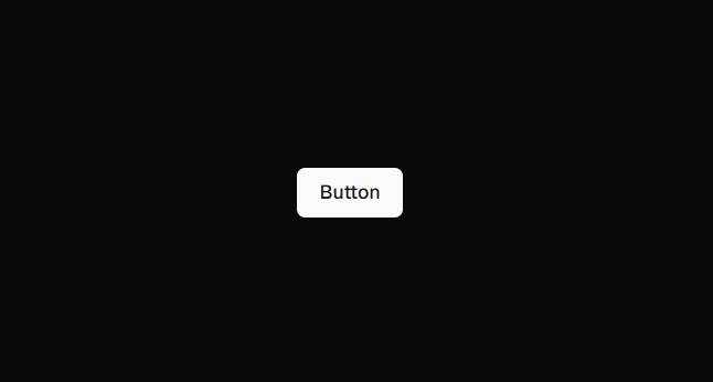
It might seem basic, but a solid Button component is the bedrock of any UI. Shadcn's Button is exemplary.
- Why it's great: It comes pre-configured with sensible defaults and several useful variants out-of-the-box:
default,destructive,outline,secondary,ghost, andlink. It also includes size variations. This covers probably 95% of button styling needs immediately. - Common Use Cases: Submit actions, navigation links styled as buttons, triggering modals, confirmation actions, secondary actions – literally anywhere user interaction is required.
- Shadcn Advantage: The
asChildprop is a game-changer. It allows you to compose theButtonwith other elements, like a Next.js, inheriting the button's styling while retaining the child's functionality (e.g., client-side routing). This avoids awkward workarounds or redundant styling. Because you own the code, adding a new custom variant (likepremiumorwarning) is as simple as adding a few lines to the component's file and defining the corresponding Tailwind classes in thevariantsconfiguration.
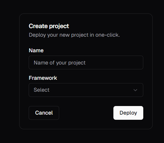
2. Focused Interaction: Dialog
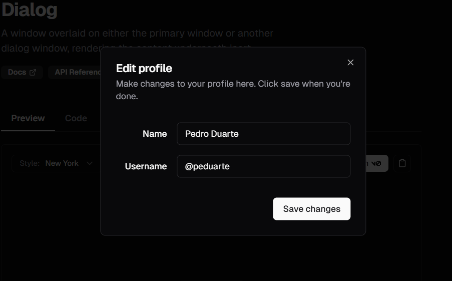
Modals or dialog boxes are essential for focused tasks, confirmations, or displaying critical information without navigating away from the current context. Shadcn's Dialog component, built on Radix UI's Dialog primitive, is superb.
- Why it's great: It handles all the tricky accessibility concerns automatically: focus trapping (keeping keyboard navigation within the modal), closing via the Escape key, and proper ARIA attributes for screen readers. The styling is clean and easily customizable.
- Common Use Cases: Confirmation prompts ("Are you sure you want to delete?"), displaying forms for quick edits or creation (like adding a new item), showing detailed information, login/signup forms.
- Shadcn Advantage: Its compositional nature (
DialogTrigger,DialogContent,DialogHeader,DialogTitle,DialogDescription,DialogFooter,DialogClose) makes it incredibly flexible. You structure the dialog exactly how you need it using these building blocks. This is far more intuitive than passing complex configuration objects to a monolithic modal component.
3. The Foundation of Forms: Input
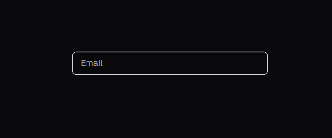
No web application is complete without forms, and the Input component is the most fundamental building block.
- Why it's great: Shadcn's
Inputprovides a consistently styled, simple text input based on standard HTML. It integrates seamlessly with Tailwind for easy adjustments to padding, borders, focus states, etc. - Common Use Cases: Text fields, email inputs, password fields, search bars.
- Shadcn Advantage: While simple, its strength lies in consistency and easy customization via Tailwind utilities directly in your project. It pairs beautifully with the
Labelcomponent (also recommended) for accessible forms and integrates perfectly with theFormcomponent pattern (see #10). You're not fighting predefined styles; you're applying standard Tailwind classes.
4. Structuring Content: Card
Cards are ubiquitous in modern UI design, used to group related information into a digestible, visually distinct block.
- Why it's great: The
Cardcomponent provides a structured container with optional, pre-styled sub-components:CardHeader,CardTitle,CardDescription,CardContent, andCardFooter. This encourages consistency in how you present information blocks. - Common Use Cases: Displaying user profiles, product summaries, blog post previews, feature blocks on a landing page, dashboard widgets.
- Shadcn Advantage: Composition is key here. You only use the parts you need (
CardHeader,CardContent, etc.), keeping the markup clean. Customizing the spacing, borders, and background is trivial using Tailwind classes directly on the components within your project'scard.tsxfile.
5. Actions and Options: DropdownMenu
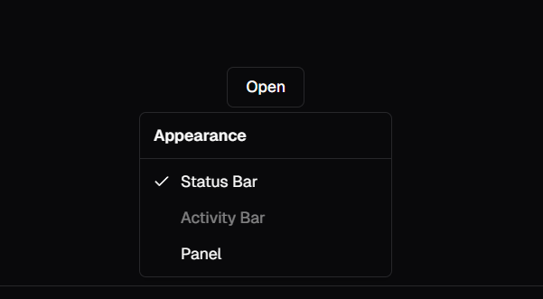
When you need to present a list of actions or options related to a specific element without cluttering the main interface, the DropdownMenu is invaluable.
- Why it's great: Built on Radix UI's accessible Dropdown Menu primitive, it handles keyboard navigation, focus management, and screen reader support flawlessly. It supports nested submenus, separators, checkbox items, and radio groups within the menu.
- Common Use Cases: User profile menus (Settings, Logout), action menus on list items (Edit, Delete, View), selection options for components.
- Shadcn Advantage: The declarative API using components like
DropdownMenuTrigger,DropdownMenuContent,DropdownMenuItem,DropdownMenuSeparator,DropdownMenuSub, etc., makes complex menus easy to construct. Customizing the appearance via Tailwind feels natural and straightforward.
6. Displaying Data: Table
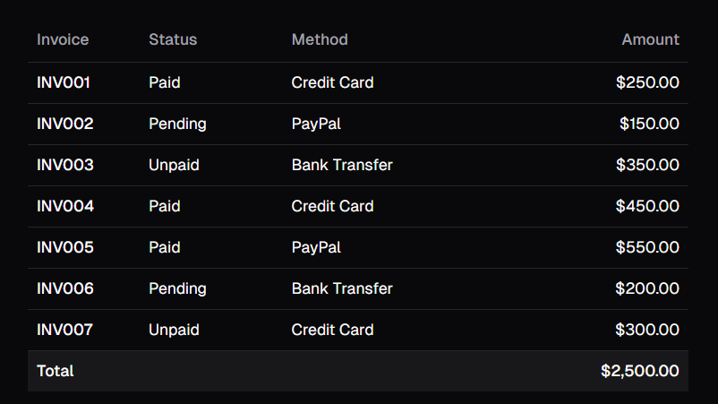
Displaying tabular data is a core requirement for many applications, especially dashboards and admin panels. Shadcn's Table component provides a clean, styled foundation.
- Why it's great: It leverages standard HTML table elements (
,
,,, , ) but applies consistent Tailwind styling via composable components: Table,TableHeader,TableBody,TableFooter,TableRow,TableHead,TableCell,TableCaption.- Common Use Cases: Displaying lists of users, orders, logs, financial data, feature comparisons.
- Shadcn Advantage: Because it uses standard HTML elements wrapped in styled components, it remains flexible. You can easily integrate sorting, filtering, or pagination libraries. The styling is applied via Tailwind classes within the component files, making adjustments (like adding zebra striping, hover effects, or changing cell padding) simple and direct.
7. Organizing Sections:
Tabs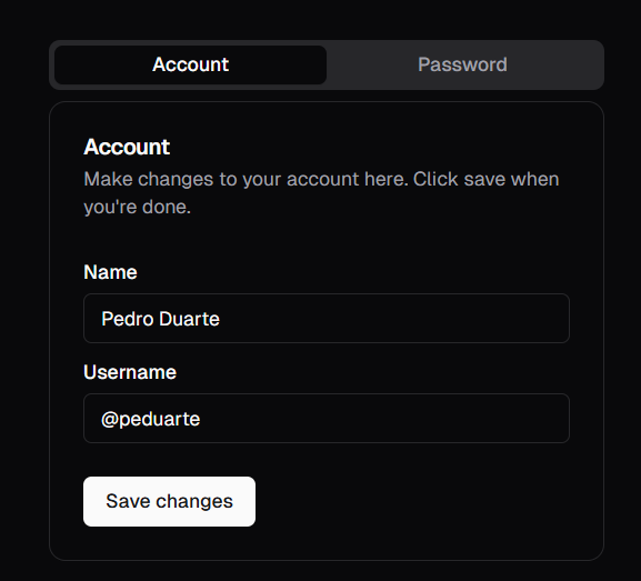
Tabs are a classic UI pattern for organizing related content into distinct sections within the same view, preventing information overload.
- Why it's great: Radix UI's Tabs primitive ensures excellent accessibility, including keyboard navigation between tabs and proper ARIA attributes. Shadcn provides clean styling on top.
- Common Use Cases: Switching between user profile sections (Details, Settings, Activity), displaying different views of related data (All, Active, Archived), organizing documentation sections.
- Shadcn Advantage: The structure (
Tabs,TabsList,TabsTrigger,TabsContent) is intuitive. Styling the active state, borders, and overall look is easily managed with Tailwind within thetabs.tsxfile. It feels robust yet lightweight.
8. Subtle Feedback:
Toast
For non-critical notifications and feedback that shouldn't interrupt the user's workflow, Toasts are the perfect solution.
- Why it's great: Shadcn's
Toastcomponent provides an imperative API via theuseToasthook, making it easy to trigger notifications from anywhere in your application (e.g., after a successful form submission). It supports different variants (likedefaultanddestructive) and positioning. - Common Use Cases: Confirming successful actions ("Item saved successfully!"), displaying errors ("Failed to upload file."), providing brief informational messages.
- Shadcn Advantage: The
Toastercomponent handles the rendering and positioning logic, while theuseToasthook provides a clean way to trigger toasts programmatically. Customizing the appearance, duration, and adding new variants is straightforward by modifying thetoast.tsxanduse-toast.tsfiles.
9. The Sidekick Panel:
Sheet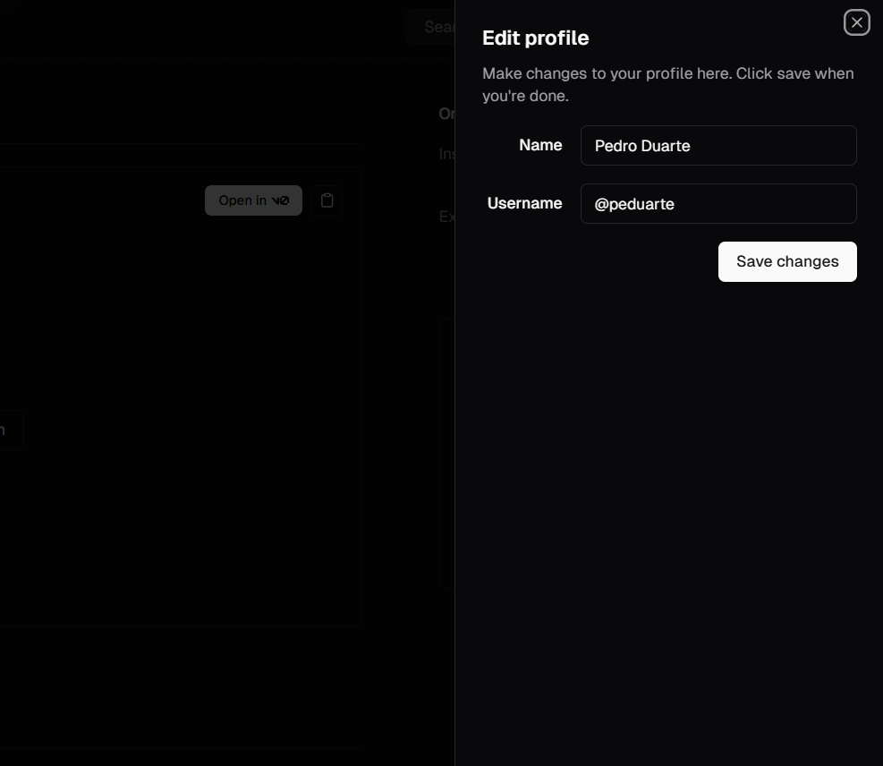
Sometimes a full modal
Dialogis too intrusive. ASheetprovides a panel that slides in from the side (or top/bottom) of the screen, often used for complex forms, navigation, or supplementary content.- Why it's great: Like
Dialog, it's built on accessible primitives, handling focus management and keyboard interactions correctly. It offers different side options (top,bottom,left,right). - Common Use Cases: Mobile-style navigation drawers, complex filtering options for a list, editing detailed settings without a full modal overlay, shopping carts.
- Shadcn Advantage: Its compositional structure (
SheetTrigger,SheetContent,SheetHeader, etc.) mirrors theDialog, providing flexibility. It offers a great alternative interaction pattern when a modal feels too heavy, and customizing its dimensions and appearance with Tailwind is easy.
10. End-to-End Forms:
Form(Integration Pattern)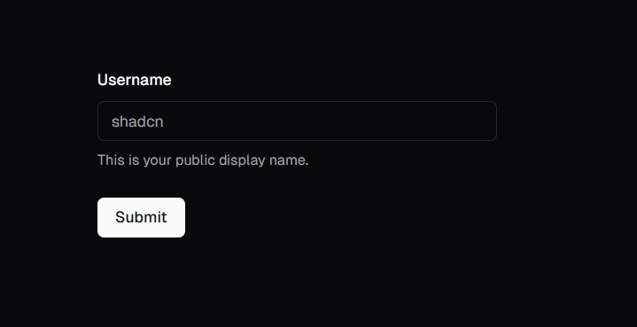
While
Formitself is more of an integration example in the Shadcn/ui documentation, the pattern it demonstrates is so powerful and commonly used that it deserves a top spot. It shows how to seamlessly combine Shadcn components (Input,Checkbox,Select, etc.) with popular form libraries likereact-hook-formand schema validation tools likeZod.- Why it's great: It provides a structured, type-safe, and accessible way to build complex forms with validation. It standardizes how form fields, labels, descriptions, and error messages are handled.
- Common Use Cases: Any non-trivial form in your application – user registration, settings pages, content creation forms, complex configuration interfaces.
- Shadcn Advantage: This pattern leverages Shadcn's components (
FormField,FormItem,FormLabel,FormControl,FormDescription,FormMessage) to create a reusable structure that works beautifully withreact-hook-form's controller logic. It drastically reduces boilerplate code for handling form state, validation, and error display, all while ensuring accessibility and consistent styling using the other Shadcn components you've added. This integration pattern is arguably one of the biggest productivity boosts Shadcn/ui offers for application development.
Beyond the Top 10
Shadcn/ui offers many other fantastic components (
Select,Checkbox,Accordion,Tooltip,Avatar,Badge, etc.) that are equally well-crafted. However, these ten form the core foundation that I find myself installing via the CLI in almost every new React/Next.js project.Why This Approach Wins
Working with Shadcn/ui feels empowering. You get beautifully designed, accessible components without the baggage of a traditional library. The "copy-paste" philosophy means you have full control and ownership, making customization intuitive via Tailwind CSS. It encourages understanding the underlying primitives and promotes a cleaner, more maintainable codebase.
If you haven't explored Shadcn/ui yet, I highly recommend giving it a try. Start by adding a simple
ButtonorCardto your next project. I suspect you'll quickly appreciate its elegance and flexibility, and components like these ten will become indispensable parts of your own web development toolkit.
