
Introduction:
Azure ML has a process called "Designer" which creates machine learning workflows then makes it accessible to both beginners and experienced user. Azure Machine Learning Designer is a drag-and-drop interface within Microsoft's Azure Machine Learning platform that allows users to build, test and deploy machine learning models without requiring extensive coding knowledge.
Here we will train a linear regression model that predicts car prices. Following are the steps for that need to follow.
Create a workspace
- Sign in to Azure Machine Learning studio
- Select Create workspace
- Provide the following information to configure your new workspace:
- Workspace name
- Friendly name
- Hub
- If you did not select a hub provide the advanced information
- If you selected a hub these values are taken from the hub.
- Subscription
- Resource group
- Region
- Select Create to create the workspace
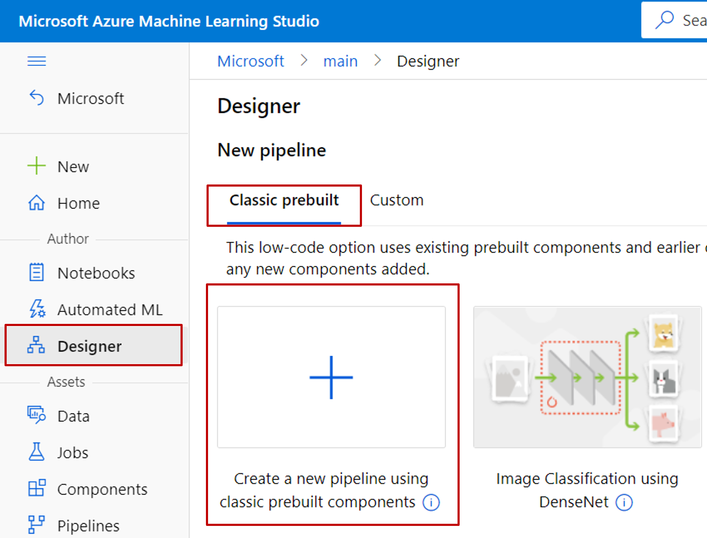
Create a new pipeline
Pipeline is a visual workflow where sequence of steps connected together to process data, train a model and produce an output. These are designed using the drag-and-drop interface.
- Sign in to ml.azure.com
- select the workspace you want to work with. If no workspace available then create one
- Select Create a new pipeline using classic prebuilt components.
- Click the pencil icon beside the automatically generated pipeline draft name, rename it to Automobile price prediction. The name doesn't need to be unique.
Import data
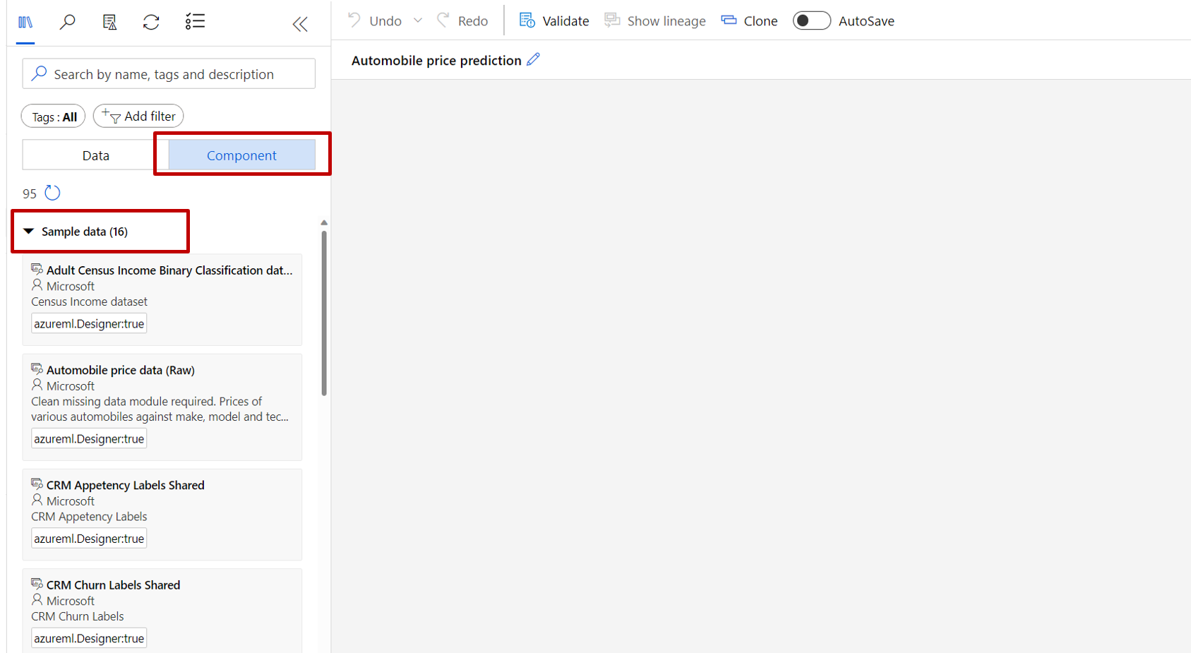
The designer comes with prebuilt sample dataset for user to do experiment. Here we will be using Automobile price data (Raw). Use the following steps to select the data set.
- On the left hand side you will see options like datasets and components.
- Select components
- Expand sample data
- Select the dataset Automobile price data (Raw) and drag it onto the canvas.
Visualize the data
It's better to visualize the data for better understanding of the dataset. To do this follow the following steps:
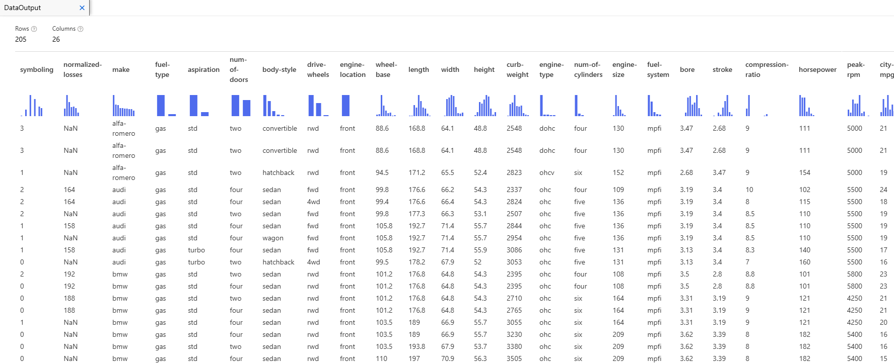
- Right click the Automobile price data (Raw) and select Preview Data.
- Select the different columns in the data window to view information about each one.
Each row represents an automobile, and the variables associated with each automobile appear as columns. There are 205 rows and 26 columns in this dataset.
Setup Data
Before doing an analysis on a data set it requires some processing. Like there might be some missing values which might create an issue for model to analyze correctly.
For our dataset we can see that the normalized-losses column is missing many values so, this need to exclude. Use the following steps:
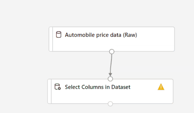
- In the datasets and component palette to the left of the canvas, click Component and search for the Select Columns in Dataset component.
- Drag the Select Columns in Dataset component onto the canvas. Drop the component below the dataset component.
- Connect the Automobile price data (Raw) dataset to the Select Columns in Dataset component. Drag from the dataset's output port which is the small circle at the bottom of the dataset on the canvas to the input port of Select Columns in Dataset which is the small circle at the top of the component.
- Select the "Select Columns in Dataset component."
- Click on the arrow icon under Settings to the right of the canvas to open the component details pane. Alternatively, you can double click the "Select Columns" in Dataset component to open the details pane.
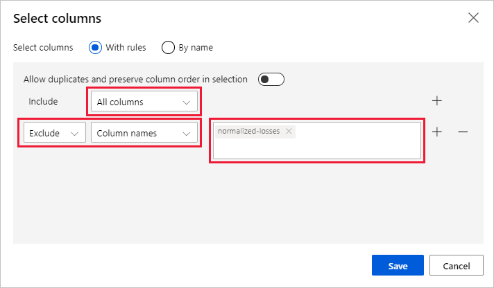
- Select Edit column to the right of the pane.
- Expand the Column names drop down next to Include and select All columns.
- Select the + to add a new rule.
- From the drop-down menus, select Exclude and Column names.
- Enter normalized-losses in the text box.
- In the lower right, select Save to close the column selector.
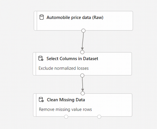
- In the Select Columns in Dataset component details pane expand Node info.
- Select the Comment text box and enter Exclude normalized losses.
Comments will appear on the graph to help you organize your pipeline.
Clean missing data
After removing normalized-losses column the still might be missing value remaining. "Clean Missing Data" component can be used to remove this.
- In the datasets and component palette to the left of the canvas, click Component and search for the Clean Missing Data component.
- Drag the Clean Missing Data component to the pipeline canvas. Connect it to the Select Columns in Dataset component.
- Select the Clean Missing Data component.
- Click on the arrow icon under Settings to the right of the canvas to open the component details pane.
- Select Edit column to the right of the pane.
- In the Columns to be cleaned window that appears, expand the drop-down menu next to Include. Select All columns
- Select Save
- In the Clean Missing Data component details pane -> under Cleaning mode -> select Remove entire row.
- In the Clean Missing Data component details pane -> expand Node info.
- Select the Comment text box and enter Remove missing value rows.
Setup a machine learning model
As we want to predict the price we can use a regression algorithm like linear regression model.
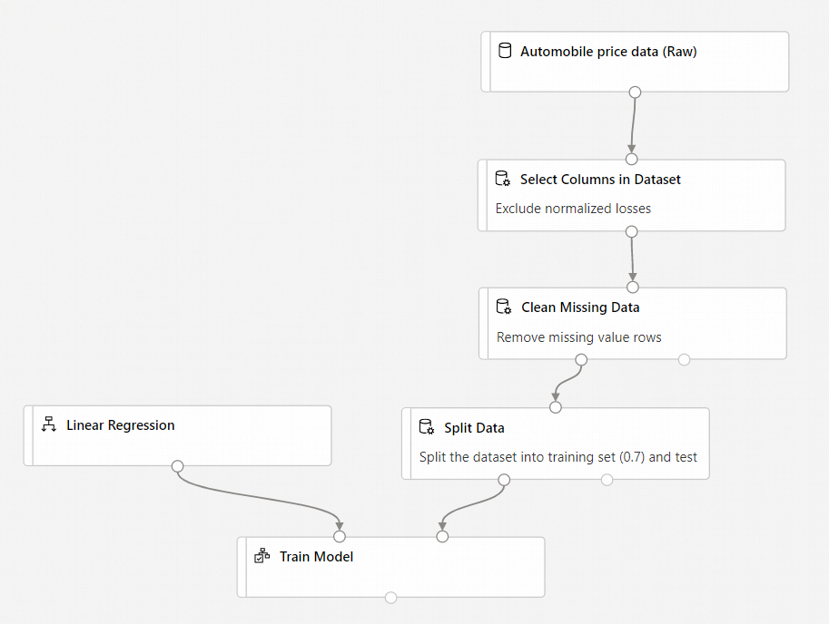
Split the data
We will split the data into two separate datasets. One dataset trains the model and the other will test how well the model performed.
- In the datasets and component palette to the left of the canvas, click Component and search for the Split Data component.
- Drag the Split Data component to the pipeline canvas.
- Connect the left port of the Clean Missing Data component to the Split Data component.
- Select the Split Data component.
- Click on the arrow icon under Settings to the right of the canvas to open the component details pane. Alternatively, you can double-click the Split Data component to open the details pane.
- In the Split Data details pane set the Fraction of rows in the first output dataset to 0.7.
- This option splits 70 percent of the data to train the model and 30 percent for testing it. The 70 percent dataset will be accessible through the left output port. The remaining data is available through the right output port.
- In the Split Data details pane, expand Node info.
- Select the Comment text box and enter Split the dataset into training set (0.7) and test set (0.3).
Train the model:
Train the model by giving it a dataset that includes the price. The algorithm constructs a model that explains the relationship between the features and the price as presented by the training data.
- In the datasets and component palette to the left of the canvas click Component and search for the Linear Regression component.
- Drag the Linear Regression component to the pipeline canvas.
- In the datasets and component palette to the left of the canvas click Component and search for the Train Model component.
- Drag the Train Model component to the pipeline canvas.
- Connect the output of the Linear Regression component to the left input of the Train Model component.
- Connect the training data output (left port) of the Split Data component to the right input of the Train Model component.
- Select the Train Model component.
- Click on the arrow icon under Settings to the right of the canvas to open the component details pane. Alternatively, you can double-click the Train Model component to open the details pane.
- Select Edit column to the right of the pane.
- In the Label column window that appears, expand the drop-down menu and select Column names.
- In the text box enter price to specify the value that your model is going to predict.
Add the Score Model component
After training the model by using 70 percent of the data, we can use it to score the other 30 percent to see how well your model functions.
- In the datasets and component palette to the left of the canvas, click Component and search for the Score Model component.
- Drag the Score Model component to the pipeline canvas.
- Connect the output of the Train Model component to the left input port of Score Model. Connect the test data output (right port) of the Split Data component to the right input port of Score Model.
Add the Evaluate Model component
Use the Evaluate Model component to evaluate how well your model scored the test dataset.
- In the datasets and component palette to the left of the canvas, click Component and search for the Evaluate Model component.
- Drag the Evaluate Model component to the pipeline canvas.
- Connect the output of the Score Model component to the left input of Evaluate Model.
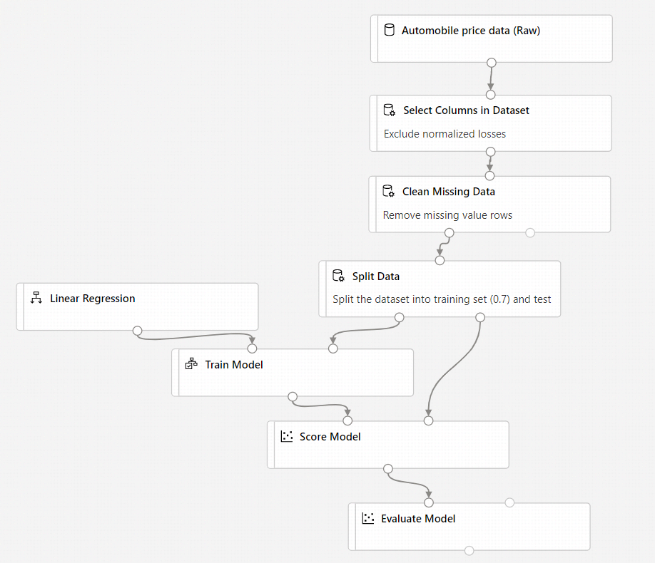
The final pipeline should look something like this:
Submit pipeline
- Select Configure & Submit on the right top corner to submit the pipeline.
- Then you'll see a step-by-step wizard follow the wizard to submit the pipeline job.
- In Basics step, you can configure the experiment, job display name, job description etc.
- After submitting the pipeline job, there will be a message on the top with a link to the job detail. You can select this link to review the job details.
View scored labels
In the job detail page, you can check the pipeline job status, results and logs.
After the job completes we can view the results of the pipeline job. First, look at the predictions generated by the regression model.
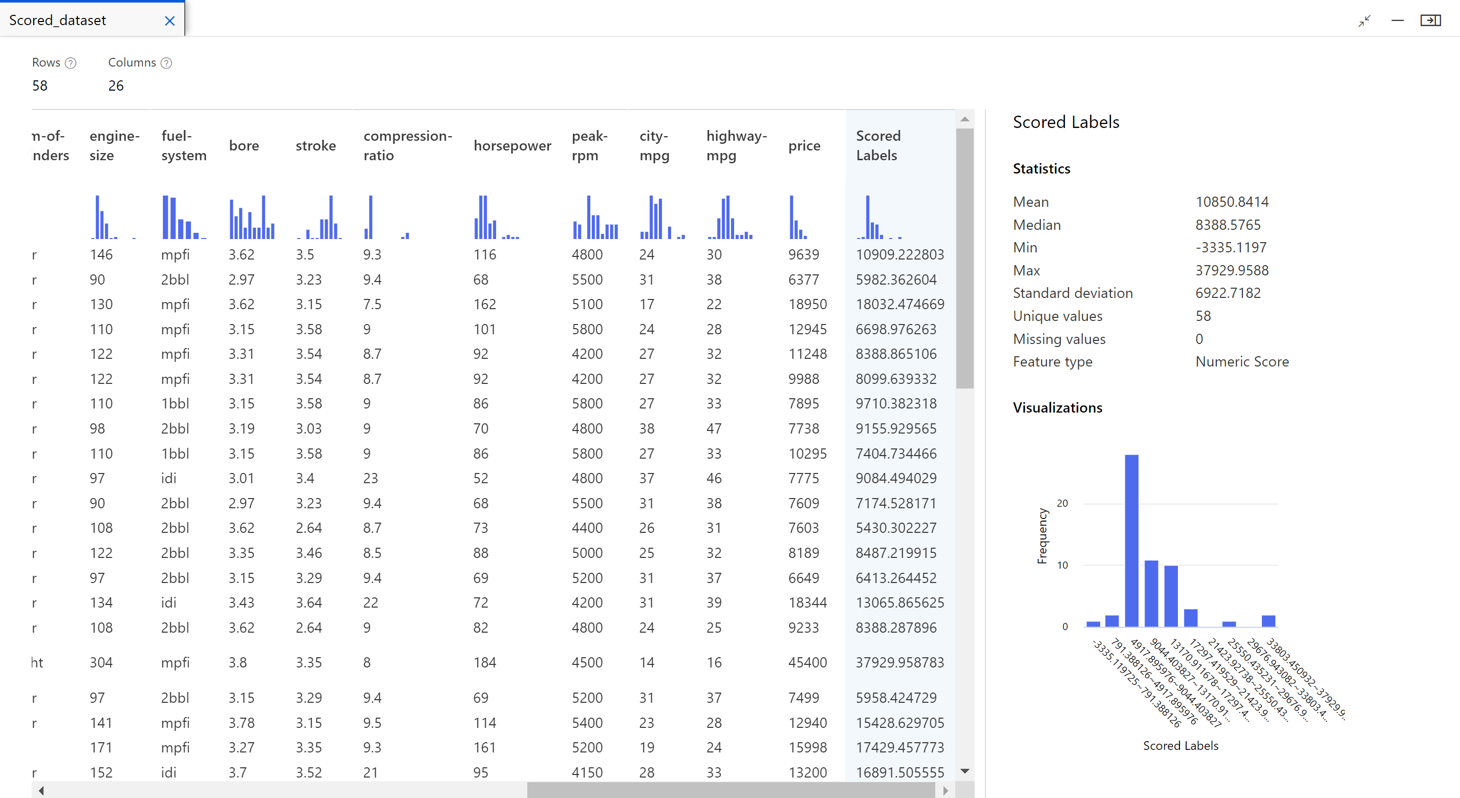
- Right-click the Score Model component, and select Preview data -> Scored dataset to view its output.
Here we can see the predicted prices and the actual prices from the testing data.
Model Evaluation
Use the Evaluate Model to see how well the trained model performed on the test dataset.
- Right-click the Evaluate Model component and select Preview data > Evaluation results to view its output.
The following statistics are shown for your model:
- Mean Absolute Error (MAE): The average of absolute errors. An error is the difference between the predicted value and the actual value.
- Root Mean Squared Error (RMSE): The square root of the average of squared errors of predictions made on the test dataset.
- Relative Absolute Error: The average of absolute errors relative to the absolute difference between actual values and the average of all actual values.
- Relative Squared Error: The average of squared errors relative to the squared difference between the actual values and the average of all actual values.
- Coefficient of Determination: Also known as the R squared value, this statistical metric indicates how well a model fits the data.
For each of the error statistics, smaller is better. A smaller value indicates that the predictions are closer to the actual values. For the coefficient of determination, the closer its value is to one (1.0), the better the predictions.