You might have heard that the humble, old attr() method in CSS just got a big update. It's only in Chrome for now, but I assume the Firefox and Safari teams are working hard on implementing this!
So what's the difference? Well, we now have types and fallbacks, so we can directly update a CSS custom property to a numeric value, with a fallback:
--property: attr(my-attr type<number>, 15);How cool is that?! It means we can now create really complex CSS-only components. In this tutorial, we'll build a
Markup
To start with, let's create a simple custom element called illumination and phase.
Valid phases are:
- new moon
- waxing crescent
- first quarter
- waxing gibbous
- full moon
- waning gibbous
- last quarter
- waning crescent
Example:
illumination="58"
  phase="waxing crescent">
And ... that's it (for now). Let's switch to CSS!
CSS
Our custom element needs a few default styles:
moon-phase {
aspect-ratio: 1;
border-radius: 50%;
display: block;
overflow: clip;
position: relative;
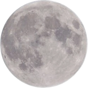
}We add an image of the moon to a ::before-pseudo element:
moon-phase::before {
  background: url('moon.png') center / cover no-repeat;
  content: '';
  inset: 0;
  position: absolute;
}
And we get:
Not very exciting! Let's add a filter to spice it up a bit:
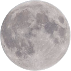
moon-phase::before {
  filter: sepia(1) grayscale(.25);
}
Now we have:
Much better! If you want to play around with CSS filters, I've made a small editor.
Now, we add an ::after pseudo-element:
moon-phase::after {
  background-color: #000;
  border-radius:
    var(--_btlr, 0)
    var(--_btrr, 0)
    var(--_bbrr, 0)
    var(--_bblr, 0);
  content: '';
  height: 100%;
  inset-inline: var(--_ii, auto 0);
  position: absolute;
  width: var(--_w, 0%);
}
Phew, let that sink in! We add four properties to control all border-radius-sides, and one for width. Let's start with that:
moon-phase {
  --_w: calc(100% - 1% * attr(illumination type(<number>), 0%));
}
So what's going on? We read the illumination-attribute as a number, convert it to a percentage by multiplying with 1%, and deduct that from the full width.
So, if illumination is set to 6%, the width will be 94% etc.
Next, we need to adjust the border-radius properties and inset, depending on which phase the moon has:
[phase*="first-quarter"],
[phase*="waxing"] {
--_ii: 0 auto;
}
[phase*="crescent"],
[phase*="first-quarter"],
[phase*="waxing"] {
--_bblr: 100%;
--_btlr: 100%;
}
[phase*="crescent"],
[phase*="last-quarter"],
[phase*="waning"] {
--_btrr: 100%;
--_bbrr: 100%;
}
[phase*="gibbous"]::after {
border-radius: 0;
width: 100%;
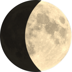
}Let's see how we're doing, with 6% illumination:
Yay, a thin slice of moon!
Now, for the "gibbous" phases, the shape is inwards, and we cannot use border-radius.
Instead, the ::after-element takes up 100%, and is cut with a mask:
[phase="waxing gibbous"]::after {
  mask: radial-gradient(circle at 100% 50%,
    #0000 calc(100% - var(--_w)),
    #000 calc(100% - var(--_w) + 1px 100%));
}
[phase="waning gibbous"]::after {
  mask: radial-gradient(circle at 0% 50%,
    #0000 calc(100% - var(--_w)),
    #000 calc(100% - var(--_w) + 1px 100%));
}
With 58% illumination we get:
Latitude and time
Now, the moon looks different depending on where on Earth you reside, so let's add two new attributes to our component:
illumination="25"
  phase="waxing crescent"
  lat="-33.86"
  hour="22">
As before, we read these directly in CSS:
moon-phase {
  --_lat: attr(lat type(<number>), 0);
  --_hour: attr(hour type(<number>), 12);
}
The calculations needed for the rotation angle, are a bit complex:
moon-phase {
  --_l: calc(var(--_lat) * 1.5deg);
  --_a: calc(((var(--_hour) - 12) * 15 * 0.7) * 1deg);
  --_r: calc(var(--_l) + var(--_a));
}
Let's break it down:
-
Latitude Tilt (
--_l)
We multiply the latitude by1.5degto simulate how the moon’s tilt changes as you move north or south. This creates:- Upward tilt in the Southern Hemisphere (negative latitudes).
- Downward tilt in the Northern Hemisphere.
-
Hour Rotation (
--_a)
The hour calculationcalc(((var(--_hour) - 12) * 15 * 0.7) * 1deg)works like this:-
(var(--_hour) - 12): Centers rotation at solar noon. -
* 15: Earth rotates 15° per hour (solar motion). -
* 0.7: Dampens the effect to match the moon’s slower apparent speed (~14.5°/hour). -
* 1deg: Converts to degrees.
-
-
Combined Rotation (
--_r)
Adding--_land--_agives a realistic orientation. Examples:- Equator (lat=0): Vertical terminator (🌒).
- Sydney (lat=-34): Tilted upward (/).
- London (lat=51.5): Tilted downward (\).
- North Pole (lat=90): Horizontal terminator (⊐).
moon-phase {
  rotate: var(--_r, 0deg);  /* Applies the final rotation */
}
Let's see an example: Same day, but different latitudes:
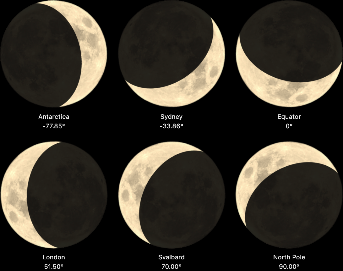
A small disclaimer: At extreme latitudes (>80°), the tilt calculation becomes approximate (the moon doesn’t quite lie flat at the poles with this formula). Also — while I’ve done my best to match real-world behavior — I am by no means an astrophysicist. If you spot errors in the calculations, you know who to blame!
Demo
Here's a Codepen with all the phases of the moon; it's pure CSS, but only working in Chrome for now:
