I’m a frontend engineer.
And I still remember the first time someone asked me to “design a scalable system.”
I froze.
No docs. No clear starting point. Just a vague prompt and a blank whiteboard.
Eventually, I gave up and said, “I don’t think I can do this.”
It wasn’t that I didn’t know how to build things - I just didn’t know how to think in system design terms. What to prioritize. What to trade off. What even mattered.
Over time, through interviews, projects, and a lot of panic-Google moments, I started noticing a pattern in how I approached problems.
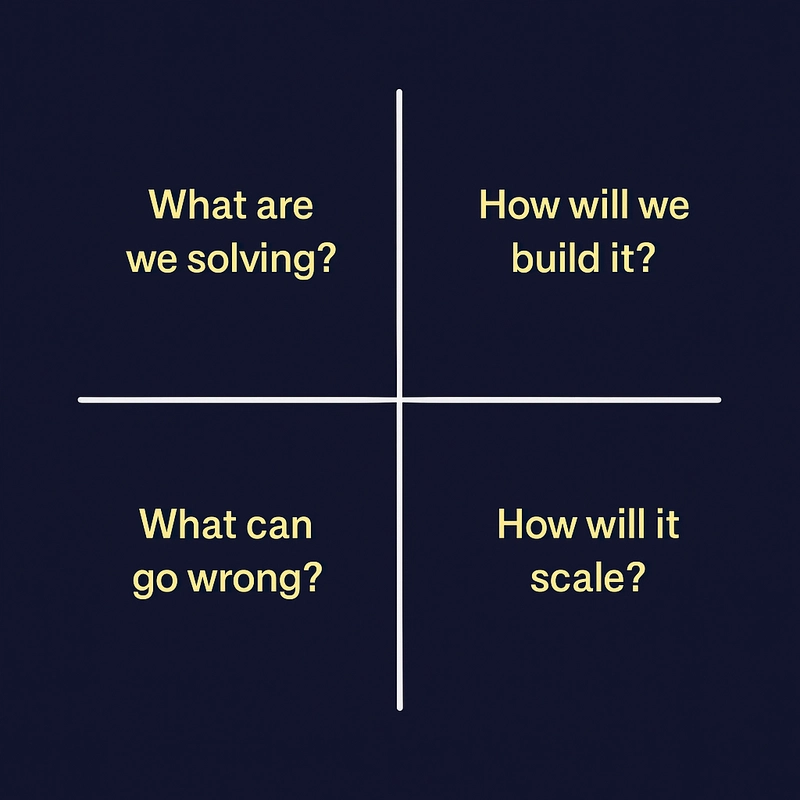
I’d always end up scribbling the same four kinds of thoughts: What we’re solving, How we’re building it, What can go wrong, and How it scales.
So I started putting them in a simple 2×2 quadrant.
Not a framework. Not a tool.
Just a small thing that helped me feel less stuck - especially during interviews.
This blog is me sharing that quadrant, and how you can use it too - whether you're prepping for interviews or just trying to design something with more clarity.
What is the Tradeoff Quadrant?
It’s just a 2×2 grid.
That’s it.
Whenever I’m designing something - a new feature, a reusable component, or even prepping for an interview - I draw a big “+” on paper or in my notes and start filling it in.
Each quadrant forces me to slow down and ask a different kind of question:
What are we solving? - What's the actual user problem? What’s the UX flow? What matters the most?
How will we build it? - What components do we need? Which rendering strategy makes sense - CSR, SSR, SSG? Is this a monolith or modular setup?
What can go wrong? - What if an API fails? What if data is missing? What happens on slow devices or bad networks?
How will it scale? - Will it handle more users? Can it support versioning or A/B testing later? Is it performance-optimized?
It’s not about filling it “perfectly” - it’s about making your thinking visible.
The best part? It works whether you're designing a whole page or just a single dropdown.
Let’s Apply This: Designing a Product Listing Page (PLP)
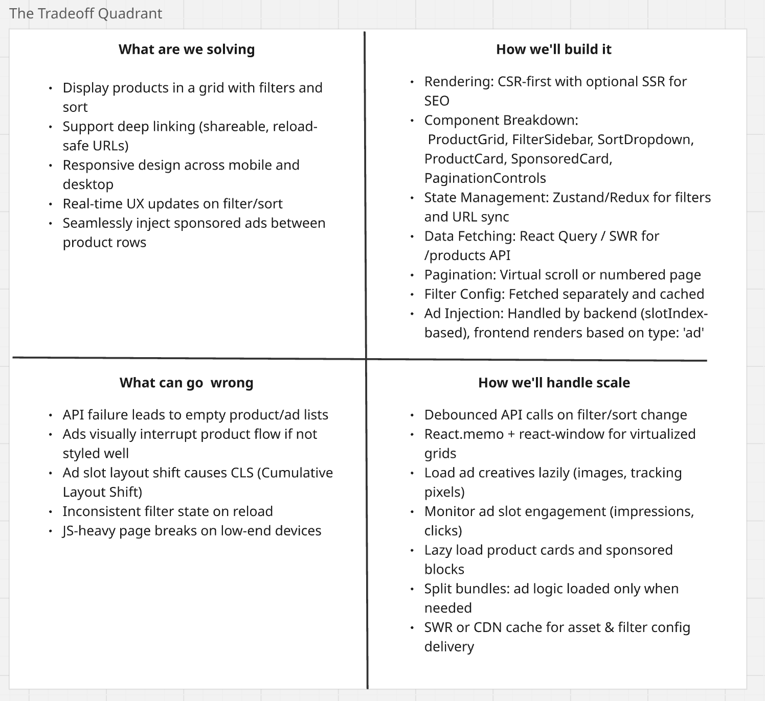
Imagine you're working at an e-commerce company and you've been asked to design the frontend system for a Product Listing Page (PLP) -like the ones you see on Amazon, Flipkart, or Myntra.
The page should:
- Show a grid of products
- Allow filtering by brand, size, price, etc.
- Support sorting (price, popularity, newest first)
- Handle pagination or infinite scroll
- Be mobile- and desktop-friendly
- Work well during high-traffic sale events
- Support deep linking (URL reflects filters and sort)
- Optionally inject ads or sponsored products between rows
Oh - and it should be fast, resilient, and easy to maintain over time.
Before jumping into components or API calls, let’s apply the Tradeoff Quadrant to understand the problem better.
Functional and Non-Functional Requirements
Once we’ve clarified the problem using the Tradeoff Quadrant, the next step is to define the requirements clearly - both functional and non-functional.
This helps prevent scope creep, sets expectations, and ensures you're designing for what actually matters.
I’ve also learned (sometimes the hard way 😅) that it’s important to think about what’s truly required to go to production. You can always add more later, but the goal of system design is to prioritize smartly, not just list every possible feature.
Functional Requirements
Must-haves for v1:
- Display a grid of products with image, title, and price
- Allow filtering by key fields like brand, price, and category
- Support basic sort options (e.g., price low to high)
- Enable pagination or infinite scroll
- Reflect filter/sort state in the URL (deep linking)
- Responsive layout that works on mobile and desktop
Nice-to-haves (can be added post-launch):
- Sponsored ad injection between rows
- Multi-select filters (e.g., select multiple brands)
- Clear-all filters button
- Breadcrumbs and category metadata
- Prefetch next page data for smoother infinite scroll
Non-Functional Requirements
Production must-haves:
- Debounced API calls to avoid unnecessary traffic
- Graceful loading (skeletons or spinners)
- Stable layout - avoid CLS (especially with ad slots)
- Resilience to API failure (fallback UI)
- SEO-ready with SSR for first PLP page
- Keyboard + screen reader accessibility for filters and sort
Post-launch enhancements:
- Telemetry for filter usage, scroll depth, and ad clicks
- SWR/CDN caching for assets and filter config
- Lazy image loading with
IntersectionObserver - A/B testing for product card variants
Component Architecture for Product Listing Page
Now that we know what the PLP needs to do, let’s break it down into components.
The idea is to keep things:
- Modular and reusable
- Config-driven wherever possible
- Scalable to accommodate features like ads, A/B tests, and SSR
Here’s a high-level breakdown of what that might look like:
├──            ← Brand, size, price filters
│   └──
│       ├──
│       └──
├──                  ← Sort options (dropdown or pills)
├──              ← Displays product + ad rows
│   └──
│       ├──
│       └──    ← Conditionally rendered
├──       ← Or
├──           ← Loading state for list
├──               ← No results found
└──         ← Fires scroll, ad impressions, clicks
Each of these components plays a specific role in how the page functions and scales.
Let’s go through them quickly to understand how they fit into the bigger picture.
| Component | Purpose |
|---|---|
|
Top-level layout, parses URL params, triggers data fetch |
|
Shows filter groups from config (brand, size, price, etc.) |
|
Renders a specific type of filter group (checkbox or range) |
|
Checkbox list filter (e.g., brand) |
|
Price slider or size range selector |
|
Sort dropdown or pill selector (e.g., Popularity, Price) |
|
Renders the list of products and sponsored cards |
|
Controls row layout (2/4 items) |
|
Shows individual product info |
|
Injected ad or sponsored placement |
|
Next/previous navigation or infinite scroll trigger |
|
Shimmer/skeletons for loading state |
|
Shown when no products match the filters |
|
Tracks scrolls, filter usage, ad clicks, etc. |
API Design for Product Listing Page
Now that the component architecture is in place, the next step is to design APIs that power the frontend cleanly.
Our API should:
- Work across verticals (shoes, furniture, books, plants)
- Support both products and sponsored content
- Be config-driven to allow flexibility without hardcoding
Thought Process Behind the API Design
Instead of coupling the frontend logic to specific filters (like brand, size, material), the API should drive what filters to show via config.
This way, the filter sidebar becomes dynamic, and the same PLP can be used across different categories with little to no hardcoded logic.
We also want to inject ads or sponsored cards into the product list - so the response should include a mixed array of items, with each item tagged by its type.
To control where the sponsored card appears, we use a slotIndex - so the frontend can inject the card at that position without guesswork.
{
  "meta": {
    "total": 1870,
    "page": 3,
    "limit": 20,
    "hasMore": true
  },
  "filters": [
    {
      "type": "checkbox",
      "label": "Brand",
      "key": "brand",
      "options": ["Nike", "Puma", "Adidas"]
    },
    {
      "type": "range",
      "label": "Price",
      "key": "price",
      "min": 799,
      "max": 9999
    },
    {
      "type": "checkbox",
      "label": "Size",
      "key": "size",
      "options": ["6", "7", "8", "9", "10"]
    }
  ],
  "sortOptions": [
    { "label": "Popularity", "value": "popularity" },
    { "label": "Price: Low to High", "value": "price_asc" },
    { "label": "Newest First", "value": "newest" }
  ],
  "items": [
    {
      "type": "product",
      "slotIndex": 0,
      "data": {
        "id": "p123",
        "title": "Nike Air Max",
        "price": 3999,
        "image": "https://cdn/air-max.jpg",
        "rating": 4.5,
        "available": true,
        "badges": ["Best Seller"]
      }
    },
    {
      "type": "ad",
      "slotIndex": 1,
      "data": {
        "id": "ad789",
        "title": "Sponsored: Adidas Originals",
        "image": "https://cdn/ad.jpg",
        "ctaUrl": "https://yourstore.com/adidas-campaign",
        "trackingPixel": "https://track.adid.as/imp.png"
      }
    },
    ...
  ]
}
Why This API Design Works
| Need | Solution in API |
|---|---|
| Configurable filters | filters[] object drives rendering |
| Category-specific logic | Backend sends only relevant filters |
| Sort options | Included as sortOptions[] |
| Ad/product mix | Unified items[] array with type |
| Placement control | slotIndex helps render at correct position |
| Frontend reusability | One PLP layout works across verticals |
Performance Considerations
Once your API and component architecture are in place, the next big question is: “How will this perform in the real world?”
A Product Listing Page might work fine in local dev, but under real conditions - slow devices, 3G networks, high concurrency - things can fall apart quickly.
Here’s how I think about performance in PLPs:
Pagination and Debouncing
- Always debounce filter and sort API calls to avoid flooding the network
- For infinite scroll, make sure to throttle or lock pagination requests to prevent race conditions
- Add a loading state between pages to give feedback and avoid double fetches
Virtualization and Lazy Loading
- Use virtualization libraries like
react-windoworreact-virtualizedto render only visible products -
Lazy-load images using
IntersectionObserverso the initial page loads faster - Load ad creatives lazily too (especially 3rd party tracking pixels)
Skeletons and Perceived Performance
- Show skeleton loaders instead of blank spaces during data fetch
- Maintain layout stability with reserved space for ads to avoid layout shifts (CLS)
- Preload next page data to make infinite scroll feel seamless
CDN, Caching, and SWR
- Cache static filter config and sort options with SWR or localStorage
- Use CDNs for product images and compress them using WebP or AVIF
- Apply
stale-while-revalidatecaching strategy to keep PLP snappy without stale content
Telemetry and Monitoring
- Track API response times, scroll depth, filter interaction, and ad clicks
- Set up frontend alerts if API failure rate exceeds a threshold
- Use these metrics to guide A/B testing and UX decisions
What I’d Say in an Interview
“In PLPs, performance is not just about speed - it’s about perception. Skeletons, lazy loading, and virtualization make a huge difference. I’d also make sure filter configs are cached, ads don’t block the main thread, and all API calls are debounced.”
Final Thoughts
If system design has ever made you freeze up, just know - you’re not alone.
I made this quadrant because I needed something simple to help me get unstuck.
Whether you’re preparing for an interview or solving a problem at work, I hope this gives you a way to slow down, ask better questions, and design with confidence.
And if this helped, let me know - or share your own version of the quadrant. I’d love to see it. 🙂