Run this in your terminal:
npm create storybook@latestAt first glance, it's a generic starter for a component library: a button, a header, and a few example stories. But underneath that simplicity lies something much more powerful — the foundation of a design system.
In this article, we’ll explore how Storybook’s starter is an introduction to core design system principles — reusability, composability, and consistency.
What is Storybook?
Storybook is an open-source tool for building and testing UI components in isolation. Think of it as a dedicated workshop where you can create, preview, and document components in every possible state without spinning up the full application.
But Storybook isn’t just a place to organize your UI components. In practice, it becomes a powerful platform that organizes frontend workflows by:
- Letting you build and debug components without business logic getting in the way.
- Supporting a wide range of frameworks like React, Vue, Angular, Svelte, and more.
- Offering a natural cross-team collaboration workflow — designers, developers, and stakeholders can all review and work on components to deliver great quality user interfaces.
Whether you're crafting a single button or a complete design system, Storybook helps you move faster, stay consistent, and collaborate more effectively.
Benefits of Using Storybook
Now, let's address some more arguments in favor of using Storybook:
- Visual Testing of Component States: Each story represents a specific state of a component. This makes it easier to notice edge cases and ensure a consistent look across the application.
- Auto-Generated Docs: Autodocs turns your stories into complete, shareable documentation. Anyone on the team can explore usage examples, parameters, and behaviors. This is also a great point when onboarding new team members on the project.
- Smooth Collaboration: Designers, product managers, and QA engineers can view and interact with components in the browser, leave feedback, and review changes even without technical knowledge of setting up a local environment.
- Works Across Frameworks: Storybook supports React, Vue, Angular, Svelte, Web Components, and more, making it a good option for any team to avoid framework support limitations.
- Trusted by Top Companies: The Washington Post, Shopify, NASA, and others rely on Storybook to power their UI workflows. It’s also the foundation behind popular component libraries like Chakra UI or Fluent UI.
Core Design System Principles in the Starter
Reusability
Reusability is a fundamental principle of any design system. It’s about creating abstract components that can be used in different use cases while maintaining a consistent look and feel.
Let's review the included Button component:
export const Button = ({
  primary = false,
  size = 'medium',
  backgroundColor,
  label,
  ...props
}: ButtonProps) => {
  const mode = primary ? 'storybook-button--primary' : 'storybook-button--secondary';
  return (
    <button
      type="button"
      className={['storybook-button', `storybook-button--${size}`, mode].join(' ')}
      style={{ backgroundColor }}
      {...props}
    >
      {label}
    button>
  );
};
It might look basic, but out of the box, it has a good set of props:
- Boolean prop
primaryto toggle variants - Props for size, color, and label
The stories for this component reinforce reusability:
export const Primary: Story = {
  args: {
    primary: true,
    label: 'Button',
  },
};

export const Secondary: Story = {
  args: {
    label: 'Button',
  },
};

export const Large: Story = {
  args: {
    size: 'large',
    label: 'Button',
  },
};
The story format encourages creating components in a Don’t Repeat Yourself (DRY), consistent manner.
Composability
Design systems aren’t just about single-use components — they’re about components that combine like LEGO blocks.
The Header component showcases this principle:
export const Header = ({ user, onLogin, onLogout, onCreateAccount }: HeaderProps) => (
  <header>
    <div className="storybook-header">
      <div>
        <svg width="32" height="32" viewBox="0 0 32 32" xmlns="">
      ...
        svg>
        <h1>Acmeh1>
      div>
      <div>
        {user ? (
          <>
            <span className="welcome">
              Welcome, <b>{user.name}b>!
            span>
            <Button size="small" onClick={onLogout} label="Log out" />
          >
        ) : (
          <>
            <Button size="small" onClick={onLogin} label="Log in" />
            <Button primary size="small" onClick={onCreateAccount} label="Sign up" />
          >
        )}
      div>
    div>
  header>
);
Here, we don't hardcode buttons that should be present in the header but reuse the existingButton component. This is how good design systems are built — small parts are assembled into larger elements.
Storybook makes it easier to follow this mindset by isolating each component. You focus on one piece at a time.
Consistency
Consistency is key in a design system — visually, behaviorally, and structurally. That can be achieved with design tokens.
The starter doesn’t include an implementation out of the box, but its architecture makes it easy to add one.
For example, at CKEditor, we use a hybrid approach — Syntactically Awesome Style Sheets (Sass) preprocessor and CSS variables:
$radius-medium: var(--app-radius-medium);
$radius-big: var(--app-radius-big);
$radius-bigger: var(--app-radius-bigger);
Then, we can define theme-specific values:
.app-theme-custom {
    --app-radius-medium: 4px;
    --app-radius-big: 7px;
    --app-radius-bigger: 15px;
}
Extending with Addons
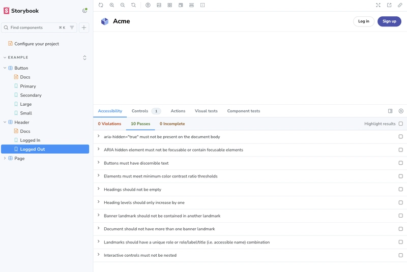
One of Storybook’s biggest strengths is its ecosystem of addons. These allow tailoring a Storybook setup for more specific needs, such as testing the accessibility of your components.
With the accessibility addon, accessibility checks can be integrated directly into your component stories.
To enable it, start by installing the npm package:
npm install @storybook/addon-a11y --save-devThen register it inside your .storybook/main.js file:
module.exports = {
    addons: [
        ...,
        '@storybook/addon-a11y',
    ],
};
Once set up, every component story gets an Accessibility panel that performs automated audits. It highlights issues like missing labels, contrast problems, and more without leaving your development environment.

This addon serves as a perfect example of how you can extend Storybook beyond the basics.
The full list of available addons can be found on the Storybook Integrations page.
Final Thoughts
In this article, we explored the Storybook starter and its main concepts and features.
It introduces you to the core principles of a good design system:
- Reusability
- Composability
- Consistency
It’s not code that is meant to be removed as soon as generated, but a foundation for your design system. Study, expand, and use it to create a design system that will help you create stunning user interfaces!