Gradient in SVG
- Each gradient must have
idattribute for future reference. - Color transitions are defined by a series of color stops.
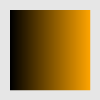
Linear gradient
xmlns="http://www.w3.org/2000/svg" viewBox="0 0 100 100">

   id="vivid">
    offset="0" stop-color="black" />
    offset="1" stop-color="orange" />


x="10" y="10" width="80" height="80" fill="url(#vivid)" />-
stopelement sets color at certain positions using:-
offsetdefines the position; -
stop-colordefines color; -
stop-opacitydefines opacity.
-

We can apply the gradient also to a stroke:
xmlns="http://www.w3.org/2000/svg" viewBox="0 0 100 100">

   id="vivid">
    offset="0" stop-color="green" />
    offset="1" stop-color="yellow" />


  x="10"
  y="10"
  width="80"
  height="80"
  rx="10" fill="none"
  stroke="url(#vivid)"
  stroke-width="10"
 />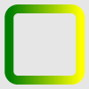
Since we refer to gradient later, it should be defined inside
defselement.
Gradient vector
The gradient vector sets boundaries for gradient stops.
-
x1,y1(default 0) define starting point for a gradient vector; -
x2,y2(default 1) define the ending point for a gradient vector.
xmlns="http://www.w3.org/2000/svg" viewBox="0 0 100 100">

   id="vivid" x2="0.2">
    offset="0" stop-color="darkred" />
    offset="1" stop-color="darksalmon" />


  x="10" y="10" width="80" height="80" fill="url(#vivid)" />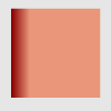
Our gradient ends at 20% of the rectangle, the rest is filled with the last gradient stop color.
We can even change the direction of the gradient using this vector:
xmlns="http://www.w3.org/2000/svg" viewBox="0 0 100 100">

   id="diag" x1="0" y1="0" x2="1" y2="1">
    offset="0" stop-color="turquoise" />
    offset="1" stop-color="black" />


 width="90" height="90" x="5" y="5" fill="url(#diag)" />
Important:
x1,y1,x2,y2are not presentation attributes and they are not overridden by CSS styles.
Radial gradient
xmlns="http://www.w3.org/2000/svg" viewBox="0 0 100 100">

   id="glare" cx="0.7" cy="0.2" r="0.7">
    offset="0" stop-color="powderblue" />
    offset="1" stop-color="steelblue" />


   cx="50" cy="50" rx="50" ry="25" fill="url(#glare)" />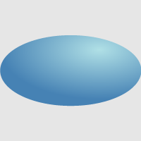
-
cx,cy,rset the end circle for the radial gradient (default values are 0.5). The 100% gradient stop is at the perimeter of the end circle. -
fx(default iscx),fy(default iscy),fr(default is 0) set the start circle. The 0% gradient stop is at the perimeter of the start circle. See an example below:
xmlns="http://www.w3.org/2000/svg" viewBox="0 0 100 100">

   id="moon" fx="0.6" fr="0.4">
    offset="0" stop-color="black" />
    offset="1" stop-color="mintcream" />


   cx="50" cy="50" r="50" fill="url(#moon)" />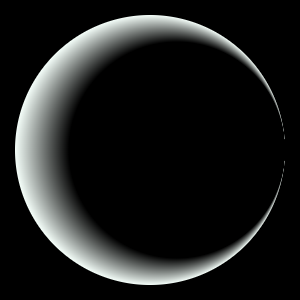
Here, we have black circle with the center at (60%, 50%) and radius 40%. After the ending of that circle, the gradient starts.
Gradient attributes
spreadMethod
If the gradient doesn't fill the whole shape, we can define how the rest of it is filled by spreadMethod that takes the following values:
-
pad(default) fills the remainder with the stop color. -
reflect
xmlns="http://www.w3.org/2000/svg" viewBox="0 0 100 100">

   id="vivid" x2="0.1" spreadMethod="reflect">
    offset="0" stop-color="darkslateblue" />
    offset="1" stop-color="floralwhite" />


  x="10" y="10" width="80" height="80" fill="url(#vivid)" />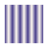
-
repeat
xmlns="http://www.w3.org/2000/svg" viewBox="0 0 100 100">

   id="rose" r="0.1" spreadMethod="repeat">
    offset="0" stop-color="maroon" />
    offset="1" stop-color="salmon" />


   cx="50" cy="50" r="50" fill="url(#rose)" />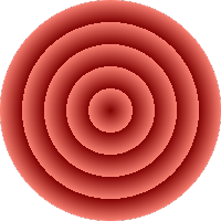
href
This attribute comes in handy when we want to use some template gradient:
xmlns="http://www.w3.org/2000/svg" viewBox="0 0 200 100">

   id="template" x2="0.5" spreadMethod="reflect">
    offset="0" stop-color="teal" />
    offset="1" stop-color="floralwhite" />

   id="vivid1" href="#template">

   id="vivid2" href="#template" y2="0.5">


  x="10" y="10" width="80" height="80" fill="url(#vivid1)" />
  x="110" y="10" width="80" height="80" fill="url(#vivid2)" />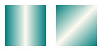
Pattern in SVG
Patterns consist of pre-defined graphic objects that are replicated to fill areas.
xmlns="http://www.w3.org/2000/svg" viewBox="0 0 100 100">


     id="grid"
     x="0" y="0" width="0.1" height="0.1"
     viewBox="0 0 10 10"
    >
      width="7" height="7" fill="darkgreen" />


   cx="10" cy="10" r="10" fill="url(#grid)" />
   cx="60" cy="40" r="40" fill="url(#grid)" />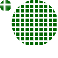
Each pattern tile takes occupies 10% of the object width and height. Since each tile contains one rectangle with width and height 7 "px" inside coordinate system of 10 x 10 "px" dimensions, the blank space occures.
-
x,y,width,heightdefine how pattern tile is placed. They are not presentation attributes and can't be defined by CSS styles. -
patternUnitstakes the following values:-
objectBoundingBox(default) set units forx,y,width,heightrelative to the object, on which the pattern is applied. -
userSpaceOnUsesets "absolute" units forx,y,width,height:
-
xmlns="http://www.w3.org/2000/svg" viewBox="0 0 100 100">


     id="grid"
     x="0" y="0" width="10" height="10"
     viewBox="0 0 10 10"
     patternUnits="userSpaceOnUse"
    >
      width="7" height="7" fill="darkslateblue" />


   cx="10" cy="10" r="10" fill="url(#grid)" />
   cx="60" cy="40" r="40" fill="url(#grid)" />
-
hrefworks the same way as for gradients; only keep in mind that the reference must be a differentpattern.