
When I first started building React apps, this decision felt overwhelming. There were so many options, each with its features and trade-offs. It's like choosing the playlist for a road trip, it can make or break the journey. But over time, I learned that a great UI library isn’t just about flashy components. It saves you hours, handles repetitive tasks, and even solves common problems like accessibility and responsiveness right out of the box.

Now that we are in 2025, there are a few standout libraries that I’ve used directly in my own projects, and others I’ve kept an eye on through the dev community. They’re reliable, developer-friendly, and packed with features I’ve come to love.
Ready to check them out? Let’s dive in! 🚀
📄 Quick Note: React PDF for Document Viewing
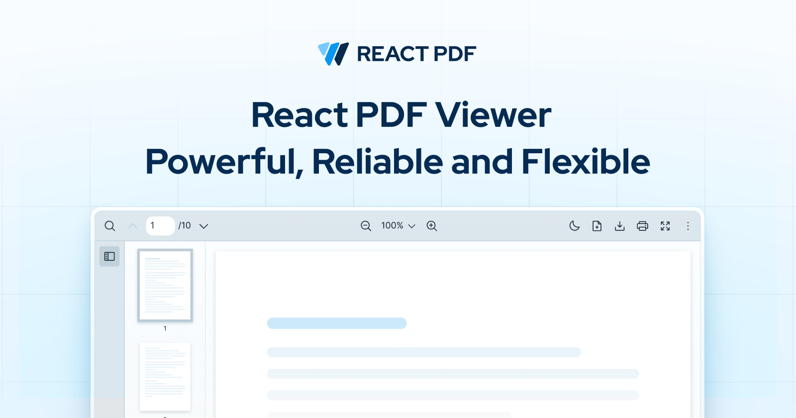
Before we get into the top UI libraries, here's something that I've been working on! If your React app needs to display PDFs without hassle, check out React PDF. It renders PDFs directly in your app using React components—no iframes, no clunky viewers, just smooth, native integration.
Now let's get back to those libraries you're here for. 😊
Leading React.js UI Libraries in 2025
Each library on this list brings its own flavor and strengths to the table. Here are five libraries dominating the React ecosystem this year, ranked based on their popularity by npm weekly download.
1. Material-UI (MUI) and Its Continued Dominance
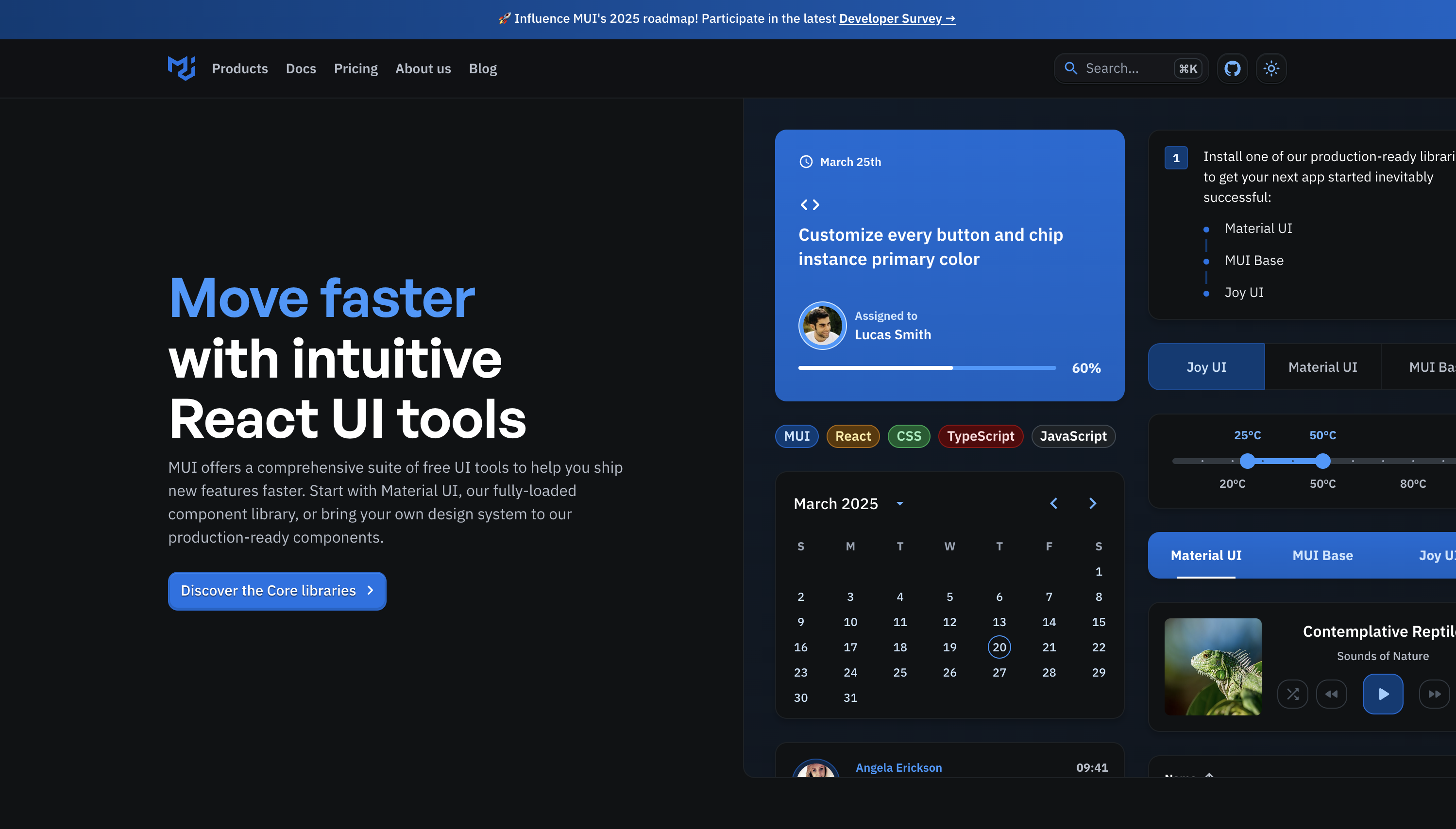
No surprises here. Material-UI, or MUI for short, is still a top choice for many developers—and for good reason. Inspired by Google's Material Design, it's packed with pre-built, highly polished components that look great right out of the box.
Here's what making MUI a favorite:
- Effortless Customization: Themes, colors, typography—it’s all ridiculously easy to tweak. Whether you want Google's Material Design "look" or your own flair, MUI’s got you covered.
- Comprehensive component library: Buttons, modals, tables, navigation—you name it, MUI probably has it. It’s like the Swiss Army knife of UI libraries.
- Active community and ecosystem: With great docs, tons of tutorials, and a thriving developer community, you never feel stuck.
Who is it for:
- Developers looking for a scalable, professional UI framework that works well for projects of all sizes.
- Teams that want out-of-the-box, production-ready components without sacrificing flexibility.
As of March 2025, MUI continues to dominate, boasting over 95,000 GitHub stars and 4 million+ weekly downloads 📈
Learn more on https://mui.com/
2. Ant Design: A Versatile and Feature-Rich UI Library
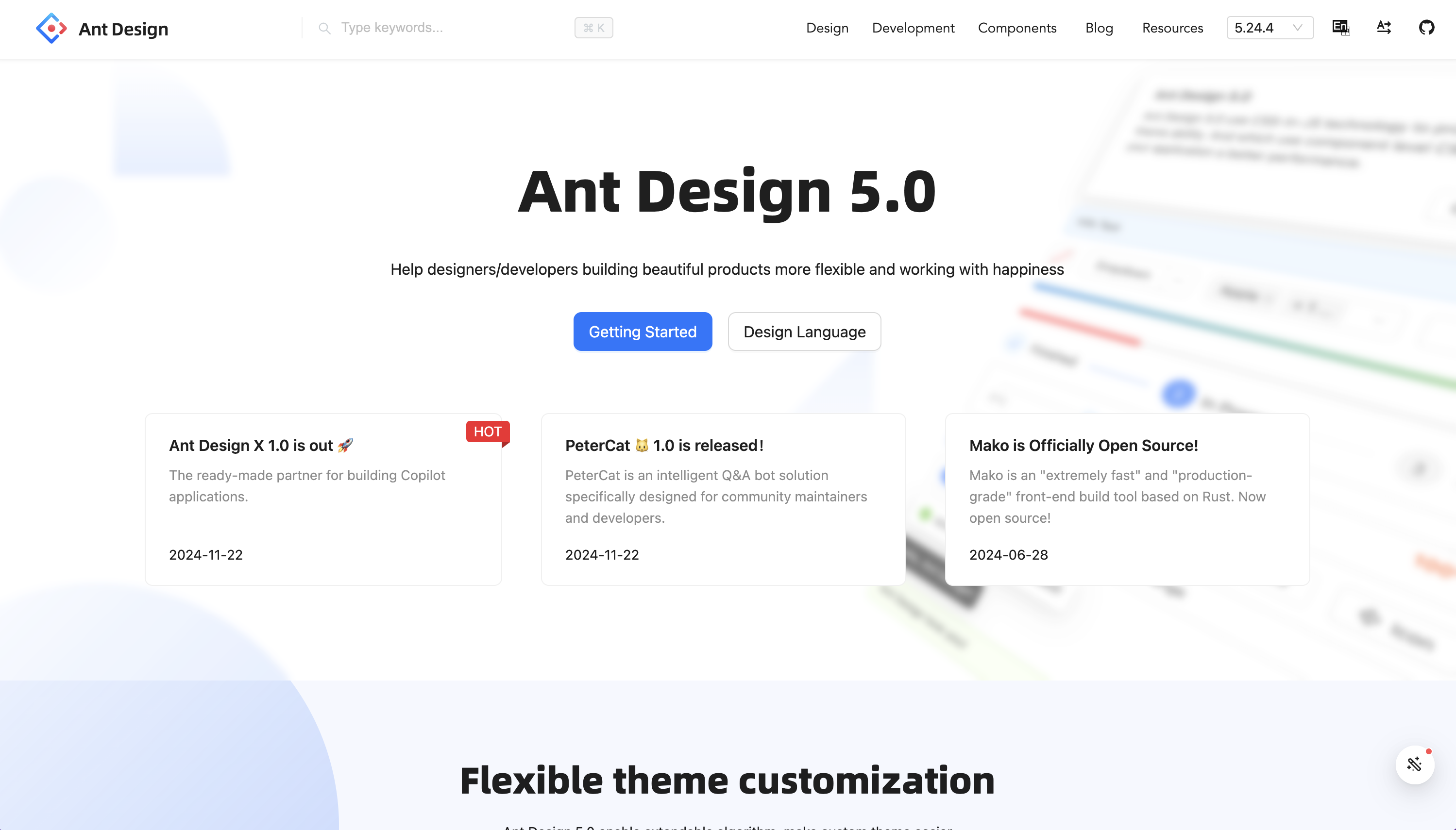
Ant Design isn’t just for enterprise apps—it’s a powerful, well-designed UI library that works great for projects of all sizes. Originally developed by Alibaba, it has become one of the most widely used React UI frameworks thanks to its extensive component set, polished design, and flexibility.
Here’s why Ant Design stands out:
- Rich components library: Tons of pre-built components to cover almost every scenario you can think of, from date pickers to advanced table handling.
- Customizable and themeable: While it leans towards a certain aesthetic out of the box, tweaking the design system is straightforward.
- Internationalization: Built-in support for multiple languages makes it ideal for global applications.
Who is it for:
- Developers building enterprise-grade applications that require scalability and a refined UI.
- Teams looking for a polished, well-documented UI framework with strong community support.
- Anyone who wants a feature-rich, consistent design system without reinventing the wheel.
As of March 2025, Ant Design continues to grow in popularity, with a thriving GitHub community of over 94,000 stars and over 1.4 million weekly downloads.
Learn more on https://ant.design/
3. Chakra UI: Accessibility and Usability First
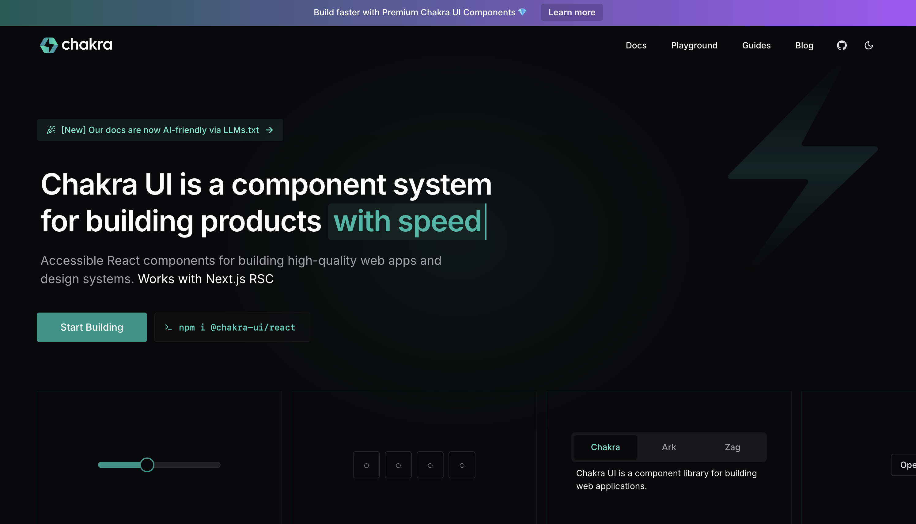
If you’re not already using Chakra UI, this may be the year to give it a shot. Known for its developer-friendly API and accessibility-first approach, Chakra UI makes building modern, user-friendly React applications a breeze.
Here’s why developers love Chakra UI:
- Out-of-the-box accessibility: All components are screen-reader friendly and keyboard accessible by default. You don't have to lift a finger.
- Built-in styling: Chakra’s prop-based styling system makes it incredibly easy to customize designs without writing complex CSS.
- Unmatched flexibility: Whether you’re building a quick demo or a full-fledged production app, Chakra UI scales beautifully to your needs.
Who is it for:
- Developers who want modern, accessible, and intuitive UI components without the hassle.
- Teams looking for a design system that scales seamlessly across different projects.
As of March 2025, Chakra UI has gained over 38,800 GitHub stars and sees 587,000+ weekly downloads, proving its continued popularity.
Learn more on https://mui.com/
4. Mantine: Your New Favorite Toolkit
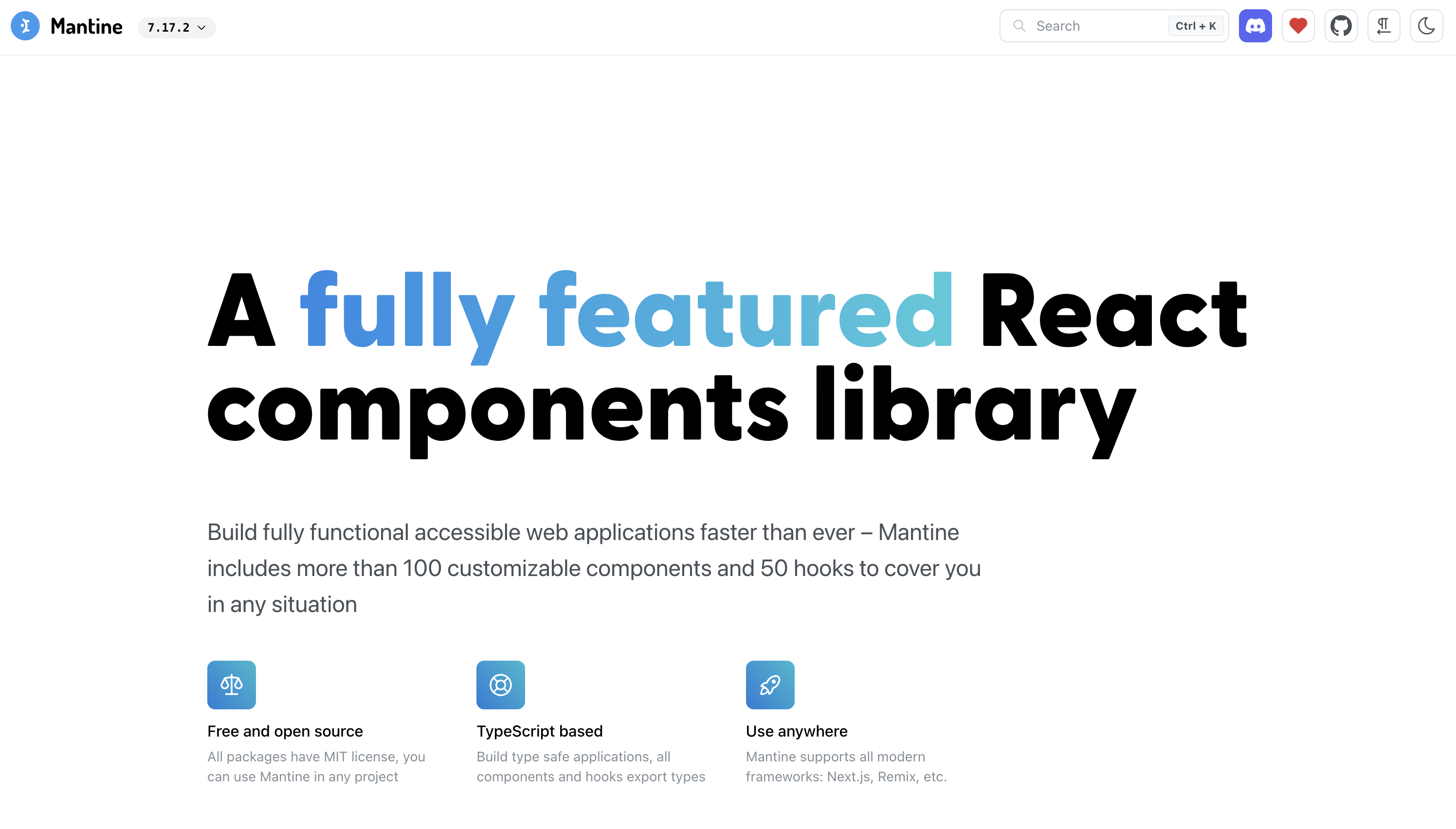
If you’re a fan of "all-in-one" solutions, meet Mantine. This library flies under the radar compared to giants like MUI but is quickly building a loyal following. Why? It’s fast, modern, and incredibly developer-friendly.
Here’s what makes Mantine stand out:
- 60+ Beautiful, Functional Components: From basic buttons to complex tables, Mantine covers a wide range of use cases right out of the box.
- Built-In Utility Hooks: No need for external libraries for things like form handling, modals, or notifications—it’s all built-in.
- Full Theme Support: Dark mode, RTL, custom themes—you name it, it’s supported. You get design flexibility without the overhead.
Who is it for:
- Developers who value speed, flexibility, and simplicity.
- Teams juggling tight deadlines but still needing room for customization.
As of March 2025, Mantine continues to gain traction, boasting 28,000 GitHub stars and over 490,000 weekly downloads.
Learn more on https://mantine.dev/
5. Shadcn UI: Tailwind Meets Radix
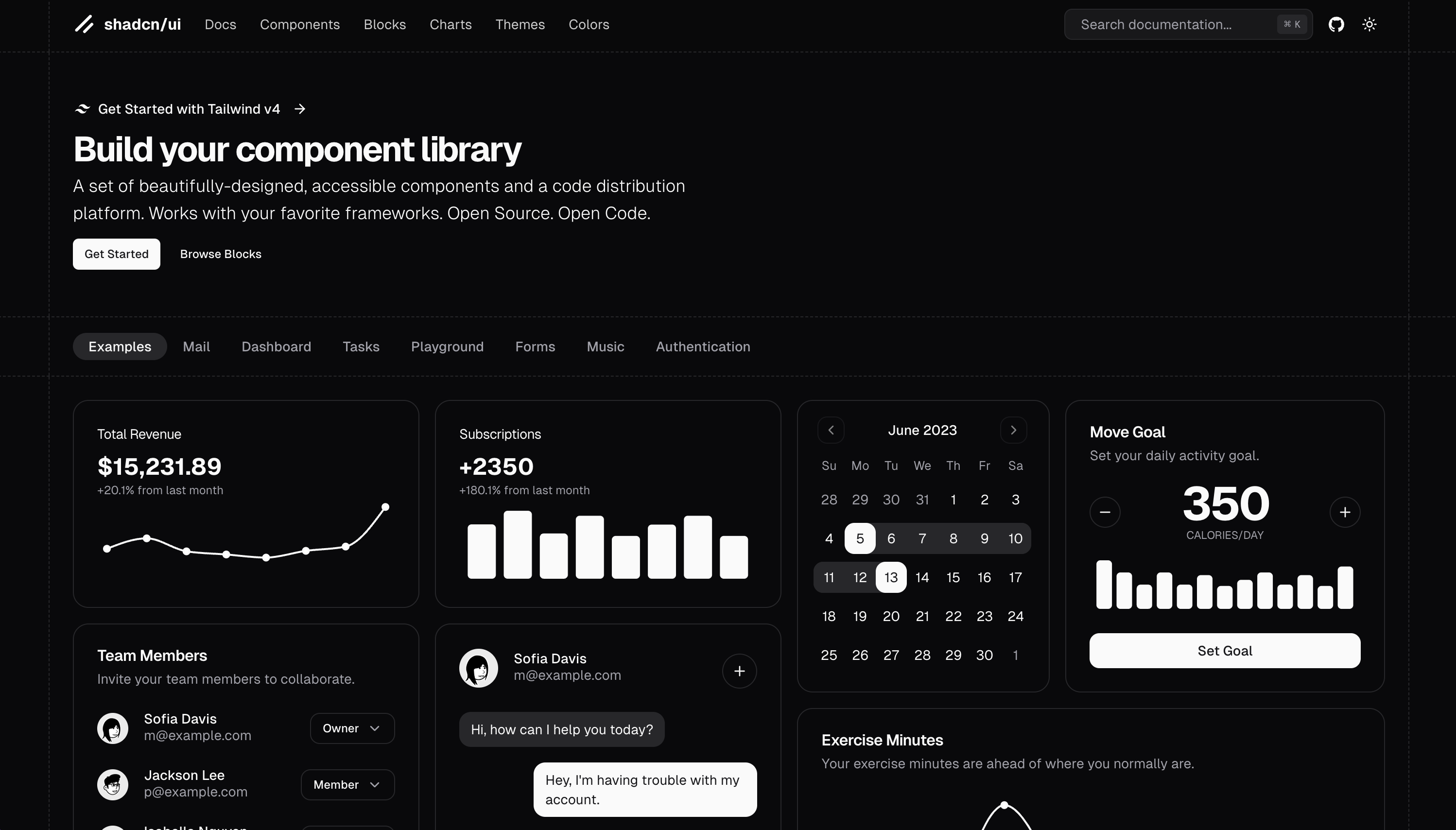
Let’s talk about the new kid on the block: Shadcn UI. This library is rising fast, thanks to its smart combination of Tailwind CSS and Radix UI. Think of it as a middle ground between pre-built components and complete customization.
Here's why Shadcn UI is gaining popularity:
- Built on Tailwind: If you’re already a fan of Tailwind CSS, this library feels like an extension of your toolkit.
- Pre-built yet customizable: Components come with a clean, modern look but are designed for easy customization to fit any design system.
- Lightweight performance: It’s designed with performance in mind, ensuring your app stays fast and lean.
Who is it for:
- Developers who want a Tailwind-native UI solution without the rigidity of traditional component libraries.
- Teams looking for pre-built, accessible components that don’t sacrifice flexibility.
As of March 2025, Shadcn UI continues to gain traction, boasting 83,000 GitHub stars and over 200,000 weekly downloads.
Learn more on https://ui.shadcn.com/
(Bonus) Radix UI: Precision and Control
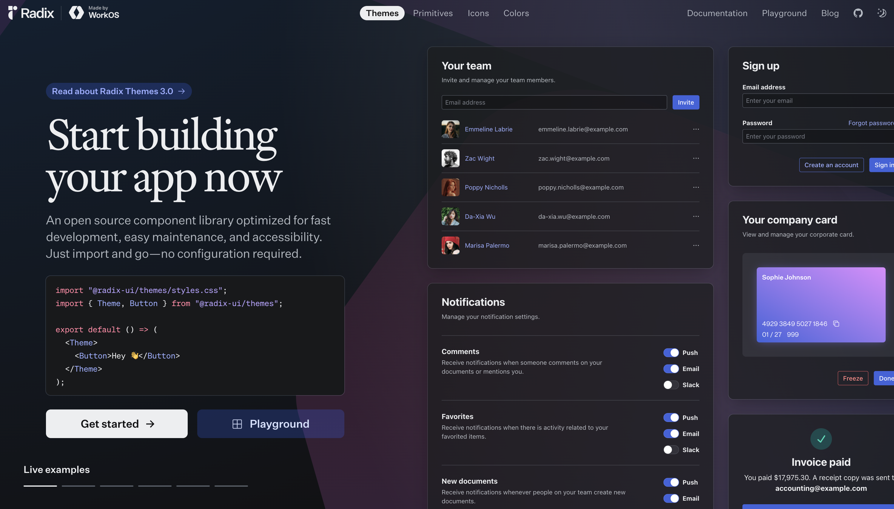
Not every project needs a fully-styled, opinionated design system. Sometimes, you need a library that gives you all the building blocks but lets you have full control over the final look. Here's where Radix UI comes in. It offers accessible, unstyled primitives that give you the freedom to build UI your way.
Here’s why developers choose Radix UI:
- Unstyled, accessible primitives: You get the raw components—buttons, modals, dropdowns—but the styling is entirely up to you.
- Composability at its core: Every component is designed to work beautifully together without locking you into a rigid structure.
- Accessibility baked in: Similar to Chakra, Radix prioritizes compliance with accessibility standards.
Who is it for:
- Developers who want maximum flexibility in styling while maintaining accessibility.
- Teams looking for a solid foundation of UI components without being locked into a specific design system.
As of March 2025, Radix UI remains on the rise, boasting a thriving GitHub community and over 130,000 weekly downloads.
Learn more on https://www.radix-ui.com/
Conclusion
So, which React.js UI library should you choose for your next project? Let’s recap:
- Use MUI if you want a polished, professional library with tons of components and customizable themes.
- Pick Ant Design if you’re building robust enterprise-grade applications or general-purpose applications.
- Go with Chakra UI for user-first, accessible designs that scale effortlessly.
- Mantine delivers an all-in-one toolkit with utility hooks and excellent TypeScript support.
- Explore Shadcn UI for a Tailwind-powered library that bridges the gap between pre-built ease and creative freedom.
- Otherwise if you need control over every pixel while keeping accessibility top-notch, choose Radix UI.
Every library on this list has its strengths, and the best choice boils down to your project's needs. Whether you prioritize speed, flexibility, or enterprise-level sophistication, there’s a library here for you.
📢 One More Thing: React PDF

We mentioned React PDF earlier, but it’s worth highlighting again. It effortlessly integrates into React and Next.js environments, offering features like theme customization and responsive layouts out-of-the-box. No need for additional libraries or complex setups—just a straightforward solution for displaying PDFs directly within your application.
If your application requires viewing or interacting with PDF documents, check out React PDF. Your support motivates me to keep creating valuable content for the React community 🙏
Now, get coding, and may your components always render perfectly! 🚀