In today's digital landscape, understanding common screen sizes is more critical than ever. Whether you're a web designer aiming for responsive layouts, a developer optimizing UI across platforms, or a homeowner picking the right screen door, knowing screen resolutions and dimensions ensures compatibility, clarity, and user satisfaction.
This article dives deep into the most common screen sizes across a variety of devices and applications—from laptops to projectors and even doors.
Why Screen Size and Resolution Matter
Before we break down specific dimensions, it’s essential to understand the relationship between screen size and screen resolution.
- Screen size refers to the physical dimensions of the display, usually measured diagonally in inches.
- Screen resolution, on the other hand, refers to the number of pixels on the screen, typically denoted in width x height (e.g., 1920x1080).
While size affects the physical usability and aesthetics, screen resolutions affect clarity and how much content fits on the screen. Designing for optimal user experience requires a balance of both.
Most Common Screen Sizes for Web and App Design
When creating digital products, it's vital to design for the most common screen sizes. This ensures your interface renders properly across devices.
Desktop and Laptop Resolutions
1920x1080 (Full HD) – By far the most common desktop resolution worldwide.
- 1366x768 – Popular among budget laptops and older models.
- 1440x900 and 1600x900 – Common in mid-range laptops and desktops.
- 2560x1440 (2K QHD) – Increasingly popular among professionals and gamers.
Designers often target these common window screen sizes for responsive layouts. The browser window can differ from the device's full resolution, so understanding common window screen sizes is essential in UI/UX development.
Common Laptop Screen Sizes
Laptops come in a variety of dimensions, and each screen size caters to different needs:
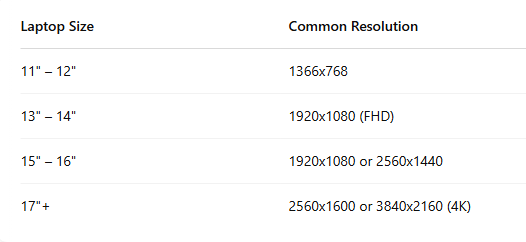
Common laptop screen sizes range from 13" to 15.6", striking a balance between portability and functionality. However, content creators and gamers often opt for 17” screens for better visibility.
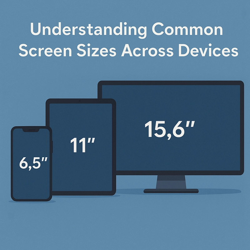
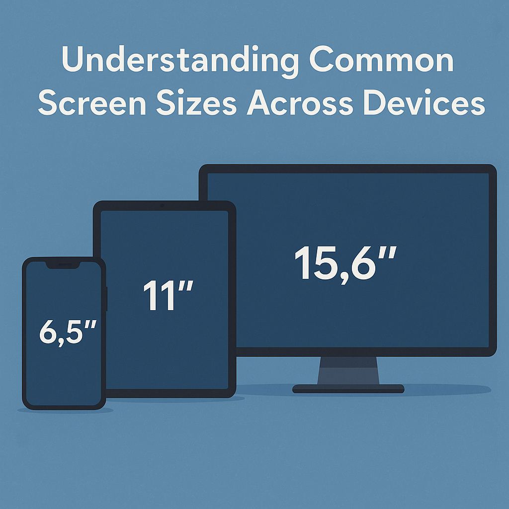
Common Mobile and Tablet Screen Sizes
Smartphones and tablets dominate web traffic, making it essential to accommodate these devices. Here are some of the most common screen sizes in mobile:
Smartphones
- 360x640 (typical design viewport for Android devices)
- 375x812 (iPhone X and newer)
- 414x896 (iPhone Plus models)
Tablets
- 768x1024 (iPad in portrait mode)
- 800x1280 (typical Android tablets)
Responsive design frameworks like Bootstrap include breakpoints to match these common screen sizes, allowing smooth scaling of content across mobile and tablet devices.
Common Projector Screen Sizes
In office spaces, schools, and home theaters, projectors are still widely used. Choosing the right screen size for a projector depends on the room size and throw distance.
Here are common projector screen sizes:
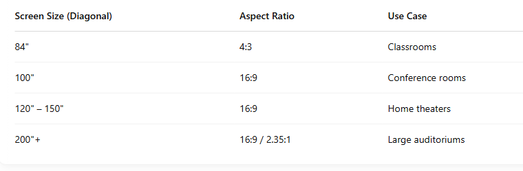
Common projector screen sizes favor widescreen (16:9) for compatibility with HD and 4K content. When choosing a projector screen, always match it with the projector’s native resolution to avoid distortion or letterboxing.
Common Screen Door Sizes
Screen sizes aren't just for electronics. In home improvement, common screen door sizes help ensure seamless airflow while keeping pests out. Here’s a breakdown:
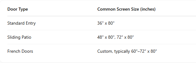
Homeowners shopping for replacements or custom installations should be aware of common screen door sizes to ensure proper fit and functionality.
Design Best Practices for Common Screen Sizes
To cater to the wide spectrum of devices and screen types, follow these practices:
1. Responsive Design
Use CSS media queries and frameworks to adapt layouts based on device width. This approach ensures consistency across common window screen sizes and devices.
2. Mobile-First Development
Design for the smallest screen first (like smartphones), then scale up. This method improves performance and usability across all common screen sizes.
3. Testing on Real Devices
Don’t just rely on simulators. Test your product on devices with different screen resolutions and aspect ratios to catch layout issues.
4. Use Vector Graphics
Icons and illustrations should be SVGs or vector-based so they scale properly across all common laptop screen sizes and more.
Tools to Check and Simulate Screen Sizes
Several tools help designers and developers simulate various common screen sizes:
- Chrome DevTools – Built-in screen emulation.
- Responsively App – View all breakpoints in one window.
- Screenfly by QuirkTools – Easy screen size previewing.
These tools help ensure your product looks polished across the most common screen sizes—from phones and laptops to larger displays.
Final Thoughts
Whether you’re designing a website, buying a new laptop, installing a screen door, or setting up a home theater, understanding common screen sizes plays a crucial role in achieving optimal functionality and user experience.
From common window screen sizes for responsive web design to common screen door sizes for a perfect home fit, being informed empowers you to make better choices across tech and home improvement projects.
Incorporate support for screen resolutions that cover the most common screen sizes—especially for laptops and mobile—and test across real devices. By doing so, you’ll future-proof your projects and meet users where they are.