This post was originally published at thedevspace.io. Everything you need to master web development, all in one place.
After defining the layout, the next step is to deal with the alignment of items. There are nine different alignment properties, as shown in the list below:
align-contentalign-itemsalign-selfjustify-contentjustify-itemsjustify-selfplace-contentplace-itemsplace-self
This is one of the most complex topics in HTML and CSS, as they do different things for different layout systems.
We'll start by discussing how they work inside a grid layout.
Grid layout
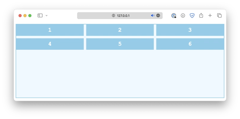
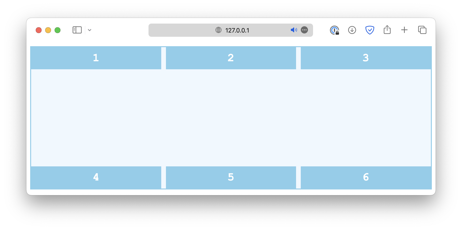
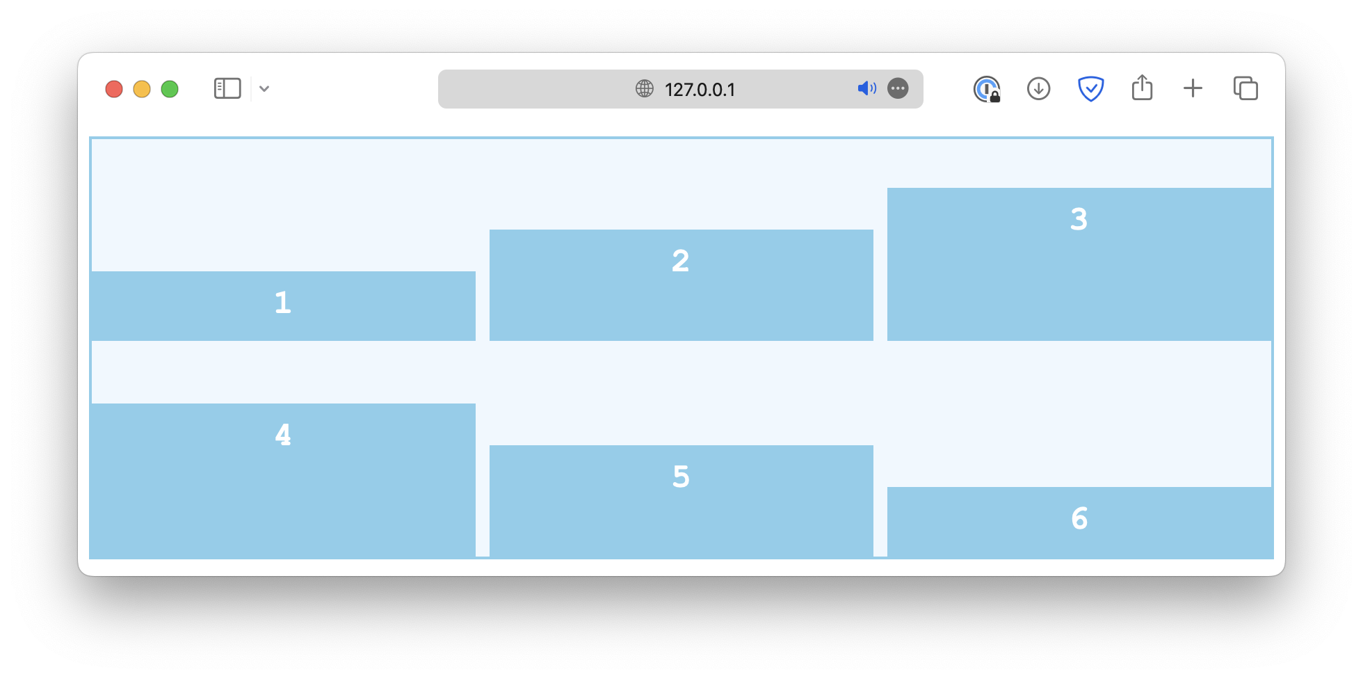
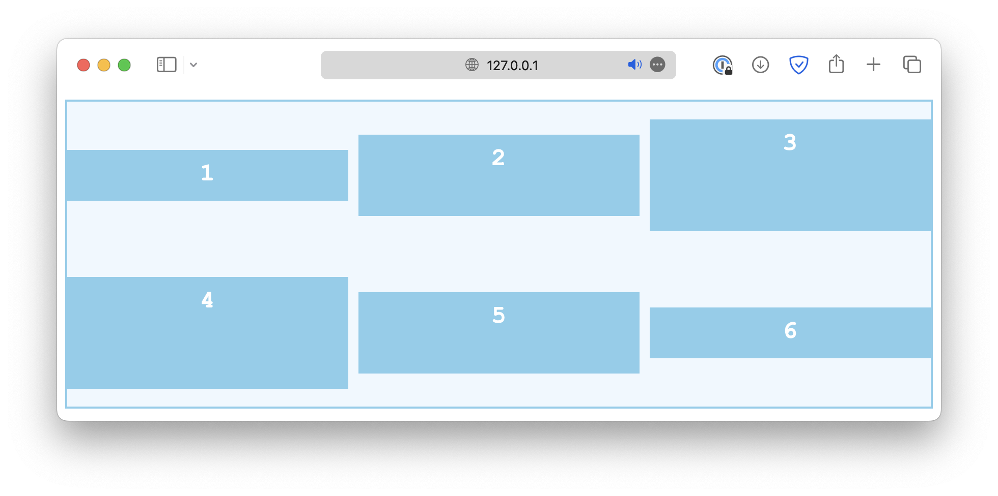
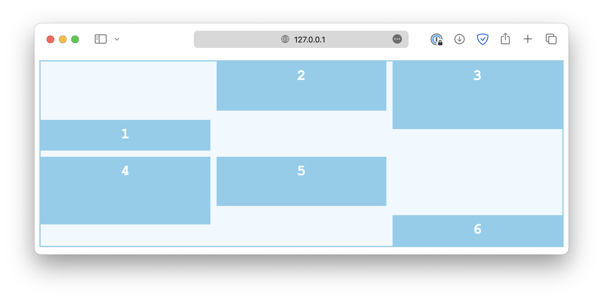
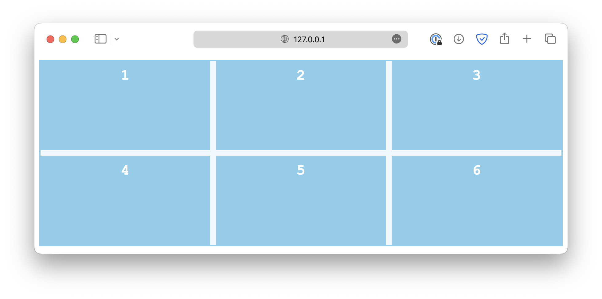
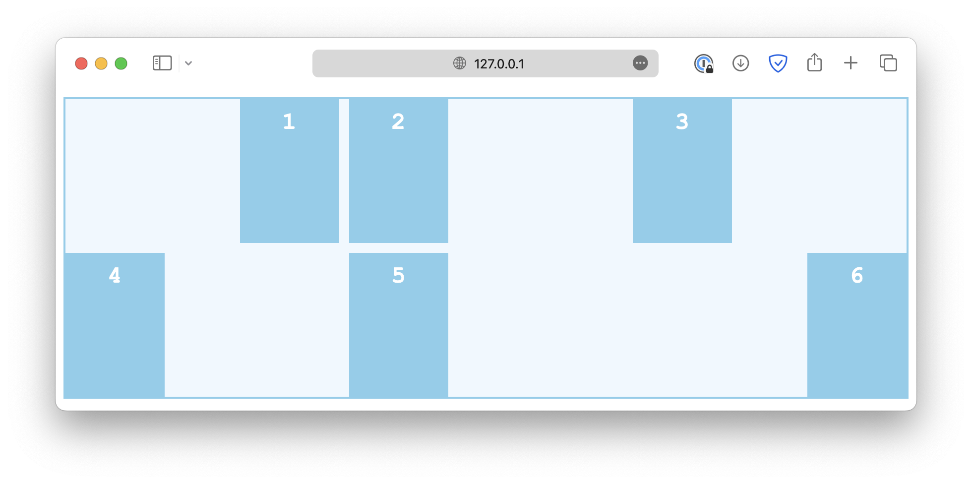
When it comes to aligning items in a grid, we have to talk about both row and column alignments. As an example, this is a grid with six items, and the grid container is 300px high:
class="container">
   class="item">1
   class="item">2
   class="item">3
   class="item">4
   class="item">5
class="item">6.container {
display: grid;
grid-template-columns: auto auto auto;
gap: 10px;
height: 300px;
}Row alignment
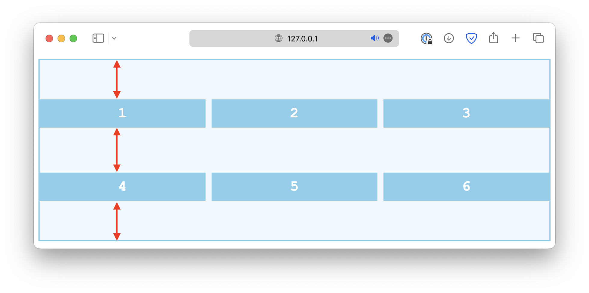
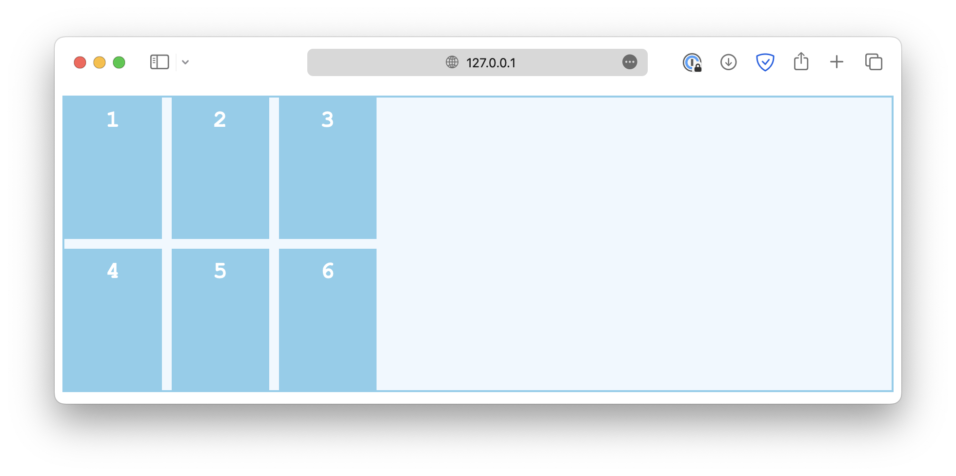
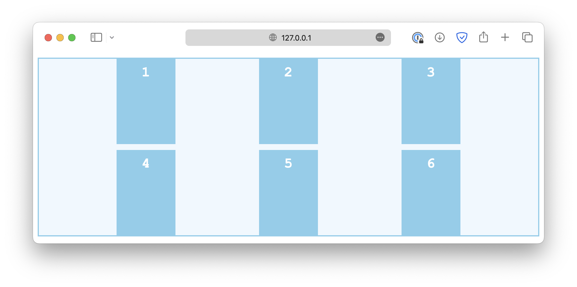
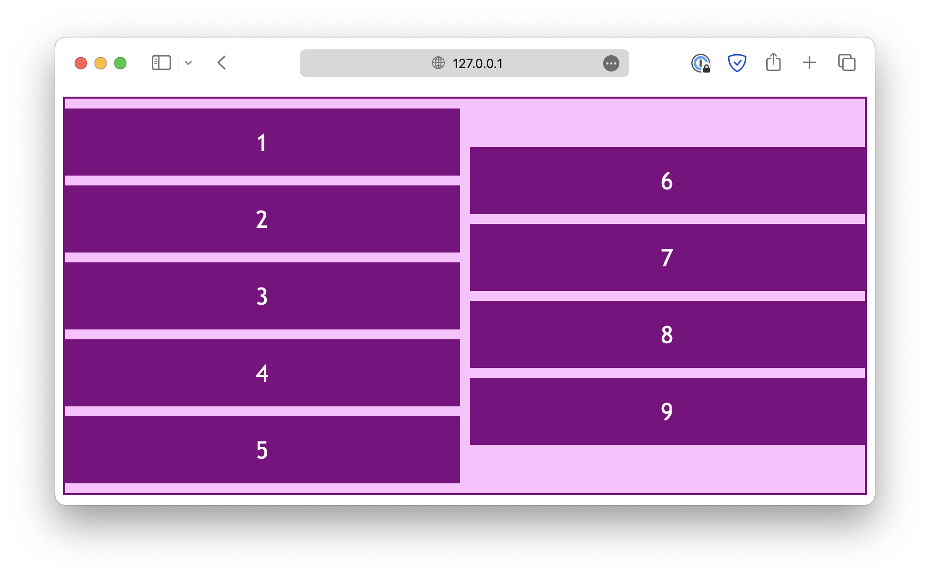
The align-content property is used to specify how the rows are positioned in a multi-row grid or flex container. For a grid layout, the common values include:
-
start
.container {
  align-content: start;
}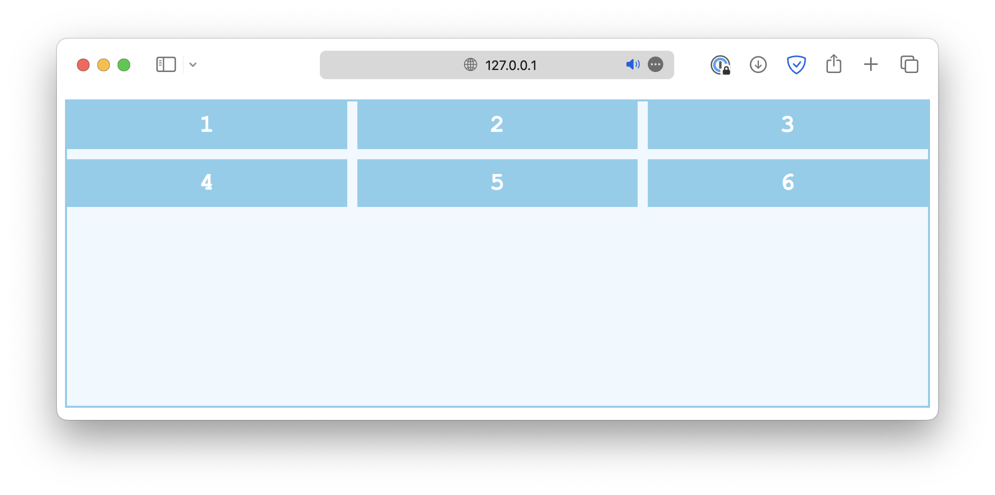
-
end
.container {
  align-content: end;
}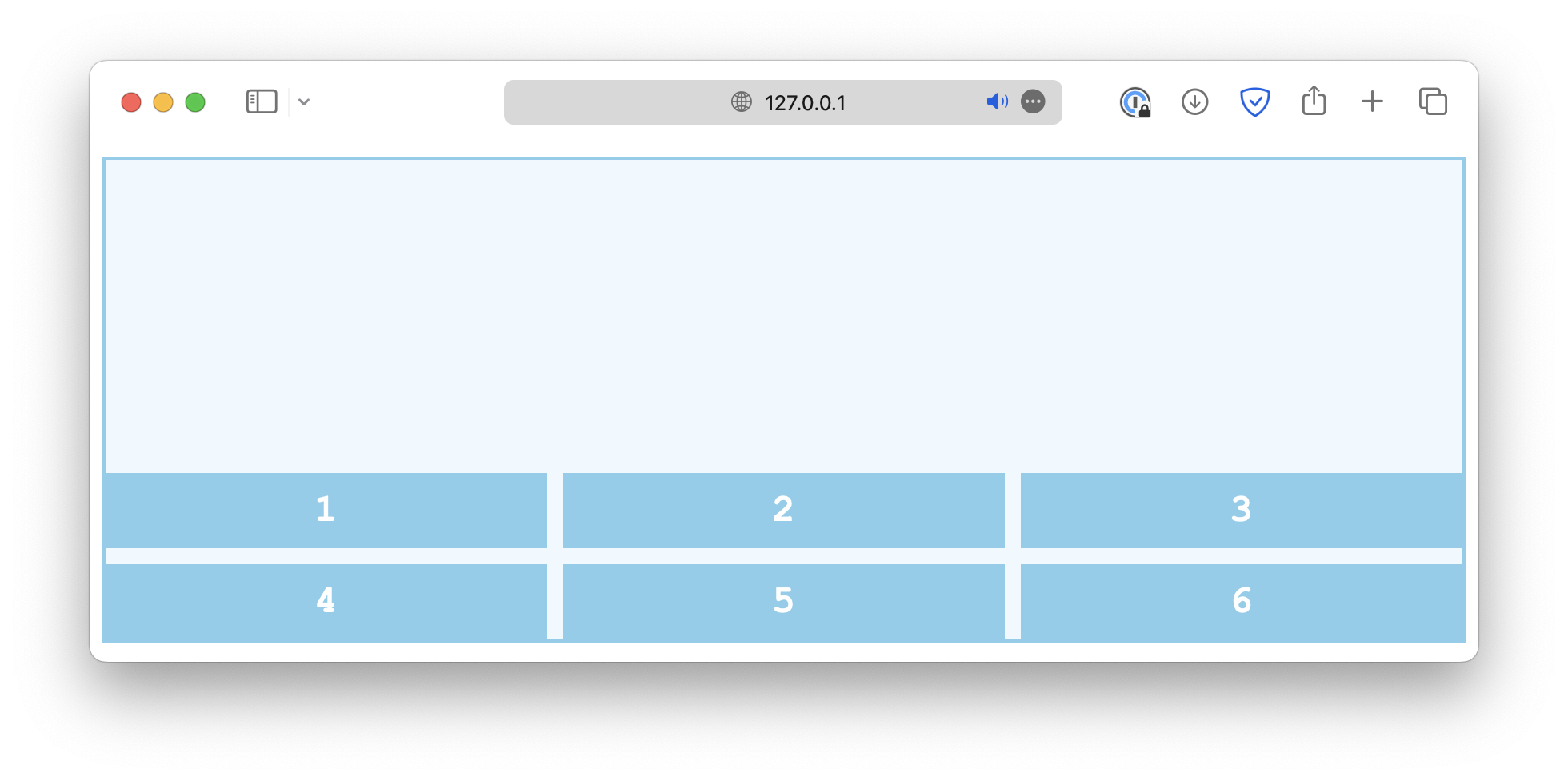
-
center
.container {
  align-content: center;
}
-
space-between
.container {
  align-content: space-between;
}
-
space-around
.container {
  align-content: space-around;
}
-
space-evenly
.container {
  align-content: space-evenly;
}
-
stretch
.container {
  align-content: stretch;
}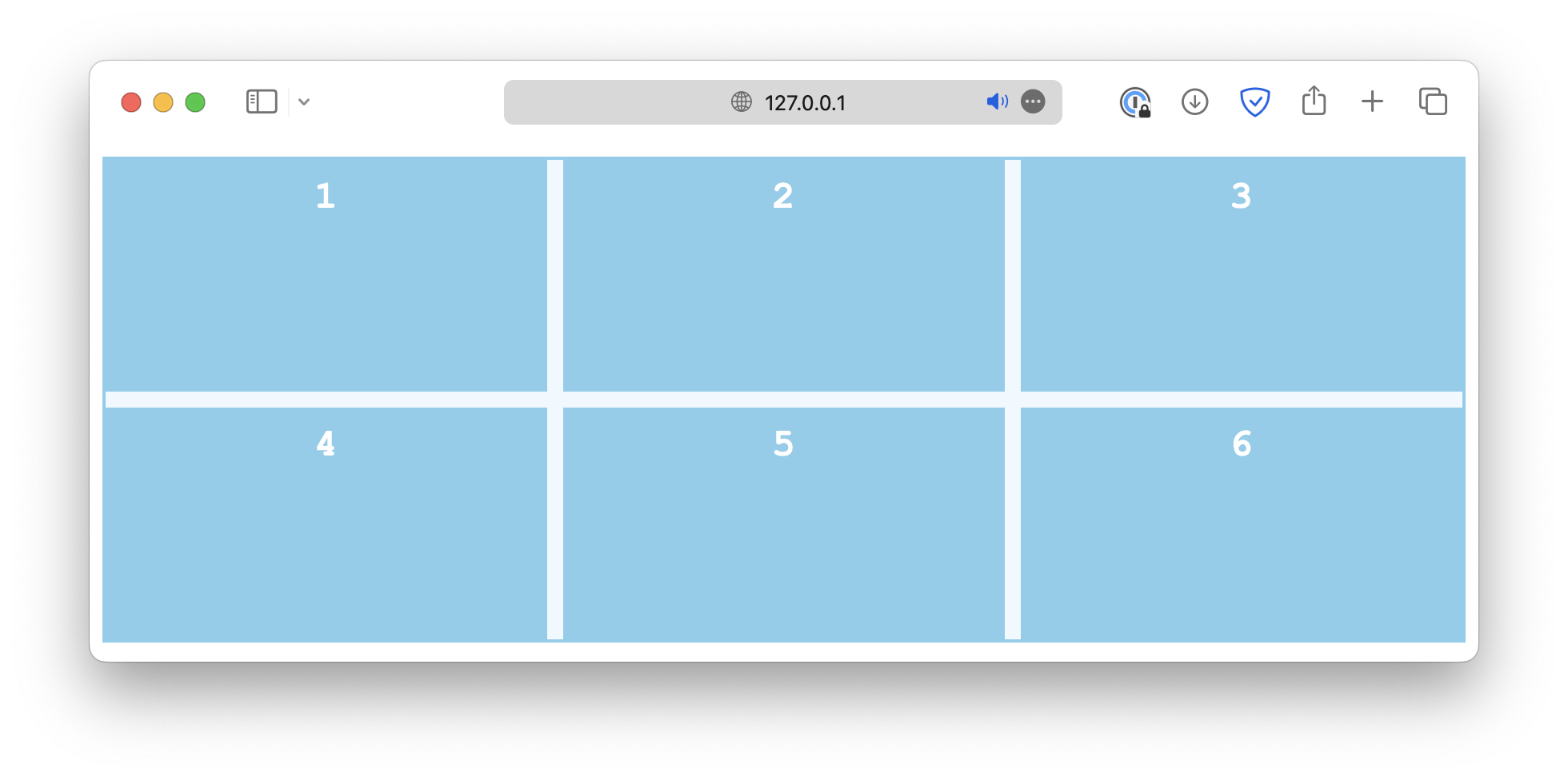
align-items, on the other hand, is used to define how the items are positioned within their respective grid cell. Common values include:
-
start
.container {
  align-items: start;
}
-
end
.container {
  align-items: end;
}
-
center
.container {
  align-items: center;
}
-
stretch
.container {
  align-items: stretch;
}
-
baseline
.container {
  align-items: baseline;
}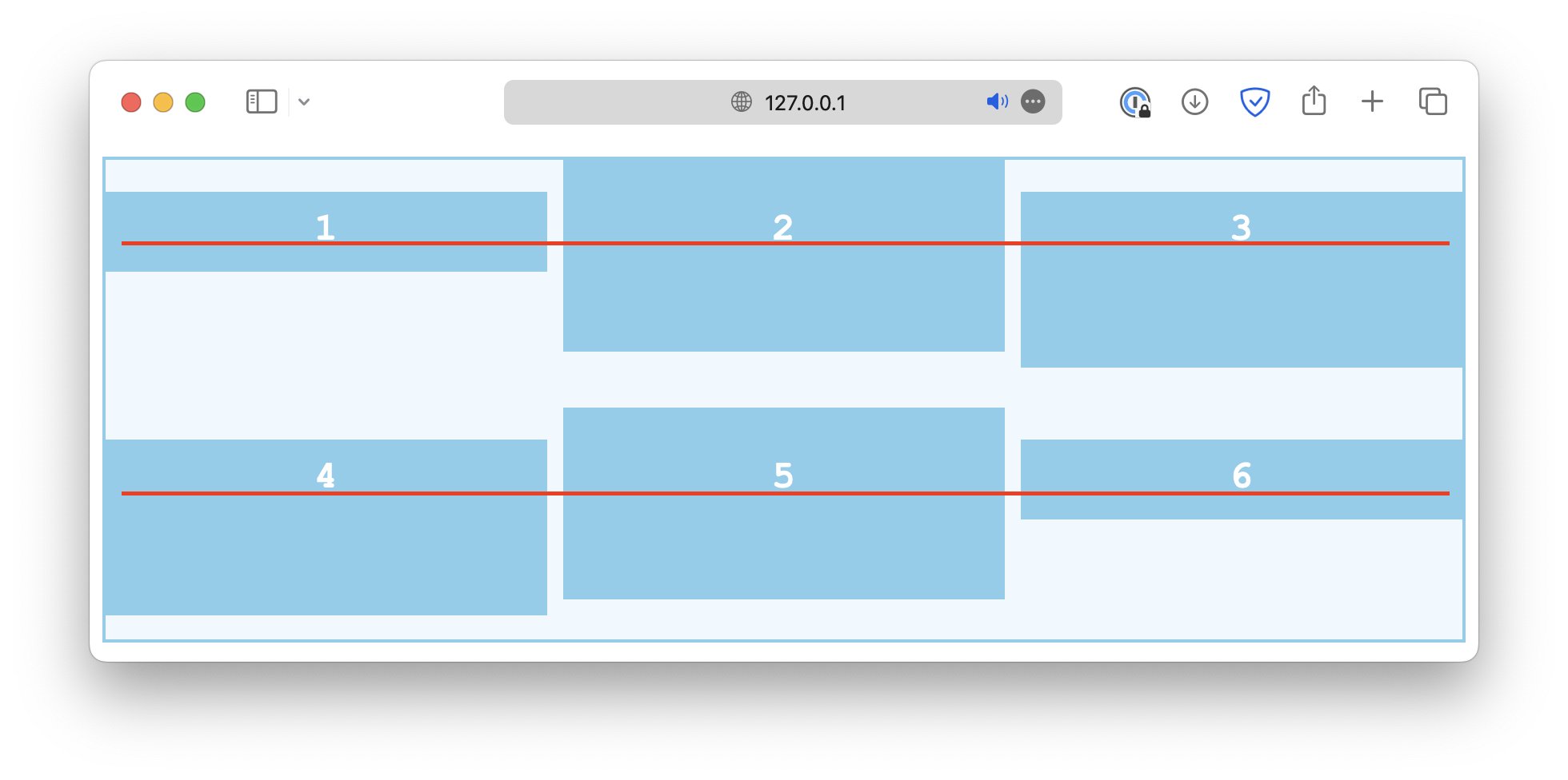
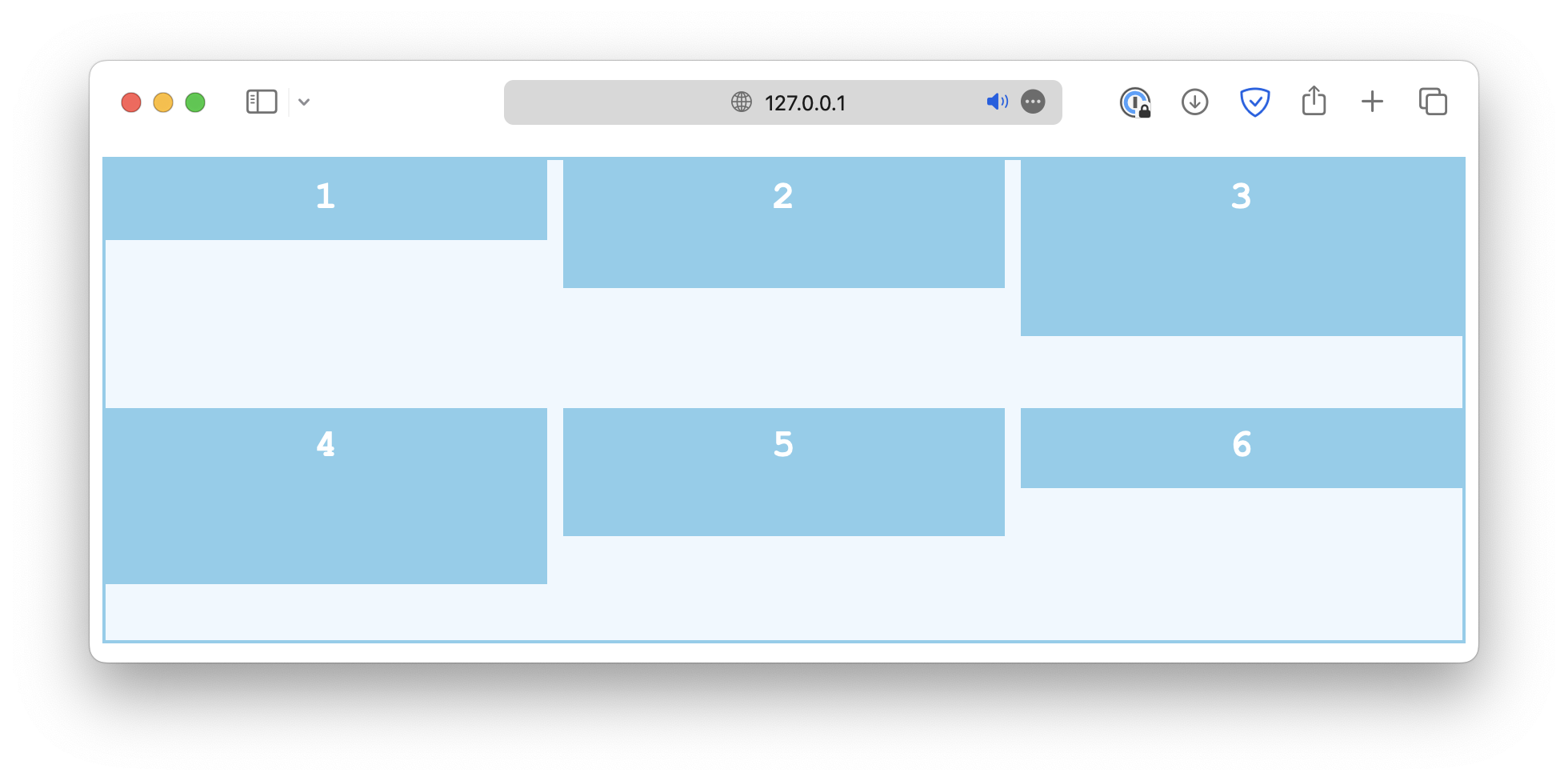
Lastly, the align-self property works just like align-items, except it is used on individual grid cells. If the container has the align-items set, it will be overwritten by align-self.
.container {
  align-items: start;
}

#Item {
  align-self: end;
}
Column alignment
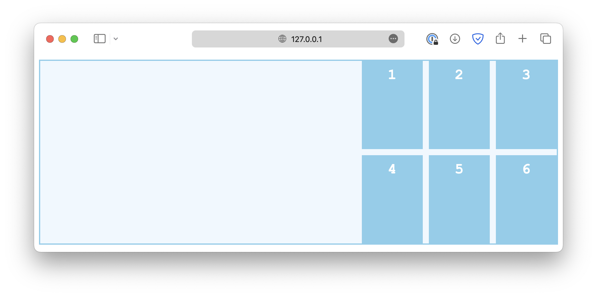
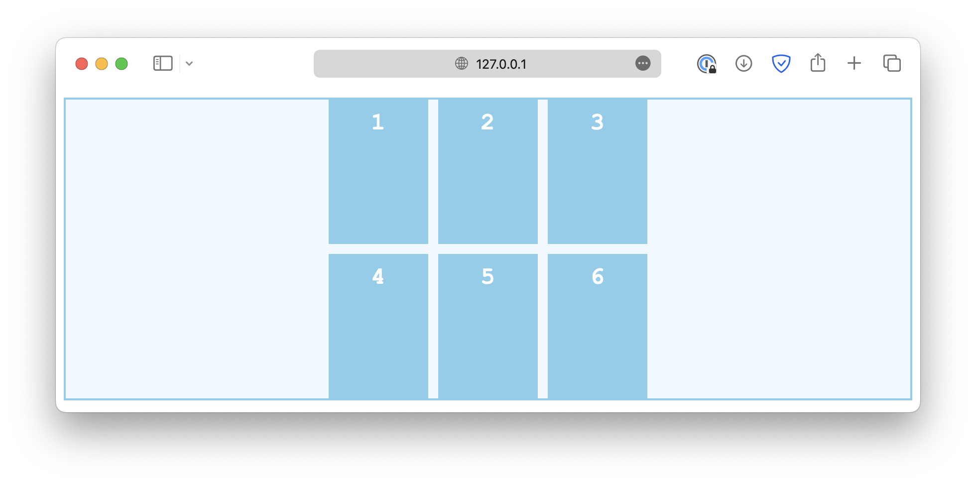
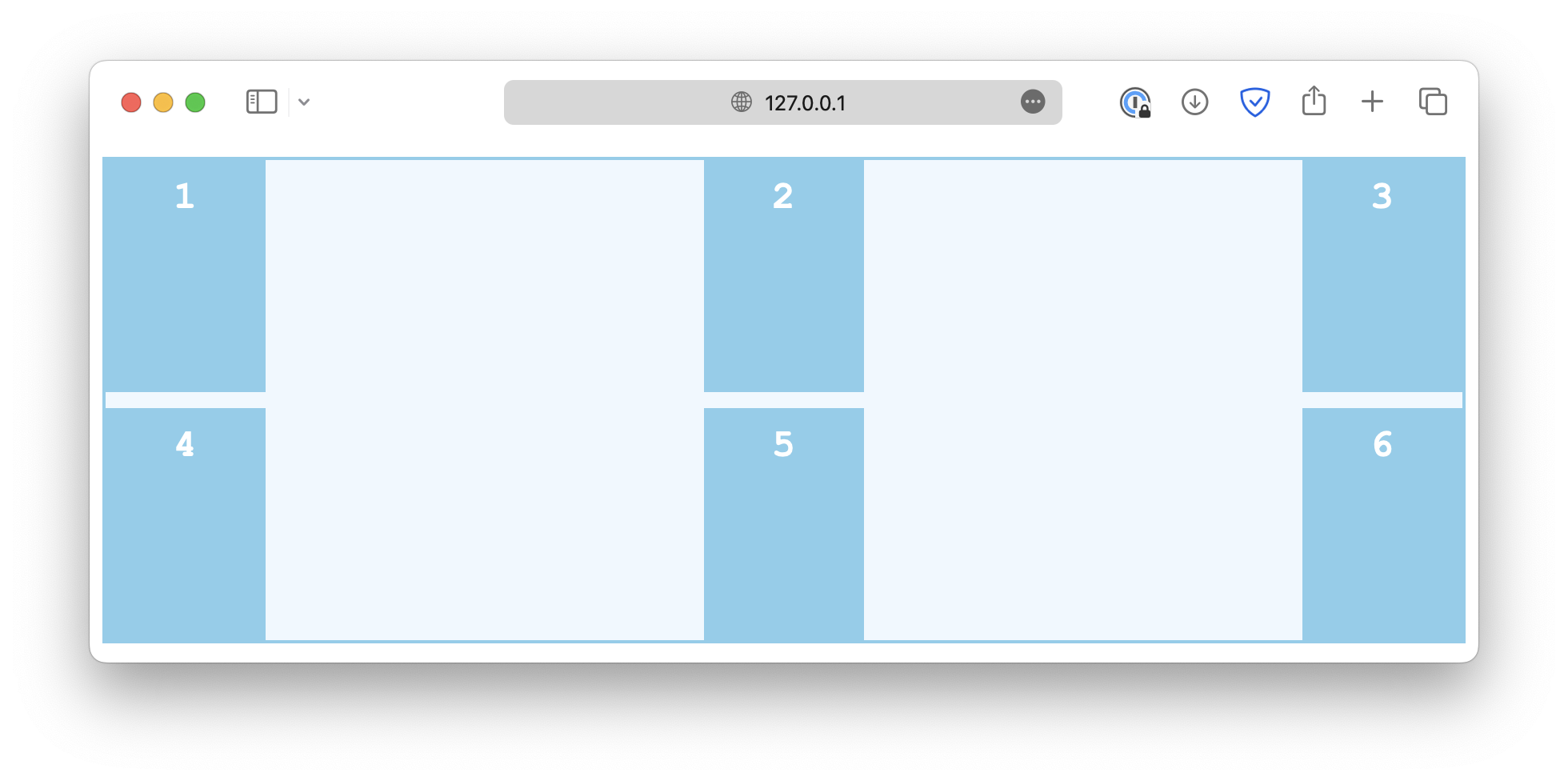
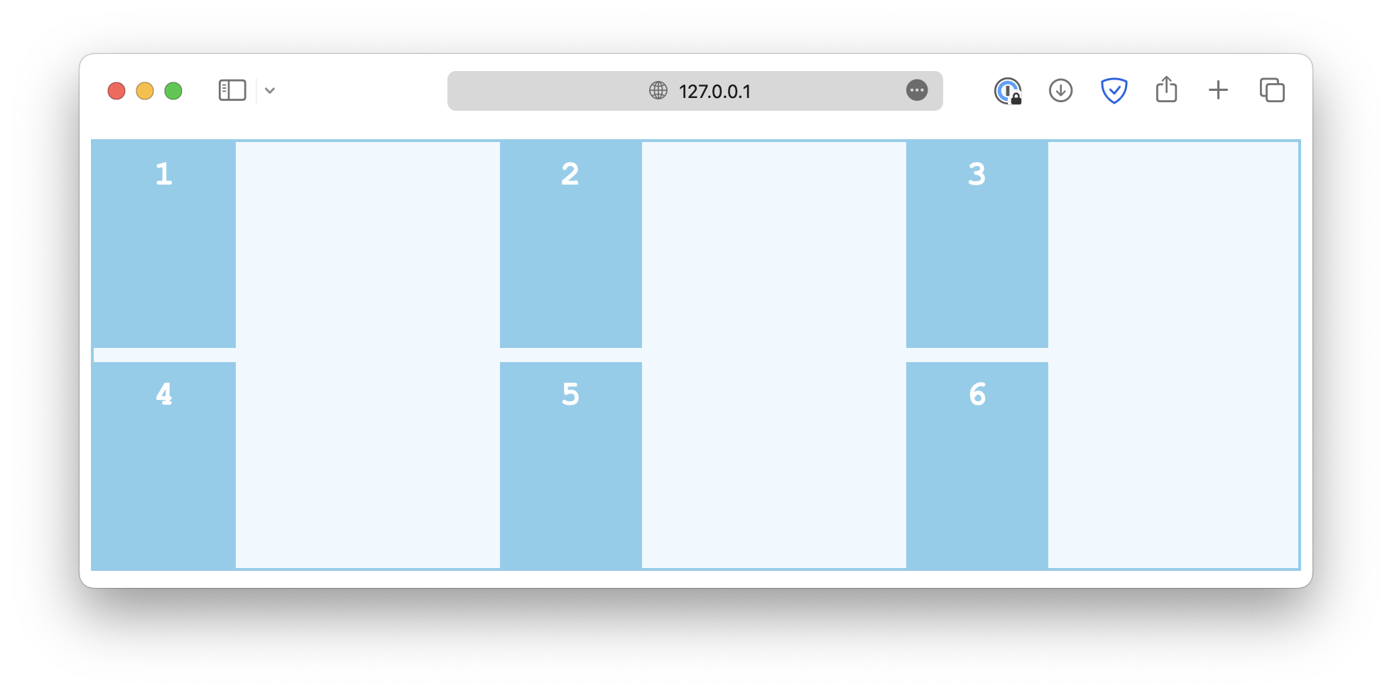
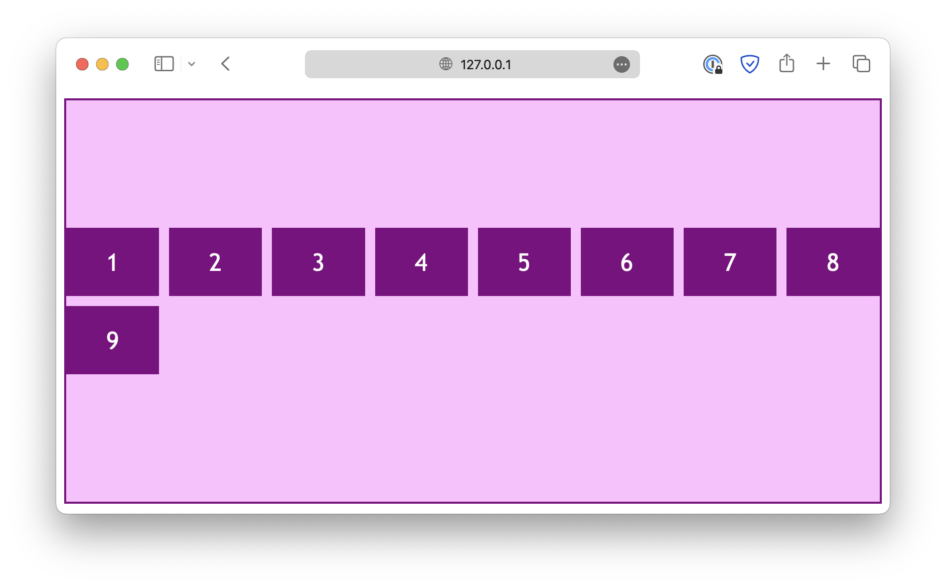
The column alignment, controlled by the justify properties, works in a similar way. First, the justify-content property defines how grid items are distributed horizontally along the main axis. Some common values are:
-
start
.container {
  justify-content: start;
}
-
end
.container {
  justify-content: end;
}
-
center
.container {
  justify-content: center;
}
-
space-between
.container {
  justify-content: space-between;
}
-
space-around
.container {
  justify-content: space-around;
}
-
space-evenly
.container {
  justify-content: space-evenly;
}
The justify-items controls how grid items are aligned horizontally within their cells. Some common values are:
-
start
.container {
  justify-items: start;
}
-
end
.container {
  justify-items: end;
}
-
center
.container {
  justify-items: center;
}
-
stretch
.container {
  justify-items: stretch;
}
Similarly, the justify-self property is used on individual grid items to overwrite the default alignment rule set by justify-items.
.container {
  justify-items: start;
}

.item-sm {
  justify-self: end;
}
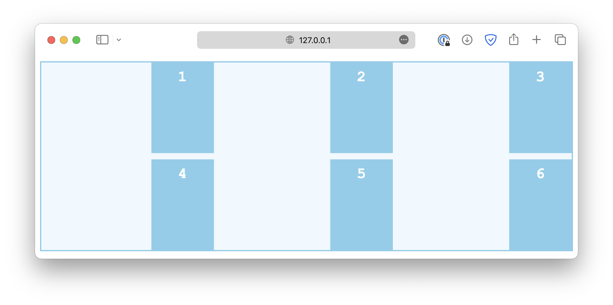
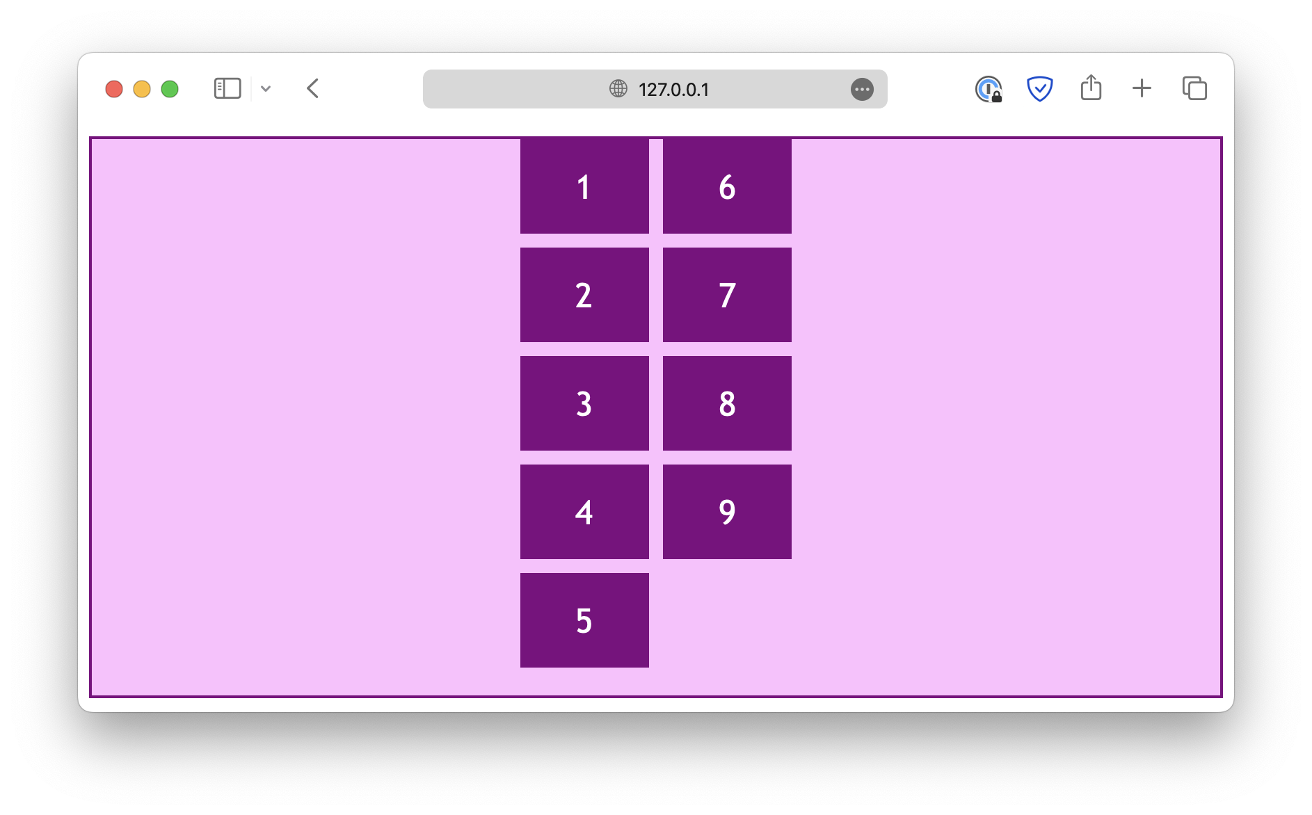
Alignment in both directions
.container {
  display: grid;
  grid-template-columns: auto auto auto;
  gap: 10px;
  height: 300px;

  place-content: center;
}
This is the same as:
.container {
  display: grid;
  grid-template-columns: auto auto auto;
  gap: 10px;
  height: 300px;

  align-content: center;
  justify-content: center;
}Flex layout
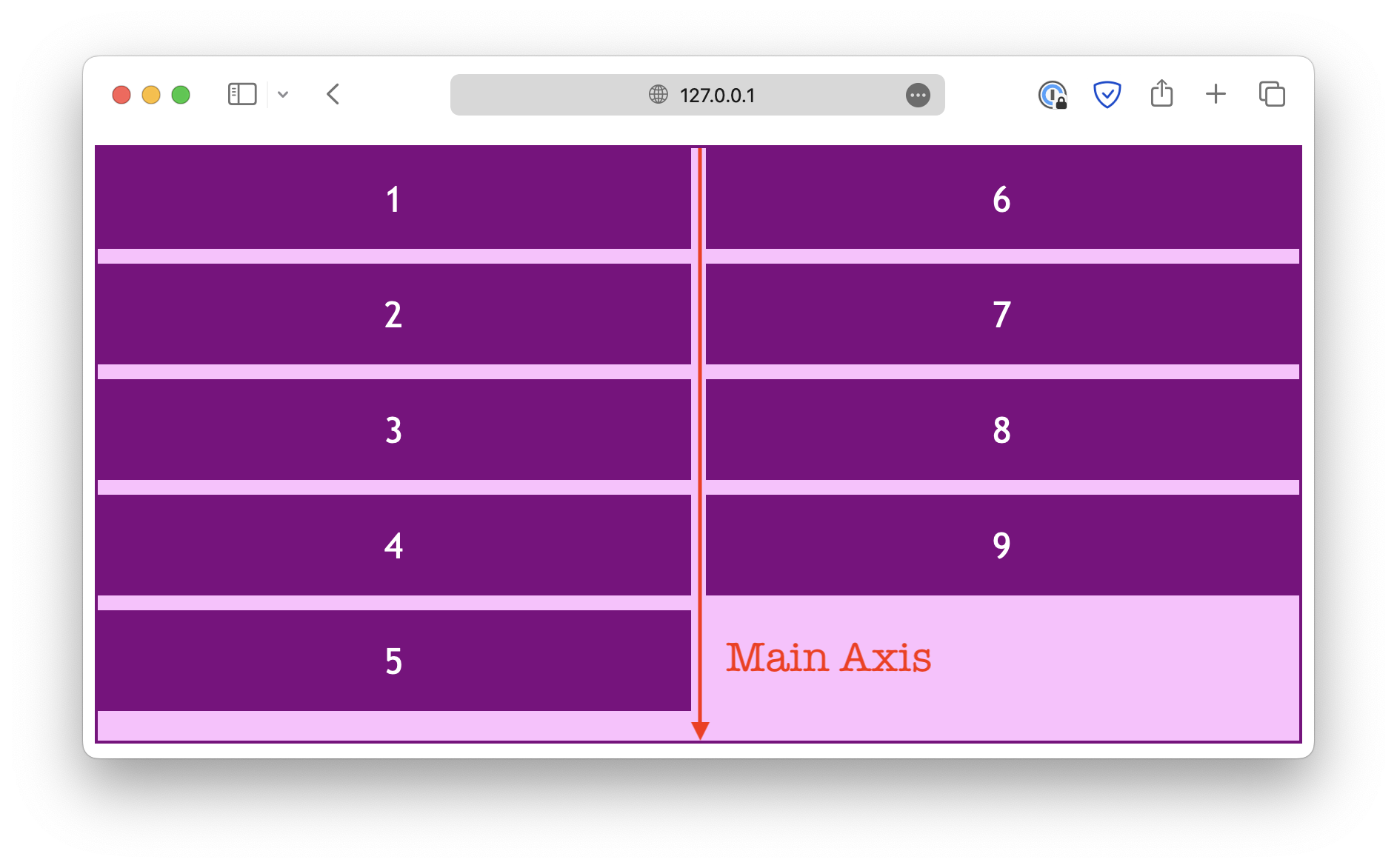
The exact same alignment properties can be used for flexbox layouts. However, instead of row and column alignments, the justify properties deal with the alignment in the flexbox's main axis, which depends on the flex-direction property.
If flex-direction is set to row, the main axis is horizontal:
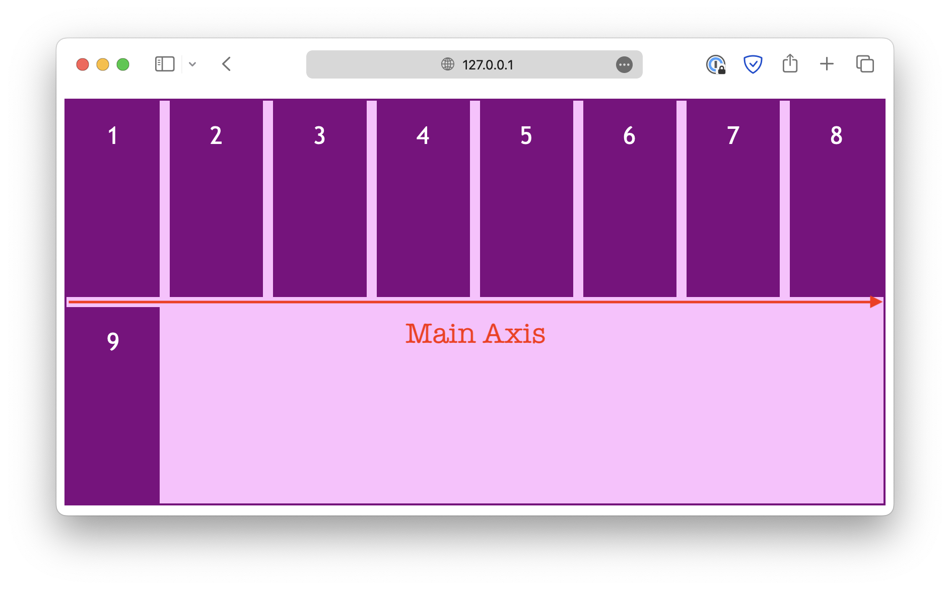
When you change the flex-direction property, the main axis also changes.
Parallel to the main axis
The justify properties deal with alignments in the direction parallel to the flex main axis. For example, when the flex-direction is set to row:
.container {
  display: flex;
  flex-direction: row;
  flex-wrap: wrap;

  height: 400px;

  /* align-content: center; */
  justify-content: center;
}
And when the flex-direction is set to column:
.container {
  display: flex;
  flex-direction: column;
  flex-wrap: wrap;

  height: 400px;

  /* align-content: center; */
  justify-content: center;
}
Note that the justify-items and justify-self properties are ignored in a flex layout.
Also, instead of start and end, there are flex-start and flex-end, designed specifically for a flex layout. In most cases, the keywords start and end would also work for a flex layout, but you might need to use the flex-* keywords for the best browser compatibility.
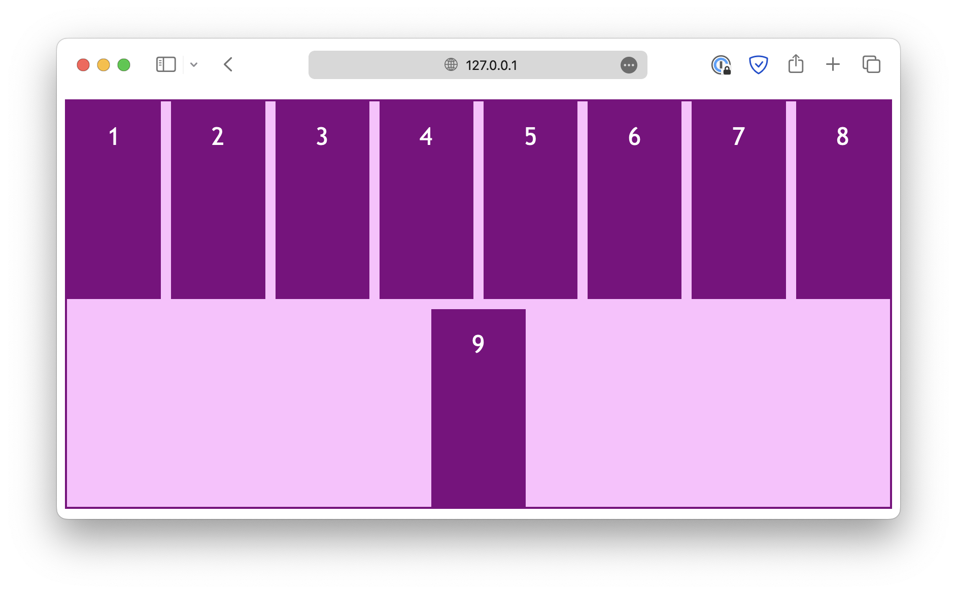
Perpendicular to the main axis
On the other hand, the align properties deal with the alignment in the direction perpendicular to the main axis. When the flex-direction is set to row:
.container {
  display: flex;
  flex-direction: row;
  flex-wrap: wrap;

  height: 400px;

  align-content: center;
}
And when the flex-direction is set to column:
.container {
  display: flex;
  flex-direction: column;
  flex-wrap: wrap;

  height: 400px;

  align-content: center;
}
Unlike the justify properties, the align-items and align-self properties work in a flex layout.
Similarly, the place properties are a set of shorthand properties that allow you to define justification and alignment at the same time.
You may experiment with the above CodePen demo.
Read More
- How to Build a Web App with JavaScript
- Learn about Network and HTTP in JavaScript
- How to Add Box Shadow Using CSS
Follow us for daily coding tips:
🔹 TheDevSpace | LinkedIn
🔹 TheDevSpace | X
🔹 TheDevSpace | Threads
🎯 Mastering z-index: Control Element Stacking in CSS
z-index is used to control the order of elements when they are stacked on top of each other. The property accepts integer values, the higher the integer, the higher the order. For example,
class="item1">z-index: 1
 class="item2">z-index: 2
 class="item3">z-index: 3
 class="item4">z-index: 2
 class="item5">z-index: 1

class="item">Try to change the z-index of this boxdiv {
font-family: Georgia, "Times New Roman", Times, serif;
font-size: x-large;
text-align: center;
padding: 20px;
border: 1px solid orange;
background-color: bisque;
position: absolute;
}
.item {
top: 0px;
left: 0px;
height: 300px;
border: 1px solid skyblue;
background-color: lightblue;
}
.item1 {
top: 0px;
left: 0px;
z-index: 1;
}
.item2 {
top: 50px;
left: 50px;
z-index: 2;
}
.item3 {
top: 100px;
left: 100px;
z-index: 3;
}
.item4 {
top: 150px;
left: 50px;
z-index: 2;
}
.item5 {
top: 200px;
left: 0px;
z-index: 1;
}By default, the box .item4 should be on top of .item3, but we configured their z-index values, and because .item3 has a higher order, it will be on top of all other elements.
You can also change the z-index of the blue box (.item) to see what happens.