📊 A developer-friendly guide to visualizing data with ease in Flutter apps
Introduction
Data visualization is a powerful way to present complex information clearly and interactively. Whether you're building a fitness tracker, finance app, or analytics dashboard, charts can greatly enhance the user experience. In Flutter, the fl_chart package makes it easy to add beautiful and customizable charts to your apps.
In this blog, we'll explore how to use fl_chart to create different types of charts — line, bar, pie, and radar — and customize them to match your app’s style.
1. Getting Started with fl_chart
To begin, add the fl_chart package to your pubspec.yaml file:
dependencies:
  fl_chart: ^0.70.2
Then run:
flutter pub getNow import it into your Dart file:
import 'package:fl_chart/fl_chart.dart';2. Line Chart – Tracking Trends
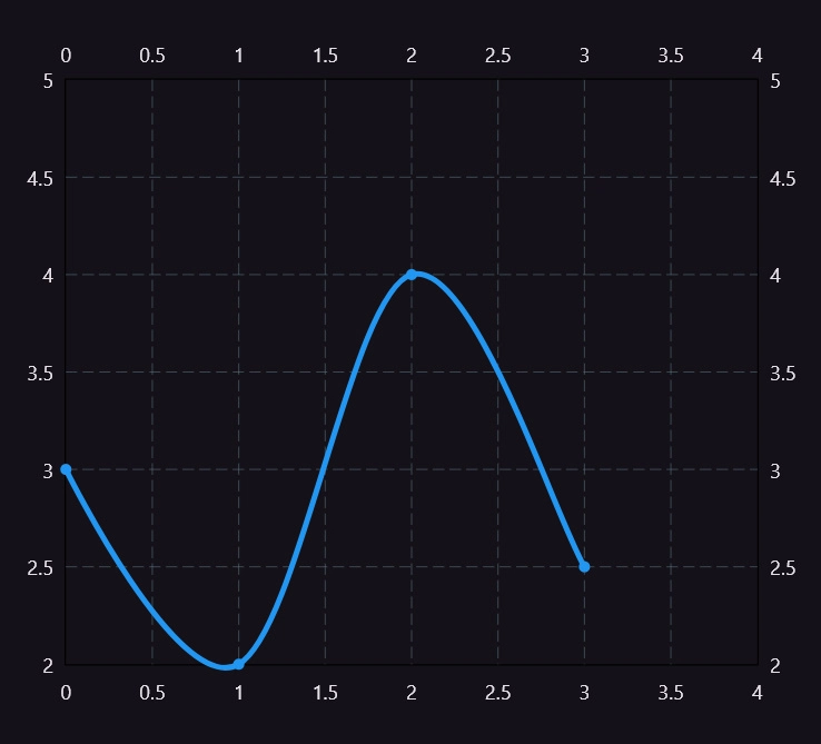
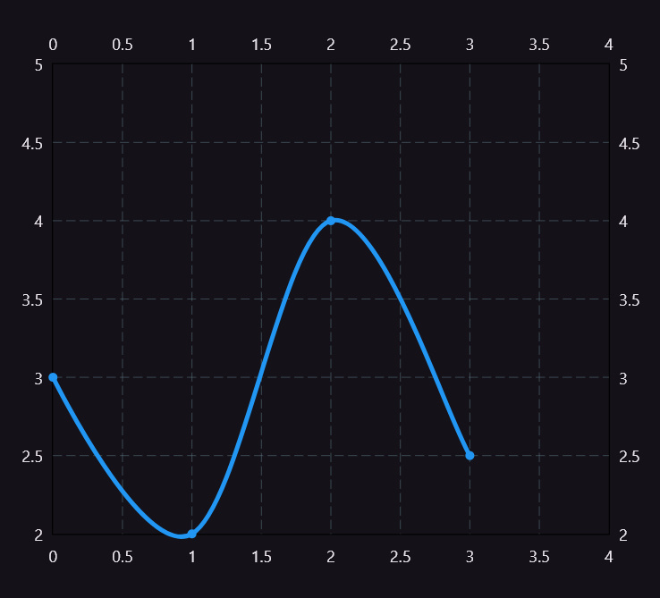
A line chart is ideal for showing data over time, like daily temperature or stock prices.
LineChart(
  LineChartData(
    lineBarsData: [
      LineChartBarData(
        spots: [
          FlSpot(0, 3),
          FlSpot(1, 1),
          FlSpot(2, 4),
          FlSpot(3, 1.5),
        ],
        isCurved: true,
        colors: [Colors.blue],
        barWidth: 4,
        belowBarData: BarAreaData(show: true, colors: [Colors.blue.withOpacity(0.3)]),
      ),
    ],
  ),
)
✅ Tip: Use isCurved: true for a smooth line.
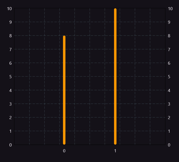
3. Bar Chart – Comparing Data
Bar charts are great for side-by-side comparisons, like monthly expenses or category-wise sales.
BarChart(
  BarChartData(
    barGroups: [
      BarChartGroupData(
        x: 0,
        barRods: [BarChartRodData(toY: 8, color: Colors.orange)],
      ),
      BarChartGroupData(
        x: 1,
        barRods: [BarChartRodData(toY: 10, color: Colors.orange)],
      ),
    ],
  ),
)
✅ Tip: Customize spacing and axis titles for better readability.
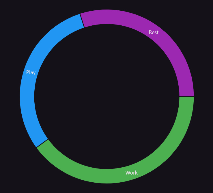
4. Pie Chart – Proportional Insights
Pie charts work well for showing proportional data, such as time spent on different tasks or market shares.
PieChart(
  PieChartData(
    sections: [
      PieChartSectionData(value: 40, title: 'Work', color: Colors.green),
      PieChartSectionData(value: 30, title: 'Play', color: Colors.blue),
      PieChartSectionData(value: 30, title: 'Rest', color: Colors.purple),
    ],
  ),
)
✅ Tip: You can use titleStyle to stylize section labels.
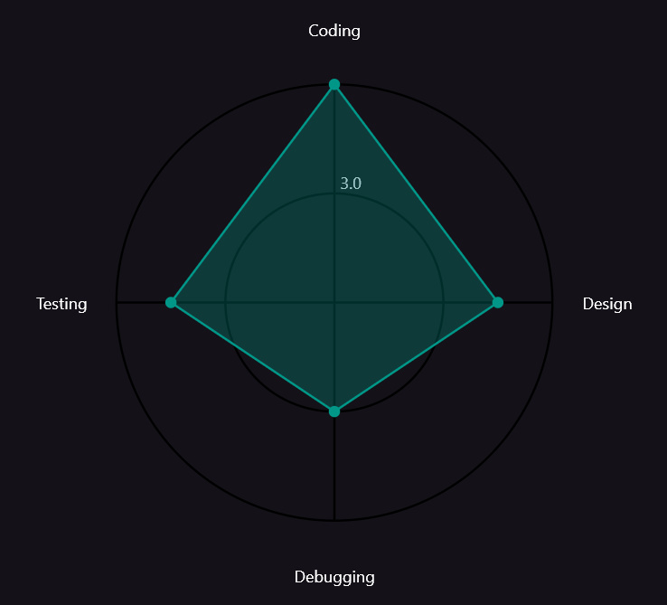
5. Radar Chart – Comparing Multiple Dimensions
Radar charts are perfect for showing multiple skills or features in a circular format.
RadarChart(
  RadarChartData(
    dataSets: [
      RadarDataSet(
        dataEntries: [
          RadarEntry(value: 5),
          RadarEntry(value: 4),
          RadarEntry(value: 3),
          RadarEntry(value: 4),
        ],
        borderColor: Colors.teal,
        fillColor: Colors.teal.withOpacity(0.3),
      ),
    ],
    radarBackgroundColor: Colors.transparent,
    titleTextStyle: TextStyle(color: Colors.black, fontSize: 14),
    getTitle: (index) {
      return ['Coding', 'Design', 'Debugging', 'Testing'][index];
    },
  ),
)
✅ Tip: Keep it minimal — too many axes can clutter the chart.
6. Real-Life Use Case: Fitness Dashboard
Imagine building a Fitness Dashboard where:
- Line chart shows weekly calorie burn
- Bar chart tracks daily steps
- Pie chart represents activity breakdown
- Radar chart compares fitness skills
This combination of charts provides an engaging, insightful UI.
7. Customization Tips
- Use gradients for eye-catching charts
- Show tooltips on tap using
touchData - Use
fl_chartwithBlocorProviderto show real-time data - Animate transitions for smoother user experience
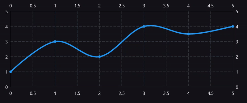
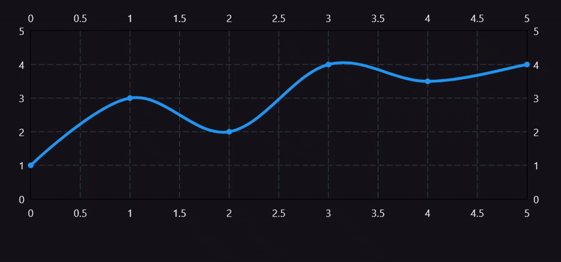
8. Add Animations to the Chart
- Add animation using AnimatedController and SingleTickerProviderStateMixin
- Code for FadeIn and SlideIn animations are shown below
class FadeInLineChart extends StatefulWidget {
  const FadeInLineChart({super.key});

  @override
  State<FadeInLineChart> createState() => _FadeInLineChartState();
}

class _FadeInLineChartState extends State<FadeInLineChart>
    with SingleTickerProviderStateMixin {
  late AnimationController _controller;
  late Animation<double> _opacityAnimation;

  @override
  void initState() {
    super.initState();

    // Animation controller for fade effect
    _controller = AnimationController(
      vsync: this,
      duration: const Duration(seconds: 3),
    );

    // Opacity animation from 0 to 1
    _opacityAnimation = Tween<double>(begin: 0, end: 1).animate(
      CurvedAnimation(parent: _controller, curve: Curves.easeIn),
    );

    // Trigger animation
    Future.delayed(const Duration(milliseconds: 1000), () {
      _controller.forward(); // Start fade animation
    });
  }

  @override
  void dispose() {
    _controller.dispose(); // Clean up animation controller
    super.dispose();
  }

  @override
  Widget build(BuildContext context) {
    return ClipRect(
      child: AnimatedContainer(
        duration: const Duration(seconds: 1),
        curve: Curves.easeOutExpo,
        height: 300,
        child: FadeTransition(
            opacity: _opacityAnimation,
            child: LineChart(
              LineChartData(
                lineBarsData: [
                  LineChartBarData(
                    spots: [
                      FlSpot(0, 1),
                      FlSpot(1, 3),
                      FlSpot(2, 2),
                      FlSpot(3, 4),
                      FlSpot(4, 3.5),
                      FlSpot(5, 4),
                    ],
                    isCurved: true,
                    color: Colors.blue,
                    barWidth: 4,
                    isStrokeCapRound: true,
                    belowBarData: BarAreaData(show: false),
                  ),
                ],
                titlesData: FlTitlesData(show: true),
                borderData: FlBorderData(show: true),
                minX: 0,
                maxX: 5,
                minY: 0,
                maxY: 5,
              ),
              duration: const Duration(milliseconds: 800),
              curve: Curves.easeInOut,
            )),
      ),
    );
  }
}
class SlideInLineChart extends StatefulWidget {
  const SlideInLineChart({super.key});

  @override
  State<SlideInLineChart> createState() => _SlideInLineChartState();
}

class _SlideInLineChartState extends State<SlideInLineChart> {
  double _chartHeight = 0; // Initial height

  @override
  void initState() {
    super.initState();
    // Trigger animation after a short delay
    Future.delayed(const Duration(milliseconds: 300), () {
      setState(() {
        _chartHeight = 300; // Final chart height
      });
    });
  }

  @override
  Widget build(BuildContext context) {
    return ClipRect(
      child: AnimatedContainer(
        duration: const Duration(seconds: 2),
        curve: Curves.easeOutExpo,
        height: _chartHeight,
        child: _chartHeight > 0
            ? LineChart(
                LineChartData(
                  lineBarsData: [
                    LineChartBarData(
                      spots: [
                        FlSpot(0, 1),
                        FlSpot(1, 3),
                        FlSpot(2, 2),
                        FlSpot(3, 4),
                        FlSpot(4, 3.5),
                        FlSpot(5, 4),
                      ],
                      isCurved: true,
                      color: Colors.blue,
                      barWidth: 4,
                      isStrokeCapRound: true,
                      belowBarData: BarAreaData(show: false),
                    ),
                  ],
                  titlesData: FlTitlesData(show: true),
                  borderData: FlBorderData(show: true),
                  minX: 0,
                  maxX: 5,
                  minY: 0,
                  maxY: 5,
                ),
                duration: const Duration(milliseconds: 800),
                curve: Curves.easeInOut,
              )
            : const SizedBox.shrink(), // Prevent overflow when height is 0
      ),
    );
  }
}
- Other animations
Smooth Bouncy Line Chart Animation
Staggered Line Chart Animation
9. Wrapping Up
Using fl_chart in Flutter is straightforward and powerful. With just a few lines of code, you can add beautiful, interactive charts that elevate your app’s UI and UX.
Start with the basics, explore the customization options, and before long, you’ll be building dashboards that impress users and stakeholders alike.
✅ Want to Try It Out?
- Add
fl_chartto your next Flutter project. - Share your custom charts on LinkedIn or GitHub.
- Comment below if you want a full sample project!