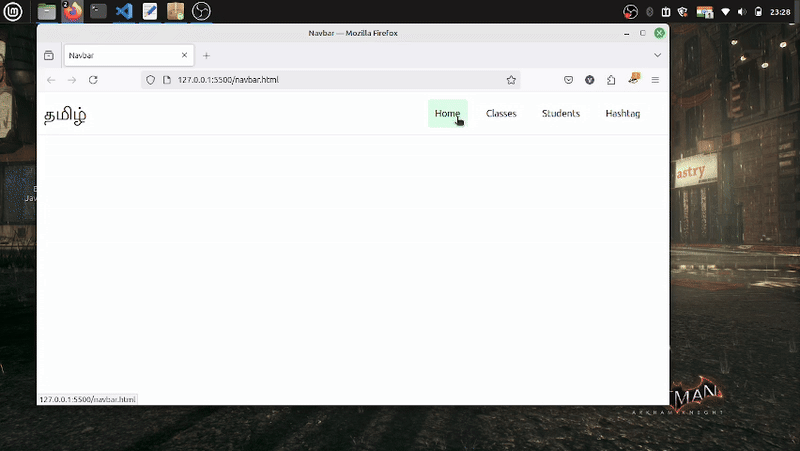
Sample Responsive navbar using tailwind css.
Step to make:
- Create a separate divisions for brand logo, bar-icon(hidden by default) & navbar-icons within a division.
- Make that navbar-icon division flex on sm & above breakpoints(small) & change flex-direction from row -> column on small devices.
- Make some hover effects on the navbar links & some bg-color for good look.
Here is the demo of the responsive navbar.