
Intro
Material UI (MUI) is a 2014 JavaScript library that's meant to be used with another JavaScript library called React. React is used to create the user interfaces of web applications, utilizing components that can be rendered within the page or within other components. While each component can have things such functions that handle logic and a state that keeps track of values, their main feature is their html that gets rendered. MUI adds many new pre-made components with new attributes that can be imported into a jsx file (the file type that React usually utilizes) and then rendered within a React component's html. MUI components are designed to mimic Google's professional look, and each component has custom attributes that can alter the component in unique ways. But before we get ahead of ourselves, we need to know more about what MUI is.
What is MUI
MUI is a JavaScript library that is intended to be used with React. It provides a plethora of tools (mostly React-based components) that can help build out the user interface of your application in a visually appealing way. Each MUI component, when rendered correctly, applies a nice-looking element to the DOM that can have different colors, sizes, display options and variations, and interactable properties without too much effort. These components sometimes interact with one another, but we will get to that later on.
How To Use MUI
MUI can be installed as a package.json dependency by looking for @mui and then importing parts of MUI to your jsx files. You will also need to install @emotion/react and @emotion/styled as dependencies as MUI requires both to function. Since MUI is so big, it is best to only include only the necessary MUI file paths in both your package.json and your imports. MUI imports often act as pre-made React components, which can be included as HTML tags inside of a React component's returned HTML or wherever else there is HTML. MUI components can utilize attributes that are unique to MUI components. Examples of MUI attributes include variant (which usually allows you to select from a few pre-made visual variations of a component), sx (which is an alternative to the style attribute that can optionally utilize methods from @mui/system to achieve its styling) and valueLabelDisplay (which is an attribute that I have only seen used with the Slider component, and it determines how a value linked to said component should be displayed). Talking about these components can only do so much, so let's actually show you what MUI can do.
Set Up for MUI Examples
Assuming that React is installed on your project and a React component is rendering to a browser page, we can install the dependencies needed for MUI. These examples will be utilizing Playcode's online code sandbox to achieve their results.
Include the needed dependencies in the package.json file before running npm install (you must have these 6 dependencies at minimum to use both MUI materials and MUI icon materials). You should already have react and react-dom installed, but they are included here none-the-less:
{
  "dependencies": {
    "@mui/icons-material": "6.4.7",
    "@mui/material": "6.4.7",
    "react": "19.0.0",
    "react-dom": "19.0.0",
    "@emotion/react": "^11.5.0",
    "@emotion/styled": "^11.13.0"
  }
}
Go to the file where your React app's main (App) component is made and exported (this file is usually called App.jsx and contains the React component that is applied to the application's index.html file first). At the top of the file, create the imports from @mui/material, and @mui/icons-material seen at the top of the code block provided below. While the code sandbox I am using for this example already had a React component utilizing MUI, I replaced the given MUI imports and components with my own (among other small modifications):
import {
Box,
Stack,
Slider,
Typography
} from '@mui/material';
import {
Circle,
AcUnit,
Money
} from '@mui/icons-material';
import React from 'react';
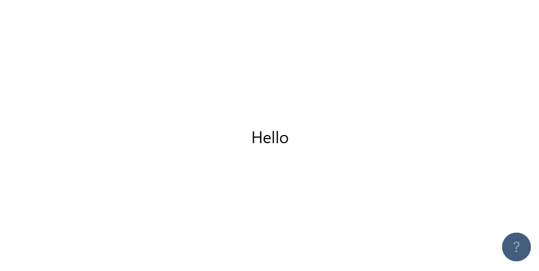
const App = () => {
return (
Hello
)
}
export { App };This results in a rendered view that looks like this:
You may have noticed that there are 4 dependencies related to MUI: @emotion/react, @emotion/styled, @mui/material, and @mui/icons-material. The two dependencies beginning with "@emotion" are utilized by MUI to help with applying styles to components. The two dependencies beginning with "@mui" are there to provide two of the many categories for tools that MUI offers (these examples will utilize MUI's main components and icon components). Now we can get to work.
MUI Examples
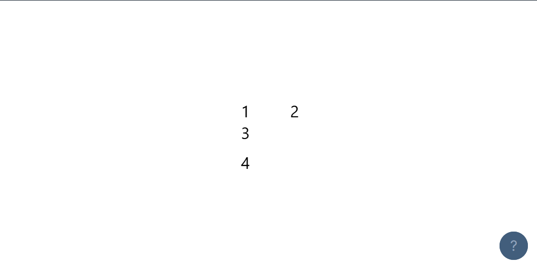
First, let's start off by making a stack. Stacks are good for aligning components along an axis (vertically or horizontally):
const App = () => {
  return (


      1
      2


      3
      4


  )
}
The first stack aligns it's two inner divs across the x-axis (row) with a spacing of 5 in between the two divs. The second stack aligns it's two inner divs across the y-axis (column) with a spacing of 1 in between the two divs:
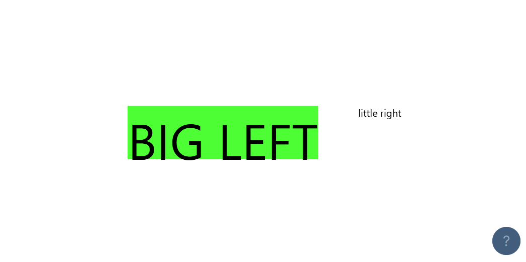
Next, let's replace those divs with boxes (and get rid of the second stack). Boxes are essentially divs, but they have access to MUI attributes and the MUI theme (if said theme is set up):
const App = () => {
  return (


      BIG LEFT
      little right


  )
}
Both boxes utilize the sx attribute to apply styling, though the same effect can sometimes be obtained through a regular attribute (as seen with fontSize='50px' in the first box and fontSize: '10px' in the second box's sx attribute). The first box uses sx to make its background green and to make its height '20vh'. The second box uses sx to give any text inside of the box a small (10px) size:
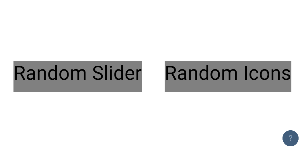
Next, let's make the boxes look a bit more appealing and then put a typography tag in each one. Typography tags are essentially MUI's weird version of span tags, as they are mainly used to apply preset "typographic scale" sizes to their inner text (in addition to other text altering options):
const App = () => {
  return (


        Random Slider


        Random Icons


  )
}
Both typography tags align their text with the middle of their respective typography component and make their text have the "heading 4" size:
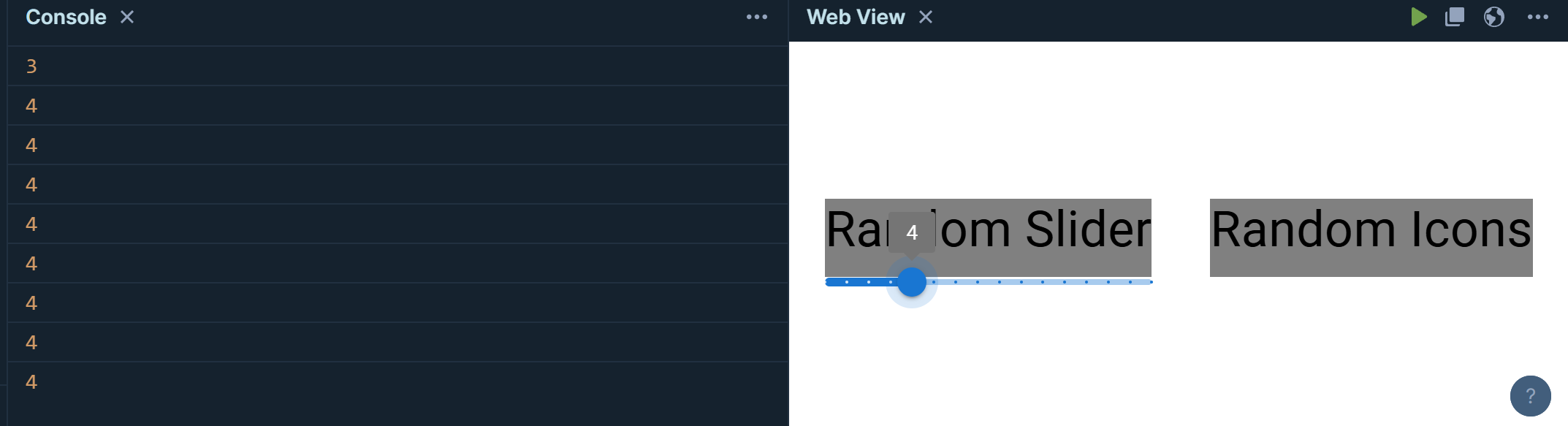
Next, we'll apply a slider to the first box. Sliders are a type of input that takes in a number from a range of numbers represented by a slider:
const App = () => {

  const logger = (val) => {
   console.log(val);
  }

  return (


        Random Slider

        {logger(e.target.value)}} />


        Random Icons


  )
}
The slider tag has a label (with the slider's current number value) that appears when the little circle is hovered over (valueLabelDisplay), can increment and decrement the slider value by 1 (step), displays each step as a mark on the slider (marks), starts at 0 (min), ends at 15 (max), and calls a logger function whenever the slider's value is changed (onChange):
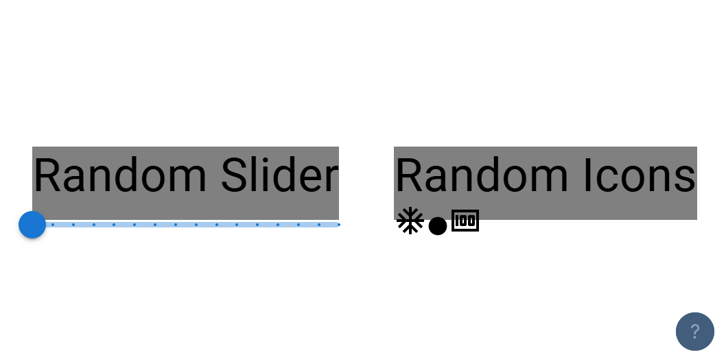
Finally, we can use the icons gotten from @mui/icons-material. Each icon is a little image that can be used in components:
const App = () => {

  const logger = (val) => {
   console.log(val);
  }

  return (


        Random Slider

        {logger(e.target.value)}} />


        Random Icons


  )
}
Each icon component can use their name as a tag name to be rendered to the DOM. The first icon is rendered regularly. The second icon is rendered with the icon size being derived from the closest parent element that affects font size (which strangely enough creates quite a small icon when the icon element has no user-made parent elements to pull a font size from). The third icon is rendered with the icon size set to "medium":
That was just a few of the MUI components, but this should have painted you a pretty good picture of what MUI can do. If more time was spent on this example, it could easily turn into something presentable. Now let's conclude this blog.
Conclusion
MUI is a useful tool created in 2014 for creating applications with pre-built, professional-looking React components. React involves the creation and use of components to build out the client side of an application. Each MUI component utilizes new attributes that can modify their appearance and function in different ways. Once you are past the learning curve, it's relatively easy to insert MUI components within your React components to make your HTML more visually appealing.
Links to Sources Used