If you’re learning React and want to create a clean, responsive, and performant image carousel, you’re in the right place! In this guide, we’ll walk through building a React image carousel with auto-sliding functionality, navigation buttons, and efficient state management.
Whether you're enhancing your portfolio or contributing to a real-world project, understanding how to build this component will sharpen your skills in React, state, effects, and component re-rendering.
Let’s dive in! 🧠
🧱 Step 1: Project Setup and Imports
Before we dive in, I’ll assume that you already have your React development environment set up and your project is running smoothly. If you haven't started yet, Vite is an excellent tool to begin with.
📝 Note: create-react-app (CRA) is now officially deprecated and no longer recommended for new projects.
Once your React project is ready, follow these steps:
Inside your src folder, create a new folder named components.
Inside the components folder, create a new file: 👉 ImageCarousel.jsx
Create an ImageCarousel.css file in the same folder to handle styling.
Now, open ImageCarousel.jsx and start with the following imports:
import React, { useEffect, useState } from 'react';
import './ImageCarousel.css';
🔍 The importance of this is:
We import
-
useStateto track the current image index. -
useEffectallows us to handle the auto-slide behavior. - Separating CSS into ImageCarousel.css helps keep JSX clean and your styles modular, promoting maintainability and scalability.
🖼️Step 2: Prepare the Image Dataset
We’re using random high-resolution images from Pexels — a free stock photo website. Always remember to credit such sources when using their content, even in demos or projects.
const images = [
    { id: 1, url: "https://images.pexels.com/photos/29089597/pexels-photo-29089597/free-photo-of-stunning-autumn-beach-sunset-with-waves.jpeg?auto=compress&cs=tinysrgb&w=1260&h=750&dpr=2"},
    { id: 2, url: "https://images.pexels.com/photos/691668/pexels-photo-691668.jpeg"},
    { id: 3, url: "https://images.pexels.com/photos/2049422/pexels-photo-2049422.jpeg?auto=compress&cs=tinysrgb&w=1260&h=750&dpr=2"},
    { id: 4, url: "https://images.pexels.com/photos/325044/pexels-photo-325044.jpeg?auto=compress&cs=tinysrgb&w=1260&h=750&dpr=2"},
    { id: 5, url: "https://images.pexels.com/photos/1485894/pexels-photo-1485894.jpeg?auto=compress&cs=tinysrgb&w=1260&h=750&dpr=2"},
];
Each image object has:
- An
id: Used as a unique key for React. - A
url: The direct link to the image.
By using an array of objects, you keep your code clean and make it easy to render the images dynamically using .map() function later. This structure makes it easy to loop through and render dynamically, which is more scalable than hardcoding images into JSX.
💡 Tip: Separating data into its own file is a best practice and usually recommended; however, this example keeps it together for convenience.
🎯 Step 3: Managing the Current Image State
const [currentImageIndex, setCurrentImageIndex] = useState(0);Understanding the relevance:
Core Functionality: The
useStateReact hook is used to manage thecurrentImageIndex, which determines the visible image.Initial State: Setting
currentImageIndexto0ensures the first image is displayed upon loading.Dynamic Control: The
setCurrentImageIndexfunction, provided byuseState, allows for changing the displayed image due to user navigation or auto-play functionality.
⬅️➡️ Step 4: Previous & Next Navigation Handlers
const handlePreviousClick = () => {
    setCurrentImageIndex(
        currentImageIndex === 0 ? images.length - 1 : currentImageIndex - 1
    );
};

const handleNextClick = () => {
    setCurrentImageIndex((currentImageIndex + 1) % images.length);
};
🧠 Let’s break this down in simple terms:
The Previous button checks:
👉 “Am I on the first image (index 0)? If yes, go to the last image. If not, go one step back.”
The Next button uses the modulo operator (%), which is a super helpful trick:
👉 (currentIndex + 1) % totalImages ensures that when you’re at the last image, it loops back to the first one automatically.
🏆 Why it’s a best practice:
Avoids
if-elsechains and long logic blocks.Makes sure the index never goes out of bounds, avoiding crashes or
undefinedbehavior.Keeps the carousel experience circular and smooth, especially important for user engagement.
⏱️ Step 5: Auto-Sliding with useEffect
useEffect(() => {
    const timer = setTimeout(() => {
        handleNextClick();
    }, 5000);

    return () => clearTimeout(timer);
}, [currentImageIndex]);
Explanation
-
useEffectis a React hook that runs every time thecurrentImageIndexchanges.
Inside it, we:
Start a timer using
setTimeoutthat waits for 5 seconds (5000ms).After 5 seconds, it calls
handleNextClick()function, moving to the next image.We also return a cleanup function
(clearTimeout)to cancel the oldtimerif the image changes before the timeout finishes.
🧠 Why this approach?
Using
setTimeoutinsideuseEffectlets us create controlled, one-time delays, which is safer and easier to debug than usingsetInterval, which repeats endlessly.Cleanup prevents memory leaks and ensures only one timer runs at a time.
Makes your carousel auto-slide lightweight and reliable without draining performance.
🧩 Step 6: Rendering the JSX
return (
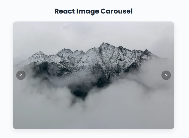
React Image Carousel
<
{images.map((image, index) => (
))}
>
)👇 Key Takeaways:
Navigation buttons on either side call their respective functions.
images.map()dynamically renders each image.
We use a conditional class:
Only the current image is set to
display: block.All others are hidden with
display: none.We use
key={image.id}to help React track which items changed, improving performance.
Complete code snippet
import React, { useEffect, useState } from 'react';
import './ImageCarousel.css';
// images from pexels.com
const images = [
{ id: 1, url: "https://images.pexels.com/photos/29089597/pexels-photo-29089597/free-photo-of-stunning-autumn-beach-sunset-with-waves.jpeg?auto=compress&cs=tinysrgb&w=1260&h=750&dpr=2"},
{ id: 2, url: "https://images.pexels.com/photos/691668/pexels-photo-691668.jpeg"},
{ id: 3, url: "https://images.pexels.com/photos/2049422/pexels-photo-2049422.jpeg?auto=compress&cs=tinysrgb&w=1260&h=750&dpr=2"},
{ id: 4, url: "https://images.pexels.com/photos/325044/pexels-photo-325044.jpeg?auto=compress&cs=tinysrgb&w=1260&h=750&dpr=2"},
{ id: 5, url: "https://images.pexels.com/photos/1485894/pexels-photo-1485894.jpeg?auto=compress&cs=tinysrgb&w=1260&h=750&dpr=2"},
]
const ImageCarousel = () => {
const [currentImageIndex, setCurrentImageIndex] = useState(0);
const handlePreviousClick = () => {
setCurrentImageIndex(
currentImageIndex === 0 ? images.length - 1 : currentImageIndex - 1
);
};
const handleNextClick = () => {
setCurrentImageIndex((currentImageIndex + 1) % images.length);
};
useEffect(() => {
const timer = setTimeout(() => {
handleNextClick();
}, 5000);
return () => clearTimeout(timer);
}, [currentImageIndex]);
return (
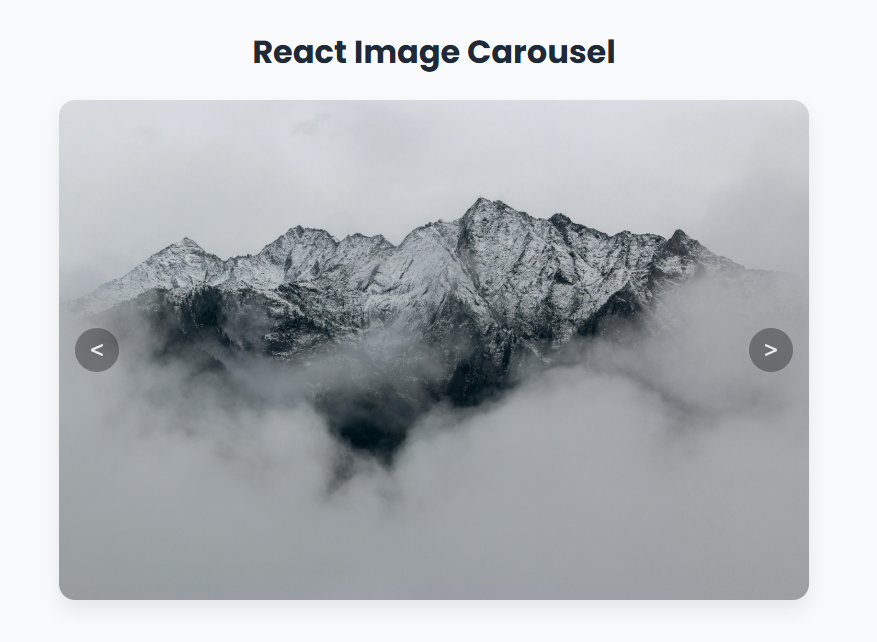
React Image Carousel
<
{images.map((image, index) => (
))}
>
)
}
export default ImageCarousel💅 Step 7: Styling with CSS
For effective web development and UI enhancement, CSS is indispensable. The CSS provided is a custom implementation, and you have the flexibility to define your own styles.
For styling your image carousel, take the provided CSS code and paste it into the ImageCarousel.css file.
section {
    height: 100vh;
    width: 100vw;
    display: flex;
    flex-direction: column;
    justify-content: center;
    align-items: center;
    background-color: #f9fafb;
    text-align: center;
}

h2 {
  font-size: 2rem;
  color: #1f2937;
  margin-bottom: 1.5rem;
}

.image-container {
  position: relative;
  display: flex;
  align-items: center;
  justify-content: center;
  max-width: 800px;
  margin: 0 auto;
  overflow: hidden;
  border-radius: 1rem;
  background-color: #fff;
  box-shadow: 0 10px 20px rgba(0, 0, 0, 0.08);
  height: 500px;
}

.image-container img {
  max-width: 100%;
  max-height: 100%;
  width: 100%;
  border-radius: 0.75rem;
  object-fit: cover;
  transition: opacity 0.5s ease, transform 0.5s ease;
}

img.hidden {
  display: none;
}

img.block {
  display: block;
  animation: fadeIn 0.6s ease;
}

@keyframes fadeIn {
  from {
    opacity: 0;
    transform: scale(0.98);
  }
  to {
    opacity: 1;
    transform: scale(1);
  }
}

.nav-button {
  position: absolute;
  top: 50%;
  transform: translateY(-50%);
  width: 44px;
  height: 44px;
  background-color: rgba(0, 0, 0, 0.4);
  color: #fff;
  border: none;
  border-radius: 50%;
  font-size: 1.5rem;
  font-weight: normal;
  cursor: pointer;
  display: flex;
  align-items: center;
  justify-content: center;
  opacity: 0.8;
  transition: background-color 0.3s ease, opacity 0.3s ease;
  padding: 0;
  line-height: 1;
  z-index: 1;
}

.nav-button.left {
  left: 1rem;
}

.nav-button.right {
  right: 1rem;
}

.nav-button:hover {
  background-color: rgba(255, 255, 255, 0.6);
  opacity: 1;
}
🚀 Final Thoughts & Optimizations
✅ Best Practices Recap:
Clean state management with
useState.Safe and performant effects with
useEffect.Modular, dynamic rendering using
.map().Looping logic via the modulo operator for easy circular navigation.
🙌 Conclusion
This easy-to-understand image carousel is a great way to learn:
React Hooks (
useState,useEffect)Conditional rendering
Auto-slide behavior
Clean, modular component architecture
Feel free to try it and experiment with your own styles and animations!
If you've had a chance to read this carefully, I'd appreciate it if you could mention anything I might have missed explaining.
Happy coding 😀
