Before we dive in: this post is part of a series where me and my partner Thiago are building a mobile app — and we’re doing it in full build in public mode.
No big promises, just real updates about the process, the decisions, the wins (and fails) along the way.
If you missed the first chapter, check it out here:
👉 We’re Building an App, and You’re in for the Ride
That’s where we introduced the project, the stack, and what we’re trying to build.
🎨 So, about this post...
When you’re building something from scratch — with no budget and no designer — guess who’s in charge of UI/UX?
Yep. The frontend dev. That would be me.
This post is my honest (and slightly improvised) take on how I designed the first screens of our app using Figma — without any formal design training and just trying to make things usable and decent-looking.
🧱 Starting from scratch: the blank canvas (and some actual paper)
Before jumping into Figma, I started where I always feel most comfortable: pen and paper.
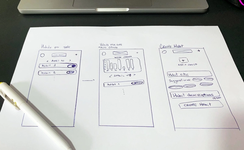
Sketching wireframes by hand helps me organize the structure, layout, and core interactions without the distraction of colors or details. That’s when I started defining what the app actually needed to do:
- Creating and viewing habits
- Marking progress daily
- Visualizing some kind of overall status
🖼️ Here’s a quick look at the initial wireframes I sketched out before moving into Figma:

Even though the idea was simple — a habit tracker — turning it into something that made sense on screen still took some thought. But this initial phase made everything less overwhelming once I moved to Figma.
And speaking of Figma... I’ll admit: I’m not a designer, so before diving in, I did what every dev does when trying something new — I watched a few YouTube tutorials, read some posts, and yes, I even asked ChatGPT some very basic questions like:
- “How do I create a gradient in Figma?”
- “How to duplicate a component and keep it synced?”
- “What’s the difference between Frames and Groups in Figma?”
It was like having a design buddy who didn’t judge my dumb questions 😅
If you're curious, I’ll leave some of the resources I found helpful at the end of this post.
🌀 Figma, uncertainty, and design decisions on the fly
With no real design system or references, I tried to build layouts based on apps I already use, plus some live feedback from Thiago.
A few questions we discussed to find the right direction:
- Should we group habits by category?
- Should progress be visualized as a chart or just icons?
- Go with accent colors or keep everything fully neutral?
Naturally, some screens changed completely halfway through — because seeing something done is very different from just imagining it.
🤝 Feedback loops
Even though I was designing the screens, having someone to bounce ideas off made a huge difference.
We'd go back and forth like:
“This feels kinda clunky, right?”
“Maybe the button should be more direct.”
“Do we even need this step right now?”
“Is the user journey as simple as it should be, or are we unintentionally making it harder?”
We kept it lightweight but honest — and that helped a lot.
🧪 What I’ve learned (so far)
If you’re a developer who suddenly becomes the “design team”, here’s what’s been helping me:
- It doesn’t need to be perfect — it just needs to work (at least for the very first version)
- Designing in Figma helps clarify logic before writing code
- Sharing early and iterating is way better than overthinking
- Most importantly: focus on the user experience, not just appearance
👀 What do you think?
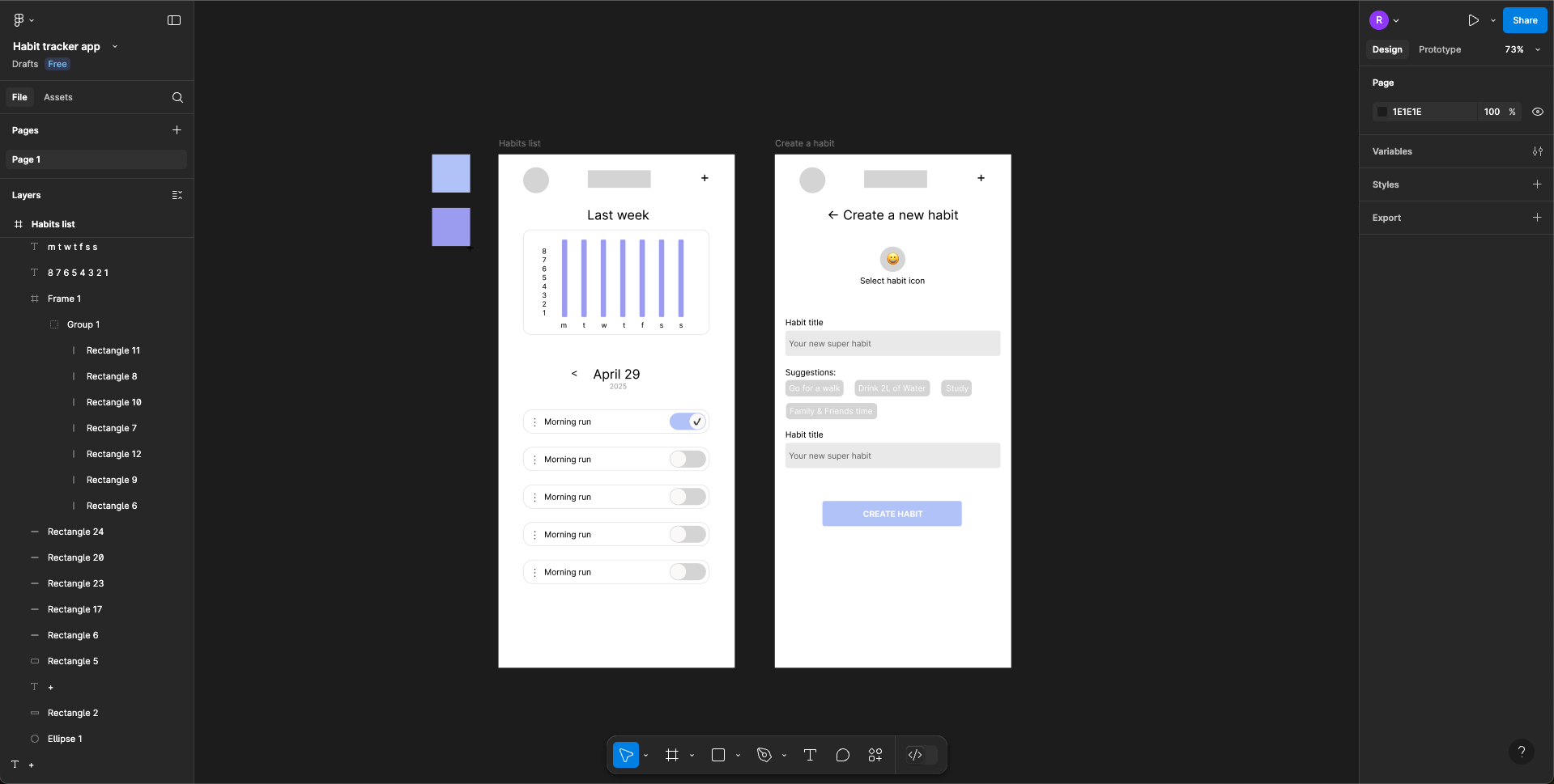
🖼️ Here’s a sneak peek of what we have in Figma so far:

If you want to check it out or drop feedback, feel free to comment or reach out — I’d really love that.
🛠️ What’s next?
We’ve already started turning those designs into code with React Native, and of course… things that looked nice in Figma don’t always translate perfectly to the real thing 😅
We’ll keep sharing our progress as we move forward — whether it’s more design updates, early development wins (or fails), or unexpected challenges along the way.
So stay tuned, and if you’re enjoying this series, follow us here on dev.to or leave a like to help us keep it going.
🙌 That’s it for now
Thanks for reading! And hey — if you’ve ever had to wear the “designer hat” as a dev, I’d love to hear your story too. Drop a comment or let’s chat.
🔗 Resources I found helpful
Here’s a short list of things that helped me get started and stay sane:
📚 How to Learn Interface Design - The Ultimate Guide. By Gabriel Silvestre (PT/BR)
A free ebook by an experienced designer that really helped me understand the UI design process.🎥 Figma UI Design Tutorial: Build a Mobile App
A great beginner-friendly walkthrough of building a clean UI in Figma.📘 Mastering Figma for Developers (full guide)
Blog post aimed specifically at devs who find themselves designing.🤖 Me asking ChatGPT random things at 2AM
Not a link — but highly recommended.


