
🔍Exploratory Data Analysis and Data Visualization with Python
Streaming services have become a crucial part of our entertainment routine. In this blog, we’ll walk through an Exploratory Data Analysis (EDA)and Data Visualization of Amazon Prime Video content using Python. This includes data cleaning, visualization, and insight extraction. Let’s dive in! 💻📊
First thing's first
Clone the repository using the Repo link provided and install the required libraries as provided in the requirements.txt file.
Link to the Github Repository: Amazon-prime
⚙️ Setting Up the Environment
We begin by importing the essential Python libraries for data analysis and visualization.
import numpy as np
import pandas as pd
import plotly.graph_objs as go
import matplotlib.colors
import warnings
warnings.filterwarnings("ignore")
import matplotlib.pyplot as plt
import seaborn as sns
import plotly as py
from datetime import datetime
import datetime as dt
📥 Loading and Understanding the Data
Let's load the dataset and get an initial understanding of its structure.
amazon_csv = pd.read_csv('Amazon_prime_titles.csv')
amazon_csv.shape
📊 Exploratory Data Analysis
np.random.seed(0) #seed for reproducibility
amazon_csv.sample(5)
Yes, it looks like there's some missing values.
Lets do some Initial data exploration and data cleaning
🧼 Checking Missing Data
# Operator to find null/ missing values
print('Percentage of null values in the given data set:')
for col in amazon_csv.columns:
  null_count = amazon_csv[col].isna().sum()/len(amazon_csv)*100
  if null_count > 0:
    print(f'{col}  : {round(null_count,2)}%')
Loops through the columns and finds the percentage of null values
✅ Validating Columns
# Define valid values
valid_types = {"Movie", "TV Show"}

# Find invalid values
invalid_types = amazon_csv[~amazon_csv['type'].isin(valid_types)]

# Check if any invalid values exist
if invalid_types.empty:
    print("Valid values")
else:
    print("\nInvalid 'type' values:")
    print(invalid_types['type'].unique())
Above code checks if the type column has any invalid values other than "TV Show" and "Movies"
# Check if there are any invalid ratings (less than 0 or greater than 10)
if ((amazon_csv['rating'] < 0.0) | (amazon_csv['rating'] > 10.0)).any():
    print("Invalid")
else:
    print("Valid range")
🎨 Amazon Prime Color Palette
Using Sea born lets visualize the data set. Let's use Amazon Prime color palette for all the visualizations.
# Amazon Prime Video brand colors
sns.palplot(['#00A8E1', '#232F3E', '#FFFFFF', '#B4B4B4'])

plt.title("Amazon Prime Brand Palette", loc='left',  fontweight="bold",  fontsize=16, color='#4a4a4a', y=1.2)
plt.show()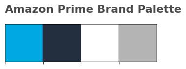
📈 Summary Statistics
# summary statistics
print("\nSummary Statistics:\n", amazon_csv.describe())
The above code gives us the summary statistics of the data set.
📉 Histograms and Box Plots
# new column 'duration_numeric'
amazon_csv['duration_numeric'] = amazon_csv['duration'].str.extract(r'(\d+)').astype(float)
#seaborn style and color palette
sns.set(style="whitegrid", rc={"font.family": "serif"})
palette = ['#00A8E1', '#232F3E', '#FFFFFF', '#B4B4B4']
#subplots for histograms
fig, axes = plt.subplots(1, 3, figsize=(18, 5))
fig.suptitle("Exploratory Data Analysis by plotting the Histogram and Box Plots", fontsize=16, fontweight='bold', family='serif')
# aesthetics
for ax in axes:
ax.spines["top"].set_visible(False)
ax.spines["right"].set_visible(False)
ax.spines["left"].set_visible(False)
ax.spines["bottom"].set_visible(False)
# Histogram for Release Year
sns.histplot(amazon_csv['release_year'], bins=30, kde=True, ax=axes[0], color=palette[0])
axes[0].set_title("Distribution of Release Years")
axes[0].set_xlabel("Year")
# Histogram for Rating
sns.histplot(amazon_csv['rating'].dropna(), bins=30, kde=True, ax=axes[1], color=palette[1])
axes[1].set_title("Distribution of Ratings")
axes[1].set_xlabel("Rating")
# Histogram for Duration
sns.histplot(amazon_csv['duration_numeric'].dropna(), bins=30, kde=True, ax=axes[2], color=palette[3])
axes[2].set_title("Distribution of Duration (Minutes)")
axes[2].set_xlabel("Duration (Minutes)")
plt.tight_layout()
plt.show()
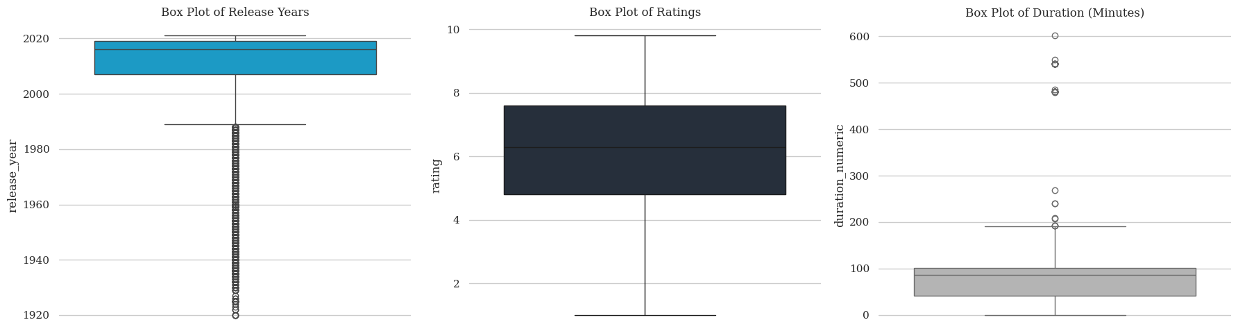
# box plots
fig, axes = plt.subplots(1, 3, figsize=(18, 5))
for ax in axes:
ax.spines["top"].set_visible(False)
ax.spines["right"].set_visible(False)
ax.spines["left"].set_visible(False)
ax.spines["bottom"].set_visible(False)
sns.boxplot(y=amazon_csv['release_year'], ax=axes[0], color=palette[0])
axes[0].set_title("Box Plot of Release Years")
sns.boxplot(y=amazon_csv['rating'], ax=axes[1], color=palette[1])
axes[1].set_title("Box Plot of Ratings")
sns.boxplot(y=amazon_csv['duration_numeric'], ax=axes[2], color=palette[3])
axes[2].set_title("Box Plot of Duration (Minutes)")
plt.tight_layout()
plt.show()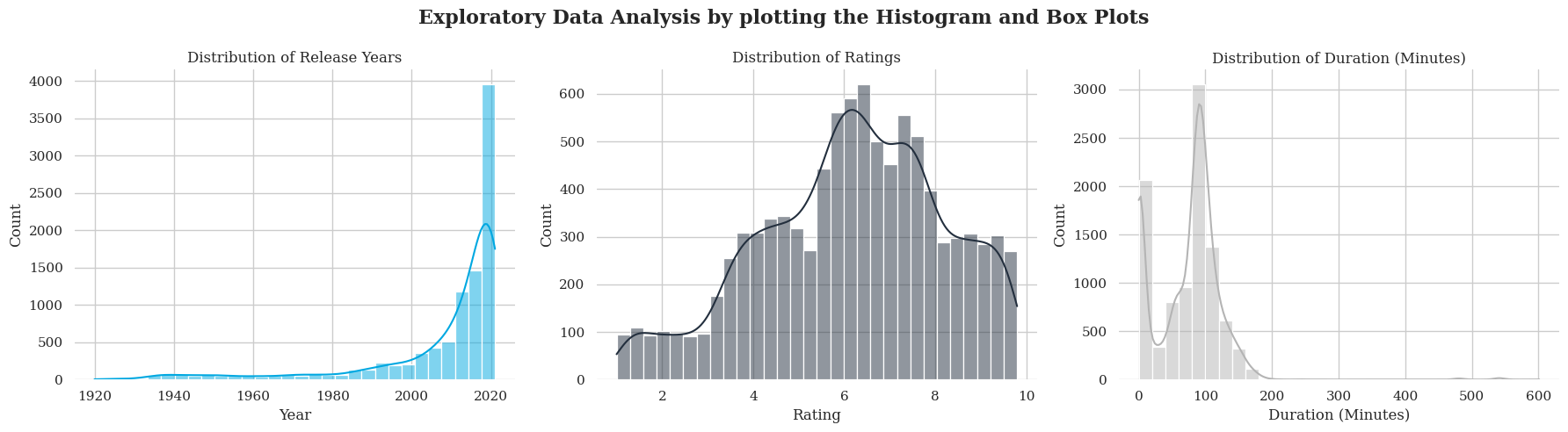
Histogram: Displays the frequency distribution of content duration. Rating values has a bell shaped spread of data with values from 0 to 10, with a peak 7.0. Release year is skewed towards year towards 2005 and beyond. Shows that spread is more towards newer contents.
Boxplots: Show the distribution of ratings and release years, highlighting outliers. The duration box plot shows a time duration of 600 minutes, which could be outlier or a lengthy movie.
⚠️ Insights on Missing Values
It's tracked that values are missing in 5 columns Director, Cast, Country , Date_added and rating.
- Date added columns has the highest missing counts
- Missing values in Ratings are the lowest
- Fair share of missing values in director, followed by cast, country and age_group column.
🧹 Data Cleaning
🌍 Handling Missing Country Data
I will replace NULL values in the 'country' column with the MODE value.
Let's deal with the missing Data
For the given dataset, with N = 7786, my approach for data cleaning will be:
I will replace NULL values in the 'country' column with the MODE value.
Why: Since the 'country' column is categorical, replacing missing values with the most common country (the mode) seems like a good choice. Because I’m keeping the most frequent value, which makes sense for the analysis.
🗑️ Dropping Columns and Rows
I will drop the row in the 'Cast' column if it has NULL values.
Why: The 'Cast' column is crucial for understanding the movie’s popularity. It’s better to drop that row so it doesn't mess up the analysis.
I will drop the whole 'Date Added' column since it might not provide any significant insight, especially since there are so many NULL values.
Why: 'Date Added' has too many NULL values, and it’s probably not useful for the analysis.
🎭 Handling Missing Cast and Director Data
I will keep the 'Director' as it is.
Why: The 'Director' column seems important, and there doesn't seem to be much missing data here. So, it’s best to leave it untouched because it might provide important information for understanding the movie.
I will drop the whole 'Date Added' column since it might not provide any significant insight, especially since there are so many NULL values.
#Drop the column date_added
amazon_csv.drop(columns=['date_added'], inplace=True)

# Replace missing values in 'country' with its mode (most frequent value)
amazon_csv['country'].fillna(amazon_csv['country'].mode()[0], inplace=True)

# Replace missing values in 'director' and 'cast' with "Not available"
amazon_csv[['director', 'cast']] = amazon_csv[['director', 'cast']].fillna("Not available")

# Drop rows where 'age group' or 'rating' are missing
amazon_csv.dropna(subset=['age_group', 'rating'], inplace=True)

# Reset index after dropping rows
amazon_csv.reset_index(drop=True, inplace=True)
📽️ Data Visualization
🕰️ Amazon Prime Timeline
Lets create a time line, to show the progress of Amazon Prime over the years. Timeline plotting code inspired from Subin An's notebook
# Set figure & Axes
fig, ax = plt.subplots(figsize=(15, 4), constrained_layout=True)
ax.set_ylim(-2, 1.75)
ax.set_xlim(0, 10)


# Timeline : line
ax.axhline(0, xmin=0.1, xmax=0.68, c='#B4B4B4', zorder=1)
# these values go on the numbers below
tl_dates = [
    "1994\nFounded",
    "2006\nIntroduced Prime",
    "2015\n100M Users",
    "2024\nPrime membership hits 250M"
]

tl_x = [1, 2.6, 4.3,6.8]
## these go on the numbers
tl_sub_x = [2.3,3.5,4.1,5.1,5.8]

tl_sub_times = [
    "2005","2010","2014","2016","2020"
]
# these values go on Stemplot : vertical line
tl_text = [
    "Amazon Prime Launched","First Amazon Original","Amazon adds streaming benefits", "India Launch (My birthplace)", "Prime Video Goes Global"]

# Timeline : Date Points
ax.scatter(tl_x, np.zeros(len(tl_x)), s=120, c='#4a4a4a', zorder=2)
ax.scatter(tl_x, np.zeros(len(tl_x)), s=30, c='#fafafa', zorder=3)
# Timeline : Time Points
ax.scatter(tl_sub_x, np.zeros(len(tl_sub_x)), s=50, c='#4a4a4a',zorder=4)

# Date Text
for x, date in zip(tl_x, tl_dates):
    ax.text(x, -0.55, date, ha='center',
             fontweight='bold',
            color='#4a4a4a',fontfamily='serif',fontsize=12)

# Stemplot : vertical line
levels = np.zeros(len(tl_sub_x))
levels[::2] = 0.3
levels[1::2] = -0.3

markerline, stemline, baseline = ax.stem(tl_sub_x, levels)
plt.setp(baseline, zorder=0)
plt.setp(markerline, marker=',', color='#4a4a4a')
plt.setp(stemline, color='#232F3E')


# Remove the Spine around the plot
for spine in ["left", "top", "right", "bottom"]:
    ax.spines[spine].set_visible(False)

# Ticks
ax.set_xticks([])
ax.set_yticks([])

# Title
ax.set_title("Amazon through the years", fontweight="bold",  fontsize=16,fontfamily='serif', color='#4a4a4a')
ax.text(2.4,1.57,"From Fast Shipping to Global Streaming - Popular streaming service for movies and TV shows.",  fontsize=12, fontfamily='serif',color='#4a4a4a')

# Text
for idx, x, time, txt in zip(range(1, len(tl_sub_x)+1), tl_sub_x, tl_sub_times, tl_text):
    ax.text(x, 1.3*(idx%2)-0.5, time, ha='center',
             fontweight='bold',
            color='#4a4a4a' if idx!=len(tl_sub_x)-1 else '#00A8E1', fontfamily='serif',fontsize=11)

    ax.text(x, 1.3*(idx%2)-0.6, txt, va='top', ha='center',fontfamily='serif',
        color='#4a4a4a' if idx!=len(tl_sub_x)-1 else '#00A8E1')
plt.show()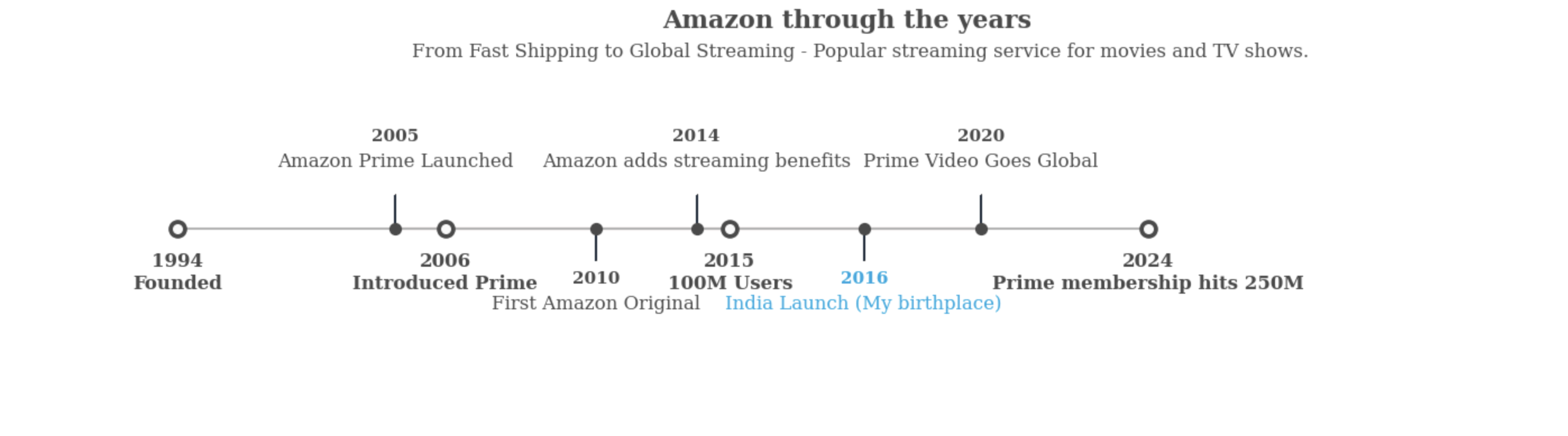
🌐 Country-Wise Content Analysis
Helper code for better display of country names , also since a few movies have more than one Country I am seggeregating. Also Group country and get the total count and sort in descending order.
amazon_csv['count'] = 1
# Extract the first country from the 'country' column
amazon_csv['first_country'] = amazon_csv['country'].apply(lambda x: x.split(",")[0])

# Shorten country names
amazon_csv['first_country'].replace({'United States': 'USA','United Kingdom': 'UK','South Korea': 'S. Korea'}, inplace=True)

# Group by country and get total count
df_country = amazon_csv.groupby('first_country')['count'].sum().sort_values(ascending=False)
Let's use Plotly's choropleth map to show country wise release of Movies/ TV shows on Amazon Prime.
Load a new CSV for ISO Code of countries, as choropleth takes one of these as the input for plotting.
Merge this with the Amazon CSV to map it with the choropleth.
# Load the ISO code CSV data
iso_df = pd.read_csv('country_iso_codes.csv')


# Merge the country counts with the ISO codes
merged_df = pd.merge(countriess, iso_df, left_index=True, right_on='Country')


# Define Amazon Prime themed color scale for specific ranges for better visibility
custom_colorscale = [
    (0.0, '#00A8E1'),  # Highest values (Prime Blue)
    (0.1, '#0073CF'),  # 700-800 range (Deep Blue)
    (0.2, '#005BB5'),  # 600-700 range (Darker Blue)
    (0.3, '#004494'),  # 500-600 range (Navy Blue)
    (0.4, '#002E73'),  # 400-500 range (Deep Navy)
    (0.5, '#001A52'),  # 300-400 range (Dark Indigo)
    (0.6, '#232F3E'),  # 100-300 range (Amazon Dark Blue)
    (1.0, '#0F1111')   # 1-100 range (Almost Black)
]


# Create the choropleth map
fig = go.Figure(data=go.Choropleth(
    locations=merged_df['ISO Code'],  # Country ISO codes
    z=merged_df['count'],  # Data values
    text=merged_df['Country'],  # Hover text
    colorscale=custom_colorscale,
    marker_line_color='darkgray',
    marker_line_width=0.6,
    colorbar_title='Count',
))

# Update layout
fig.update_layout(
    title={
        'text': "TV Shows / Movies origin country available on Amazon Prime",
        'x': 0.5,
        'xanchor': 'center',
        'yanchor': 'top',
        'font': dict(
            size=30,
            family='serif',
            weight='bold'
        ),
        'pad': dict(t=20)
    },
    geo=dict(
        showframe=False,
        showcoastlines=True,
        projection_type='equirectangular'
    )
)

# Show the figure
fig.show()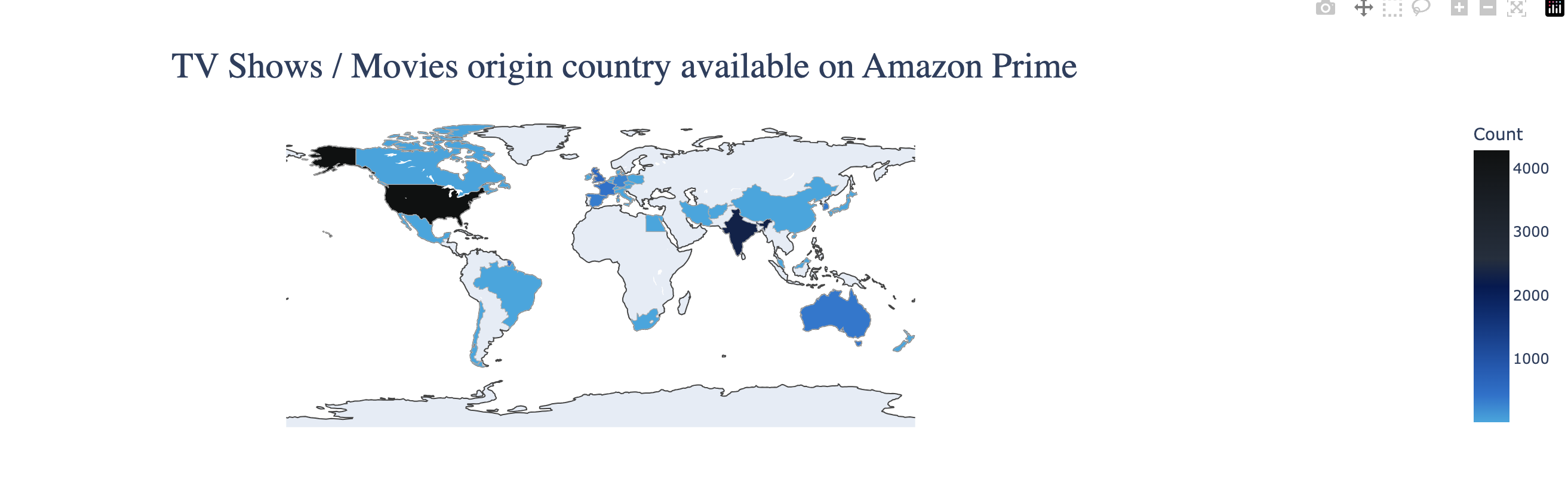
We can clearly see that Majority of the content on Amazon Prime is produced in USA & then followed by India, UK, South Korea, France, Australia. This could be because of Hollywood and Bollywood which are major producers of Movies and TV Shows. Also, because of K Drama and K Pop, South Korea also holds a strong hold. But also could be a result of Population in the respective countries which increases the production of contents.
🍿Movie vs TV Show Ratio
Let's plot the share of ratio between Movies and TV Shows on Amazon Prime
# Find the ratio of type
x=amazon_csv.groupby(['type'])['type'].count()
y=len(amazon_csv)
r=((x/y)).round(2)

mf_ratio = pd.DataFrame(r).T
print(mf_ratio)
Above code finds the ratio of Movies to TV Shows for the next step in visualizing.
#calclated 'mf_ratio'
mf_ratio = pd.DataFrame({'Movie': [0.8], 'TV Show': [0.2]})

fig, ax = plt.subplots(figsize=(6, 1.5))

#  single horizontal stacked bar
ax.barh(0, mf_ratio['Movie'], color='#00A8E1', alpha=0.9)
ax.barh(0, mf_ratio['TV Show'], left=mf_ratio['Movie'], color='#232F3E', alpha=0.9)

# Remove axes details
ax.set_xlim(0, 1)
ax.set_xticks([])
ax.set_yticks([])
ax.spines[['top', 'left', 'right', 'bottom']].set_visible(False)

# Annotations for Movie & TV Show
ax.annotate("80%", xy=(mf_ratio['Movie'][0] / 2, 0), va='center', ha='center',  color='white', fontsize=20, fontweight='bold', fontfamily='serif')
ax.annotate("20%", xy=(mf_ratio['Movie'][0] + mf_ratio['TV Show'][0] / 2, 0), va='center', ha='center', fontsize=20, color='white', fontweight='bold', fontfamily='serif')
fig.text(1.1, 1, 'Insight', fontsize=15, fontweight='bold', fontfamily='serif')

fig.text(1.1, 0.40, '''
The graph shows that the content available
in Amazon Prime is majorly Movies with (80%)
and TV Shows  only add upto (20%).This could
be a result because of the country distribution which
we saw on the previous plot. Or Maybe because
TV Shows are something which are new to the trend than movies.
'''
         , fontsize=8, fontweight='light', fontfamily='serif')
# Creates a vertical line to seperate the insight
import matplotlib.lines as lines
l1 = lines.Line2D([1, 1], [0, 1], transform=fig.transFigure, figure=fig,color='black',lw=0.2)
fig.lines.extend([l1])

# Title
fig.text(0.125, 1.1, 'Movie & TV Show Distribution', fontsize=14, fontweight='bold', fontfamily='serif')

fig.text(0.64,0.9,"Movie", fontweight="bold", fontfamily='serif', fontsize=15, color='#00A8E1')
fig.text(0.77,0.9,"|", fontweight="bold", fontfamily='serif', fontsize=15, color='black')
fig.text(0.8,0.9,"TV Show", fontweight="bold", fontfamily='serif', fontsize=15, color='#221f1f')

plt.show()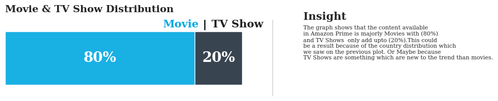
The graph shows that the content available in Amazon Prime is majorly Movies with (80%) and TV Shows only add upto (20%).This could be a result because of the country distribution which we saw on the previous plot. Or Maybe because TV Shows are something which are new to the trend than movies.
🎬 Top Directors on Amazon Prime
Now lets analyze the Directors column and find Top 6 of them all.
# Filter out 'Not Available' values before counting occurrences
filtered_directors = amazon_csv[amazon_csv['director'] != "Not available"]

# Count the number of titles per director
director_counts = filtered_directors['director'].value_counts()

# Select top 10 directors
top_directors = director_counts[:6]

# Define bar colors
colors = ['#232F3E'] * 10  # Default light color
colors[:3] = ['#00A8E1'] * 3  # Highlight top 3 directors

# Create figure and axis for the bar chart
fig, ax = plt.subplots(figsize=(12, 6))

# Plot the bar chart
ax.bar(top_directors.index, top_directors.values, width=0.5, color=colors, edgecolor='darkgray', linewidth=0.6)

# Get the maximum value for dynamic annotation positioning
max_value = top_directors.max()

# Add value labels above the bars
for i, director in enumerate(top_directors.index):
    ax.annotate(f"{top_directors[director]} Content",
                xy=(i, top_directors[director] + max_value * 0.05),  # 5% above the bar
                ha='center', va='bottom', fontweight='light', fontfamily='serif')

# Remove top, left, and right borders
for side in ['top', 'left', 'right']:
    ax.spines[side].set_visible(False)

# Set x-axis labels
ax.set_xticks(range(len(top_directors.index)))  # Correct tick positioning
ax.set_xticklabels(top_directors.index, fontfamily='serif', rotation=0, ha='center')
ax.set_yticklabels('', fontfamily='serif', rotation=0, ha='center')


# Add horizontal grid lines for better readability
ax.grid(axis='y', linestyle='-', alpha=0.4)
ax.set_axisbelow(True)  # Place grid lines behind bars

# Add a thick bottom border
plt.axhline(y=0, color='black', linewidth=1.3, alpha=0.7)
fig.text(0.95, 0.75, 'Insight', fontsize=15, fontweight='bold', fontfamily='serif')

fig.text(0.95, 0.45, '''
I have chosen only Top 6 for better visualization
because majority of the directors have single
figure content under their name.
Director, Mark Knight has the highest
content of Movies/ TV show with 104 counts
that is hosted on Amazon Prime. Followed
by Cannis Holder (60), Moonbug E(36).

Its interesting although India , South Korea are one of the top
producers, the directors dont hold a Monopoly.
'''
         , fontsize=8.5, fontweight='light', fontfamily='serif')

# Remove tick marks
ax.tick_params(axis='both', which='major', labelsize=12, length=0)
fig.text(0.65,0.75,"Top 3", fontweight="bold", fontfamily='serif', fontsize=15, color='#00A8E1')
fig.text(0.71,0.75,"|", fontweight="bold", fontfamily='serif', fontsize=15, color='black')
fig.text(0.73,0.75,"Rest 3", fontweight="bold", fontfamily='serif', fontsize=15, color='#221f1f')
# Title styling
plt.title('Top 6 Directors on Amazon Prime', fontsize=16, fontweight='bold', fontfamily='serif')

# Display the plot
plt.show()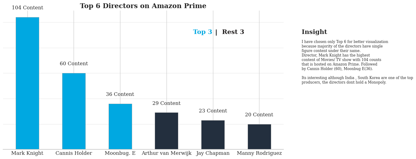
Director, Mark Knight has the highest content of Movies/ TV show with 104 counts that is hosted on Amazon Prime. Followed by Cannis Holder (60), Moonbug E(36).
Its interesting although India , South Korea are one of the top
producers, the directors dont hold a Monopoly.
⏳ Chronological availability of Movies & TV Shows
# To create a layout with length and width defined
fig, ax = plt.subplots(figsize=(12, 6))
color = ["#00A8E1", "#221f1f"]

# Annotation
for i, mtv in enumerate(amazon_csv['type'].value_counts().index):
    mtv_rel = amazon_csv[amazon_csv['type']==mtv]['release_year'].value_counts().sort_index()
    ax.plot(mtv_rel.index, mtv_rel, color=color[i], label=mtv)
    ax.fill_between(mtv_rel.index, 0, mtv_rel, color=color[i], alpha=0.9)

ax.yaxis.tick_right()
# Creates a horizontal line below in x axis
ax.axhline(y = 0, color = 'black', linewidth = 1.3, alpha = .7)
# Limits for the y axis ticks
ax.set_ylim(0, 1000)
#To remove the box around
for s in ['top', 'right','bottom','left']:
    ax.spines[s].set_visible(False)

ax.grid(False)
plt.xticks(fontfamily='serif')
plt.yticks(fontfamily='serif')
# Insights
fig.text(0.30, 0.85, 'Chronological availability of Movies & TV Shows', fontsize=16, fontweight='bold', fontfamily='serif')
fig.text(0.13, 0.75, 'Insight', fontsize=15, fontweight='bold', fontfamily='serif')
fig.text(0.13, 0.55,
'''It shows that majority of the content on Amazon Prime
is new. We can see a steep curve in the range of 2000-2020.
Definitely this will give us an insight of the age group
of the consumers.
Could this mean contents are mainly focused on youth or teens?
'''

, fontsize=8.5, fontweight='light', fontfamily='serif')
# Legends
fig.text(0.13,0.2,"Movie", fontweight="bold", fontfamily='serif', fontsize=15, color='#00A8E1')
fig.text(0.19,0.2,"|", fontweight="bold", fontfamily='serif', fontsize=15, color='black')
fig.text(0.2,0.2,"TV Show", fontweight="bold", fontfamily='serif', fontsize=15, color='#221f1f')
# removes the ticks
ax.tick_params(axis=u'both', which=u'both',length=0)
# Display the grapgh
plt.show()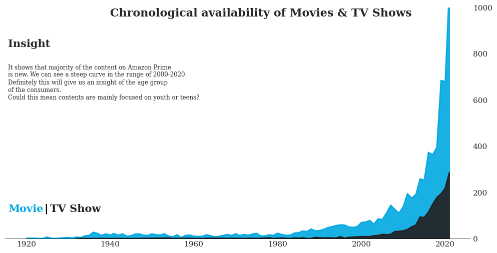
It shows that majority of the content on Amazon Prime is new. We can see a steep curve in the range of 2000-2020. Definitely this will give us an insight of the age group of the consumers. Could this mean contents are mainly focused on youth or teens?
Plot a Heatmap .
# Get the unique countries
unique_countries = set()
# Get the first country if multiple are listed
for entry in amazon_csv['country'].dropna():
    first_country = entry.split(', ')[0]
    unique_countries.add(first_country)

# Filter the dataset
amazon_csv['first_country'] = amazon_csv['country'].apply(lambda x: x.split(', ')[0] if isinstance(x, str) else x)

# Get the top 10 countries
top_countries = amazon_csv['first_country'].value_counts().head(10).index
# Creating a dictionary for clubbing
ratings_ages = {
    'TV-Y': 'Kids', 'TV-G': 'Kids', 'G': 'Kids', 'ALL': 'Kids', 'ALL_AGES': 'Kids',
    'TV-Y7': 'Older Kids', '7+': 'Older Kids', 'TV-PG': 'Older Kids', 'PG': 'Older Kids',
    'PG-13': 'Teens', 'TV-14': 'Teens', '13+': 'Teens', '16+': 'Teens', '16': 'Teens', 'AGES_16_': 'Teens',
    '18+': 'Adults', 'R': 'Adults', 'TV-MA': 'Adults', 'NC-17': 'Adults', 'NR': 'Adults', 'TV-NR': 'Adults',
    'UNRATED': 'Adults', 'AGES_18_': 'Adults', 'NOT_RATE': 'Adults'
}

# Create 'target_age_group' column *before* filtering
amazon_csv['target_age_group'] = amazon_csv['age_group'].map(ratings_ages)

# Filter data for only the top 10 countries
filtered_data = amazon_csv[amazon_csv['first_country'].isin(top_countries)]
filtered_data['first_country'].replace({'United States': 'USA',
                                     'United Kingdom': 'UK',
                                     'South Korea': 'S. Korea'}, inplace=True)
# Create a pivot table with counts of each age group per country
heatmap_data = filtered_data.pivot_table(index='target_age_group', columns='first_country', aggfunc='size', fill_value=0)

# Convert counts to percentages
heatmap_data_percentage = heatmap_data.div(heatmap_data.sum(axis=0), axis=1) * 100

# custom colormap for Amazon
cmap = matplotlib.colors.LinearSegmentedColormap.from_list("", ['#FFFFFF', '#B4B4B4', '#00A8E1'])

# Plot the heatmap
plt.figure(figsize=(12, 6))
sns.heatmap(heatmap_data_percentage, cmap=cmap, annot=True, fmt='.1f', linewidths=2.5, square=True,
            cbar=False, vmax=60, vmin=5, annot_kws={"fontsize": 12, "fontfamily": 'serif', "fontweight": 'bold', "color": 'black'})

# Annotations
for t in plt.gca().texts:
    t.set_text(t.get_text() + "%")
    t.set_fontsize(10)

# Title and labels
plt.title("Target Age Group Distribution by Country (%)", fontsize=16, fontweight='bold', fontfamily='serif', pad=20, color='#232F3E')
plt.xlabel("", fontsize=10, labelpad=10, fontfamily='serif', color='#232F3E')
plt.ylabel("", fontsize=10, labelpad=10, fontfamily='serif', color='#232F3E')

plt.xticks(fontsize=10, fontfamily='serif')
plt.yticks(fontsize=10, fontfamily='serif')

# Add  labels
plt.text(10.5, 0.2, "Insight", fontweight="bold", fontfamily='serif', fontsize=16)
plt.text(10.5, 0.9, '''Yes, we can see that Most of the countries
 target Teens and Adults for their viewer engagement.
 Italy targets 70% of younger viewers.
  ''', fontfamily='serif', fontsize=8.5)

# Show plot
plt.show()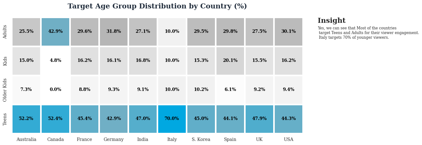
Yes, we can see that Most of the countries target Teens and Adults for their viewer engagement.
Italy targets 70% of younger viewers.
Could the number of seasons of a TV Show has any relation with the rating? Usually TV Shows tend to increase their seasons if its a success or has a good engagegement.
amazon_csv['num_seasons'] = amazon_csv['duration'].str.extract(r'(\d+) Season[s]?')From duration checks if the value has 'season' in it to confirm its TV Shows.
###Correlation between Number of Seasons Vs Ratings.

correlation = amazon_csv['num_seasons'].corr(amazon_csv['rating'])
print(f"Correlation Coefficient: {correlation}")
Correlation Coefficient is found between Number of Seasons in a TV Show and Rating value of it. To check for statistical signicance.
# Make it numeric to extract the number of seasons
amazon_csv['num_seasons'] = pd.to_numeric(amazon_csv['num_seasons'], errors='coerce')

# Create the regplot / Scatter plot
plt.figure(figsize=(12, 6))
sns.regplot(x=amazon_csv['num_seasons'], y=amazon_csv['rating'], scatter_kws={"s": 3, "color": "#232F3E"}, line_kws={"color": "#00A8E1", "linewidth": 2})

# Set title and labels
plt.title("Number of Seasons vs Rating", fontsize=16, fontweight='bold', family='serif')
plt.xlabel("Number of Seasons", fontsize=12, fontweight='normal', family='serif')
plt.ylabel("Rating", fontsize=12, fontweight='normal', family='serif')

# Grid customization
plt.grid(True, axis='both', linestyle='-', alpha=0.4)

# Make the background color white for a cleaner look
plt.gca().set_facecolor('white')
plt.text(22, 15.5, 'Insight', fontsize=16, fontweight='bold', fontfamily='serif')
plt.text(22, 13,
'''There is a strong correlation of 0.67 to show
 that rating might have tempted the Directors to
 increase the number of seasons.
'''

, fontsize=8.5, fontweight='light', fontfamily='serif')
# Customize the ticks
plt.xticks(fontsize=8, family='serif')
plt.yticks(fontsize=8, family='serif')

# Remove the borders (spines)
for spine in plt.gca().spines.values():
    spine.set_visible(False)

# Display the plot
plt.tight_layout()
plt.show()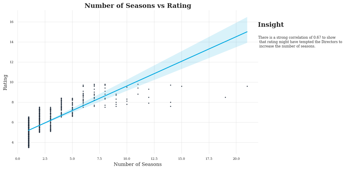
There is a strong correlation of 0.67 to show that rating might have tempted the Directors to increase the number of seasons. But correlation doesnt imply causation so we cant predict AND confirm the analysis.
Exploratory Data Analysis (EDA) of Amazon Prime Titles
Word count: 391
This analysis explores Amazon Prime’s content library using data from 9,667 titles, including movies and TV shows. The dataset contains attributes like title, type, release year, rating, and genre. The objective is to clean the data, handle missing values, and uncover trends in content distribution.
Data Cleaning and Preprocessing
Missing values were found in multiple columns:
- "date_added" (98.4%) – Dropped due to excessive missing data.
- "country" (10.3%) – Filled with mode value.
- "director" (21.54%) and "cast" (12.75%) – Replaced with "Unknown."
- "rating" (2.93%) – Filled with mode value.
Checks ensured "type" only had "Movie" and "TV Show" values, and all ratings were valid.
Content Distribution and Trends
- Movies vs TV Shows: The dataset contains 7,814 movies (80%) and 1,854 TV shows (20%).
- Release Year Trends: Content production increased after 2000, with a sharp rise post-2015.
- Newer Content Preference: 50% of content is from 2016 or later.
Genre and Audience Analysis
- Popular Categories: "Drama," "Comedy," and "Suspense" dominate the dataset.
- Ratings Breakdown: PG, R, and TV-MA are common ratings, showing a mix of family-friendly and mature content.
-
Country-wise Production:
- USA leads content production.
- India, UK, South Korea, and France follow.
- Hollywood, Bollywood, and K-Dramas contribute significantly.
Duration and Rating Analysis
- Movies: Average duration is 90 minutes.
- TV Shows: Ratings correlate strongly (0.67) with the number of seasons, suggesting successful shows get extended seasons.
- Highest Rated Content: Median rating is 6.3, with a maximum of 9.8.
Key Findings and Business Insights
- Content Type: Majorly populated with Movies than TV Shows
- Content Age: Significant rise in content chronology distrubtion after 2010, majorly being newer releases.
- Regional Availability: USA dominates, but India and South Korea also have strong presence maybe due to Hollywood, Bollywood and KDrama.
- Directors: Mark Knight (104 titles) leads, followed by Cannis Holder (60) and Moonbug E (36). Notably, no monopoly among Indian and Korean directors even with higher content origin.
- Statistical Insights: Correlation between rating and number of TV show seasons suggests audience engagement influences newer releases.
Conclusion
Amazon Prime’s content is heavily movie-focused. The platform’s diverse genre majorly targets Adult viewers but mix both family and mature audiences. These insights can help optimize content curation and engagement strategies.